Cracking the Budget #1: Chronic Underspend
Pie-chart showing that 4.2% (~50M) of the 2024–2025 comes from unused budget. In 2023–2024 where the total Budget Deficit was 80M, removing…
Cracking the Budget #1: Chronic Underspend

Pie-chart showing that 4.2% (~50M) of the 2024–2025 budget comes from unused allocations. In 2023–2024 where the total Budget Deficit was 80M, removing this chunk would have reduced the deficit by 66%.
TL;DR In 2024, Seattle Public Schools projected an 80M budget deficit, but the actual shortfall was only 13M — a variance (budget — actuals) of 67M or roughly a 6x overestimate. Of that 67M, 53M comes from unnecessarily large budget allocations in just 8 OSPI “Activities” that for the past decade have been chronically over-allocated in the budget by more than 0.5M yearly.
This variance matters because the inflated “structural deficit” narrative drives drastic solutions — school closures, bell time changes, class size increases, and staff reductions.
Trimming these unused allocations would have zero impact on operations, yet could shrink the apparent deficit down to something closer to 27M, helping avoid panic-driven decisions and even the looming threat of Binding Conditions. They should be addressed immediately.
Key Points
- There are two distinct deficits: Budget Deficit and Actual Deficit. They require entirely different solutions — yet are often conflated in public discussions.
- Over the past decade, the Budget Deficit is, on average, 56M larger than the Actual Deficit — a weirdly consistent “cashflow variance.”
- In 2024, 79% of this variance (53M/67M) comes from repeated over-budgeting, i.e. earmarking more money than is ever actually spent, across just 8 OSPI Activities.
- This variance must be reduced first since it’s what triggers yearly alarms about insolvency.
- Correcting this could have reduced the 2024 Budget Deficit from 80M → 27M, without a single operational cut. That “savings” is 1.7x larger than what the district claimed closing 21 schools would yield.
- Keeping the inflated 80M deficit distorts policy discussions towards drastic measures — pushing closures and bell-time changes that each aim to “save” less than the phantom 53M.
IMPORTANT: ₿udget Dollars ≠ Actual Dollars
Before continuing, we need to introduce some new notation convention:
- ₿ will be used for budget dollars (e.g., ₿ 100M)
- $ will be used for actual dollars (e.g., $98M)
Most SPS financial discussions use ₿ amounts and $ amount interchangeably — including some of my own older analyses. That can lead to wildly incorrect conclusions.
For example, assume a budget item is allocated ₿ 100M but at the end of the the actual spend was only $98M. This creates an “underspend” of ₿ 100M — $98M = ₿ 2M. Many people will incorrectly assume this translates to $2M (notice symbol change) and falsely conclude that there is $2M left in the bank that could have been used. This is completely, utterly, wrong.
Without looking at how the actual revenues or expenditures tracked the budget, it is impossible to know how much is in the bank. For example, we had a thousand more students than expected which increased the revenue by millions. We should have way more than 2M money in the bank and wonder why we did not spend more on teachers. This example 2M — the variance — only tells you how accurate your budget line item was and not much more.
Note that in finance, variance is the technical term for budget — actual which is different from the meaning of the term in statistics. We will use the finance term going forward as it will make talking with the district finance staff easier.
Anyways, as a rule of thumb, whenever someone compares a budget figure to an actual figure without context, your immediate reaction should be:

Rumi, Mira, and Zoey just say “nah nah nah nah” to naively comparing Budget dollars and Actual dollars.
And yes, the Bitcoin emoji for the budget is intentional. Because much like Bitcoin (or K-Pop Demon Hunters), SPS ₿udget dollars have only a loose relationship with reality.
Now back to the analysis.
Are You Saying We Could Cut 54M from the “Structural Deficit” Without Touching Classrooms?
Yes.
While it’s true that some of that deficit variance is a result of good, conservative, expense estimates, tens of millions are simply repeatedly unspent allocations.
This sounds unbelievable. Can you show your work?
Absolutely. Thank you for always asking!
Here’s how the analysis was done.
- Every SPS expenditure since 2016 is tagged with OSPI “Program Activity Object” codes (“PAO codes” for short). For this analysis, we use the Activity code.
- Using F195 (budget) and F196 (actuals) reports, we calculated: Variance = ₿udget — $Actuals for each Activity
Taking variance numbers from above, we then
- Found the Median Variances for 2016–2024
- Sorted Activities by largest Median Variance
- Graphed the ₿udget and $Actuals for the Activities.
- Flagged the Activities underspend their budgets by more than 500k.
That analysis revealed the top 8 activities with highest variance also tended to have large unused budget allocations that recurred year-after-year. Over 2016–2024, these sum of the underspend of these 8 activities has a median of ₿53M which is actually larger than the median variance of ₿51M for the same span of years.
In 2024, those same activities also sum to ₿53M and are responsible for 66% of the ₿80M deficit that fueled the school closure debate.
Full graphs with more comments are in the appendix. For now though, here is a summary table of the results:
[embed]Table showing the 8 categories with large, chronic, variance (aka underspend). Lists the median variance from 2016–2024 and also the 2024 (last year will full data) variance.
Why Care About Unused Budget Capacity?
Three reasons…
#1 Distorted urgency and magnitude The magnitude of an ₿80M “structural deficit” has been used to justify sweeping actions — mass school closures, bell-time shifts, librarian cuts. It also leads to us dismissing attention from smaller, easier, and possibly more creative solutions.
For example, with the unused capacity removed the remaining budget deficit is ₿27M. At that amount, modest ideas like eliminating the $6M/year on electricity by using Capital Fund Dollars (read: no impact on operating budget) for covering schools with solar panels (h/t Mary Ellen Russel) would suddenly eliminate 22% of the problem.If we think there’s a ₿80M deficit, solutions of that size would not even get airtime.
#2 Opaque finances and forecasting During those years, were the Weighted Staffing Standards — the process which directly controls staffing allocations to schools — skimping on staff expecting red ink when we should have been expanding expecting green? What about now? Are we skimping more than we need to with things like the 2-FTE rule?
Worse, there are many years in 2016–2024 where underspend in these areas completely mask overspend in others. Having such a large repeated variance makes it impossible to know if the money is going where we budgeted it to go.
#3 Unneeded borrowing In FY2024, the district took a ₿27M interfund loan to balance the budget. However, when looking at the actual spending in the district’s monthly fiscal reports, the general fund balance never dropped below $38M so we never actually used the money we borrowed.
Though the loan gave us a way to avoid Binding Conditions by “balancing the budget” and bought more time to handle the Actual deficit, it also let us continue without confronting these repeated structure budging oddities — all while making us pay interest.
All three consequences are bad. The consistently unused ₿udget capacity should go. Because it is consistently unused, removing it should be doable immediately.
“But What If We Go Over Budget?”
Good question.
If this happens, then the district would need to go through a process to request extra funds from OSPI.
Yes, it’s time-consuming to make this request so a little buffer is good practice. But padding that forces closures or multi-year disruptions vastly outweigh the potential time saved.
Ultimately, while removing this underspend will likely expose volatility in other activities that has been hidden for years, that is arguably a good thing as the volatility should be understood and planned for in policy.
Fortunately, the latent volatility is likely not that huge. SPS’s revenue and expenditure forecasts are actually quite accurate compared to its peers. The expenditures are just consistently biased upwards. See the next section.
How SPS compares to other districts
Across neighboring districts, SPS’s consistency of variance is among the best. This is true for both the budget estimates of revenues and expenditures. However, our systematic expenditures overestimation (5–6% every year) stands out.
Looking at the following box-plot of yearly Expenditure variance for neighboring districts you can see that the SPS box is shorter than most districts but the median is around 5%.

This consistency means the error likely isn’t caused by enrollment or funding swings, but by internal allocation patterns that have ossified over time.
It also means that we are less likely to fall into Binding Conditions the way that Bellevue did, where expenditures exceeded budget for 2 years until the General Fund balance went negative. Our spending is just more predictable.
On the Revenue side, SPS looks even better as its median is near 0 and the height of the box is also not very big.

Given how consistent SPS is, it seems likely that we can remove up to about 5%-6% of the general fund budget’s worth of chronic underspend.
What keeps getting budgeted for and never fulfilled?
Mostly Staffing.
Using the “Object code” from the PAO Codes, we can further divide each activity into Compensation vs Non-Compensation expenditures and see the variances in each.
[embed]Table showing that nearly all of the underspend is in chronically unfilled staffing allocations. Table alsos hows that this underspend masks ₿7.4M and ₿3.4M of going over-budget in non-staffing expenses for teaching and Principal Office.
Notice that most of the underspend is in compensation. Notice also that in the case of “Teaching / Prof Learn” and “Principal’s Office / Principal”, the ₿44.7M and ₿4M compensation underspend masks a non-compensation overspend of $7.4M and $3.4M respectively. This data is not available in the budget book but it is available in the raw F195 and f196 filings from the district.
We can also cross-verify this result by examining the variance in Full-Time Equivalent (FTE) staff counts in the F195 Fiscal Report and the S275 Personnel File final report. Here is a graph showing that every year (except during COVID), SPS budgets for 200–500 more FTEs than it actually hires.

Variance Column graph showing that from 2016–2024, the actual hired FTE (per S275 data) is lower than budget by a median of 317 FTE. The actual data is noisy, but the trend is still clear.
While the S275 reporting has a lot of errors (topic for another post), it is what the district uses as “actuals” for FTE and should not be hundreds of FTE off of reality.
In 2024, that gap was ~460 FTEs (the s275 can miss some employees). So, assuming an average 150k total compensation for each FTE, a back-of-the envelope calculation makes that into a ₿ 69M expenditure variance — roughly equal the deficit variance we are seeing.
A Quick Mother’s Day Data Mystery
Fun aside: much of this clarity came together when Jane Demel filed a public records request for Student Outcomes Focused Governance (SOFG).
One of the contracts included a cost center number.
Tara Chace noticed it.
That clue pinballed through online groups and eventually reached our little Data Nerd chat on Mother’s day morning. This commenced a few hours of nerdy code-breaking over chat as we collectively reverse-engineered the cost center system confirming how OSPI F196 data ties back to internal allocations.
Specifically, we decode that a cost center ID like 10021097117340 can be broken into:
- 1002 = Building (District Office)
- 1 = Fund number (General Fund)
- 0 = Sub Fund number (State)
- 97 = Program Code (District Wide Support)
- 11 — Activity Code (Board of Directors)
- 7 = Object Code (Purchased Services)
- 340 = NCES Code (“Other Professional Services” NCES codes are like expense categories in Quicken)
We then could confirm our allocation numbers against a PRR that Beth Day had made for SOFG invoices.
From that, we knew that OSPI f196 Actuals line items could be reversed back into the district’s internal financial structure which gave us confidence in this analysis.
Totally a community effort that came out of PRRs and fast sharing information between different involved advocates. Talk to everyone people! We can get a lot of stuff done together!
Also… what a weird way to spend Mother’s Day.
So What About the Actual Deficit?
That’s the next post.
For now, here’s a teaser: look at a graph compensation only in the Teaching Activity over time — both as 2 graphs, one of the dollar amount and the other as % of expenditures.

Variance graph of Teaching Activity Compensation in raw dollars showing it increasing over time.

Variance graph of Teaching Activity Compensation as % of expenditures showing it decreasing over time.
So here’s the multi-million dollar question: is teaching spend going up up up until we’re golden? Or has the % of our resources that we allocate and spend on teaching been the subject of a takedown, takedown, takedown-down-down-down (omg make the KPop Demon Hunters stop).
… hmmm…
Conclusion
The ₿udget vs. $Actual gap distorts our understanding, misguides our policy choices, and inflates fear.
By trimming a few predictable, decade-long overallocations, we can clarify what’s real and start focusing on actual resource use — not accounting shadows. We also remove the main threat of the district entering Binding Conditions which is us predicting that we have far less money than we really do.
And next time you see a “$” in a report, ask yourself: Is that a ₿, a $?
Appendix
The evidence for the above is most easily interpretable in showing the underspend charts for each activity. This appendix will show all 8 charts with special detail spent on the Teaching Activity since that’s, by itself, makes up most of the underspend.
Teaching / Professional Learning
This is the most egregious and so we will delve a little more deeply.

Variance column chart showing that Teaching is given an oddl consistent 50M more budget each year than gets used.
SPS has underspent about ₿49M every year since 2016 — a strangely stable number. True variance would fluctuate with inflation or labor costs, but this pattern suggests a persistent, unnoticed ₿50M allocation rather than diffuse error across all the different teaching category.
If we break this down further using the program codes, we actually see traces of exactly. For example, let’s isolate Program 73, Instructional Programs — Other, compesnation spending

Here it shows that ₿25M if this variance usually comes from just this one program, activity, object combo. Given our cost-center decoding earlier, knowing it is compensation can let us construct a list of likely cost centers that we can give to the district to examine. Those would be
- District Office Certificated Salary = 1002-1-A-79–27–2–110
- District Office Classified Salary = 1002–1-A-79–27–3–110
- District Office Benefits Salary = 1002–1-A-79–27–4–B
A can be 0 or 1 for state or local funding source
B can be one of the 2xx NCES codes (eg 212-Group Insurance-Certificate, 213-Group Insurance-Classified, 282Health Benefits — Certificated, etc)
We can dig further, but this illustrates the point that the unused budget is clustered.
Supervision — Instruction

Variance graph of Supervision Instruction from 2016 to 2024. Median variance of 2M. 2024 is 5.3M.
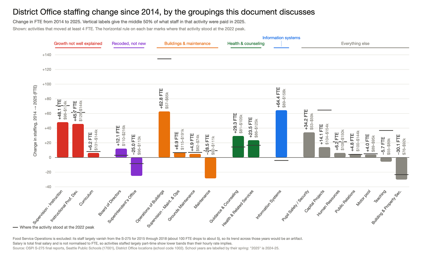
This is straightforward constant underspend that has somehow increased. A separate question that we will dig in later is why has Supervision — Instruction spending nearly tripled since 2014? Note that Supervision — Instruction does NOT include Principals. These are people above that level.
Information Systems
Information systems also has a median underspend of 1.3M but it moves more randomly.

Variance graph of Informational Systems from 2016 to 2024. Median variance of 1.3M. 2024 is 4.6M. This graph does not look quite as consistenly under budget.
However, if you split it out to look only at the compensation, suddenly it gets more steady:

Variance graph of Informational Systems, Compensation Only, from 2016 to 2024. Median variance of 1.5M. 2024 is 3.4M. Compensation spending never reaches budget.
The variance is very steady at around 1.5M each year until recently when it grows.
This likely means staffing is not getting filled, but purchases vary wildly.
Principal Office / Principal
Underspend here is consistently just about 1M under and has reduced recently. This seems almost good...

…but if you look at compensation only, suddenly it looks consistently over-allocated as well.

Variance graph of Principal’s Office/Principal, Compensation Only, from 2016 to 2024. Median variance of 1.9M. 2024 is 4M. In contrast to the activty roll-up, this breakdown sows the staffing variance is larger than expected and getting worse.
Variance is now consistently 1.9M off — nearly double the median for the full activity. The underspend has actually increased to 4M in 2024, as opposed to decreasing to 400k so our staffing budget accuracy has gotten worse.
The roll-up number of the activity is hiding resource allocation shifts.
Superintendent’s Office
Superintendent office is starting to get into very small numbers, the consistent underspend is still fairly visible.

Variance graph of Superintendent’s Office, from 2016 to 2024. Median variance of 0.82M. 2024 is 0.84M. It is consistently under-allocated.
The variance is less interesting here than the trend of actual spending shrinking over time. This is “good” in that it reflects the central office trying to trim cost down to even pre 2014 levels. It is bad though because these are likely the costs visible to the board directors (eg Hersey once said they are down to a skeleton staff) but other parts, such as Supervision — Instruction remain above 2020 levels. It makes you wonder if there’s a selection towards cutting visible staff (eg front desk, HR people that leave paperwork) are somehow being cut first giving the impression of scarping-by.
Operations of Buildings
Operations of Building has two odd spikes, but it seems that FY22–23 and FY23–24, the years that lead to the budget deficit panic, the allocation to this budget was inflated a by around 2M. 2025 seems to have adjusted back down.

Variance graph of Operations of Buildings from 2016 to 2024. Median variance of 0.76M. 2024 is 2.7M. Excluding 2022, 2023, it is consistently under-allocated with an odd spike in variance in 2023 and 2024
Supervision — Transportation
Supervision Transportation is getting into some small numbers. However it is consistently underspending as well.

Variance graph of Supervision — Transportation from 2016 to 2024. Median variance of 0.72M. 2024 is 0.84M. The variance is smallish, but it is consistent
Operations — Food Service
Again back to very small numbers but excluding 2024, this is always underspent.

Variance graph of Operations — Food Service from 2016 to 2024. Median variance of 0.54M. 2024 is -0.89M, an overspend.
메타데이터
- post_id
- 7d6098cc2fbc
- slug
- cracking-the-budget-1-chronic-underspend-7d6098cc2fbc
- url
- https://medium.com/@awongawong/cracking-the-budget-1-chronic-underspend-7d6098cc2fbc
- canonical_url
- https://medium.com/@awongawong/cracking-the-budget-1-chronic-underspend-7d6098cc2fbc
- author_url
- https://medium.com/@awongawong
- status
- ok
- fetched_at
- 2026-08-07 22:47:36