Your Uber Driver Isn’t Distracted, The App Is Distracting Him
I counted eight notification dismissals in a 20-minute ride. Each one pulled his eyes off the road.
Your Uber Driver Isn’t Distracted, The App Is Distracting Him
I counted eight notification dismissals in a 20-minute ride. Each one pulled his eyes off the road.
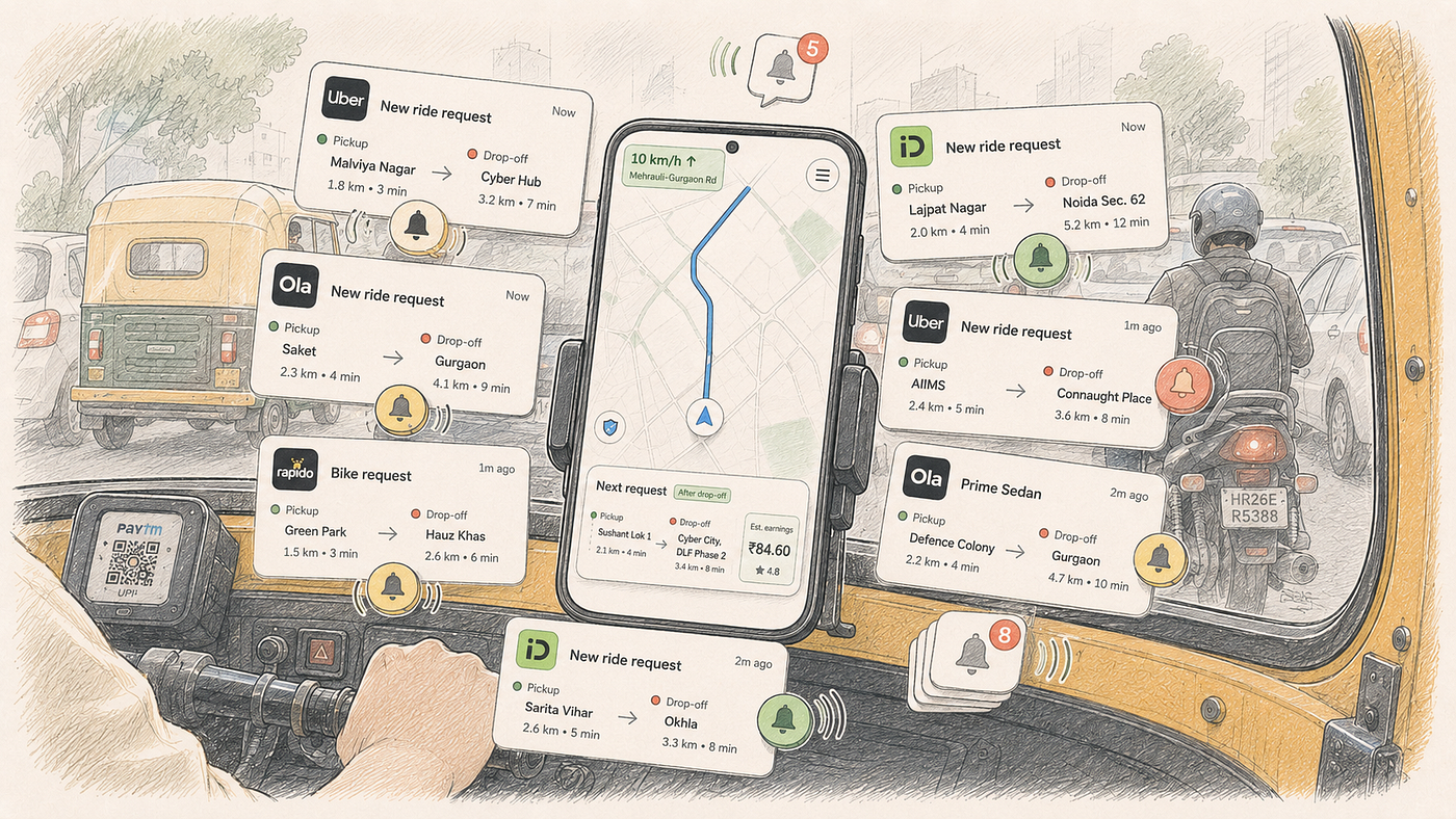
Last week I booked an auto on Uber from IFFCO Chowk in Sector 29 to the Passport Seva Kendra in Udyog Vihar Sector 18. Short ride. About 3.1 km. The fare on the screen said ₹73.10 and the app estimated 7 minutes. It took closer to 20.
Not because of Gurgaon traffic, though that is its own genre of pain. My driver spent half the ride tapping and swiping at his own phone, cancelling notification after notification of new ride requests coming in while he was already driving me somewhere. Every minute or so, his phone would chime. A bottom sheet would slide up on his screen, covering about seventy percent of the map. He would glance down, tap the X, and go back to trying to see the road. A minute later, another one.
At one point I asked him why so many were coming through. “Yeh toh chalta hi rehta hai sir,” he shrugged. The app pinged him even when he was on a trip, and turning it off meant going offline, which would tank his acceptance rate.
Acceptance rate is the metric ride-hailing apps use to score drivers on how often they take the requests dispatch sends them. It feeds into dispatch priority (which driver gets the good rides next) and into the incentive tiers that affect how much a driver takes home in a week. Ignoring a ping is not a free option. Cancelling is not a free option either. Going offline is the only clean escape and it means no rides at all until you come back on.
At the end of the ride, he asked me to rate him five stars because his acceptance rate had already taken a hit from all the cancellations. I gave him five and walked into the passport office. And then I sat down to write this.
What I watched happen in the back of that auto was not a driver being distracted. It was a driver being forced to be distracted, over and over, by a product that had no idea he was already busy. Every time he looked at his phone to dismiss the notification, his eyes came off Mehrauli-Gurgaon Road, where his auto was pushing forward at 10 km/h through cars, bikes, and other rickshaws.
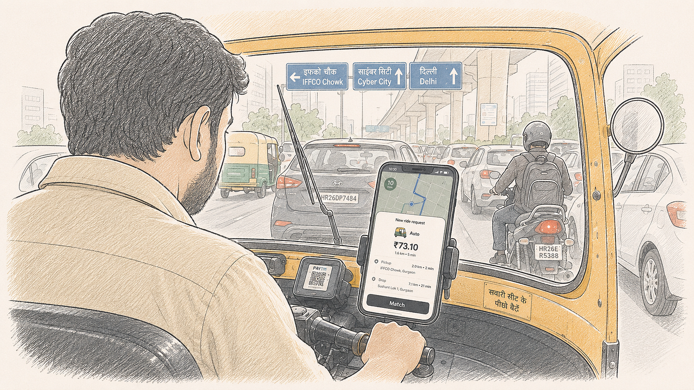
What The Screen Was Actually Doing
Three things were on his screen at once, more or less on top of each other.
At the top corner, a green speed indicator. It said 10 km/h with a small arrow towards Mehrauli-Gurgaon Road. Small, tucked away, and did not fight for space.
Below that, the map. This is the actual working surface for a driver. The route, the turn, the pillar number they use as landmarks, the little indicator showing where the auto currently is. This is what tells the driver where to go and when to turn.
Then the notification. A big fat bottom sheet, easily the largest single element on the screen. It said “Auto” at the top, then ₹73.10 in a very large font, a five-star rating, a pickup point (5 minutes, 2.0 km away), and a drop-off point (7 minutes, 3.1 km) which happened to be the Passport Seva Kendra I was headed to. At the bottom, a black “Match” button running almost the full width of the sheet.
This bottom sheet made total sense in isolation. If you were a driver who was not currently on a trip, and a new request came in, this is exactly what you want to see. Big Match button that is easy to tap, rating visible, distance and time clear. Someone put real thought into this card.
The problem was context. Or the lack of it.
The driver was already on a ride. My ride. And the app was showing him ride-request cards designed for someone who was idle. The visual weight matched what he would see at rest, and so did the sound and the Match button. There was no signal in the design that said, “hey, we know you are busy, we are just giving you a heads up in case you want to queue this one up for later.” It looked and behaved exactly like an urgent decision he needed to make right now, even though he could not accept it anyway without dropping me off first.
So he did the only thing he could. He cancelled it. Then the next one. Then the next.
The Problem Nobody Designed Around
From a product management seat, the first question is: who is this notification for?
The answer probably sits in the operations dashboard somewhere. I do not work at a ride-hailing platform, so I am inferring. But the logic of pinging busy drivers is not mysterious. Dispatch, the system that decides which driver gets pinged for which ride, usually tries to shave seconds off the time-to-match. If a driver is 2 minutes away from his current drop-off, and there is a pickup 2 minutes past that drop-off, matching him early keeps the network moving.
There is a business case for pinging busy drivers. I get that.
But somewhere along the way, the design of the driver-facing screen stopped asking a different question. Not “should we ping this driver” but “how should we ping this driver, given what he is doing right now?”
That question seems to have been skipped. The ping he was receiving was identical in visual weight, sound, and interaction pattern to a ping he would receive at a stand.
This is what I would call a context-blind interface. The system knows a lot about the driver: his current location, his current speed, whether he has an active trip, the passenger in the back seat, the ETA for his drop-off. And yet the notification design treats all these states as if they are the same.
A busy shift, from what drivers I have spoken to describe, is mostly spent on trips. Not idle at a stand, not waiting for a request. In-trip pings are not a minority of what a driver sees during his working hours. They are the majority. And the current design shapes the majority case around a state the driver is almost never in when the ping arrives.
The driver also has no easy escape valve. Acceptance rate becomes soft coercion. If you cancel too many, your priority in dispatch drops. Your earnings drop. Ignoring a ping shows up in the same score.
He was in a bind. Accepting was impossible because he was already on my trip. Cancelling was expensive over time. Ignoring was worse. The only option that kept his standing safe was to cancel each one manually and quickly.
This is a design problem hiding a policy problem, which is not something the driver can fix. Only the product team can.
Where This Sits In The Product Table
Around a real product table, the roles would show up like this.
The PM would want to know what percentage of rides get matched via drivers on the last mile of an existing trip. If that number is high, killing off in-trip notifications entirely would hurt fill rate, meaning the share of ride requests that get matched to a driver at all. If the number is low, the case for silencing them is stronger. Either way, the PM needs the data before making a call, and my hunch is that nobody at the platform has run this segmentation with driver safety as the framing question.
The designer would ask why the same bottom sheet component is being reused in a context it was not designed for. They would want a smaller, less intrusive treatment when the driver is in a trip. Maybe a chip at the top of the screen. Maybe a subtle side card. They would also flag the sound, because the alert tone is doing double duty for two very different situations.
The QA person is often the seat that says the thing nobody wants to hear. They would ask: what happens when a driver receives three notifications in ten seconds? What if the driver taps the map behind the bottom sheet by mistake? Where does the tap target overlap with the sound icon that also lives on the map? Is there a risk of accidentally accepting the wrong ride when trying to close a notification? These questions matter because a design that looks clean in Figma can behave very differently on a smudged budget Android running two apps at once.
The engineering lead would think about whether the app knows the trip status at the moment the ping is created. If the notification is going out via a server-side push, meaning it arrives on the phone as an OS-level alert the app cannot easily reshape after the fact, the driver’s app might not have a chance to suppress or downgrade it.
Each seat is looking at the same problem and seeing a slightly different edge of it. When a product ships without one of those perspectives, this is what happens. A well-designed component gets deployed in a context where it becomes actively harmful.
Solution One: Shrink The Bottom Sheet When The Driver Is In A Trip
The most direct fix, and probably the cheapest to build, is to detect the trip state and change the component treatment.
If the driver is idle, show the full bottom sheet. Big fare, big Match button, full pickup and drop details. This is the case the current design was built for and it works well.
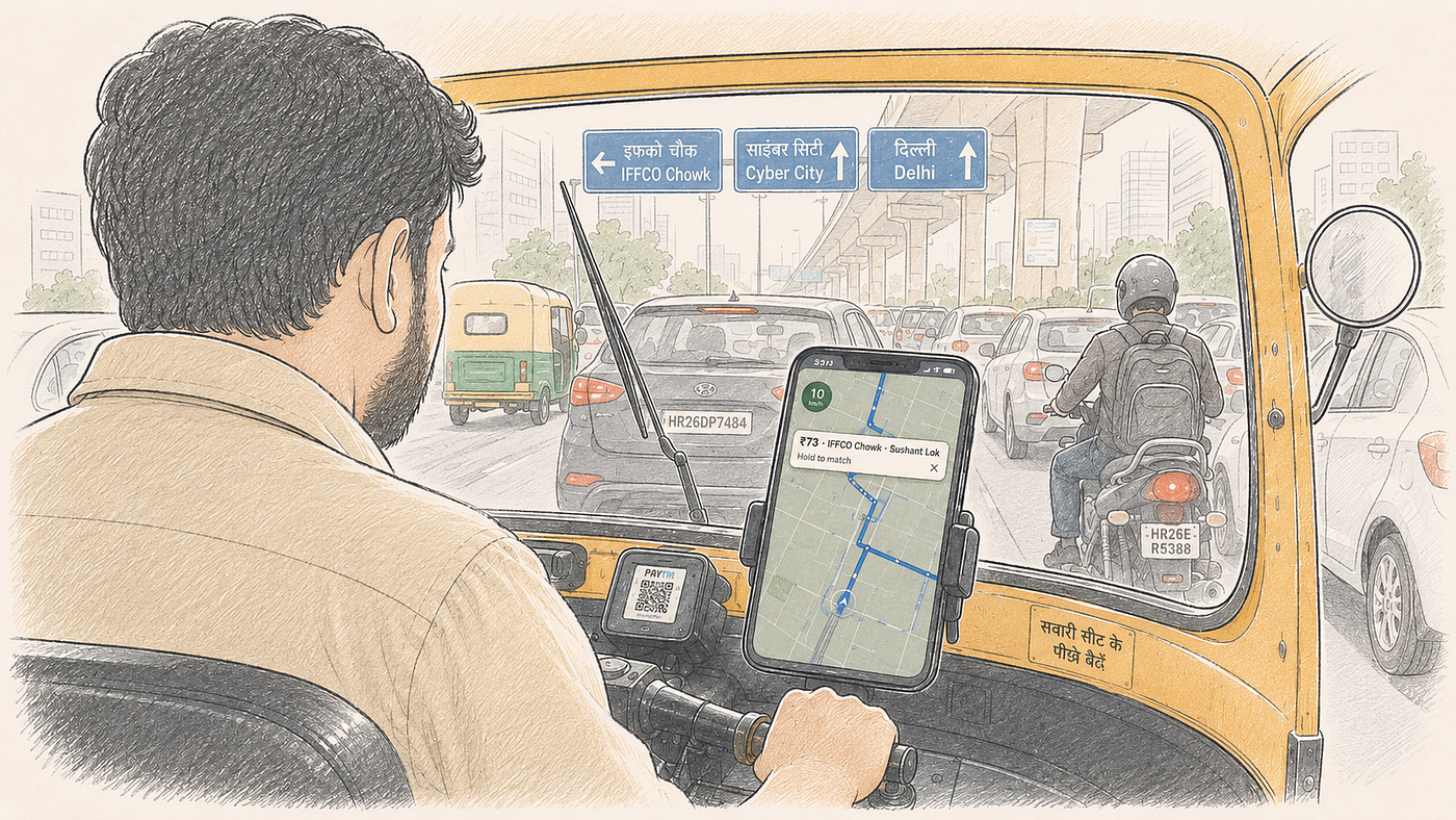
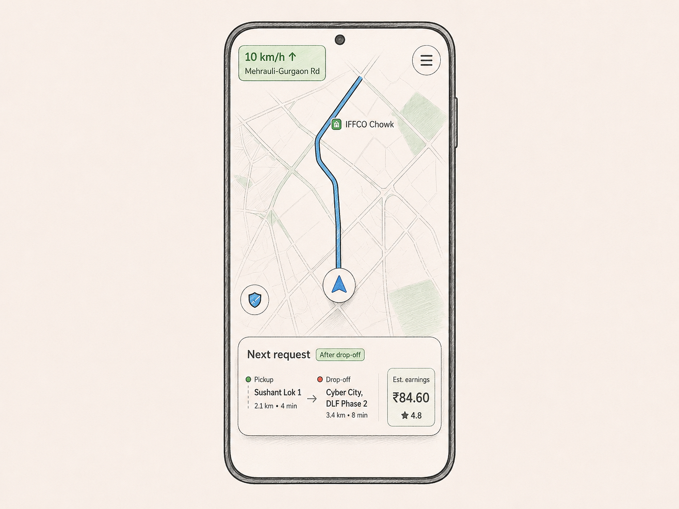
If the driver is on a trip, downgrade the notification to a compact banner or a chip. Something that lives at the top of the screen, does not block the map, and can be dismissed with a small X or a swipe. The information visible could be much shorter. Fare, pickup landmark, a rough drop area. That is enough for a driver to decide whether he wants to queue it up.
Concretely, picture a slim card no taller than the speed indicator itself, sitting near the top of the screen. A fare on the left, a pickup landmark on the right, and a very small dismiss button. Match is available on a long-press or a tap-and-hold, not a single tap. That last detail matters because it removes the accidental-accept risk when a driver bounces over a pothole and his thumb lands on the wrong spot.
Sound should change too. Not the same alert tone as an idle-state ping. A softer, shorter chime, closer to “for your information” than “urgent decision needed.”
For the driver I rode with, this change alone would have turned eight cancellations into eight quick glances, or into nothing at all if the softer sound let him ignore most of them without penalty.
The engineering lift is small. The app already knows the trip state. The bottom sheet component can accept a prop that switches between full and compact modes. The audio asset already exists in the app for other purposes. This is a two-sprint change.
The tradeoff is that in compact mode, the acceptance rate for those notifications will probably drop. Drivers will glance at a small chip and think, “eh, maybe later.” Fewer taps means fewer matches. If the operations team is relying on these mid-trip matches for network efficiency, this will show up in the numbers.
That is a tradeoff worth having. If the current design is causing drivers to cancel every mid-trip notification anyway, the effective acceptance is already low. And it is buying that low acceptance at the cost of driver attention on the road.
Solution Two: Batch The Requests And Show Them At The End
A second angle is to think about when the notification arrives, not just how it looks.
Right now, notifications arrive continuously through the trip. Every time dispatch decides this driver might be a good match, ping. Any request roughly on his route or near his drop-off triggers another one. Multiply this by the number of drivers on the platform and the number of requests per minute in a city like Gurgaon, and you get a stream of pings that never really stops.
What if the app held some of these back?
Imagine the dispatch system quietly earmarking two or three potential next-trips for this driver during the current ride. It does not ping him for any of them. Instead, when the driver is about 2 minutes from dropping off the current passenger, it shows him a screen with those queued options. Fare, distance, pickup landmark. He picks one, or he picks none and stays free.
This changes the interaction from “constant interruption” to “one focused decision at the end.” The driver is not cancelling five things while driving. He is looking at a curated shortlist while stopped at his drop location, or safely idling in the last minute of the trip.
For the driver I rode with, this would have replaced seven or eight mid-trip disruptions with a single screen right as he pulled up at the Sector 18 gate. He could have accepted the best of the three and been on his way. Or declined all three and taken a break.
Building this is harder than the first solution. Dispatch systems are usually tuned for real-time matching. Holding candidates back for a driver introduces a small delay in the marketplace, which the operations team will not love. It also means the driver might miss the “best” match that came in three minutes ago because dispatch was waiting to batch.
There are ways around this. The system could still ping the driver immediately for a very high-value request, one that is worth interrupting for. Everything else gets held. This is essentially treating in-trip notifications the way many people treat their email. Not all messages need to be read the moment they arrive.
The interesting failure cases are around trip completion. What if the driver drops off and immediately gets a new pickup request that arrived while he was queued? Should the batched list still show up? What if he took a slight detour and the estimated drop time is now different? Does the batch timing recalculate?
This is the kind of thing that would fail beautifully in one specific city and work fine in three others, and the team would only find out because a driver in Gurgaon complained three months post-launch.
Solution Three: Let The Driver Set The Filter
The third solution puts more control in the driver’s hands.
The reason my driver was cancelling every notification was not that he did not want more rides. Most of them were not worth his attention. A pickup 4 km away, when he is about to drop off in a busy area? Not worth it. A short trip with a low fare when he is heading towards a zone where longer trips originate? Not worth it either.
The app has no idea what he considers “worth it.” So it pings him for everything.
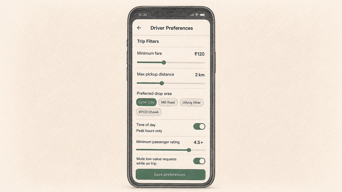
What if there was a settings screen where the driver could set his own filters? Minimum fare, maximum pickup distance from current location, preferred drop area, time-of-day rules, rating threshold for passengers. These are things the driver already runs through mentally on every notification. The app could move that filter into the code and stop pinging him for anything that fails it.
There is a real concern that filters could concentrate rides among high-earning drivers and leave newer drivers with worse allocations. Any filter system needs to be balanced against fair allocation. Food delivery apps like Swiggy and Zomato have offered driver-side preferences in some form for years, including things like zone selection, and the fact that both platforms have kept tuning those features suggests this balance is hard to get right the first time. That does not mean it is not worth trying. It means it needs the operations team and the driver-experience team in the same room.
The design of the filter screen itself matters. Too many options and drivers will not touch it. Too few and it will not solve the actual problem. A designer building this would want to interview real drivers about what mental filters they already use, not build hypothetical ones from a spreadsheet.
The edge cases are dense. What if a driver sets an impossible filter and never gets pinged? Does the app warn him? What if the filter is set through voice input in the wrong language? What if a filter conflicts with a promotional guarantee the marketing team ran that week? Whose logic wins?
Filters are powerful and easy to demo. They are hard to run reliably at scale. But if executed well, they could cut the number of low-value notifications a driver has to cancel while driving.
One Driver, Three Apps
Most auto drivers in Gurgaon are not on one platform. They are on two, sometimes three. Uber, Ola, Rapido, and InDrive all sit on the same phone, each running its own dispatch logic and each running its own notification stream. Whichever one lands a match first gets the trip, and the other two keep pinging because they have no idea their driver is now busy.
I did not spot this on my driver’s screen, because his phone was mounted on the dashboard and I was in the back seat. But when I asked him about it later, he confirmed. He runs Uber and Rapido on the same phone, and switches between them depending on demand and surge. If he takes a Rapido pickup, Uber does not know. If he takes an Uber pickup, Rapido keeps trying to match him with another one.
This changes the shape of the problem. Even if Uber ships every fix from the previous three sections perfectly, the driver is still getting a full-fat notification bottom sheet from Rapido while he is on an Uber trip. And another one from Ola. Uber cannot suppress a notification it did not send.
There is no clean solution at the platform level. A cross-platform standard where apps signal “driver is on trip elsewhere” is theoretically possible but competitively unlikely, because dispatch efficiency is the kind of signal ride-hailing companies do not want to volunteer to a competitor. Governments could mandate something like it in principle. In India, I would not hold my breath.
What is left is the operating system. Android has had Do Not Disturb for years. iOS has Focus modes. Neither is designed for gig work, but both could be extended for it. A “driver mode” on the phone itself, triggered when any ride-hailing app enters an active-trip state, could mute or downgrade non-foreground app notifications until the trip ends. That does not need Uber and Rapido to talk to each other. It only needs each of them to signal trip state to the OS, which is a much easier ask than getting the platforms to cooperate directly.
Whether any of this ships depends on someone deciding it matters enough. Right now, the driver is paying the cost of a coordination problem the platforms have no incentive to fix on their own.
The Combination That Might Actually Work
All three of these fixes rest on the same lever. The app already knows the trip state, it just is not using that knowledge to shape the ping. If I had to sketch a version that could ship in a real quarter, it would combine them.
Start with the compact treatment, so notifications become small, non-blocking, and quiet while the driver is in a trip and the map stays visible with only a short chime instead of a full alert. Layer the queue on top, so dispatch holds a shortlist of potential next-rides in the background and surfaces them in the last minute before drop-off, when the driver can decide from a stopped or nearly stopped position. Add a light version of filters, maybe just minimum fare and maximum pickup radius, and most of the low-value pings never reach the driver at all.
Voice can join later. The app could announce a new ride request through the audio system and take a spoken “accept” or “skip” without a screen tap. Google Maps has done voice interaction for years, though it is worth verifying how reliably an Android phone mounted in a running autorickshaw can pick up the driver over Gurgaon traffic noise. Dedicated hardware, like a handlebar or steering-wheel button for accept and decline, is a bigger swing and unlikely to reach the auto market in India any time soon. I do not know of a ride-hailing app in this country that has shipped either voice or hardware for in-trip requests, and I will leave it at that.
This is not just an Uber problem. Ola, Rapido, InDrive, Bolt, Grab, Careem, every ride-hailing app I have looked at ships some version of this pattern. Loud in-trip notification, big call-to-action, sits on top of the map. The problem is category-wide. Somewhere along the way, dispatch algorithms were tuned for match rate, and driver-facing UX was tuned for conversion on the notification card. Nobody asked what happens when those two priorities collide with a moving vehicle and a passenger in the back seat.
None of this closes the cross-app gap. Uber can build the calmest, best-behaved in-trip notification in the world, and my driver will still get a full-fat Rapido card on top of it. That is the operating system’s problem to solve, not any one platform’s. But shipping the fixes above at least stops each platform from making the situation worse on its own turf, and it gives the OS something to hook into if a “driver mode” ever gets built.
Would this combination ship easily? Probably not. There are metrics on the operations dashboard that will look worse in the short term. Fewer mid-trip acceptances, slightly slower time-to-match on some rides, and a few drivers who never touch the settings screen and miss the odd good ride.
The metrics that get worse sit on the operations dashboard. The metrics that get better sit on the road: fewer cancellations, more of the driver’s attention on the map instead of on a card asking him to Match, and, if the platform is willing to measure it, fewer near-miss incidents on that road.
Closing
The passport office interview took two hours. Standing in the queue for biometrics, I kept thinking about the count. Eight cancellations in the twenty minutes I had been in his auto. Each one a Match button too easy to hit by accident and an X too small to hit on the first try. A driver squinting at a map he could barely see, on a road he could barely watch.
The trip state already lives in the app. The dispatch queue already exists somewhere in the operations backend. Shrinking the sheet, batching the requests, and giving the driver a basic filter would not need new infrastructure, just the acknowledgement that a driver in a moving auto is a different user than a driver at a stand.
메타데이터
- post_id
- 7fe3e5170cbb
- slug
- your-uber-driver-isnt-distracted-the-app-is-distracting-him-7fe3e5170cbb
- url
- https://medium.com/design-bootcamp/your-uber-driver-isnt-distracted-the-app-is-distracting-him-7fe3e5170cbb
- canonical_url
- https://medium.com/design-bootcamp/your-uber-driver-isnt-distracted-the-app-is-distracting-him-7fe3e5170cbb
- author_url
- https://medium.com/@imrsharma0
- status
- ok
- fetched_at
- 2026-07-13 22:03:30