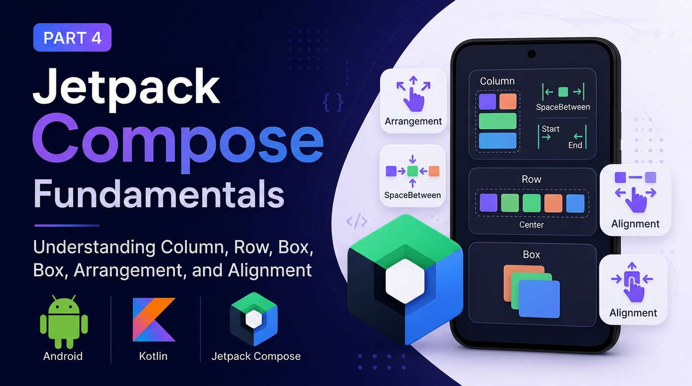
Jetpack Compose Fundamentals — Part 4: Understanding Column, Row, Box, Arrangement, and Alignment
In the previous part of this series, we explored some of the most commonly used Jetpack Compose UI components, including Text, Image…
Jetpack Compose Fundamentals — Part 4: Understanding Column, Row, Box, Arrangement, and Alignment
In the previous part of this series, we explored some of the most commonly used Jetpack Compose UI components, including Text, Image, Button, and TextField. We also discussed an important Compose concept: State and Recomposition.
Now that we understand the basic UI components, the next question is:
How do we arrange multiple composables on the screen?
In the traditional Android View system, you may have worked with layouts such as:
LinearLayoutFrameLayoutRelativeLayoutConstraintLayout
Jetpack Compose provides simple and powerful composables to achieve similar layouts:
ColumnRowBox
In this article, we’ll understand how each of them works and how to use Arrangement and Alignment to control the position of UI elements.
1. Column — Arranging Items Vertically
A Column arranges its children vertically.
In simple terms:
Item A
Item B
Item C
Each composable is placed below the previous one.
Example
Column {
    Text(text = "A")
    Text(text = "B")
}
The result will look like:
A
B
The name itself makes it easy to remember:
Column = Vertical Arrangement
If you want to place multiple UI elements one below another, Column is usually the right choice.
2. Row — Arranging Items Horizontally
A Row arranges its children horizontally.
Item A Item B Item CExample
Row {
    Text(text = "A")
    Text(text = "B")
}
The result will be:
A BSo the simple rule is:
Row = Horizontal Arrangement
This is commonly used for layouts such as:
- Image + Text
- Icon + Text
- Buttons placed side by side
- List item layouts
- Toolbar content
Column vs Row
The easiest way to remember the difference is:

3. Arrangement: Controlling Space Between Children
Simply placing children inside a Column or Row is often not enough.
We also need to control how the available space is distributed.
This is where Arrangement comes into play.
Consider this layout:
Column {
    Text(text = "A")
    Text(text = "B")
}
There may be extra space available inside the Column.
How should that space be distributed?
Compose provides several options.
Arrangement.SpaceBetween
SpaceBetween places the first item at the start and the last item at the end.
The remaining space is distributed between the children.
A

B
Example:
Column(
    verticalArrangement = Arrangement.SpaceBetween
) {
    Text(text = "A")
    Text(text = "B")
}
This is useful when you want maximum space between elements while keeping the first and last elements at opposite ends.
Arrangement.SpaceEvenly
SpaceEvenly distributes the available space equally:
- Before the first item
- Between the items
- After the last item
Conceptually:
A

B
The spacing is equal everywhere.
Example:
Column(
    verticalArrangement = Arrangement.SpaceEvenly
) {
    Text(text = "A")
    Text(text = "B")
}
This is useful when you want a balanced layout with equal spacing.
4. Alignment: Controlling the Cross-Axis
Arrangement and Alignment solve two different problems.
This distinction is extremely important.
For a Column:
- Main axis → Vertical
- Cross axis → Horizontal
For a Row:
- Main axis → Horizontal
- Cross axis → Vertical
Let’s understand this with examples.
Column: Vertical Arrangement and Horizontal Alignment
Column(
    verticalArrangement = Arrangement.Center,
    horizontalAlignment = Alignment.CenterHorizontally
) {
    Text(text = "A")
    Text(text = "B")
}
verticalArrangement
Controls how children are arranged vertically.
Top
 ↓
 A
 B
 ↓
Bottom
horizontalAlignment
Controls how children are aligned horizontally.
Possible values include:
Alignment.Start
Alignment.CenterHorizontally
Alignment.End
For example:
Column(
    horizontalAlignment = Alignment.CenterHorizontally
) {
    Text(text = "A")
    Text(text = "B")
}
Both items will be horizontally centered.
Row: Horizontal Arrangement and Vertical Alignment
For a Row, the concepts are reversed.
Row(
    horizontalArrangement = Arrangement.SpaceEvenly,
    verticalAlignment = Alignment.CenterVertically
) {
    Text(text = "A")
    Text(text = "B")
}
horizontalArrangement
Controls how the children are distributed horizontally.
verticalAlignment
Controls how the children are aligned vertically.
Possible values include:
Alignment.Top
Alignment.CenterVertically
Alignment.Bottom
Arrangement vs Alignment
A simple way to remember the difference:
Arrangement controls how the available space is distributed among the children.
Alignment controls where the children are positioned on the cross-axis.
For example:

This mental model makes it much easier to understand Compose layouts.
5. Box — Layering UI Elements
The third important layout composable is Box.
A Box is similar to a FrameLayout from the traditional Android View system.
Instead of arranging elements next to each other, a Box allows children to overlap.
┌─────────────┐
│             │
│    Image    │
│      ❤️     │
│             │
└─────────────┘
Example
Box {
    Image(
        painter = painterResource(R.drawable.image),
        contentDescription = null
    )
    Icon(
        imageVector = Icons.Default.Favorite,
        contentDescription = null
    )
}
The second composable is drawn on top of the first one.
This makes Box useful for:
- Image overlays
- Badges
- Favorite icons
- Loading indicators
- Text over images
- Floating UI elements
Aligning Content Inside a Box
Just like a traditional frame layout, a Box allows you to position its content.
Box(
    contentAlignment = Alignment.Center
) {
    Text(text = "Hello")
}
The content will be placed in the center of the Box.
Other options include:
Alignment.TopStart
Alignment.TopCenter
Alignment.TopEnd
Alignment.CenterStart
Alignment.Center
Alignment.CenterEnd
Alignment.BottomStart
Alignment.BottomCenter
Alignment.BottomEnd
Example:
Box(
    contentAlignment = Alignment.BottomEnd
) {
    Image(
        painter = painterResource(R.drawable.image),
        contentDescription = null
    )
   Text(text = "Favorite")
}
The text will be positioned at the bottom-right corner.
6. Combining Column, Row, and Box
The real power of Compose comes from combining these layouts.
For example, imagine a list item like this:
┌─────────────────────────────┐
│  🖼️     Software Engineer    │
│             Android Developer│
└─────────────────────────────┘
The structure can be represented as:
Row
├── Image
└── Column
    ├── Text
    └── Text
In Compose:
@Composable
fun ListViewItem() {
    Row {
        Image(
            painter = painterResource(R.drawable.profile),
            contentDescription = "Profile Image"
        )
        Column {
            Text(
                text = "Software Engineer",
                fontWeight = FontWeight.Bold
            )
           Text(
                text = "Android Developer"
            )
        }
    }
}
This structure is simple and readable:
Rowplaces the image and text section side by side.Imagedisplays the visual content.Columnplaces the two text elements vertically.
This is one of the most common patterns in real-world Android applications.
7. Reusable Composables with Parameters
One of the biggest advantages of Compose is that UI components are simply Kotlin functions.
Instead of creating one hardcoded list item, we can make it reusable.
@Composable
fun ListViewItem(
    imageId: Int,
    title: String,
    subtitle: String
) {
    Row {
        Image(
            painter = painterResource(imageId),
            contentDescription = null
        )
        Column {
            Text(
                text = title,
                fontWeight = FontWeight.Bold
            )
            Text(
                text = subtitle
            )
        }
    }
}
Now the same composable can be reused multiple times:
ListViewItem(
    imageId = R.drawable.android,
    title = "Android Developer",
    subtitle = "Kotlin Developer"
)

ListViewItem(
    imageId = R.drawable.flutter,
    title = "Flutter Developer",
    subtitle = "Dart Developer"
)
The layout remains the same, but the data changes.
This is a very important principle:
Create reusable UI components instead of duplicating UI code.
8. Creating Multiple Items
We can call the same composable multiple times to create a static list.
Column {
    ListViewItem(
        imageId = R.drawable.android,
        title = "Android Developer",
        subtitle = "Kotlin"
    )
    ListViewItem(
        imageId = R.drawable.flutter,
        title = "Flutter Developer",
        subtitle = "Dart"
    )
}
This works perfectly for a small number of items.
However, if you have a large list, placing every item inside a regular Column is not the best approach.
Why?
Because all items are composed at once.
For large lists, Compose provides lazy layouts such as:
LazyColumnLazyRow
These layouts compose only the items that are currently needed on screen.
We will explore them in a future article.
The Key Mental Model
When building a UI in Jetpack Compose, think about the structure of your screen as a tree.
For example:
Column
├── Text
├── Row
│   ├── Image
│   └── Column
│       ├── Text
│       └── Text
└── Button
This tree-based approach makes UI composition intuitive.
You can build complex screens by combining small composables.
Summary
In this article, we explored the three fundamental layout composables in Jetpack Compose.
Column
Use it to arrange items vertically.
Row
Use it to arrange items horizontally.
Box
Use it to layer items on top of each other.
We also learned about:
ArrangementAlignmentSpaceBetweenSpaceEvenlyCenterStartEnd- Reusable composables
- Passing parameters to composables
- Combining layouts to create complex UI
The most important concept to remember is:
Column arranges vertically, Row arranges horizontally, and Box layers content.
Once you understand these three composables, you can create a large variety of Android UI layouts using only Kotlin and Compose.
In the next part of this series, we’ll take a deeper look at Modifiers in Jetpack Compose and understand how they control size, padding, spacing, alignment, appearance, and behavior.
🚀 Jetpack Compose Mastery Series
This article is part of my Jetpack Compose Mastery Series, where I explain Jetpack Compose concepts from beginner to advanced with practical examples and clean code.
👉 Follow the complete series here: Jetpack Compose Mastery Series
💬 If this article helped you, consider following me on Medium so you don’t miss upcoming parts. Every article is designed to make Jetpack Compose easier to understand through real-world examples and visual explanations.
🚀 Happy Composing!
메타데이터
- post_id
- 8318b53b0b7f
- slug
- jetpack-compose-fundamentals-part-4-understanding-column-row-box-arrangement-and-alignment-8318b53b0b7f
- url
- https://medium.com/@vaibhavi.rana99/jetpack-compose-fundamentals-part-4-understanding-column-row-box-arrangement-and-alignment-8318b53b0b7f
- canonical_url
- https://medium.com/@vaibhavi.rana99/jetpack-compose-fundamentals-part-4-understanding-column-row-box-arrangement-and-alignment-8318b53b0b7f
- author_url
- https://medium.com/@vaibhavi.rana99
- status
- ok
- fetched_at
- 2026-08-21 04:22:37