Is Rhode’s Website Just Pretty, or Is It Actually Smart UX?
What makes a skincare website feel effortless instead of overwhelming?
Is Rhode’s Website Just Pretty, or Is It Actually Smart UX?
What makes a skincare website feel effortless instead of overwhelming?
As someone who has definitely impulse bought skincare at 1 am, I can tell you this. If a site feels confusing, cluttered, or slow, I leave. Immediately.
So when I went through Rhode’s website, I was not just looking at it as a consumer. I was looking at it through the UX lens we’ve been learning in class. And I think Rhode is a really strong example of a website that is not just aesthetically beautiful, but strategically built to convert.
The Aesthetic Is Minimal, But It’s Not Empty
The first thing you see when you land on rhodeskin.com is movement. A full screen video of Hailey. Soft lighting. Cinematic but calm. It immediately communicates the brand story in three words: clean, intentional, modern.
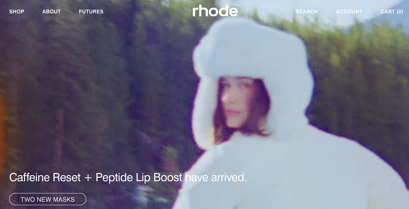
The navigation is simple. Shop. About. Futures. Search. Account. Cart. No clutter, no dropdown chaos. No twenty tabs fighting for attention.
According to Elementor, high quality, engaging, SEO optimized content is the foundation of a successful website because it communicates value and attracts the right audience. Rhode does this well. The homepage is not text heavy, but the messaging is intentional. “To restore, protect, and nurture the skin you have now for lasting results.” That is a clear value proposition. It tells you exactly what they stand for without overwhelming you.
It Is Designed for the User, Not the Celebrity
Even though Hailey Bieber founded the brand, the website does not revolve around her. After the hero video, the layout shifts immediately to clean product tiles, clear pricing, and simple descriptions. It is easy to scan and frictionless to shop.
More importantly, the “rhode + you” section features real customers pulled from social media. The brand may have started with Hailey’s routine, but the UX makes the customer the center of the story.

Marie Claire highlights how Rhode’s growth has been fueled by viral social engagement from trends like strawberry shortcake makeup and glazed donut skin. What the website does well is convert that social buzz into usability. It feels inclusive, not aspirational in a distant way. That shift builds trust, and trust drives conversion.
It Is Built to Convert
A website can look beautiful and still fail if it does not clearly guide users toward action. Rhode avoids that completely.
The CTAs are simple and consistent. Phrases like “Add them to your routine” and “Get the edit” make the next step obvious without feeling aggressive. The structure flows logically from brand storytelling into product exploration, then into social proof and values. Nothing feels random, and every section supports the next.
The site also loads quickly, even with video, which is critical given that most users expect a page to load in under two seconds. Speed supports both UX and SEO, and Rhode clearly prioritizes that.
What strengthens the experience even more is the limited product assortment. Fewer products reduce decision fatigue and align with the brand’s positioning around intentional skincare. The overall flow moves you naturally from inspiration to routine to purchase.
That clarity is what makes the UX effective.
The Counterargument: Is It Too Minimal?
If I had to critique something, it would be the minimalism. For some users, the site might feel almost too empty. There are not long ingredient lists, and anyone looking for deep clinical data has to click further.
But, Rhode is not positioning itself as a hyper clinical, dermatologist first brand. It is positioning itself as routine driven skincare. The tone and structure reflect that audience.
In my opinion, clarity feels more strategic than excess information.
So Is It Just Pretty?
Rhode’s website works because it balances aesthetics with intention. It tells a brand story, feels easy to navigate, loads quickly, and guides users toward conversion without ever feeling pushy.
In a market saturated with celebrity skincare brands, Rhode feels less like a vanity project and more like a scalable business. And as someone who has absolutely judged a brand by its homepage before, I can say this confidently.
This one is not just pretty. It is strategically built.
메타데이터
- post_id
- 8446eebce6b5
- slug
- is-rhodes-website-just-pretty-or-is-it-actually-smart-ux-8446eebce6b5
- url
- https://medium.com/marketing-in-the-age-of-digital/is-rhodes-website-just-pretty-or-is-it-actually-smart-ux-8446eebce6b5
- canonical_url
- https://medium.com/marketing-in-the-age-of-digital/is-rhodes-website-just-pretty-or-is-it-actually-smart-ux-8446eebce6b5
- author_url
- https://medium.com/@irj2017
- status
- ok
- fetched_at
- 2026-06-14 11:28:49