How I Designed Dispatch Panda: Simplifying Fleet Management Through UX
Designing the First Impression | Hero Section
How I Designed Dispatch Panda: Simplifying Fleet Management Through UX
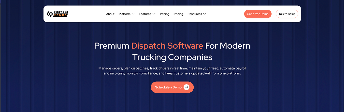
Hero Section (Part A)

Hero Section (Part B)
Designing the First Impression | Hero Section
The hero section was designed to answer the most important question as quickly as possible. What does this platform do?
Instead of presenting every feature upfront, the focus is on a single value proposition. Helping trucking companies manage their entire operation from one platform. This keeps the message simple, reduces cognitive load, and allows visitors to understand the product within seconds.
A live dashboard preview is placed alongside the headline to make the product feel real from the very first interaction. Rather than asking users to imagine the software, they can immediately see how the platform works. This builds confidence and helps potential customers decide whether the solution is relevant to their business.
The background takes inspiration from the texture of a truck trailer body. This subtle detail strengthens the connection to the trucking industry without distracting from the content. Instead of using a generic pattern or gradient, the texture gives the hero a distinct identity while maintaining a clean and professional appearance.
The primary call to action sits next to the main message so users know exactly where to go after understanding the product. Every element in the hero is arranged to guide attention naturally from the headline to the interface and finally to the action button.
Building Trust Before Selling | Trusted by 100+ Trucking Companies

Once users understand what the platform offers, the next step is building confidence.
This section appears early in the page because visitors naturally look for proof before investing time in exploring a new product. Showing that the platform is already trusted by over 100 trucking companies reassures users that it is built for businesses like theirs.
The layout is intentionally simple. A clean trust statement supported by company logos communicates credibility at a glance without pulling attention away from the rest of the page. It acts as a quiet confirmation that the product is established and already delivering value.
Placing this section directly after the hero creates a smoother transition into the rest of the experience. Users move from understanding the product to believing in it before they begin exploring its features.
One Platform to Solve Every Trucking Problem

This section shifts the focus from introducing the product to showing how it fits into everyday trucking operations.
Instead of presenting every feature at once, the platform is broken into five core workflows. Each card highlights a specific task with a large product preview, while supporting micro UI elements provide quick context without overwhelming the user.
Reliable Dispatch

This card extends the workflow beyond dispatch by introducing invoicing.
Using the same visual language as the rest of the dashboard keeps the experience consistent. Invoice cards, payment summaries, and status indicators reinforce the workflow without adding visual clutter.
Delight Customer

Delight Customer Image
Customer communication is presented as a natural part of the platform.
Live tracking, delivery updates, and notification components are shown through lightweight micro UI, helping users understand the experience without relying on lengthy explanations.
Track & Trace Shipment

The interface focuses on clarity rather than map complexity.
Location pins, ETA cards, and shipment alerts surface the most important information first, making shipment tracking quick to scan and easy to act on.
Driver Payment Plans

The final card highlights payroll management with a clean financial dashboard.
Earnings cards, settlement summaries, and payment status badges organize complex information into a layout that is simple to review.
Making Pricing Feel Simple

Pricing Section Image
Pricing is designed to help users decide quickly, not compare endlessly.
Plans are organized by business size, making it easy to find the right fit. The recommended plan is visually highlighted, while the monthly and annual toggle gives users flexibility without adding complexity.
Bringing Every Tool Together

After introducing the core workflows, this section brings the entire platform together.
Instead of another feature list, related capabilities are grouped into clear categories. Simple cards, recognizable icons, and concise labels make the platform feel complete while remaining easy to scan.
Reinforcing Trust Through Real Experiences

By this stage, users understand the product. Now they need confidence that it works.
The testimonial cards combine customer quotes with profile details and ratings to make each story feel authentic. Different experiences highlight different outcomes, helping users relate to businesses with similar challenges without relying on lengthy case studies.
Why Dispatch Panda

Before the final call to action, this section reinforces why businesses should choose the platform.
Instead of introducing new features, it highlights the qualities that matter most when adopting software. Each point is presented as a concise card with supporting icons, making the content easy to scan while giving the section a balanced and structured layout.
A Clear Next Step

The final section is designed to remove friction and encourage action.
The messaging brings the core value proposition back into focus, while the bold headline and supporting visuals create a strong closing impression. Two clear call-to-action buttons give users the freedom to either book a demo or continue exploring, allowing them to move forward at their own pace without feeling pressured.
THANK YOU READING Please provide your feedbacks
메타데이터
- post_id
- 84bec02c9755
- slug
- how-i-designed-dispatch-panda-simplifying-fleet-management-through-ux-84bec02c9755
- url
- https://medium.com/@rishabhkishore10/how-i-designed-dispatch-panda-simplifying-fleet-management-through-ux-84bec02c9755
- canonical_url
- https://medium.com/@rishabhkishore10/how-i-designed-dispatch-panda-simplifying-fleet-management-through-ux-84bec02c9755
- author_url
- https://medium.com/@rishabhkishore10
- status
- ok
- fetched_at
- 2026-08-23 21:32:58