UI Laws Explained: The Visual Rules That Make Interfaces Feel Effortless
A product can have solid UX logic and still feel confusing.
UI Laws Explained: The Visual Rules That Make Interfaces Feel Effortless
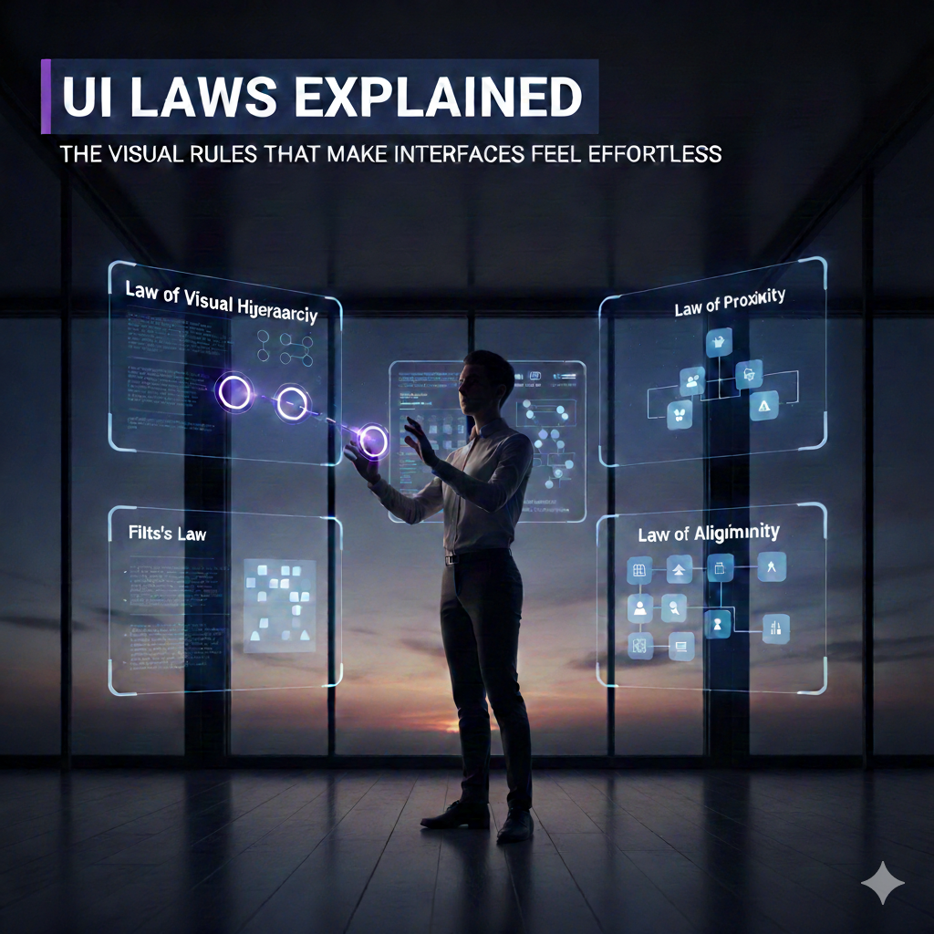
A product can have solid UX logic and still feel confusing.
Why? Because UX decides what happens, but UI decides how clearly users see it.
UI laws are the visual principles that control attention, clarity, and perception. When they’re applied well, interfaces feel calm and intuitive. When they’re ignored, even good features feel broken.
Let’s break them down — simply and practically.
What Are UI Laws?
UI laws are visual perception principles rooted in:
- Gestalt psychology
- Human visual scanning behaviour
- Accessibility standards
They guide how users see, group, prioritize, and understand interface elements.
1. Law of Visual Hierarchy — Attention Follows Importance
The idea: Users notice what stands out first.
How it works:
- Size
- Color
- Contrast
- Position
- Whitespace
Example: A bold “Submit” button draws attention before secondary actions.
Apply it by:
- Making primary actions visually dominant
- Toning down secondary elements
2. Law of Proximity — Spacing Communicates Meaning
The idea: Elements placed close together feel related.
Example:
- Labels near inputs feel connected
- Wide spacing causes confusion
Apply it by:
- Grouping related items
- Separating unrelated content
3. Law of Similarity — Consistency Builds Understanding
The idea: Similar-looking elements are perceived as having the same function.
Example: All primary buttons share the same color and shape.
Apply it by:
- Keeping styles consistent
- Using visual differences intentionally
4. Law of Alignment — Order Creates Trust
The idea: Aligned elements feel stable and professional.
Example: Misaligned cards make the UI feel broken — even if it works.
Apply it by:
- Using grids
- Maintaining consistent margins and baselines
5. Law of Contrast — If It’s Not Visible, It Doesn’t Exist
The idea: Low contrast kills usability.
Example: Light grey text on white background = unreadable.
Apply it by:
- Ensuring readable text contrast
- Highlighting key actions
- Following accessibility guidelines (Web Content Accessibility Guidelines) in sort WCAG
6. Law of Whitespace — Space Improves Understanding
The idea: Whitespace isn’t empty — it’s functional.
Example: Crowded dashboards feel overwhelming. Spaced layouts feel clear.
Apply it by:
- Giving content room to breathe
- Avoiding edge-to-edge clutter
7. Law of Feedback — Every Action Needs a Response
The idea: Users must know the system heard them.
Examples:
- Loading indicators
- Hover states
- Success or error messages
Apply it by:
- Providing instant visual feedback
- Avoiding “dead clicks”
8. Law of Readability — Content Must Be Effortless to Scan
The idea: Users don’t read — they scan.
Example: Dense paragraphs vs. short, scannable text blocks.
Apply it by:
- Using clear typography
- Keeping line lengths readable
- Using headings and spacing
UI isn’t decoration — it’s communication. When UI laws are respected:
- Interfaces feel calm
- Users feel confident
- Errors drop dramatically
Great UI doesn’t demand attention — it guides it.
If you enjoyed this, check out my earlier post on **UX Laws** to see how behaviour and visuals work together to create truly intuitive products.
메타데이터
- post_id
- 84db694f6cdc
- slug
- ui-laws-explained-the-visual-rules-that-make-interfaces-feel-effortless-84db694f6cdc
- url
- https://medium.com/@soougata99/ui-laws-explained-the-visual-rules-that-make-interfaces-feel-effortless-84db694f6cdc
- canonical_url
- https://medium.com/@soougata99/ui-laws-explained-the-visual-rules-that-make-interfaces-feel-effortless-84db694f6cdc
- author_url
- https://medium.com/@soougata99
- status
- ok
- fetched_at
- 2026-06-15 20:49:13