I Tested Five Different Onboarding Flows on the Same Group of Users
Completion rate looked like success. It wasn’t measuring what mattered.
I Tested Five Different Onboarding Flows on the Same Group of Users
Completion rate looked like success. It wasn’t measuring what mattered.
The flow with the lowest completion rate was the one people came back to a week later.
I didn’t expect that. I had built five separate onboarding experiences, run them past the same fourteen users, and walked in assuming the winner would be obvious within the first two sessions. It wasn’t. The version everyone finished was also the version almost nobody remembered anything from. The version people abandoned halfway through was the one three participants mentioned unprompted, a week later, when I called to schedule a follow-up interview.
That contradiction is the reason this article exists.
Most onboarding advice treats the problem like a funnel optimization exercise. Reduce friction. Cut steps. Get the activation number up. I’ve written that advice myself, in decks, in Slack messages to junior designers, in the confident tone you use when you haven’t been proven wrong yet. Then I ran this test, and the tidy story fell apart.
This isn’t a case study built to sell you a framework. It’s a record of what happened when I stopped guessing and started watching the same people react to five genuinely different philosophies about how humans learn a new product.
The Setup Nobody Warns You About
Before I describe the flows, I need to explain the method, because the method is where most onboarding tests quietly fail.
The usual approach is a between-subjects A/B test. Group A gets version one, Group B gets version two, and you compare metrics across two populations that are, in theory, similar. That’s fine for measuring one variable across a large sample. It’s a poor way to understand why people behave a certain way, because you never get to ask the same person what they were thinking when they hit a wall.
I wanted the second thing more than the first.
So I ran a within-subject study. Fourteen participants, all recent sign-ups for a B2B analytics tool who had never triggered the “aha” event we cared about, meaning they’d created an account and done essentially nothing with it. Each person went through all five onboarding flows, on five separate seeded accounts, spread across three moderated sessions over ten days.
Spreading it out mattered. Cramming five onboarding experiences into one sitting would have produced nothing but fatigue and irritability, and irritability is not a signal, it’s noise. Ten days gave people time to forget details and approach each flow with something closer to a fresh mind.
The order in which each person saw the five flows was rotated using a Latin square design, so no single flow always went first or always went last. This matters more than people realize. The first onboarding experience a person has with a category of product quietly trains their expectations for every version that follows. If the wizard-style flow always went first, everyone would judge the later flows against “the one that asked me a bunch of questions,” and that comparison bias would contaminate every result after it.
What surprised me most about the setup itself was how much the order effect showed up in the interview transcripts, even with rotation. People who happened to see the sink-or-swim version early built their own private theory of the product, and every later flow got measured against whether it matched or contradicted that theory. Onboarding doesn’t just teach a product. It teaches a person how to think about learning that product, and that lesson sticks around for the rest of the relationship.
I also paired the qualitative sessions with a small quantitative check. The two flows that performed best in the interviews got rolled out to a limited beta of new sign-ups, about sixty accounts each, so I could see whether the pattern held outside a moderated room where people know they’re being watched. It mostly did. I’ll get to that.
One honest caveat before I go further. Fourteen people is not a statistically significant sample in the traditional sense, and I’m not presenting this as generalizable research. It’s a structured, repeated observation of real behavior, the kind of evidence a design team can act on with more confidence than a hunch, but with less certainty than a controlled trial. Treat every number that follows as directional, not definitive.
Five Flows, Five Different Bets on How People Learn
Each onboarding flow represented a different assumption about what a new user actually needs. Naming the assumption mattered more than naming the flow.
Flow one: Sink or swim. No tour, no checklist, no modal. The user lands in an empty dashboard with a single visible call to action and has to figure the rest out themselves. The bet here is that motivated users will explore, and that exploration builds a stronger mental model than being told what to click.
Flow two: The guided tour. A sequential series of tooltips highlighting features in order, with a “Next” button carrying the user from step to step. The bet is that showing everything up front prevents confusion later.
Flow three: The checklist. A persistent sidebar listing five setup tasks, each with a checkbox, disappearing once complete. The bet is that visible, incremental progress creates its own motivation.
Flow four: The setup wizard. A multi-step form completed before the user ever sees the actual product. Connect your data source, name your workspace, invite a teammate, pick a template. Only after finishing does the real dashboard appear. The bet is that a small upfront investment produces a better-configured, more relevant first experience.
Flow five: Contextual, just-in-time hints. No forced sequence at all. Empty states contain embedded prompts specific to that section, tooltips appear only when a user’s behavior suggests they’re stuck, and nothing interrupts the person who already knows what they’re doing. The bet is that people learn best exactly at the moment they need the information, not before.
I want to be direct about something. None of these five approaches is inherently wrong. Slack has shipped versions closer to flow five for years. Notion leans heavily on flow four, front-loading setup because its product is genuinely useless until it’s configured. Duolingo runs something closer to flow two combined with flow three, because gamified progress is core to its retention strategy, not an accessory to it. There is no universal best onboarding pattern. There is only the pattern that matches what your product needs a person to believe within the first few minutes.
That’s the sentence I’d ask you to sit with for a second, because the rest of this article is really just evidence for it.
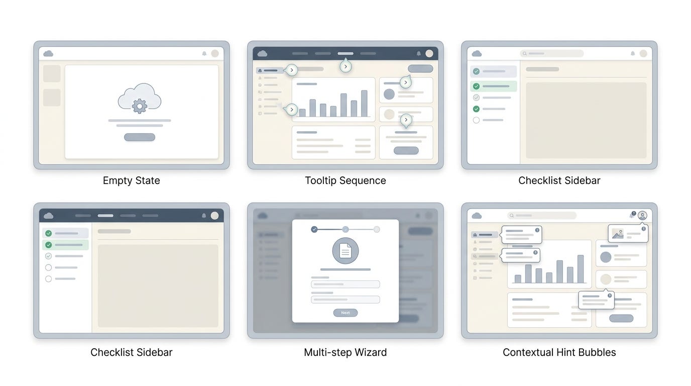
Figure 1. Five different assumptions about how people learn, tested against the same fourteen users.
What Actually Happened When Real Users Touched Them
The sink-or-swim flow split people almost exactly in half, and the split wasn’t random.
Users who had prior experience with a similar analytics tool did fine. A few even said they preferred it, one participant told me flatly that tours make her “feel like the product thinks I’m stupid.” But users without that background context got stuck within the first ninety seconds, and the sessions with them were uncomfortable to watch. Long silences. Clicking the same menu item three times. One person eventually asked, out loud, “am I supposed to know what to do here?” That’s not a UX problem you fix with copy. That’s a flow mismatched to the audience it’s actually going to face.
The guided tour produced the highest completion rate of any flow I tested, close to ninety percent of participants clicked through to the final tooltip. It also produced the least retained information. When I asked people, five minutes after finishing the tour, to tell me what the third tooltip had said, most couldn’t. Several admitted they’d been clicking “Next” without reading, waiting for the interruption to end so they could start actually using the product. One participant said something that stuck with me: “I wasn’t learning, I was just waiting for permission to start.”
That’s the moment I stopped trusting completion rate as a proxy for learning.
The checklist performed well early and then created a strange kind of anxiety near the end. Four of five tasks checked off, the fifth sitting there unfinished, and multiple people described feeling a low-grade compulsion to close it out even when the fifth task, inviting a teammate, wasn’t something they actually wanted to do yet. That’s the Zeigarnik effect doing exactly what it’s supposed to do, an open loop the brain doesn’t like leaving unresolved, and it’s a legitimate motivational tool. But it comes with a side effect nobody warns you about. Two participants completed the final checklist item just to make the list disappear, not because they understood or needed the feature. Motivation without comprehension is a hollow win.
The setup wizard had the highest drop-off of any flow, three of fourteen participants abandoned it partway through during the moderated session, saying some version of “I don’t know why I need to answer this yet.” That’s a real cost. Asking for commitment before demonstrating value is a legitimate reason people leave. But the participants who finished the wizard were noticeably more confident once they reached the dashboard. They’d made choices, they understood why the workspace looked the way it did, and none of them asked the disoriented “what am I looking at” questions that showed up constantly in the sink-or-swim sessions.
The contextual, just-in-time flow was the slowest to produce a visible “aha” moment. It took most participants longer to discover the feature we considered core to activation, because nothing forced them toward it directly. But it was also the flow people described most positively in their own words, “it didn’t feel like it was managing me” was a phrase I heard twice, in nearly identical wording, from two different participants who never spoke to each other. And it was the flow that, a week later, the most people mentioned unprompted when I called for follow-up. They remembered discovering something, rather than being shown it.
That’s the finding I opened this article with. Lowest completion, highest recall.
I noticed something else worth naming directly. The metric that felt most obviously important going into this test, completion rate, turned out to be the least predictive of what actually mattered a week later. Not because completion doesn’t matter at all. It matters if your business model depends on someone finishing a specific action before they can be billed, invoiced, or provisioned. But if what you actually care about is whether someone understands your product well enough to come back on their own, completion and comprehension are not the same thing, and treating them as interchangeable is the mistake I see most often in onboarding reviews.
An onboarding flow is not a tutorial sitting in front of your product. It is the first real experience of the product, and people judge the whole relationship by how that first experience treated them.
The Pattern That Made Me Rethink Completion Rate
Here’s the uncomfortable part. I’ve shipped onboarding flows optimized purely for completion rate before, and I defended those decisions in reviews with confidence I probably didn’t earn.
The mistake was treating onboarding as a problem of reducing steps, full stop. Fewer steps, less friction, higher completion, ship it. That mental model works when the goal really is a single transactional action, get someone to verify an email, confirm a payment method, accept terms. It fails badly when the goal is comprehension, because comprehension sometimes requires friction on purpose.
BJ Fogg’s behavior model frames this cleanly enough that I now use it as a filter before choosing an onboarding pattern. Behavior happens when motivation, ability, and a trigger converge at the same moment. Most onboarding critique focuses entirely on ability, meaning make it easier, remove clicks, simplify the form. But ability isn’t the only lever, and sometimes it isn’t even the right one to pull.
The checklist flow worked on motivation. The wizard worked by accepting lower ability temporarily in exchange for a stronger trigger later, because once someone has invested effort configuring something, they’re primed to return and see it through. The contextual flow worked by aligning the trigger with the exact moment ability and motivation were already both present, rather than trying to manufacture that moment artificially with a tooltip.
None of that shows up if you’re only measuring how many people clicked through to the end.
Most people assume a higher completion number means the design succeeded. What I’ve learned is that completion tells you whether people finished, not whether they understood, not whether they’ll return, and not whether they trust the product more than they did before they started. Those three things are the ones that predict whether someone becomes a paying, retained customer. Completion is the easiest number to measure and the least connected to the outcome you actually care about, which is exactly why so many teams over-index on it. It’s available in the dashboard by Tuesday. Retention and comprehension take weeks to show up, and by then the team has moved on to the next sprint.
There’s a comparison here worth making to Samuel Hulick’s long-running work at UserOnboard, where he’s broken down teardown after teardown of real product onboarding and arrived at a similar conclusion from a different direction. The products that retain well tend to treat onboarding as an extension of the value proposition itself, not a separate wrapper bolted onto the front of the product. The tour, the checklist, the wizard, these are all wrappers. The contextual flow, in my test, felt less like a wrapper and more like the product simply behaving well from the first click, which might be the actual reason it produced better recall. It wasn’t teaching people about the product. It was letting them experience it, with help arriving exactly when needed and disappearing when it wasn’t.
I keep coming back to a question that reframed the entire project for me: what if the goal was never to onboard people faster, but to make the first real use of the product indistinguishable from the onboarding itself?
That single question changes what you optimize for. It stops being “how do we get someone through five steps” and becomes “what’s the smallest real task this person can complete that proves the product works.” Those are very different design briefs, and most teams are quietly answering the first question while believing they’re answering the second.

Figure 2. The flow people finished most often was not the flow people remembered a week later.
A Framework for Choosing Your Own Onboarding Flow
None of this means the contextual flow is the answer for every product. That would be swapping one universal rule for another, which is the exact mistake this whole test talked me out of.
What I use now, instead of a favorite pattern, is a short set of questions I ask before default-defending any onboarding decision. It’s not elegant enough to put on a slide, but it’s held up across three projects since this test.
How reversible is the user’s first action? If a wrong first move is expensive or hard to undo, front-loaded structure like a wizard earns its friction, because the cost of confusion later is higher than the cost of a slower start. If the first actions are cheap to explore and easy to undo, structure becomes a tax rather than a safety net.
Does the product’s value show up in the first sixty seconds, or does it require setup first? Notion’s core value is invisible until a workspace has some structure in it, which is why its onboarding leans toward guided setup. A tool like a color picker or a quick converter needs almost no onboarding at all, because the value is the interface itself.
What does the user already believe about how this category of product works? Someone migrating from a competitor arrives with a mental model already loaded. Forcing them through a full tour disrespects that experience and reads as condescending, which is precisely what one of my participants said out loud. Someone new to the category benefits from more scaffolding, because they have no prior model to lean on.
What’s the actual cost of a slow first impression versus a bad one? A flow that takes two extra minutes but leaves someone confident is often a better trade than a flow that takes twenty seconds and leaves someone lost. Speed is not free. It’s a trade against comprehension, and the trade only makes sense when comprehension wasn’t the goal to begin with.
Are you measuring the metric that matches the goal, or the metric that’s easiest to pull from the dashboard? This is the question I skip least often now, because it’s the one that caught me out in this test. If the business goal is activation this week, completion rate is a fair proxy. If the business goal is retained, engaged accounts three months from now, completion rate is close to irrelevant, and continuing to optimize for it will actively push the design in the wrong direction.
I don’t think there’s a chart or a matrix that replaces actually asking these questions about your specific product, your specific users, and what they already believe walking in. Every framework I’ve seen that promises a universal onboarding answer has been wrong the moment I applied it somewhere the assumptions didn’t hold. What holds up, in my experience, is the discipline of asking the same handful of questions honestly before defaulting to whatever pattern is easiest to build this sprint.
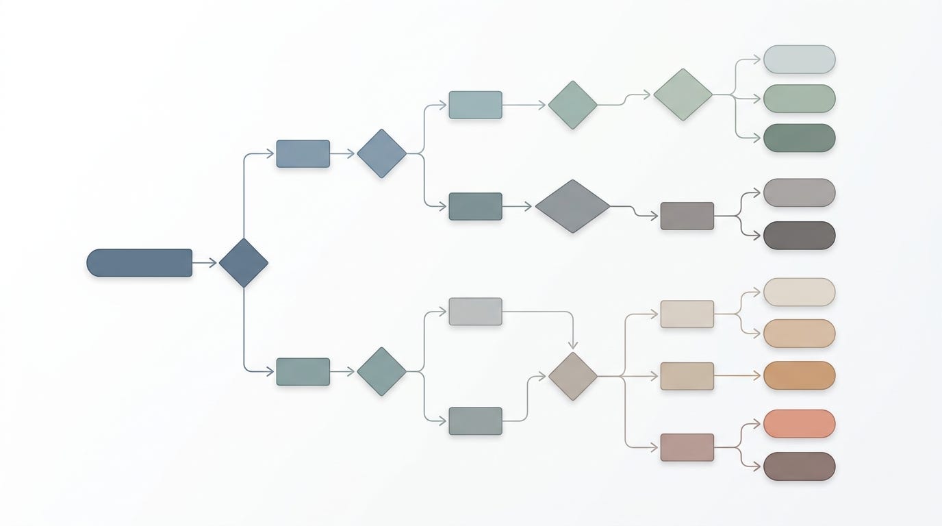
Figure 3. There is no universal best onboarding flow, only the flow that matches what your product needs a person to believe first.
What I’d Tell My Past Self
I opened this piece with a contradiction that bothered me enough to write about it. The flow people finished least was the flow they remembered most.
Looking back, I think the discomfort wasn’t really about onboarding at all. It was about how easily a clean number convinces a team it’s done its job. Ninety percent completion feels like success. It photographs well in a slide deck. Nobody in that meeting is going to ask what people actually understood, because the number in front of them already answered the question they meant to ask, just not the one that mattered.
I still build tours sometimes. I still use checklists when the goal genuinely is nudging someone through a handful of setup tasks fast. None of these five patterns is retired in my mind. What changed is the order of operations. I no longer pick the pattern first and hope the metrics agree with me later. I ask what the person needs to believe within their first few minutes, and I let that answer choose the pattern, even when the pattern that follows is slower, messier, or harder to defend in a review with a completion chart on the screen.
The test didn’t hand me a winner. It handed me a better question, which turned out to be worth more.
If you’ve run something like this yourself, on your own product, with your own users, I’d genuinely like to know whether completion rate told you the truth or told you a comfortable story. Which one was it for you?
메타데이터
- post_id
- 84dc39f4dfed
- slug
- i-tested-five-different-onboarding-flows-on-the-same-group-of-users-84dc39f4dfed
- url
- https://medium.com/design-bootcamp/i-tested-five-different-onboarding-flows-on-the-same-group-of-users-84dc39f4dfed
- canonical_url
- https://medium.com/design-bootcamp/i-tested-five-different-onboarding-flows-on-the-same-group-of-users-84dc39f4dfed
- author_url
- https://medium.com/@iAkio
- status
- ok
- fetched_at
- 2026-07-16 05:23:09