What Really Makes Cars Pollute? A Data Science Deep Dive into CO₂ Emissions
How I built a 98.8% accurate prediction model — and discovered that the “cleanest” fuel is hiding a dirty secret
What Really Makes Cars Pollute? A Data Science Deep Dive into CO₂ Emissions
How I built a 98.8% accurate prediction model — and discovered that the “cleanest” fuel is hiding a dirty secret
When the Global Automotive Council wants to reduce vehicle emissions, where do they start? Do they target fuel types? Engine sizes? Vehicle classes? The answer, it turns out, is not as straightforward as you’d think — and the data tells a story that completely contradicts common intuition.
I recently worked through a CO₂ emissions dataset covering over 7,000 vehicles, with the goal of building a predictive model and uncovering the real drivers of automotive pollution. What I found along the way surprised me — and it should surprise you too.
The Dataset
The dataset contains detailed records of vehicle specifications including engine size, number of cylinders, transmission type, fuel type, fuel consumption across city and highway conditions, vehicle class, and the target variable: CO₂ emissions in grams per kilometre.
Before writing a single line of model code, I spent time understanding what each feature actually represents. This matters more than most beginners realise. A dataset is not just rows and columns — it’s a story about the real world, and you need to read it before you can analyze it.
Step 1 — Cleaning the Data
The first discovery was significant: out of 7,385 rows, 1,103 were exact duplicates — nearly 15% of the entire dataset. After dropping them, we were left with 6,282 unique vehicle records. Always check for duplicates. Always.
Missing values? Zero. Clean on that front.
The target variable, CO₂ emissions, ranged from 96 g/km to 522 g/km with a mean of around 250 g/km. The distribution was slightly right-skewed — most vehicles cluster in the 200–300 g/km range, with a long tail of high-performance emitters.
import pandas as pd
import numpy as np
import matplotlib.pyplot as plt
import seaborn as sns

df = pd.read_csv('CO2_Emissions.csv')
print(df.shape) #(7385, 12)

print(df.duplicated().sum())

df = df.drop_duplicates()
print(df.shape) #(6282, 12)
fig, axes = plt.subplots(1, 2, figsize=(12, 4))
df['CO2 Emissions(g/km)'].hist(bins=40, ax=axes[0])
axes[0].set_title('Distribution of CO2 Emissions')
axes[0].set_xlabel('CO2 Emissions (g/km)')
df['CO2 Emissions(g/km)'].plot(kind='box', ax=axes[1])
axes[1].set_title('Boxplot of CO2 Emissions')
plt.tight_layout()
plt.show()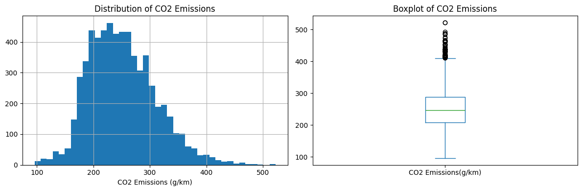
Step 2 — The Multicollinearity Trap
This is where most analysts make a critical mistake, and the dataset is practically designed to catch you.
Look at the feature list: Fuel Consumption City (L/100km), Fuel Consumption Highway (L/100km), Fuel Consumption Combined (L/100km), and Fuel Consumption Combined (mpg). That’s four columns measuring the same underlying thing — how much fuel a car burns — just in different contexts and units.
I used Variance Inflation Factor (VIF) to quantify this:
from statsmodels.stats.outliers_influence import variance_inflation_factor

X_num = df.select_dtypes(include='number').drop('CO2 Emissions(g/km)', axis=1)

vif_data = pd.DataFrame()
vif_data['Feature'] = X_num.columns
vif_data['VIF'] = [variance_inflation_factor(X_num.values, i)
                   for i in range(len(X_num.columns))]
print(vif_data.sort_values('VIF', ascending=False))
Fuel Consumption Comb (L/100km): VIF = 75,440 ← catastrophic
Fuel Consumption City (L/100km): VIF = 30,259
Fuel Consumption Hwy (L/100km): VIF = 10,501A VIF above 10 is a problem. These values are in the tens of thousands. If you feed all of these into a linear regression model, the coefficients become wildly unstable — the model can’t decide how to split credit between nearly identical features.
The fix: keep only Fuel Consumption Combined (L/100km) and drop the rest. After this, residual multicollinearity remained between Engine Size, Cylinders, and Fuel Consumption (VIF 26–59), but these features measure physically distinct vehicle properties. This was addressed by choosing Ridge Regression, which handles residual multicollinearity through its L2 penalty term — stabilizing coefficients without discarding meaningful information.
# Drop the redundant fuel consumption columns
cols_to_drop = ['Fuel Consumption City (L/100 km)',
                'Fuel Consumption Hwy (L/100 km)',
                'Fuel Consumption Comb (mpg)']
df = df.drop(cols_to_drop, axis=1)

# Verify residual VIF after dropping
X_num = df.select_dtypes(include='number').drop('CO2 Emissions(g/km)', axis=1)
vif_data = pd.DataFrame()
vif_data['Feature'] = X_num.columns
vif_data['VIF'] = [variance_inflation_factor(X_num.values, i)
                   for i in range(len(X_num.columns))]
print(vif_data.sort_values('VIF', ascending=False))
# Cylinders: 59.4, Engine Size: 39.4, Fuel Consumption Comb: 26.5
# Residual multicollinearity handled by Ridge Regression
Step 3 — The Outliers Worth Keeping
Using the IQR method, I identified 59 vehicles in the top 1% of CO₂ emissions — producing between 416 and 522 g/km. These are the monsters of the automotive world: 6.0L+ engines, 8 to 16 cylinders, consuming nearly 20L/100km.
The temptation is to remove outliers. Resist it.
These aren’t data errors. They are Bugatti-tier vehicles, V12 luxury sedans, and heavy performance trucks. Removing them would make the model blind to exactly the category that policy makers most need to regulate. Their pattern — big engine, high consumption, extreme emissions — is perfectly consistent (standard deviation of only 25 g/km within the group). That’s signal, not noise.
Decision: keep them all, justified.
numerical_cols = df.select_dtypes(include='number').columns

for col in numerical_cols:
    Q1 = df[col].quantile(0.25)
    Q3 = df[col].quantile(0.75)
    IQR = Q3 - Q1
    lower = Q1 - 1.5 * IQR
    upper = Q3 + 1.5 * IQR
    outliers = df[(df[col] < lower) | (df[col] > upper)]
    print(f"{col}: {len(outliers)} outliers")

# Output:
# Engine Size(L): 121 outliers
# Cylinders: 177 outliers
# CO2 Emissions(g/km): 74 outliers

# Top 1% emitters — these are the vehicles to regulate
outliers_top1pct = df[df['CO2 Emissions(g/km)'] > df['CO2 Emissions(g/km)'].quantile(0.99)]
print(f"\nTop 1% emitters: {len(outliers_top1pct)} vehicles")
print(outliers_top1pct[['Engine Size(L)', 'Cylinders', 'Fuel Consumption Comb (L/100 km)', 'CO2 Emissions(g/km)']].describe())
Step 4 — The Finding That Changes Everything
Here is where the analysis gets genuinely interesting.
When I looked at average CO₂ emissions by fuel type, this is what the raw data showed:
Fuel Type X (Regular gasoline):   236 g/km
Fuel Type D (Diesel):             235 g/km
Fuel Type Z (Premium gasoline):   266 g/km
Fuel Type E (Ethanol E85):        276 g/km  ← highest!
# Raw average CO2 emissions by fuel type
print(df.groupby('Fuel Type')['CO2 Emissions(g/km)'].mean().round(2))
# Output:
# Fuel Type
# D 235.24 ← Diesel
# E 276.05 ← Ethanol E85 (appears highest — but misleading!)
# N 213.00 ← Natural Gas (only 1 vehicle)
# X 235.98 ← Regular gasoline
# Z 265.73 ← Premium gasoline
# EDA: Correlation Heatmap
plt.figure(figsize=(10, 8))
corr = df.select_dtypes(include='number').corr()
sns.heatmap(corr, annot=True, fmt='.2f', cmap='coolwarm')
plt.title('Correlation Heatmap')
plt.show()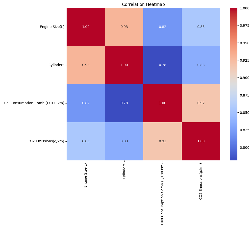
Correlation Heatmap: Fuel Consumption (0.92) is the strongest predictor of CO₂, followed by Engine Size (0.85) and Cylinders (0.83)
Ethanol, widely promoted as a cleaner alternative fuel, appears to be the worst emitter in the dataset. That would be a damning finding — if it were true.
But then I built the Ridge regression model and examined the coefficients:
Fuel Type E coefficient: -139 g/km# Feature importance from Ridge model coefficients
coef_df = pd.DataFrame({
'Feature': X_train.columns,
'Ridge_Coef': ridge.coef_
})
coef_df['Abs_Coef'] = coef_df['Ridge_Coef'].abs()
print(coef_df.sort_values('Abs_Coef', ascending=False).head(10))
# Top coefficients output:
# Fuel Type_E -139.10 ← ethanol is chemically cleanest
# Fuel Type_Z -27.35 ← premium gas
# Fuel Type_X -27.33 ← regular gas
# Fuel Consumption +22.10 ← strongest numerical predictorNegative. By a massive margin. The model is saying that Fuel Type E vehicles emit 139 g/km less than the baseline — the complete opposite of the raw average.
How can both be true?
This is Simpson’s Paradox — one of the most important and underappreciated phenomena in data analysis. The key is what happens when you look at the vehicles using E85 ethanol more carefully:
Fuel Type E vehicles:
  Average engine size:      4.14L  (vs 2.84L for regular gas)
  Average cylinders:        6.56   (vs 5.04 for regular gas)
  Average fuel consumption: 16.93 L/100km  (vs 10.13 for regular gas)
# Compare engine characteristics across fuel types (Simpson's Paradox revealed)
print(df.groupby('Fuel Type')[['Engine Size(L)', 'Cylinders',
'Fuel Consumption Comb (L/100 km)',
'CO2 Emissions(g/km)']].mean().round(2))
# Output shows why raw averages mislead:
# Fuel Type Engine Size Cylinders Fuel Consumption CO2 Emissions
# D 2.53 4.93 8.75 235.24
# E 4.14 6.56 16.93 276.05 ← large engines!
# X 2.84 5.04 10.13 235.98
# Z 3.44 6.18 11.41 265.73
# Boxplot: CO2 by Fuel Type
plt.figure(figsize=(10, 5))
sns.boxplot(data=df, x='Fuel Type', y='CO2 Emissions(g/km)')
plt.title('CO2 Emissions by Fuel Type')
plt.show()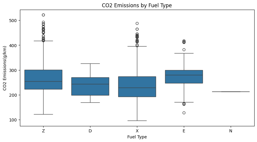
CO2 Emissions by Fuel Type: Raw averages suggest Ethanol E85 (E) is the worst emitter at 276 g/km — but this is Simpson’s Paradox. E85 vehicles have much larger engines (4.14L vs 2.84L for regular gas)
E85 vehicles come with much larger, thirstier engines. The fuel itself is chemically cleaner — but the cars it’s put into are gas guzzlers. The raw average hides this because it conflates the effect of the fuel with the effect of the engine.
The model, after controlling for engine size and fuel consumption, correctly isolates the fuel’s contribution and reveals the truth: ethanol is the cleanest fuel in the dataset — it’s just being wasted in the wrong cars.
The policy implication is direct: pairing ethanol fuel mandates with engine size caps (≤ 2.5L) could unlock significant real-world emission reductions. Right now, the market isn’t doing this.
Step 5 — Building the Model
I used a Scikit-learn Pipeline combining StandardScaler and Ridge Regression. The pipeline architecture is important — it ensures the test data is never seen during the scaling step, preventing data leakage and making the workflow fully reproducible.
Categorical features (Vehicle Class, Transmission, Fuel Type) were one-hot encoded. Make and Model were dropped — they have hundreds of unique values and would create a bloated, noisy feature space without adding meaningful signal.
The model was trained on 80% of the data (5,025 samples) with 48 features after encoding.
from sklearn.pipeline import Pipeline
from sklearn.preprocessing import StandardScaler
from sklearn.linear_model import Ridge
from sklearn.model_selection import train_test_split

# Prepare features
df_model = df.drop(['Make', 'Model'], axis=1)
df_model = pd.get_dummies(df_model, columns=['Vehicle Class', 'Transmission', 'Fuel Type'], drop_first=True)

X = df_model.drop('CO2 Emissions(g/km)', axis=1)
y = df_model['CO2 Emissions(g/km)']

X_train, X_test, y_train, y_test = train_test_split(X, y, test_size=0.2, random_state=42)

# Build pipeline: scaler + Ridge (prevents data leakage)
pipeline = Pipeline([
    ('scaler', StandardScaler()),
    ('model', Ridge(alpha=1.0))
])

pipeline.fit(X_train, y_train)

print(f"Training samples : {X_train.shape[0]}")
print(f"Features used    : {X_train.shape[1]}")
# Output:
# Training samples : 5025
# Features used    : 48
Step 6 — The Results
MAE:   3.35 g/km
RMSE:  6.54 g/km
R²:    0.9881
CV R²: 0.9898 ± 0.0061  (5-fold cross-validation)
from sklearn.metrics import mean_absolute_error, mean_squared_error, r2_score
from sklearn.model_selection import cross_val_score
import numpy as np
# Model evaluation on test set
y_pred = pipeline.predict(X_test)
mae = mean_absolute_error(y_test, y_pred)
rmse = np.sqrt(mean_squared_error(y_test, y_pred))
r2 = r2_score(y_test, y_pred)
print(f"MAE: {mae:.2f} g/km")
print(f"RMSE: {rmse:.2f} g/km")
print(f"R²: {r2:.4f}")
# 5-fold cross-validation
cv_scores = cross_val_score(pipeline, X, y, cv=5, scoring='r2')
print(f"\nCV R² Scores: {cv_scores.round(4)}")
print(f"Mean CV R²: {cv_scores.mean():.4f} ± {cv_scores.std():.4f}")
# CV R² Scores: [0.981 0.9842 0.992 0.9955 0.9961]
# Mean CV R²: 0.9898 ± 0.0061An MAE of 3.35 g/km on a target variable that ranges from 96 to 522 g/km represents roughly 1.3% average error. The cross-validation R² of 0.9898 across all 5 folds — with a standard deviation of just 0.006 — confirms this is not overfitting. The model genuinely generalises.
Why is the model this accurate? Because CO₂ emissions are governed by combustion chemistry. There is a near-deterministic relationship between fuel burned and carbon dioxide produced. When you give a linear model clean, non-redundant features built on this physical reality, it learns the relationship almost perfectly.
fig, axes = plt.subplots(1, 2, figsize=(14, 5))

# Plot 1: Predicted vs Actual (perfect model lies on diagonal)
axes[0].scatter(y_test, y_pred, alpha=0.3, color='steelblue')
axes[0].plot([y_test.min(), y_test.max()],
             [y_test.min(), y_test.max()],
             'r--', linewidth=2, label='Perfect Prediction')
axes[0].set_xlabel('Actual CO2 Emissions (g/km)')
axes[0].set_ylabel('Predicted CO2 Emissions (g/km)')
axes[0].set_title('Predicted vs Actual')
axes[0].legend()

# Plot 2: Residual Plot (random scatter = good model)
residuals = y_test - y_pred
axes[1].scatter(y_pred, residuals, alpha=0.3, color='coral')
axes[1].axhline(0, color='red', linestyle='--', linewidth=2)
axes[1].set_xlabel('Predicted CO2 Emissions (g/km)')
axes[1].set_ylabel('Residuals (Actual - Predicted)')
axes[1].set_title('Residual Plot')

plt.tight_layout()
plt.show()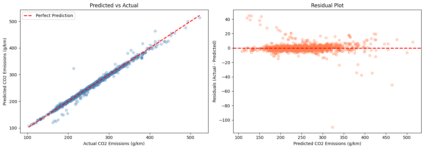
Left: Predicted vs Actual — points closely follow the perfect prediction line (R²=0.9881). Right: Residual Plot — random scatter around zero confirms no systematic bias in the model
Step 7 — Where the Model Fails (And Why It Matters)
No honest analysis stops at the headline metrics. I computed residuals and sorted by absolute error to find the 5 worst predictions:
Chevrolet Impala Dual Fuel (Fuel N):  error = -110 g/km
Chevrolet Express 3500 (Fuel E):      error = -51 g/km
Ford Focus FFV (Fuel E):              error = +45 g/km
Ford Focus FFV (Fuel E):              error = +45 g/km
Mercedes CLA 250 FFV (Fuel E):        error = +44 g/km
# Residual analysis — find worst predictions
results = pd.DataFrame({
'Actual': y_test.values,
'Predicted': y_pred,
'Residual': y_test.values - y_pred
}, index=y_test.index)
results['Abs_Error'] = results['Residual'].abs()
# Top 5 worst predictions
worst = results.sort_values('Abs_Error', ascending=False).head(5)
print(worst)
print()
print(df.loc[worst.index, ['Make', 'Model', 'Vehicle Class', 'Engine Size(L)', 'Fuel Type', 'CO2 Emissions(g/km)']])
# Pattern: 4 of 5 involve alternative fuel types (E or N)
# → Model struggles with underrepresented categoriesFour of the five worst predictions involve alternative fuel vehicles. The pattern is revealing:
The single worst prediction involves the Chevrolet Impala Dual Fuel — the only natural gas (CNG) vehicle in the entire dataset. With one training example, the model has no way to learn CNG emission behaviour. It looks at the 3.6L engine and predicts ~323 g/km based on similar petrol cars. The actual emissions are 213 g/km. This is not a model flaw — it’s a data collection gap.
The remaining four involve Fuel Type E vehicles — some with large engines (model overpredicts) and some with small engines (model underpredicts). The model has learned a strong association between E85 and large engines, so when it encounters small-engine E85 vehicles, it gets confused in both directions.
The takeaway: the model is excellent for conventional fuel vehicles, which make up 94.7% of the dataset. It struggles at the edges of rare, underrepresented categories.
The Business Recommendations
Based on the model’s findings, here are five data-driven policy levers:
Mandate fuel efficiency standards. With a coefficient of +22 g/km per L/100km, fuel consumption is the strongest numerical predictor. Every 1 L/100km reduction in combined consumption saves approximately 22 g/km in emissions across the fleet.
Pair ethanol incentives with engine size caps. Ethanol is chemically the cleanest fuel (coefficient -139 g/km) but is deployed in large-engine vehicles that negate the benefit. Cap eligible E85 vehicle engines at 2.5L to realise the actual chemical advantage.
Reshape fleet composition through tax policy. Vehicle class has meaningful impact on emissions. Tax incentives for compact and mid-size vehicles, combined with levies on large SUVs and trucks, would shift the fleet distribution toward lower-emission categories.
Require richer alternative fuel data. The model’s failures are concentrated in Fuel Types E and N — 331 vehicles out of 6,282. Mandating detailed emissions reporting for all alternative fuel variants would enable more reliable predictions and better policy calibration.
Introduce a super-emitter tax. The top 1% of vehicles — 59 cars with 6.0L+ engines — emit 416 to 522 g/km, nearly double the fleet average. A targeted levy on vehicles exceeding 400 g/km CO₂ would create direct financial incentives to remove the worst emitters from the market.
What I Learned
The most valuable lesson from this project was not technical — it was about the gap between raw averages and controlled analysis. Ethanol looked like the dirtiest fuel in the data. A naive analysis would have concluded exactly that, possibly even recommending against ethanol subsidies. The multivariate model revealed the opposite truth.
Data science done poorly can produce conclusions that are not just wrong but actionable in harmful directions. The tools — VIF for multicollinearity, Ridge for stability, residual analysis for honest error assessment — exist precisely to prevent this.
If you’re working on a similar project, the workflow is straightforward: understand your data before modeling it, handle multicollinearity explicitly, choose your model for the right reasons, evaluate with multiple metrics, and always look at where you fail — not just where you succeed.
The dataset, the notebook, and all the code are available for anyone who wants to replicate or extend this analysis.
메타데이터
- post_id
- 87cfd61d1ac1
- slug
- what-really-makes-cars-pollute-a-data-science-deep-dive-into-co₂-emissions-87cfd61d1ac1
- url
- https://pub.towardsai.net/what-really-makes-cars-pollute-a-data-science-deep-dive-into-co%E2%82%82-emissions-87cfd61d1ac1
- canonical_url
- https://pub.towardsai.net/what-really-makes-cars-pollute-a-data-science-deep-dive-into-co%E2%82%82-emissions-87cfd61d1ac1
- author_url
- https://medium.com/@saibhargavr
- status
- ok
- fetched_at
- 2026-06-26 06:47:43