In Sync: Bringing Consistency, Accessibility, and Scalability to Twitch
An unofficial deep dive into components, documentation, and a whole lot of purple.
In Sync: Bringing Consistency, Accessibility, and Scalability to Twitch
An unofficial deep dive into components, documentation, and a whole lot of purple.
Twitch is the world’s leading live streaming platform, home to millions of broadcasters and viewers who gather daily around gaming, music, art, and culture.
As platforms grow, so do the opportunities for inconsistencies to be introduced into their design. The quality of the design and the speed at which you can iterate are pivotal for large-scale innovation. This is the scenario where design systems thrive.
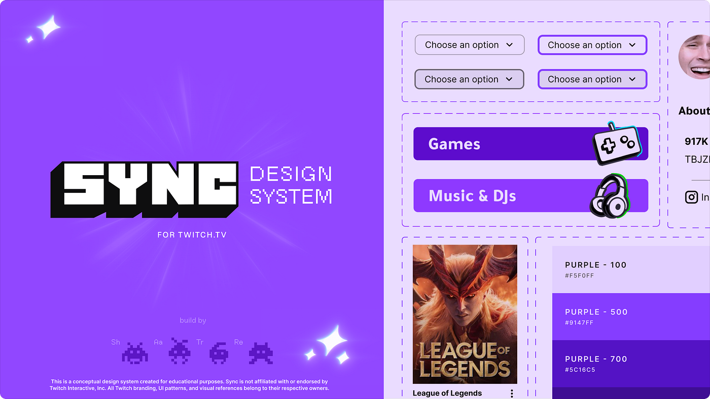
Design Systems weed out inconsistencies and establish standards that prepare designers and engineers to create new designs and pages. That is where Sync comes in, an unofficial design system that tackles consistency, accessibility, and scalability.
Project Overview:
- My Role: UX Designer
- Tools: Figma, Zeroheight, Google Workspace
- Timeline: 10 weeks
- Team: Shateny Maclang, Tracy Khiew, Aayushi Bharadwaj, Rex Fukuchi

4-step project process detailing preparation, design, and deliverables
Our First Steps: A Twitch Audit & UI Inventory
Finding inconsistencies and planning our plan of action:
The team audited Twitch’s user interface elements. We inventoried key visual elements, components, and interactions on the landing page, the livestream page, and the browsing category page.

Twitch UI Audit
We found a few undefined elements within Twitch’s UI.
- Typographical Inconsistencies—Certain font styles were applied inconsistently or in single-use scenarios.
- Unclear Interaction States—Hover and focus states were underdefined, creating ambiguity for users navigating the platform
This audit gave the team a clear mission with specific elements to fix and components to standardize.
The Solution: A unified and vetted Design System

Sync is a design system for Twitch that standardizes components, typography, spacing, and colors into a single scalable source. The absence of a centralized system means design decisions are being made in isolation, leading to visual disparity across pages. Sync establishes guidelines to ensure consistency, accessibility, and scalability. Thus, taking the weight off designers and engineers by setting and documenting standards within a design system.
Design Principles: Our design system was guided by consistency, accessibility, scalability, and community.
As the team was getting ready to start working on our design system, we sat together and collated design principles that aligned with Twitch’s principles and our goals. We aligned on four principles that would guide every decision throughout the project:
- Consistency—Our design system creates a shared visual language that keeps every addition consistent, and every component intentional.
- Accessibility—By documenting and standardizing accessible behavior at the component level, our design system ensures that no user gets left behind.
- Scalability — Sync was designed with the future in mind; every component is built to be flexible and reusable.
- Community—This design system was built for the people who use and build Twitch, connecting the experience between designers, developers, and users.
Building the Foundation: Twitch purple and the standardization of colors, typography, icons, and spacing

Our initial phase was to build out the core visual language for the entire user interface and its components.
Color
For the color, the team created tokens, taking low-level information like the color’s hex code and building it to have an alias token that specifies the type of color, what it is used for, and what interactive state it corresponds to.
As we began building our components, we realized that our initial selection of colors needed some more variety to make sure we considered all of our users’ needs. Therefore, we also established new standards for interactive states, like hover, to incorporate clearer differences between default button colors. As well as including some lower opacity colors for overlay chips used in our cards.

Typography
After our audit flagged typographic inconsistencies, we established Tajawal and Inter as Sync’s definitive type pairing.
Tajawal replaced Twitch’s proprietary display typeface, Roobert, to allow the team to have a publicly accessible display font. Tajawal serves as the display and heading font; Inter handles all body copy, UI labels, and metadata.
The UI Kit documents the type scale for both typefaces, including information on the size, use cases, and line height.

Icons
A standardized icon set was defined to complement the component library, ensuring that iconography felt cohesive across surfaces and that every icon had a consistent size, stroke weight, and usage rule.

Spacing
A spacing scale was introduced to Sync to bring alignment and consistency across all surfaces. Spacing tokens were documented so that the same values are used whether a designer is building a new page or a developer is implementing a component in code.

The team working on the first iteration of the design system’s color and spacing tokens
By establishing these foundational rules, the team remained on the same page when designing components. We were all pulling from the same primitives, so if we ever needed to update any rules, our components would automatically sync to the changes.
Developing SYNC from the ground up: Atomic Design
Starting small: Atoms, Molecules, Organisms
The team first delved into designing by adopting an atomic design approach, identifying Twitch’s smallest elements and building up to more complex components.
For the atoms, we categorized them under badges, chips, toggles, buttons, etc.

Next, we built up some of our molecules, including cards, navigation elements, menus, etc.

Finally, for organisms, we built up some of the most common component clusters found on the website. The streamer side menu, the home page stream carousel, the livestream card grid, etc.

Using atomic design as our base helped us stay consistent from the beginning and build everything in unison with our standardized elements. We avoided errors and inconsistencies by establishing a common baseline. It allowed the team to work independently while maintaining the same level of cohesion and brand identity.
Developing Components: Livestream cards, Category Cards, and Beyond
Now, the really fun part: learning Auto Layout and designing components.
I personally designed all of the badges and chips, as well as the cards for Sync. For the most part, these two sections were intrinsically tied to one another, and working on them allowed me more control to test and fix any issues I encountered while designing.
I had not had much practice with Figma’s Auto Layout feature before this project. Learning its tips and tricks was interesting, and it made adjusting or creating new components from previously built ones a breeze.
Badges and Chips
The badge and chip system covers the live badge, notification badge, viewer count, verified badge, the red dot live indicator, livestream tags, and clip information chips. These components were used in the construction of the cards and required specific rules on how and where to use them, as well as how to adapt them to fulfill accessibility needs. These rules were established in Sync’s documentation site on zeroheight.

Cards
Cards are the backbone of discovery on Twitch; they allow users to preview livestreams or search for categories they might be interested in. They were a priority when designing components for Sync, so I made sure that the category and livestream preview card were as customizable and easy to include as possible.
Each card comes with predetermined dimensions, overlay behavior, badge placement, and responsive considerations. While also using Figma’s properties feature to include boolean toggles and customizable text elements when inserting an instance.

Special attention was paid to overlaid elements such as the Live badge and viewer count, where contrast against variable thumbnail backgrounds needed to be verified carefully. Accessibility was built into our color primitives to allow for a more inclusive and seamless design flow.
Buttons
Buttons were structured into a clear hierarchy: primary (default and inverse), secondary, and tertiary, each with defined default, hover, focus, and disabled states. A key accessibility improvement was the introduction of a clearly visible focus state, addressing a gap in Twitch’s existing UI. The hover state was also refined to a darker grey to create a more distinct separation from the default state.

While designing our components, our team took notes as to where our foundation had gaps. Initially, we had not defined our radius tokens, so we standardized that element. Additionally, as we considered more accessibility standards, the team added some more color tokens to ensure we were meeting WCAG guidelines.
These changes truly made me realize that design systems are living documents; they are meant to establish guidelines while allowing space for improvements and change.
Does it even work? Testing SYNC and reorganizing the UI kit
Before starting the documentation, the team shared the UI kit with fellow designers for feedback. This round of testing was less about Twitch’s end user and more about us: could another designer pick up this kit and use it without confusion?
The feedback surfaced two key areas for improvement:
- Labeling—some component names were ambiguous and didn’t clearly communicate the component’s purpose or variant
- Categorization—certain components were grouped in ways that didn’t match how designers naturally searched for them
Based on this, the team refined naming conventions (using kebab case) and reorganized the library structure. The designer’s feedback served as a great starting point for our documentation and guidelines.

Having the opportunity to receive feedback on our system was invaluable. It also helped us think of the design system as a real product that we would continually iterate on. It got us thinking about how we would introduce Sync to Twitch. How could we make the system itself accessible and get stakeholders to buy into our work?
Documenting the Do’s and Don’ts of SYNC
Next step: making sure anyone can use Sync, not just the people who built it.
The team built Sync’s documentation in Zeroheight, covering every component with usage guidance, dos and don’ts, visual examples, and accessibility requirements. My main individual contributions to the documentation included:
- Typography — font families, size and weight scales, accessibility guidance for contrast and spacing.
- Badges & Chips — usage rules, interactive behavior, and accessibility notes for every badge and chip type.
- Cards — anatomy, overlay contrast requirements, keyboard navigation, screen reader behavior, and motion considerations.
- Accessibility pages — dedicated accessibility sections for typography and cards, covering WCAG requirements, touch targets, and assistive technology considerations.

Rather than writing rules for their own sake, the goal was to explain the reasoning behind each decision, so that designers encountering Sync for the first time could understand not just what to do, but why.
Documentation is when the design system really starts to feel alive; it unifies the UI Kit into a cohesive ecosystem. We needed to keep in mind who the audience we were writing for was, while allowing for space to expand on more niche information. For Sync, we wrote for designers, engineers, and managers, but we also included resources for others who might need more context on the work.
Ready, set, LIVE: Pitching our Design System
The team presented SYNC to the class as a full design system pitch — walking through the problem we identified, the principles we established, and the components we built.

The pitch covered:
- The inconsistencies we found in Twitch’s existing UI and why they mattered
- How Sync’s principles guided every decision
- Specific component and foundation highlights: tokens, typography, cards, and our accessibility improvements
- Who Sync is for and why you should use it.
For this initial pitch, the team focused on what problems Sync resolves and why it is an essential tool for the company. However, in future presentations, we would definitely showcase a live demo of the UI Kit, as well as explore more about our roadmap and our design system adoption plans.
Looking Towards the Future…
Thinking of our next steps, we developed a three-phase roadmap for Sync’s future: Solidify, Expand, and Deepen. We would stress-test the current components, expand the library to cover Twitch’s chat system and additional pages, and deepen the accessibility and responsive guidelines as the system grows.

Takeaways
Here are some of the main things I took away from this project:
- Start with the problem, not the solution — the audit was the most important thing we did. Without it, we would have been building a system based on assumptions rather than evidence and would have had trouble narrowing our scope.
- A design system is a living product — it needs to be tested, iterated on, and documented with the same care you’d give any user-facing interface.
- Documentation is design — the words you choose to describe a rule are as intentional as the component itself; clarity in language can make or break your system.
- Accessibility is structural, not supplemental — the most meaningful accessibility improvements we made happened at the foundation level, not as a last-minute check. Keeping accessibility at the forefront when designing meant that we incorporated it into every component, and rarely had to go back to alter any foundational elements.

Want to take a look at our Design System?
Here is the link for our **documentation on zeroheight**, where you can find links to our UI kit, pitch deck, guidelines, and other resources.
메타데이터
- post_id
- 88f953ae9dd1
- slug
- in-sync-bringing-consistency-accessibility-and-scalability-to-twitch-88f953ae9dd1
- url
- https://medium.com/@shasteny.maclang/in-sync-bringing-consistency-accessibility-and-scalability-to-twitch-88f953ae9dd1
- canonical_url
- https://medium.com/@shasteny.maclang/in-sync-bringing-consistency-accessibility-and-scalability-to-twitch-88f953ae9dd1
- author_url
- https://medium.com/@shasteny.maclang
- status
- ok
- fetched_at
- 2026-06-09 15:37:30