Barcelona Bicing UX Case Study
Adding a Feature: Book a bike park from the App
Barcelona Bicing UX Case Study
Adding a Feature: Book a bike park from the App
Bicing is a shared service of bicycles for public use through an annual payment system designed for citizens of Barcelona. Tours must be less than 30 minutes, with a maximum of 2 hours. Subscribers can choose to use an App or a card that allows them to remove and return the bicycle through the use of the kiosk, from where they can also obtain useful information and, in the case of not finding available parking, be able to move to another nearby location within a maximum period 10 minutes. If this time is exceeded, the user is penalized with an extra cost that is charged to his bank account. The use of electric bicycles also has an added cost of about 35 cents per way.
Currently, the service offers a quantity of 6000 mechanical bicycles and 300 electric bicycles, but this number will increase as there are more subscribers.
I started by investigating how the service works: this includes bicycles, the totem information interface installed in the car parks, bicycle anchors and the mobile application.
Browsing the App, the first thing I found after login were two large buttons at the bottom that allow us to reserve a bicycle and scan the code to get it in case we are at the station. We can also see the map in route mode or general view, the location of the car parks, and choose to show the number of available anchors or the number of bicycles in each one. We can also filter by mechanical, electric, or both bicycles.
We can bookmark the car parks we want and we have additional information by clicking on a specific bicycle parking.
This is quite intuitive and functional.
But … what do users think?
In the investigation phase, I wanted to discover: how users behaved, what were their main problems with the application and how they used the card and the application, and why.
I went to different stations and quickly could see the difference between them in regard to the amount of parking available.
Those parks that were closer to the subway station used to be full of bicycles available, but hardly any arriving users could park.
Pain points
After interviewing 11 users and conducting surveys who use (or have used the service) and perform the affinity diagram, I immediately saw that the main problem is to park the bike because usually they don´t find it.
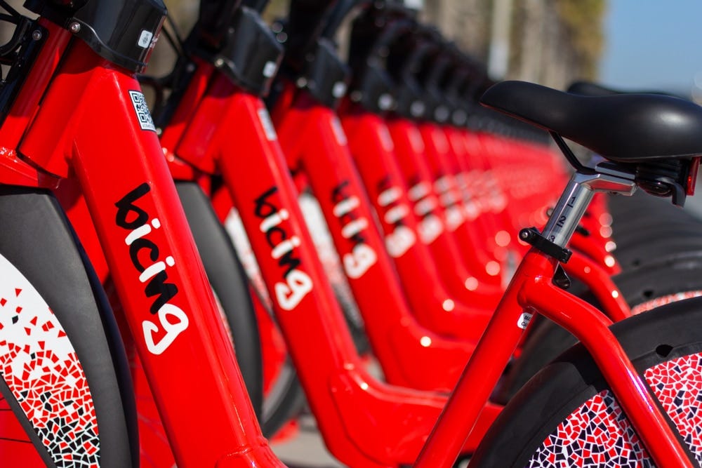
Bicing parking full
User persona
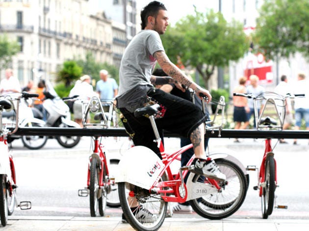
Sergio, 35 years old. Living and working in Barcelona.
He travels every day from his home to his workplace. He must be at 9 o’clock in the office but hardly finds Bicing park available at the near station.
It causes him a lot of frustration not to be able to find a parking lot because it makes him late and sometimes he has had to go to five different car parks to be able to park the bicycle.
Problem statement and Design phrase
The functionality that should be added, is a need that users would appreciate since it would be very useful and avoid unnecessary travel to other more distant stations and the loss of time that entails.
At this point, this is the problem statement:
Bicing users need a way to reserve a location at the Bicing station they are going to because it is usually full and the situation creates a lot of stress because they have to find another station and they can be late to the job.
And this is the design phrase:
How can we do so that the user reserves a location at the destination station at the time he takes the bike?
Ideation
In the ideation phase it took me a bit to focus on a solution. Rather, I saw the possibility of locating solutions in different sections of the application. I was simplifying the ideas until I reached a solution that went through taking advantage of the simplicity of the application so that users could find the way to reserve parking equally intuitive, just as they did to reserve the bicycle.
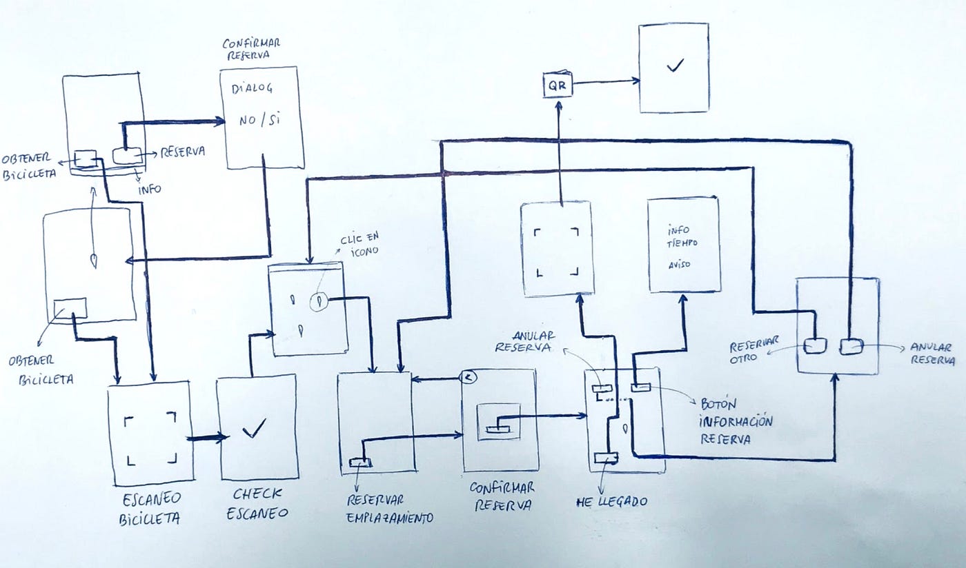
User flow for Bicing App feature
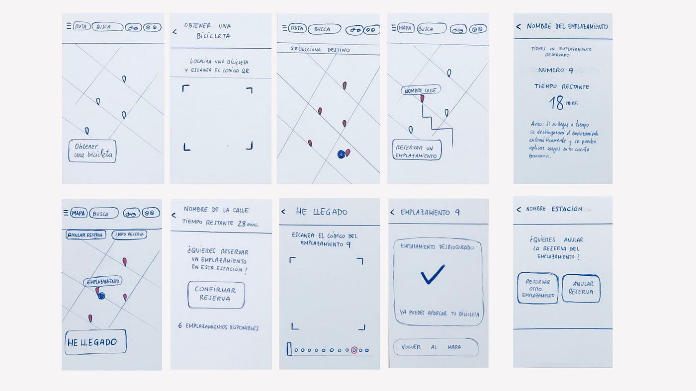
Bicing feature Low fidelity wireframes
After testing the wireframes with 7 users who used both the usual card and scan and the responses were positive. I got the users to link the new parking reservation button with the bicycle reservation button and do it quickly and intuitively, and also thank and be interested in the new functionality.
At that time I felt very happy and eager to start the model in Mid-fidelity.
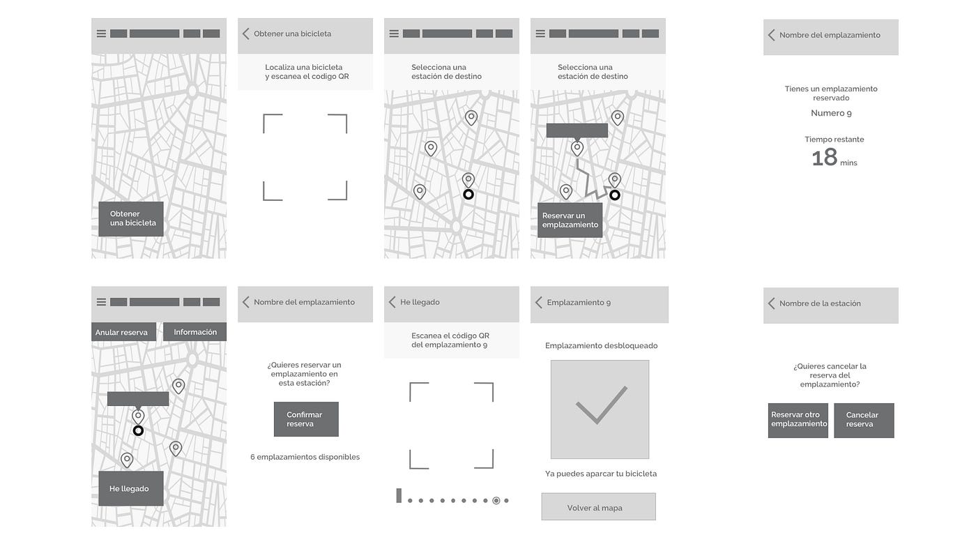
Bicing feature Mid fidelity wireframes
I tested the model in Mid-Fi with 5 regular users who used the App and made the usual round trips. Very active users.
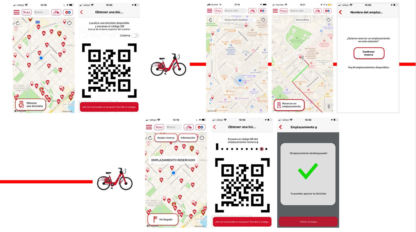
Hi-Fi Wireframes
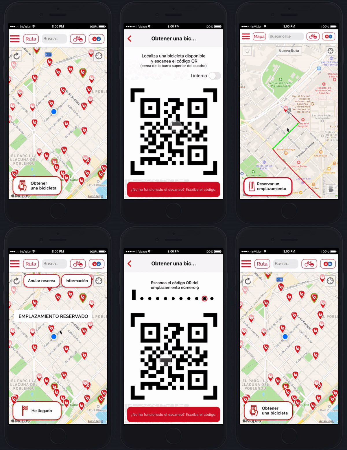
After making the changes, I started building the model in high fidelity.
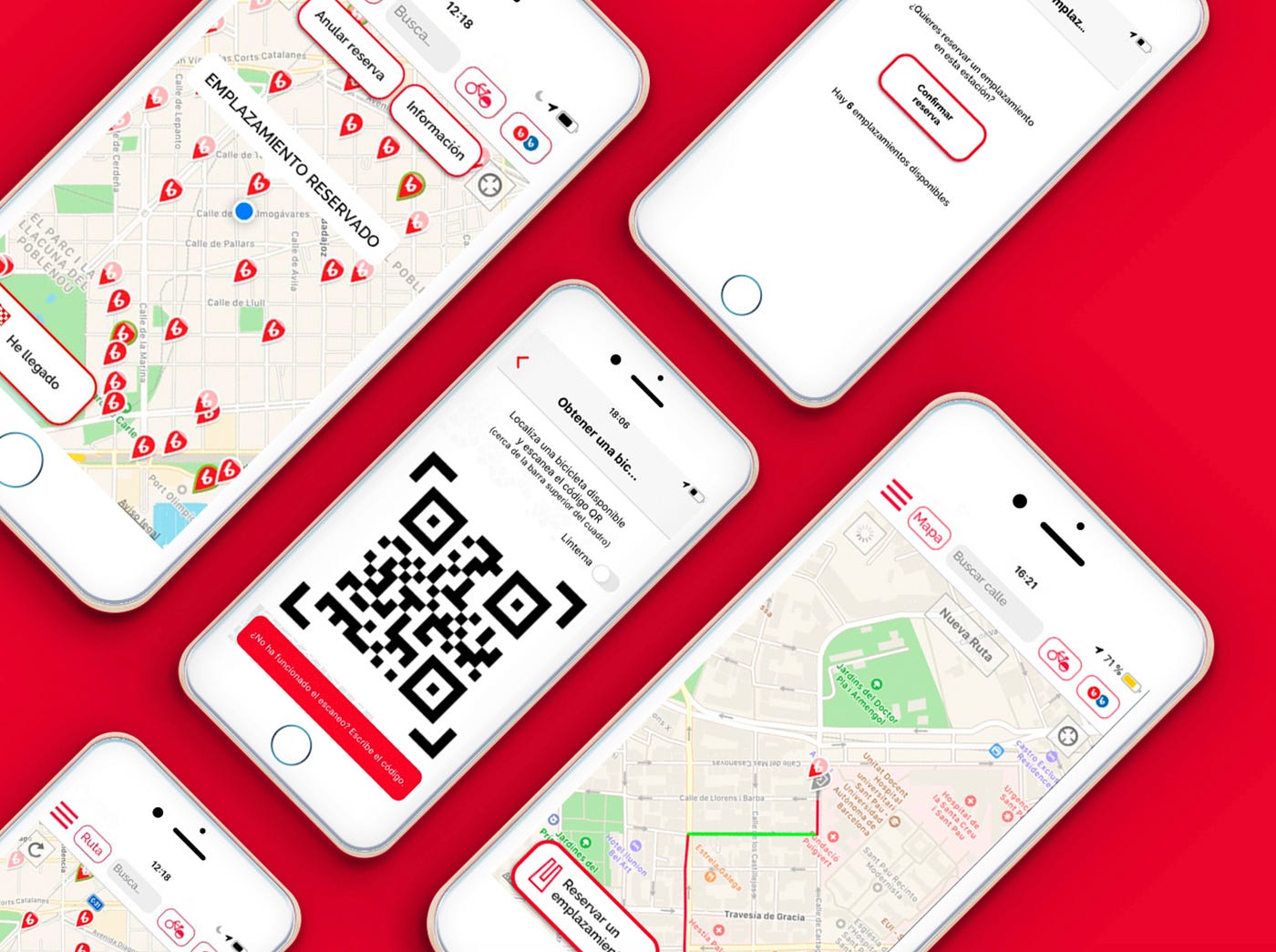
I thoroughly enjoyed recreating the original both at the level of colors and icons. The idea was to respect the same aesthetic so that the user immediately understood the navigation and conserved clarity and simplicity without major surface changes, only changes at the level of functionality.
Next steps
Card user
Investigating the problem, I could verify that the user who used the card also used the app to see the nearest bicycle parking and check availability. Through the parking interface I could also get this information, but the combination of this with the App and the unlock button installed in the anchor was powerful, because we could go further, making it possible for users who preferred to use a card to also book from the exit parking. This led me to the idea of designing a sticker to number the anchors of each station and include a Qr code in each of them to unlock them.
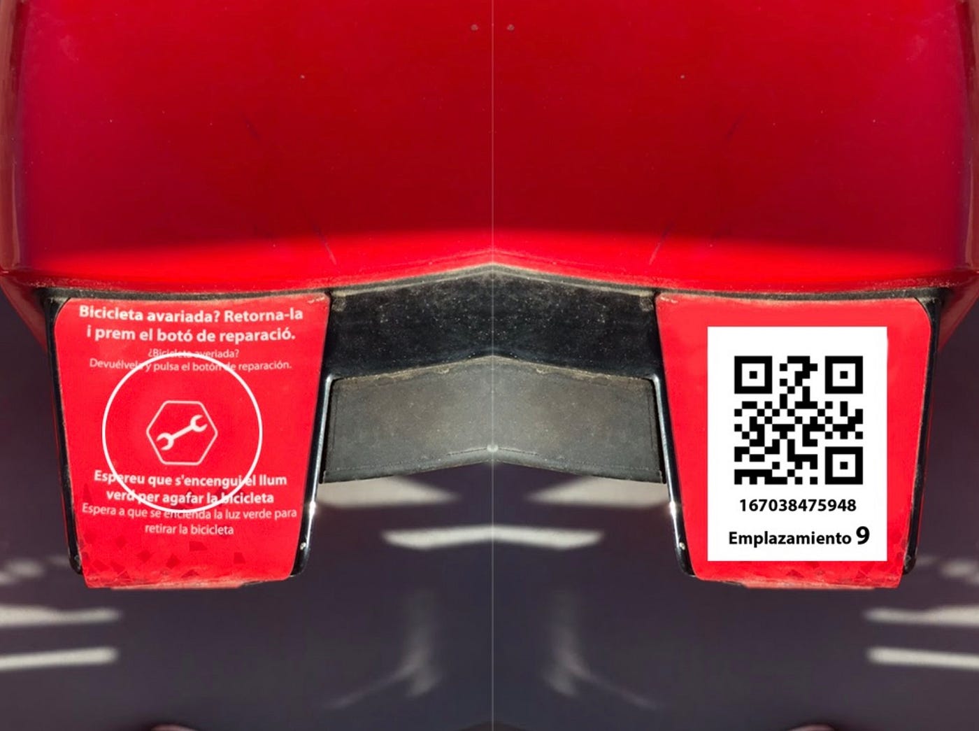
Lock / unlock button installed in the anchor on the left side. Proposed sticker on the right side of the image.
Reserve a bike that has reserved an anchor
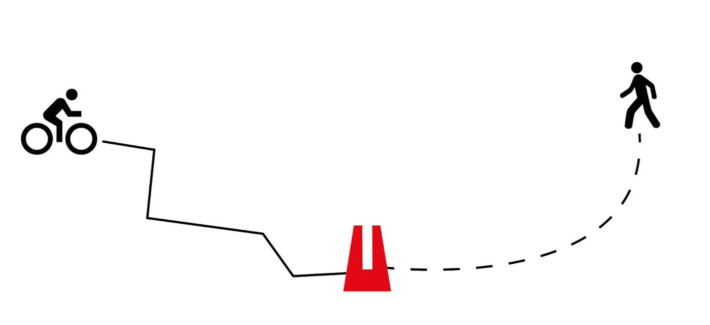
Another very attractive possibility is to relate users who have not reserved a bicycle, to reserve one that is arriving whose user has reserved an anchor. In this way the App could warn you that there are missing, for example, 2 minutes for a user who has booked the anchor number 3 to arrive and ask if you want to book that bike and wait for it.
Thanks for your time! I hope you enjoy this post 😊
메타데이터
- post_id
- 8a2f4374bf93
- slug
- barcelona-bicing-ux-case-study-8a2f4374bf93
- url
- https://medium.com/@kehms/barcelona-bicing-ux-case-study-8a2f4374bf93
- canonical_url
- https://medium.com/@kehms/barcelona-bicing-ux-case-study-8a2f4374bf93
- author_url
- https://medium.com/@kehms
- status
- ok
- fetched_at
- 2026-06-10 08:17:25