7 Design Rules That Take 10 Minutes to Learn and Fix Your UI Forever
You can write clean code. Your logic is solid. Your app works perfectly.
7 Design Rules That Take 10 Minutes to Learn and Fix Your UI Forever
You can write clean code. Your logic is solid. Your app works perfectly.
But the moment someone opens it, something feels wrong. They cannot point to it. You cannot point to it. It just does not look right.
That feeling has a cause. Usually more than one.
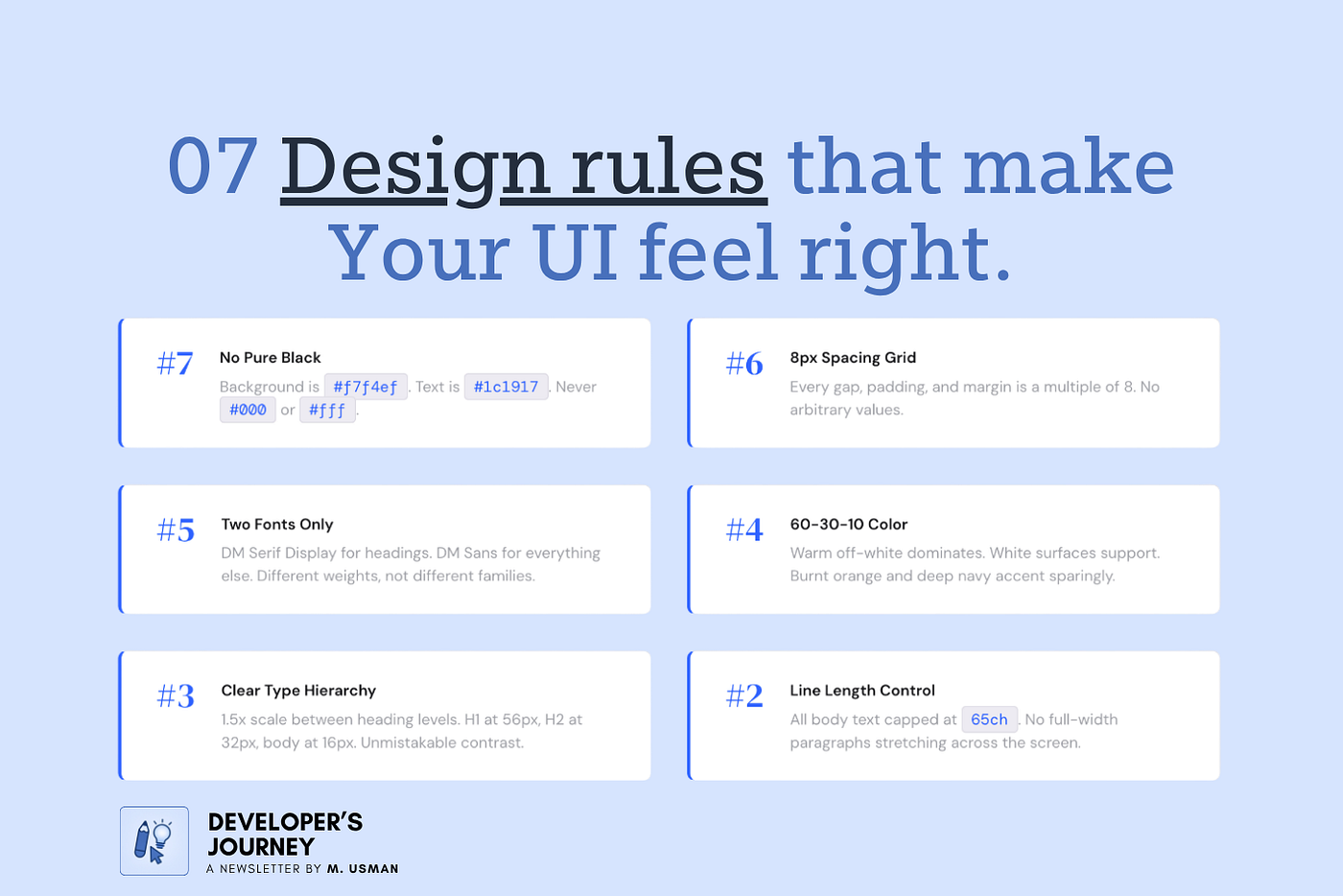
These are the design rules nobody puts in a programming tutorial. The ones that separate a UI that works from a UI that feels professional.
As always, here is the actual design system for all examples:
[embed]
#7 — You Are Using Pure Black. Nobody Does That.
#000000 feels logical. Maximum contrast. Maximum readability.
But every serious design tool, every production-grade UI, and every major design system avoids it.
Pure black text on a white background causes eye strain over time. White has 100% color brightness. Black has 0%. That gap forces the retina to constantly adapt, which becomes uncomfortable the longer someone reads.
This is what most developers that I have worked throughout my career write:
body {
  background-color: #ffffff;
  color: #000000;
}
This is what it should look like:
/* What it should look like */
body {
  background-color: #f5f5f5;
  color: #111111;
}
The change is subtle in your editor. The difference in how it feels to read is not.
#6 — Your Spacing Is Random. It Should Not Be.
Open your stylesheet. Look at your margin and padding values.
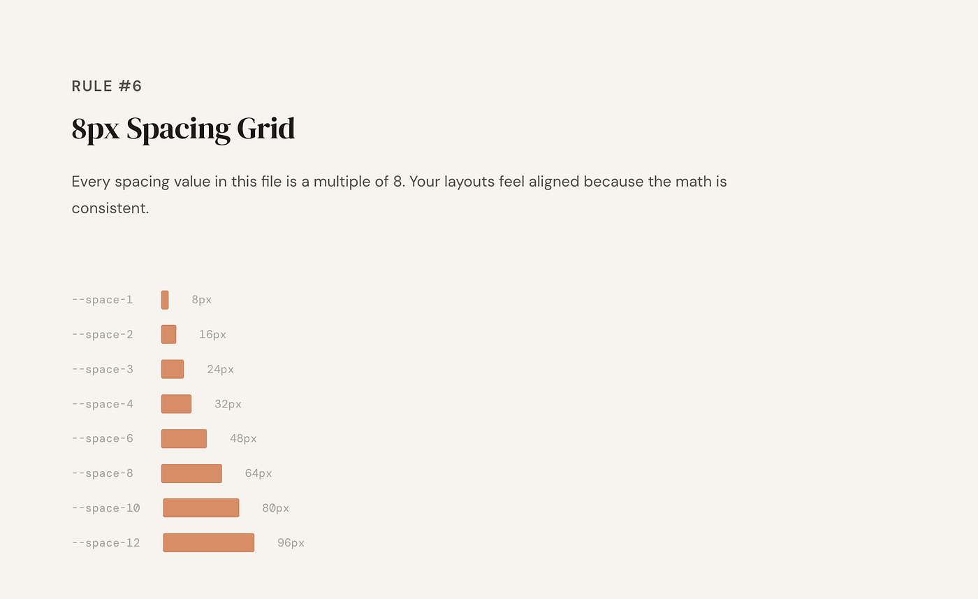
8px Spacing Grid
If you see numbers like 13px, 22px, 7px scattered around, that is the problem. It looks fine per element. As a whole it feels inconsistent, and users feel that even if they cannot explain why.
The fix is an 8px grid system. Apple’s Human Interface Guidelines and Google’s Material Design both recommend it. Everything visually aligns because it is mathematically related.
Instead of writing arbitrary values everywhere, define your spacing scale once:
/* Random spacing — the problem */
.card {
  padding: 13px;
  margin-bottom: 22px;
  gap: 7px;
}
/* 8px grid system — the fix */
:root {
--space-1: 8px;
--space-2: 16px;
--space-3: 24px;
--space-4: 32px;
--space-6: 48px;
--space-8: 64px;
}.card {
padding: var(--space-2);
margin-bottom: var(--space-3);
gap: var(--space-1);
}Define it once. Use the tokens everywhere. Random spacing is the most common reason a developer-built UI feels slightly off without anyone being able to name why.
#5 — You Are Using Too Many Fonts
Most developers that I have worked with building their own UI do this. They pick a display font for headings, a body font for text, maybe a third one because it looked interesting, and suddenly the page feels like a ransom note.
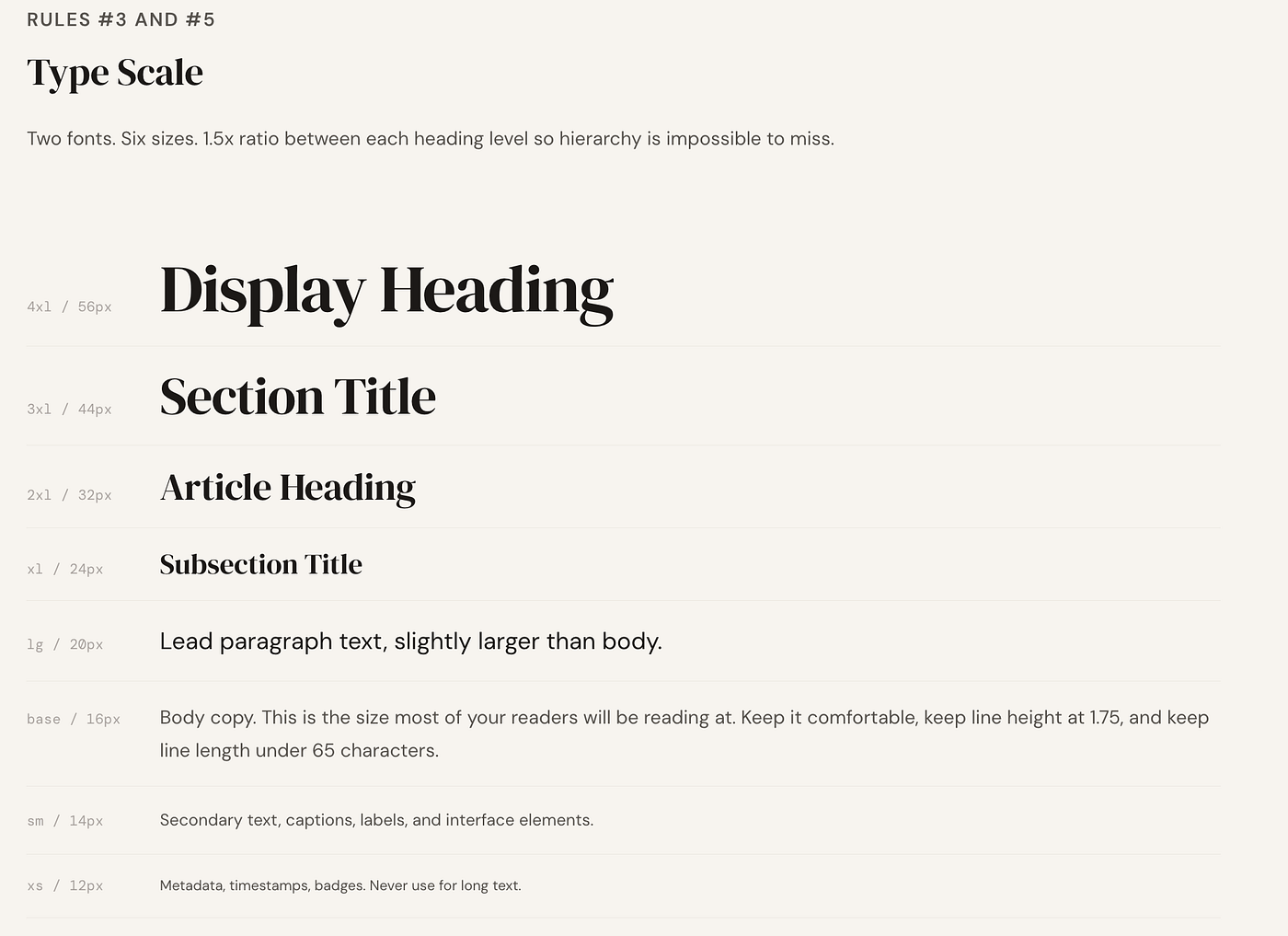
The rule is two font families maximum. Use different weights within each family to create hierarchy.
/* Too many fonts — the problem */
h1 { font-family: 'Playfair Display', serif; }
h2 { font-family: 'Raleway', sans-serif; }
p  { font-family: 'Merriweather', serif; }
small { font-family: 'Space Mono', monospace; }
/* Two fonts, multiple weights — the fix */
@import url('https://fonts.googleapis.com/css2?family=Inter:wght@400;500;600;700&display=swap');:root {
--font-base: 'Inter', sans-serif;
}h1 {
font-family: var(--font-base);
font-weight: 700;
font-size: 2.5rem;
}h2 {
font-family: var(--font-base);
font-weight: 600;
font-size: 1.75rem;
}p {
font-family: var(--font-base);
font-weight: 400;
font-size: 1rem;
}Inter, Plus Jakarta Sans, and DM Sans are free, versatile, and used across thousands of production apps. One font, multiple weights. That alone will make your UI look significantly more intentional.
#4 — Your Color Has No System
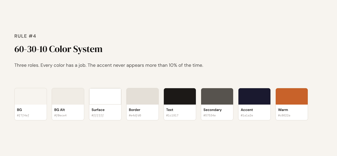
60–30–10 Color System
You picked a nice blue for your primary button. Then a slightly different blue for a link. Then a teal for a badge because the first blue did not quite work there. Now you have six shades of blue with no relationship to each other.
There is a rule for this. It is called the 60–30–10 rule.
60% of your UI is a dominant neutral, usually your background. 30% is a secondary color for surfaces and cards. 10% is your accent, used for primary buttons and highlights only.
/* No color system — the problem */
.btn-primary  { background: #3b82f6; }
.btn-secondary { background: #2563eb; }
.badge        { background: #0ea5e9; }
.link         { color: #1d4ed8; }
.highlight    { background: #38bdf8; }
/* Five different blues with no relationship */
/* 60-30-10 color system — the fix */
:root {
/* 60% — dominant background */
--color-bg: #f8fafc; /* 30% — surfaces, cards, sidebars */
--color-surface: #ffffff;
--color-border: #e2e8f0; /* 10% — accent, used sparingly */
--color-accent: #3b82f6;
--color-accent-hover: #2563eb; /* Text */
--color-text-primary: #111827;
--color-text-muted: #6b7280;
}.btn-primary {
background: var(--color-accent);
}.btn-primary:hover {
background: var(--color-accent-hover);
}.card {
background: var(--color-surface);
border: 1px solid var(--color-border);
}Most developer UIs fail because the accent color shows up everywhere and stops meaning anything.
#3 — Your Text Has No Hierarchy
This one is subtle and devastating.
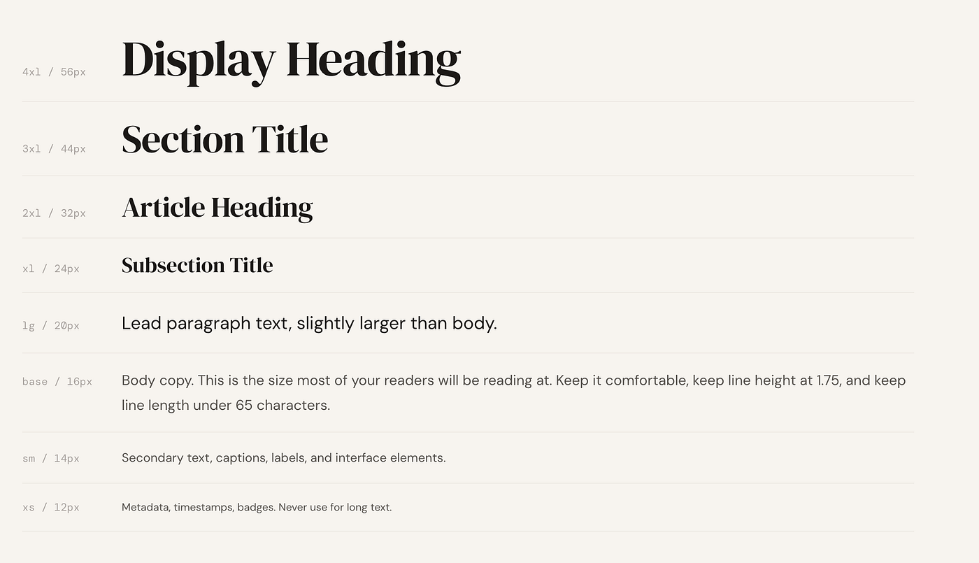
If your H1 is 28px and your H2 is 24px, your brain registers them as basically the same size. The page feels flat. Nothing commands attention. The user scans and finds nothing to land on.
The minimum ratio between heading levels should be 1.25x. But 1.5x is better for real clarity.
/* Flat hierarchy — the problem */
h1 { font-size: 28px; font-weight: 600; }
h2 { font-size: 24px; font-weight: 600; }
h3 { font-size: 20px; font-weight: 600; }
p  { font-size: 16px; font-weight: 400; }
/* Everything feels the same size and weight */
/* Clear hierarchy with 1.5x scale — the fix */
:root {
--text-base: 1rem; /* 16px — body */
--text-lg: 1.25rem; /* 20px — small headings */
--text-xl: 1.5rem; /* 24px — h3 */
--text-2xl: 2rem; /* 32px — h2 */
--text-4xl: 3rem; /* 48px — h1 */
}h1 {
font-size: var(--text-4xl);
font-weight: 700;
line-height: 1.1;
}h2 {
font-size: var(--text-2xl);
font-weight: 600;
line-height: 1.2;
}h3 {
font-size: var(--text-xl);
font-weight: 600;
line-height: 1.3;
}p {
font-size: var(--text-base);
font-weight: 400;
line-height: 1.7;
}Your H1 should be impossible to confuse with anything else on the page.
#2 — Your Line Length Is Too Wide
This one almost no developer thinks about.

You give your content a full-width container. The text stretches across the entire screen. On a large monitor, a single line has 120, 140, sometimes 160 characters.
That is not readable. The eye has to travel too far to find the start of the next line. People lose their place. They slow down. They leave.
The ideal line length for body text is between 50 and 75 characters per line.
/* Full width text — the problem */
.content {
  width: 100%;
  /* Lines stretch to 150+ characters on wide screens */
}
/* Constrained line length — the fix */
.content {
max-width: 65ch;
margin-inline: auto;
}/* For a full layout with sidebar */
.layout {
display: grid;
grid-template-columns: 1fr min(65ch, 100%) 1fr;
}.layout > * {
grid-column: 2;
}Put max-width: 65ch on your content container. Your text becomes dramatically easier to read immediately.
#1 — Your UI Has No Visual Hierarchy at All
This is what ties every other rule together.
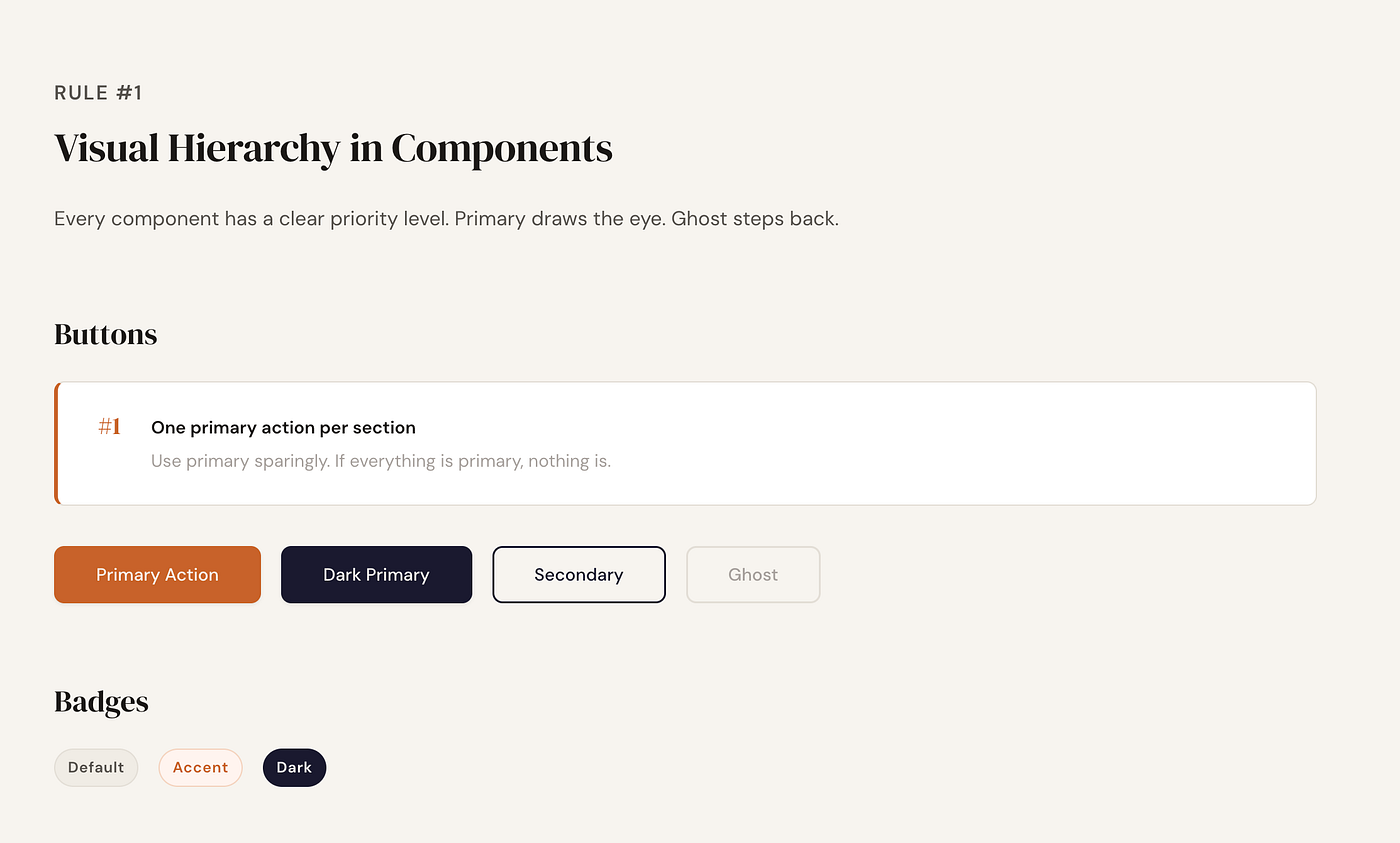
Visual Hierarchy in Components
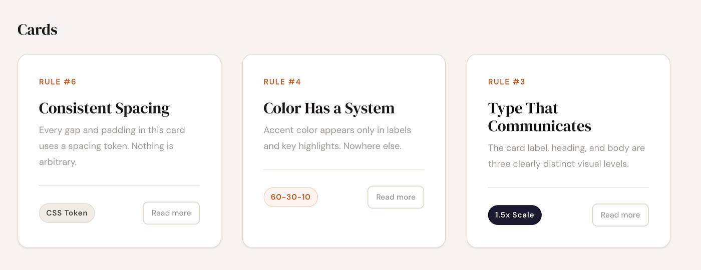
If all buttons look equally important, users will not know where to click. Most developer-built UIs treat every element as equal. Everything is the same weight, the same color intensity, the same size relationship to everything else.
/* No hierarchy — the problem */
.btn {
  padding: 10px 20px;
  background: #3b82f6;
  color: white;
  border-radius: 6px;
}
/* Every button looks exactly the same */
/* Primary, secondary, destructive — all identical *//* Clear visual hierarchy — the fix *//* Primary — one per page, unmissable */
.btn-primary {
padding: 12px 28px;
background: var(--color-accent);
color: white;
font-weight: 600;
border-radius: 8px;
box-shadow: 0 1px 3px rgba(0,0,0,0.1);
}/* Secondary — present but steps back */
.btn-secondary {
padding: 12px 28px;
background: transparent;
color: var(--color-accent);
font-weight: 500;
border: 1.5px solid var(--color-accent);
border-radius: 8px;
}/* Ghost — lowest priority, almost invisible */
.btn-ghost {
padding: 12px 28px;
background: transparent;
color: var(--color-text-muted);
font-weight: 400;
border-radius: 8px;
}One strong primary button. One dominant heading. One clear focal point. The rest should visually step back.
The Honest Part
Nobody teaches this in web development courses.
You learn HTML, CSS, JavaScript, frameworks, APIs, databases. You learn how to build things that work. Design thinking is treated as someone else’s job.
But if you are building your own product, your own portfolio, your own side project, there is no designer on the team. It is just you.
These rules do not require a design background. They require knowing that they exist.
Now you do.
Did you learn something good today? Then show some love. © Usman Writes WordPress Developer | Website Strategist | SEO Specialist Don’t forget to subscribe to **Developer’s Journey** to show your support.

메타데이터
- post_id
- 8be82e04a835
- slug
- design-rules-to-learn-ui-ux-8be82e04a835
- url
- https://uxplanet.org/design-rules-to-learn-ui-ux-8be82e04a835
- canonical_url
- https://uxplanet.org/design-rules-to-learn-ui-ux-8be82e04a835
- author_url
- https://medium.com/@pixicstudio
- status
- ok
- fetched_at
- 2026-07-13 06:23:13