How to Create an Eye-Catching Animated Counter Using HTML, CSS, and JavaScript
Animated counters are a powerful addition to any website, adding a dynamic element that instantly catches users’ attention. Whether you’re…
How to Create an Eye-Catching Animated Counter Using HTML, CSS, and JavaScript
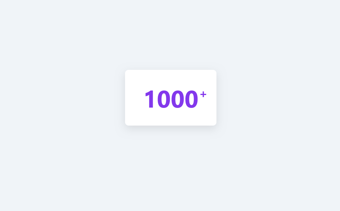
Animated counters are a powerful addition to any website, adding a dynamic element that instantly catches users’ attention. Whether you’re displaying statistics, achievements, or milestones, an animated counter enhances user engagement by showcasing numbers in a visually appealing way. In this guide, we’ll walk you through the process of creating a simple yet striking animated counter from scratch. We’ll explore the HTML structure, CSS styling, and JavaScript code needed to bring this counter to life with smooth transitions and eye-catching animations. Ready to boost your website’s interactivity? Let’s dive in!
See the demo **here!**
Disclaimer:
Please note that this content was crafted with the assistance of ChatGPT, an artificial intelligence language model developed by OpenAI. The author has overseen and refined AI’s contributions to ensure adherence to editorial standards and the accurate reflection of the intended messaging.
HTML Structure for the Animated Counter
Here’s the complete HTML code for our animated counter project:
<!DOCTYPE html>
<html lang="en">
<head>
    <meta charset="UTF-8">
    <!-- Page title displayed on the browser tab -->
    <title>Animated Counter</title>
    <!-- Link to the external CSS stylesheet -->
    <link rel="stylesheet" href="styles.css">
</head>
<body>
    <!-- Main container for the counter -->
    <div class="counter-container">
        <!-- Counter element with a data-target attribute specifying the final number -->
        <div class="counter" data-target="1000">0</div>
    </div>

    <!-- Include the external JavaScript file -->
    <script src="script.js"></script>
</body>
</html>
Step-by-Step Explanation:
- DOCTYPE Declaration:
<!DOCTYPE html>Defines the document as HTML5, ensuring modern web standards are applied.
2. HTML Tag:
<html lang="en">- The root element for the HTML document.
- The
lang="en"attribute specifies the language of the document, helping search engines and screen readers interpret it correctly.
3. Head Section:
<head>
    <meta charset="UTF-8">
    <title>Animated Counter</title>
    <link rel="stylesheet" href="styles.css">
</head>
**<meta charset="UTF-8">**: Defines the character encoding, ensuring correct display of various text characters.**<title>**: Sets the title for the webpage, which appears on the browser tab.**<link rel="stylesheet" href="styles.css">**: Links to an external CSS file (styles.css) to style the counter, keeping the HTML clean and separating concerns.
4. Body Section:
<body>
    <div class="counter-container">
        <div class="counter" data-target="1000">0</div>
    </div>
    <script src="script.js"></script>
</body>**<body>**: Contains the main content displayed on the page.**<div class="counter-container">**: A wrapper around the counter element, centering and styling the counter.**<div class="counter" data-target="1000">0</div>**:- The main counter element, which starts at
0and animates up to thedata-targetvalue of1000. - The
data-targetattribute holds the final value for the counter, which JavaScript uses to control the animation. **<script src="script.js"></script>**: Links to an external JavaScript file (script.js) responsible for animating the counter.
This simple HTML structure lays the foundation for an animated counter. In the next sections, we’ll dive into the CSS for styling and the JavaScript for dynamic animations!
CSS Styling for the Animated Counter
Here’s the complete CSS code for styling our animated counter:
/* Style for the body of the page */
body {
  /* Light and pleasant background color */
  background-color: #f0f4f8;
  /* Use Flexbox to center content */
  display: flex;
  justify-content: center;
  align-items: center;
  /* Set height to viewport height to occupy the full window */
  height: 100vh;
  /* Remove default margins */
  margin: 0;
  /* Use a sans-serif font for a modern look */
  font-family: 'Segoe UI', Tahoma, Geneva, Verdana, sans-serif;
}

/* Style for the counter container */
.counter-container {
  /* White background for contrast */
  background-color: #ffffff;
  /* Internal padding for spacing */
  padding: 40px 60px;
  /* Rounded corners for a softer design */
  border-radius: 12px;
  /* Light shadow for depth */
  box-shadow: 0 10px 30px rgba(0, 0, 0, 0.1);
  /* Center the text */
  text-align: center;
}

/* Style for the counter number */
.counter {
  /* Large font size for visibility */
  font-size: 80px;
  /* Bold text */
  font-weight: bold;
  /* Initial text color */
  color: #3a86ff;
  /* Relative positioning for pseudo-elements */
  position: relative;
  /* Inline-block display to manage dimensions and margins */
  display: inline-block;
  /* Transition for color change */
  transition: color 0.3s ease;
}

/* Style applied when the 'animate' class is added */
.counter.animate {
  /* Change text color for animation */
  color: #8338ec;
}

/* Style for the plus sign that appears after the number */
.counter::after {
  /* Add content: the '+' sign */
  content: '+';
  /* Font size for the plus sign */
  font-size: 40px;
  /* Absolute positioning relative to the counter */
  position: absolute;
  /* Position at the top-right of the number */
  top: 10px;
  right: -30px;
  /* Initial color of the plus sign */
  color: #3a86ff;
  /* Initial opacity set to zero for animation */
  opacity: 0;
  /* Initial translation for sliding effect */
  transform: translateX(10px);
  /* Transitions for opacity and transformation */
  transition: opacity 0.3s ease-out, transform 0.3s ease-out;
}

/* Animation style for the plus sign when 'animate' class is present */
.counter.animate::after {
  /* Full opacity to make the plus sign visible */
  opacity: 1;
  /* Reset translation to bring the plus sign into position */
  transform: translateX(0);
  /* Change color of the plus sign for animation */
  color: #8338ec;
}
Step-by-Step Explanation:
- Body Styling:
body {
    background-color: #f0f4f8;
    display: flex;
    justify-content: center;
    align-items: center;
    height: 100vh;
    margin: 0;
    font-family: 'Segoe UI', Tahoma, Geneva, Verdana, sans-serif;
}- A soft background color (
#f0f4f8) provides a light and modern aesthetic. - Flexbox centers the counter both vertically and horizontally within the viewport, set by
height: 100vh. - A sans-serif font creates a clean, modern look.
2. Counter Container:
.counter-container {
    background-color: #ffffff;
    padding: 40px 60px;
    border-radius: 12px;
    box-shadow: 0 10px 30px rgba(0, 0, 0, 0.1);
    text-align: center;
}- A white background (
#ffffff) contrasts with the body background. - Padding and rounded corners create a smooth, spacious feel.
- A subtle shadow adds depth to the container.
3. Counter Styling:
.counter {
    font-size: 80px;
    font-weight: bold;
    color: #3a86ff;
    position: relative;
    display: inline-block;
    transition: color 0.3s ease;
}- The counter font size (
80px) and bold weight enhance readability. - The initial color (
#3a86ff) gives the counter a vibrant look. - The
transitionproperty allows for smooth color changes when the.animateclass is applied.
4. Plus Sign Styling with Pseudo-Element:
.counter::after {
    content: '+';
    font-size: 40px;
    position: absolute;
    top: 10px;
    right: -30px;
    color: #3a86ff;
    opacity: 0;
    transform: translateX(10px);
    transition: opacity 0.3s ease-out, transform 0.3s ease-out;
}- The
::afterpseudo-element adds a plus sign after the counter. - Positioned at the top-right, initially set to transparent (
opacity: 0) and offset (translateX(10px)) for animation effects.
5. Animated Class for Counter and Plus Sign:
.counter.animate {
    color: #8338ec;
}

.counter.animate::after {
    opacity: 1;
    transform: translateX(0);
    color: #8338ec;
}
When .animate is added, the counter color shifts to a new shade (#8338ec) and the plus sign becomes fully visible and aligned.
This CSS enhances the counter’s appearance with modern styling, soft animations, and a vibrant color scheme. Next, we’ll explore how JavaScript controls the animation for an engaging user experience!
JavaScript for Animating the Counter
Here’s the complete JavaScript code that will bring our animated counter to life:
// Wait for the DOM to be fully loaded before executing the code
document.addEventListener('DOMContentLoaded', () => {
    // Select all elements with the class 'counter'
    const counters = document.querySelectorAll('.counter');

    // Iterate through each 'counter' element found
    counters.forEach(counter => {
        // Function to animate the counter
        const animateCounter = () => {
            // Get the target value from data-target attribute and convert it to a number
            const target = +counter.getAttribute('data-target');
            // Get the current value displayed in the counter and convert it to a number
            const current = +counter.innerText;
            // Calculate the increment for each animation frame
            const increment = target / 200;

            // Check if the current value is less than the target
            if (current < target) {
                // Update the counter text by incrementing the current value
                counter.innerText = Math.ceil(current + increment);
                // Request the next animation frame
                requestAnimationFrame(animateCounter);
            } else {
                // If the current value has reached or surpassed the target
                // Set the counter text to the exact target value
                counter.innerText = target;
                // Add the 'animate' class to trigger CSS animations
                counter.classList.add('animate');
            }
        };

        // Start the counter animation
        animateCounter();
    });
});
Step-by-Step Explanation:
- Wait for DOM Content to Load:
document.addEventListener('DOMContentLoaded', () => {
    // JavaScript inside this block will execute after the DOM is fully loaded.
});
This event listener ensures that our code only runs after all HTML elements are available in the DOM, preventing potential errors.
2. Selecting Counter Elements:
const counters = document.querySelectorAll('.counter');Uses querySelectorAll to find all elements with the class .counter. This allows for multiple counters on the page if needed.
3. Looping Through Each Counter:
counters.forEach(counter => { ... });Loops over each .counter element, so the animation function can apply to each one independently.
4. Define the animateCounter Function:
const animateCounter = () => { ... };The main function responsible for incrementing the counter’s value and updating the displayed text.
5. Retrieve the Target Value:
const target = +counter.getAttribute('data-target');Reads the data-target attribute (in this case, 1000) and converts it to a number. This target value represents the final count displayed in the counter.
6. Get the Current Value:
const current = +counter.innerText;7. Calculate the Increment:
const increment = target / 200;Divides the target by 200 to determine the amount added in each animation frame, resulting in a smooth, gradual increase.
8. Animate the Counter Incrementally:
if (current < target) {
    counter.innerText = Math.ceil(current + increment);
    requestAnimationFrame(animateCounter);
} else {
    counter.innerText = target;
    counter.classList.add('animate');
}- If Condition: Checks if the current value is less than the target.
- If true, it increments the current value and updates
innerTextwith the new value. requestAnimationFrame(animateCounter): RepeatsanimateCounteruntil the target value is reached, allowing for a smooth animation.- Else Condition: When the current value reaches the target:
- Sets the final number precisely to avoid overshooting.
- Adds the
animateclass, triggering the CSS animations for color changes and the plus sign.
This JavaScript code creates a smooth, engaging animation that visually counts up to the target value. Together with the CSS animations, the counter provides an interactive user experience.

Unlock your JavaScript potential with ’50 Real-World JavaScript Apps for Beginners and Intermediates.’ Now available for download on both Gumroad and Ko-fi! Start building amazing projects today.
Conclusion
Creating an animated counter with HTML, CSS, and JavaScript is an excellent project to enhance your web development skills. In this tutorial, we’ve built a visually engaging counter from scratch, covering every step of the process — from HTML structure to CSS styling and JavaScript animation. This project not only improves your knowledge of JavaScript DOM manipulation and CSS animations but also introduces key techniques for creating interactive web components.
If you’re interested in learning more about JavaScript, check out the following resources:
- JavaScript Documentation: The official documentation on MDN Web Docs, perfect for in-depth explanations and exploring JavaScript’s full potential.
- Codecademy’s JavaScript Course: A beginner-friendly course that covers the fundamentals of JavaScript and introduces interactive programming.
- The Complete JavaScript Course on Udemy: This comprehensive course by Jonas Schmedtmann is ideal for anyone looking to master JavaScript, including DOM manipulation, animations, and other advanced concepts.
By combining hands-on practice with these resources, you’ll be well-equipped to develop more complex interactive elements and elevate your web development skills. Dive deeper, keep experimenting, and have fun coding!
메타데이터
- post_id
- 8c948db1608f
- slug
- how-to-create-an-eye-catching-animated-counter-using-html-css-and-javascript-8c948db1608f
- url
- https://medium.com/@francesco-saviano/how-to-create-an-eye-catching-animated-counter-using-html-css-and-javascript-8c948db1608f
- canonical_url
- https://medium.com/@francesco-saviano/how-to-create-an-eye-catching-animated-counter-using-html-css-and-javascript-8c948db1608f
- author_url
- https://medium.com/@francesco-saviano
- status
- ok
- fetched_at
- 2026-08-27 22:22:31