How to Effectively Use CSS Grid and Flexbox for Layout Design
Let me tell you a secret. For years, I wrestled with layouts in CSS. Boxes would not align, divs overlapped, and I spent way too long…
How to Effectively Use CSS Grid and Flexbox for Layout Design
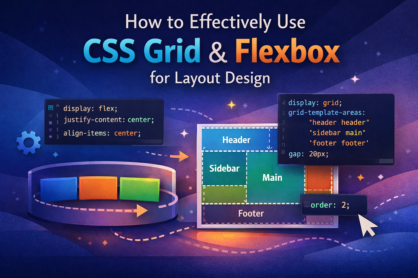
Let me tell you a secret. For years, I wrestled with layouts in CSS. Boxes would not align, divs overlapped, and I spent way too long adding random margins and paddings like I was sprinkling fairy dust. Then I discovered CSS Grid and Flexbox, and suddenly designing layouts felt like choreographing a dance instead of wrestling an octopus.
Here is how I have learned to make them work for me, and how you can do it too.
Flexbox: The One-Dimensional Wonder

Flexbox is my go-to when I need things in a row or a column. Simple, flexible, and predictable. It is like a conveyor belt for your elements. You line them up, and they automatically adjust to the available space.
A few tricks I love:
Centering made easy Instead of the old trickery with positions and transforms, I just do:
display: flex;
justify-content: center;
align-items: center;
Perfectly centered every time.
Reordering without changing HTML
With the order property, I can move things around visually without touching the markup. Life-changing when working with responsive designs.
Flexbox works best when your layout flows in one direction. But when I want to design something more complex, I turn to Grid.
CSS Grid: The Two-Dimensional Magician

Grid is like Flexbox’s cooler, more organized cousin. It handles rows and columns simultaneously, which is a dream when creating magazine-style layouts or complex dashboards.
Some Grid moves I swear by:
Define areas Instead of micromanaging the position of each item, I define grid areas:
display: grid;
grid-template-areas:
  "header header"
  "sidebar main"
  "footer footer";
gap: 20px;
Then I just assign each element to its area. Clean, readable, and less headache-inducing.
Auto-placement magic
Sometimes, I do not even need to define rows and columns precisely. With grid-auto-flow and repeat(auto-fill, minmax(...)), elements automatically fill the space neatly. Responsive design becomes much easier.
When I Use One Over the Other
Here is my rule of thumb after years of trial, error, and some hair-pulling:
- Use Flexbox for linear layouts such as navbars, lists, buttons in a row, or any single-direction alignment.
- Use Grid for complex, multi-dimensional layouts such as dashboards, galleries, and sections where both rows and columns matter.
I often combine them. A Grid container can hold Flexbox items. This way, I get the structure of Grid with the flexibility of Flexbox.
The Takeaway
The trick is not about memorizing properties. It is about knowing which tool suits your design problem. Flexbox is nimble, Grid is powerful, and together they let me craft layouts without endless hacks.
If you are still manually spacing divs with margins, give these two a shot. Once you get the hang of it, CSS feels less like a chore and more like painting -a very satisfying, responsive painting.
If you ever feel stuck, remember that I have been there. Start small, experiment, and soon you will be dancing between Flexbox and Grid like it is second nature.

메타데이터
- post_id
- 8cbc69714b5f
- slug
- how-to-effectively-use-css-grid-and-flexbox-for-layout-design-8cbc69714b5f
- url
- https://medium.com/@kabakelenka/how-to-effectively-use-css-grid-and-flexbox-for-layout-design-8cbc69714b5f
- canonical_url
- https://medium.com/@kabakelenka/how-to-effectively-use-css-grid-and-flexbox-for-layout-design-8cbc69714b5f
- author_url
- https://medium.com/@kabakelenka
- status
- ok
- fetched_at
- 2026-06-09 15:37:30






