Share Analysis in Jupyter Notebook with Two Lines of Code using Datapane
Sharing the entire notebook may overwhelm certain audience, static charts may miss the full story. Share a web app.
Share Analysis in Jupyter Notebook with Two Lines of Code using Datapane
Sharing the entire notebook may overwhelm certain audience, static charts may miss the full story. Share a web app.
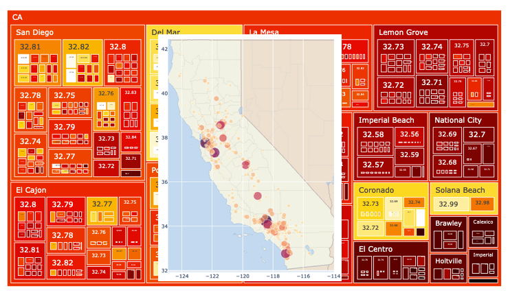
Image by author
Disclaimer: I don’t have any affiliation with Datapane or its creators. This article provides an unbiased view of the library usage for app sharing with the intention to make its knowledge available to the masses.
When working on a data science project, we usually want to share project progress with stakeholders at various stages. This helps us to get feedback as well as facilitates any course correction to ensure the best project outcome. A key question here would be how do we go about sharing our progress. Many data scientists and engineers use Jupyter Notebook for their analysis. Even though there are a number of ways to share the notebook itself using Jupyter nbviewer, Binder or Jovian, for instance, the entire content of a notebook may not be suitable for consumption by all stakeholders.
To highlight analysis of Pandas Dataframes as well as point out noteworthy patterns in charts while concealing the code, there are tools such as Mercury and Voilà. They facilitate the conversion of notebooks to web apps as well as have options to upload to a public cloud for broader sharing. They do however have a bit of overhead to set them up. Is there any easier way to remove even this barrier? We are in luck! Meet Datapane. It can convert your notebook to a web app with a single command, and another line to save it to an HTML file that can be hosted on any of your web server. And if you need to share with any external stakeholders, there is an option to upload to the Datapane public cloud.
To see this app-sharing feature in action, we will adopt a specific dataset for illustration.
A Brief EDA and its Code
Before we look at how Datapane is used to generate a shareable web app, lets perform a very brief exploratory data analysis on the California Housing Data from scikit-learn.
For this EDA, we will create a dataframe with this housing data and add an additional column City to associate the property location to the nearest city/town based on the available geographical data of CA cities. We then groupby the dataframe by City, and perform aggregation on a number of columns for charting purposes. Two Plotly scatter plots are made to capture certain feature relationships. Finally, a Plotly Treemap chart will be generated to capture some hierarchical relationship in this data. Treemap encodes a lot of data and to get a full appreciation, we would need to preserve the interactivity that Plotly affords.
Here is a code extract of those main tasks:
# get the dataset as a dataframe and add another column for
# the closest city to each data point
df = fetch_california_housing(as_frame=True).frame
df['City'] = df.apply(lambda x: cal_df.loc[closest(cal_dict_list,x.Latitude, x.Longitude),'Name'], axis=1)

# create a group by dataframe by City and aggregate certain columns
gdf = df.groupby(['City']).agg({'Latitude':'mean', 'Longitude':'mean',\
      'Population':'sum','MedInc':'mean','MedHouseVal':'mean', }).reset_index()

# display first 10 rows of dataframe
gdf.head(10)

# plot a couple of Plotly charts
fig1 = px.scatter(gdf, x="Longitude", y="Latitude", color="Population", \
           size="Population", hover_data=['City'], width=600, height=750, \
           title="Population vs Location", color_continuous_scale='matter')

fig2 = px.scatter(gdf, x="Longitude", y="Latitude", color="MedInc",
           width=600, height=750, title="Income vs Location", \
           color_continuous_scale='speed')

# plot a treemap to display hierarchical data
map = px.treemap(gdf, path=[px.Constant('CA'),'City','Latitude','Longitude'], \
                 values='MedInc',color='MedHouseVal', \
                 color_continuous_scale='hot')
The Jupyter Notebook with the full code is available on GitHub.
Web App Generation
Here is where Datapane comes in play to help direct the focus toward the analysis, and away from the code, to make them shareable with stakeholders. To help with the conversion to a web app, we firstly need to install datapane 0.15.0 or later. Within the notebook, let’s import this library:
import datapane as dpHere is a single command to generate the web app:
app = dp.App.from_notebook()That is all! Before executing the cell with this line, ensure all other cells are already executed and the notebook saved. This is not an optional step. Here is the output shown when the app generation completes successfully:

Successful conversion by Datapane. Image by author
If the notebook has not be saved after running all the cells, you would see this warning:

Warning about the conversion failure. Image by author
Once the app is generated, it can be saved locally to a file with the following command:

App saved to a local file. Image by author
This HTML file could be shared as is or uploaded to a web server. To facilitate even a broader sharing, the app could be uploaded to the Datapane cloud. You will need to create an account first, which is free, before the upload. Once you have created an account, you will be assigned a unique auth token string. From the notebook, you can initiate a login to Datapane using this token, as follows:
!datapane login --token=<your-token-string>And the next line helps with the actual upload:
app.upload("CA Housing EDA")The following link will lead us to the uploaded app:
To fully appreciate this app, look no further that the treemap. Even though I am not intimately familiar with property values in California, Wikipedia tells us that property values in Del Mar, Coronado and Solana Beach are very high which are readily observable within the treemap.
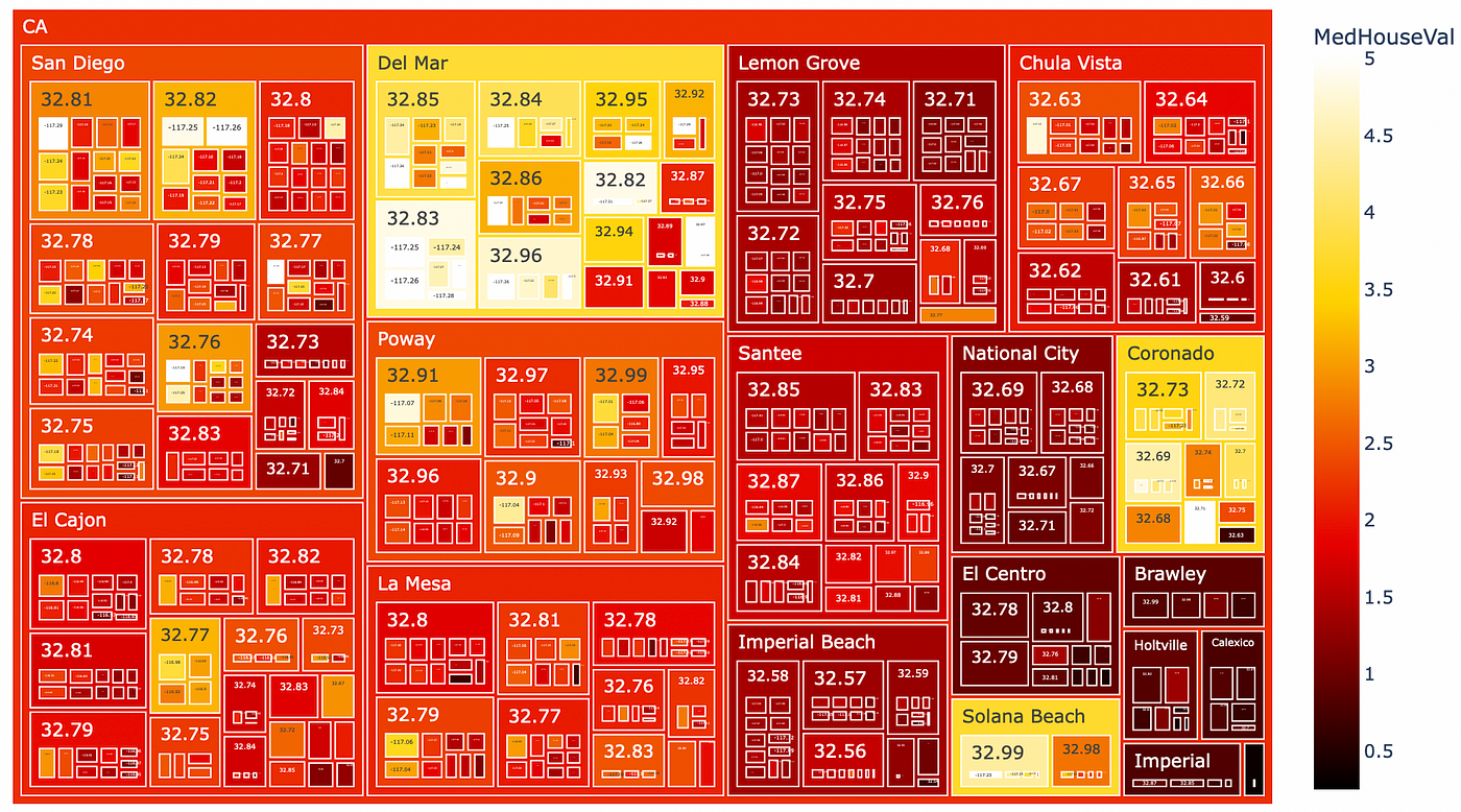
Treemap of property value pattern across south CA cities. Image by author
Clicking on any of this city with the app gives us insight into how the property value varies across neighboring locations. No amount of static images or Powerpoint slides will be able to capture such deep insights afforded by these interactive charts.
For discussion into hierarchical data and the impact of Treemap or Sunburst, please check my other article:
Final Thoughts
Sharing analysis of your work at various stages of a data science project is a good practice to keep the stakeholders informed and engaged. There are times when sharing the Jupyter Notebook itself may be sufficient with some internal stakeholders. However, the presence of code and other debug info in the notebook may be a distraction for some stakeholders.
Datapane has implemented a way to generate a web app off your Jupyter Notebook incorporating some dataframe data, charts as well as markdowns. With just a couple of lines, it is able to convert the notebook to a web app, and then save locally to a file or upload to the cloud. This has lowered the barrier to analysis sharing even further than a couple of other similar libraries out there. This is a huge step forward and we are running out of excuses not to share insights early.
Thanks for reading!
메타데이터
- post_id
- 8ea97e88989
- slug
- share-analysis-in-jupyter-notebook-with-two-lines-of-code-using-datapane-8ea97e88989
- url
- https://medium.com/@heelara/share-analysis-in-jupyter-notebook-with-two-lines-of-code-using-datapane-8ea97e88989
- canonical_url
- https://medium.com/@heelara/share-analysis-in-jupyter-notebook-with-two-lines-of-code-using-datapane-8ea97e88989
- author_url
- https://medium.com/@heelara
- status
- ok
- fetched_at
- 2026-08-08 10:10:36