The Dialog Map: A Valuable Business Analysis and UX Design Tool
Modeling a possible user interface architecture can reveal requirement errors and improve the user experience.
The Dialog Map: A Valuable Business Analysis and UX Design Tool
Modeling a possible user interface architecture can reveal requirement errors and improve the user experience.

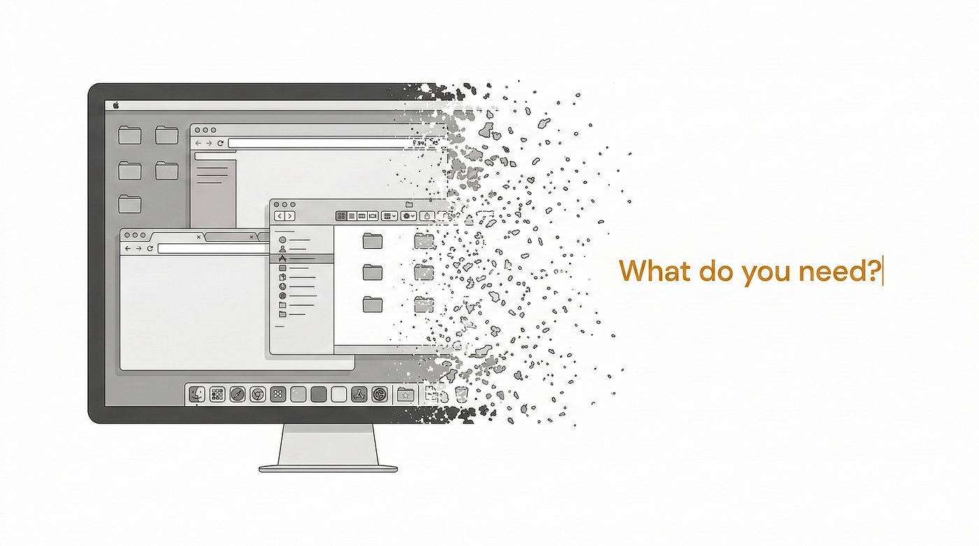
Graphic by Author
Not a Medium member? Read this story here.
I’m a big fan of analysis modeling, drawing diagrams that visually represent various aspects of a software system and its requirements. One of my favorite models is the dialog map, which provides a convenient way to represent, validate, and improve how a user navigates through a user interface to perform a task. Making that flow sequence logical, efficient, and complete is an essential contributor to a positive user experience. The dialog map is also a useful requirements elicitation tool when exploring how a user envisions interacting with an app to get something done.
What’s a Dialog Map?
A dialog map illustrates the architecture of a proposed user interface design. It depicts the system’s dialog elements and navigation links among them, but it doesn’t show detailed screen layouts (Figure 1).

Figure 1. A dialog map shows navigation pathways between user interface elements.
You can think of a user interface as a series of state changes. Only one dialog element — web page, menu, workspace, dialog box, line prompt, or touch screen display — is active for user input at any time. Users can navigate to certain other dialog elements based on the action they take at the active dialog element and the system’s state at the time.
In formal terms, a dialog map is a way to model a user interface in the form of a state-transition diagram. Stated more simply, it’s just a set of boxes and arrows that show how the user can move around in an app to accomplish a task. Similar modeling techniques are called a navigation map or user interface flow.
The dialog map shows each dialog element as a state (rectangle) and each allowed navigation option as a transition (arrow). The conditions that trigger a navigation are shown as a text label on each transition arrow. Types of trigger conditions include
- A user action, such as pressing a key, clicking on a button, or tapping on a link,
- A data value, such as an invalid user input that triggers an error message, and
- A system event, such as detecting that a printer is out of paper and then popping up a message on the screen.
Dialog maps are related to storyboards, which can illustrate a workflow or a user journey. Storyboards typically also include a short description of each screen’s purpose and perhaps a screen sketch. Wireframes are one further design level down, sketching out preliminary concepts of screen layouts. The dialog map is a high-level model of the UI’s architecture, whereas storyboards and wireframes are progressively more detailed models.
Why Draw a Dialog Map?
During requirements development, a dialog map helps the team explore hypothetical or preliminary user interface concepts based on how users imagine working with the product. Through this activity, they’re certain to find errors they can correct quickly and cheaply at this conceptual stage. Dialog maps help you find missing, incorrect, and unnecessary navigation options, thereby revealing missing, incorrect, and unnecessary requirements.
I found that sketching dialog map fragments on a whiteboard was helpful during use-case elicitation workshops in which a team explored the sequence of actor actions and system responses that would lead to task completion. If you think you already understand a use case or process flow, compare it to a dialog map to ensure that all the functions needed to execute the steps can be accessed by navigating through the UI you have in mind. Make sure the stakeholders understand that you’re not committing to any particular UI design yet, just starting to bridge the gap to design as a way to better understand the requirements.
As a design tool, stakeholders and developers can review a dialog map to reach a common vision of how the user might perform a task logically and efficiently. Dialog maps capture the essence of the user–system interactions and task flow without bogging the team down in detailed screen layouts prematurely. A good way to become comfortable with the technique is to draw a dialog map to document an existing system.
Dialog maps are useful for modeling the visual architecture of any app or website. Navigation links that you build into the system appear as transitions on the diagram. It’s easy for users to walk through a dialog map and imagine how they might perform a task. When I did this on one project, our team realized that it took too many clicks to complete a specific operation. That insight led us to think of ways to simplify the dialog map and hence the UI itself. That is, you can employ a dialog map to improve the user experience even before users begin to complain about it!
It’s Not a Flowchart
Dialog maps look a bit like flowcharts, but they serve a different purpose. A flowchart shows the processing steps and decision points involved in a process sequence, but not the UI elements the user encounters along the way.
In contrast, the dialog map does not explicitly show processing. The processing takes place along the transition lines that connect one dialog element to another. Branching decisions, both user choices and system decisions, are implied behind the dialog elements shown as rectangles on the dialog map. The conditions that lead to displaying one screen or another appear in the labels on the transitions.
Dialog maps and flowcharts, therefore, are complementary visual models. The flowchart shows how the user gets there. The dialog map shows where the user gets to.
The Dialog Map Illustrated
As a case study for requirements discussions, I often use a real project I worked on called the Chemical Tracking System. A core use case for this system was Request a Chemical. The normal flow for this use case lets the user request a chemical bottle from the chemical stockroom’s inventory. An alternative flow lets the user request to purchase a new bottle of the chemical from a vendor. The user placing the request also wanted the option to view the usage history of any available stockroom bottles of that chemical before selecting a particular bottle.
Figure 2 shows a dialog map for this fairly complex use case.

Figure 2. Dialog map for the “Request a Chemical” use case from a Chemical Tracking System.
The entry point for this dialog map is the transition line that begins with the solid black circle labeled “ask to place a request.” The user would enter this portion of the application’s UI from some other part of the UI along that line. Exit points for the dialog map to return to some other portion of the UI are the transition lines that end with a solid black circle inside another circle: “cancel entire request” and “OK; exit request function.”
This diagram might look complicated at first, but if you trace through it one line and one box at a time, it’s not difficult to understand. The user initiates this use case by asking to place a request for a chemical from some menu in the Chemical Tracking System. In the dialog map, this action brings the user to the box called Current Request List, along the downward arrow in the upper-left part of the dialog map.
The Current Request List box represents the main workspace for this use case. It shows a list of the chemicals in the user’s current request. The arrows leaving that box on the dialog map show all the navigation options — and hence functionality — available to the user in that context. These options are to
- Cancel the entire request,
- Submit the request if it contains at least one chemical,
- Add a new chemical to the request list, and
- Delete a chemical from the list.
The last operation, deleting a chemical, doesn’t involve another dialog element; it simply refreshes the current request list display after the user makes the change. This appears in the dialog map as a loop that goes back to the Current Request List screen.
As you trace through this dialog map, you’ll see elements that reflect the rest of the “Request a Chemical” use case:
- One flow path for requesting a chemical from a vendor
- Another path for fulfillment from the chemical stockroom
- An optional path to view the history of a container in the chemical stockroom
- An error message display flow to handle the entry of an invalid chemical identifier or any other error conditions that could arise
I hate it when an app forces me to complete a task even if I change my mind partway through. It’s a good practice to add transitions to the dialog map that allow the user to back out of operations, such as returning to the previous page to make a change. The dialog map lets you maximize usability by designing in those cancellation options at strategic points, as Figure 3 illustrates. In fact, reviewing a dialog map can show places where you’ve missed such options. It’s a lot cheaper to find those problems on a simple diagram than after you’ve delivered the product and customers start to complain.

Figure 3. Drawing a dialog map for an online survey application ensures a design that lets the user back out of an operation smoothly.
A user who reviews this dialog map might spot a missing requirement. Suppose a cautious user wants to confirm the operation that leads to canceling an entire request to avoid inadvertently losing data. You could easily add a box and some arrows to depict this confirmation display. It costs far less to add this new function at the requirements analysis stage than to build it into a delivered product.
I Love Dialog Maps!
My software teams found dialog maps to be invaluable for communicating with our customers to create an optimal user experience. I’ve worked on projects in which we created dialog maps to illustrate the user’s navigation options among more than fifty screens. They were also a great way to begin the transition from requirements to design. Creating and reviewing dialog maps let us discover many requirements errors at the conceptual stage. This helped us avoid considerable rework we otherwise might have encountered later in development or after delivery.
Because the dialog map represents just the conceptual view of the possible elements involved in the interaction between the user and the system, you don’t need to pin down all the user interface design details at the requirements stage. Instead, use these models to help the project stakeholders reach a common understanding of the system’s intended functionality and create a superior user experience.
This article is adapted from *Software Requirements, 3rd Edition by Karl Wiegers and Joy Beatty. Karl is also the author of [Software Requirements Essentials](https://www.softwarereqs.com) (with Candase Hokanson), [Software Development Pearls](https://www.processimpact.com/karls_books/sdp/index.html), The Thoughtless Design of Everyday Things, Successful Business Analysis Consulting,* and numerous other books.
메타데이터
- post_id
- 8ffa503d6e03
- slug
- the-dialog-map-a-valuable-business-analysis-and-ux-design-tool-8ffa503d6e03
- url
- https://medium.com/analysts-corner/the-dialog-map-a-valuable-business-analysis-and-ux-design-tool-8ffa503d6e03
- canonical_url
- https://medium.com/analysts-corner/the-dialog-map-a-valuable-business-analysis-and-ux-design-tool-8ffa503d6e03
- author_url
- https://medium.com/@karlwiegers
- status
- ok
- fetched_at
- 2026-06-12 18:14:10