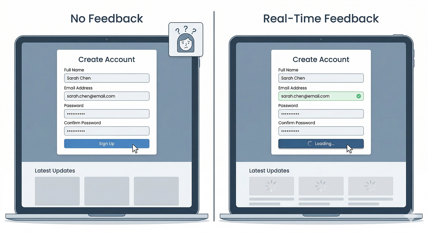
What actually makes a great UI design?
Most people judge UI design by how it looks but, I don’t. A beautiful interface means very little if users struggle to understand it. Over…
What actually makes a great UI design?
Most people judge UI design by how it looks but, I don’t. A beautiful interface means very little if users struggle to understand it. Over the years, I’ve observed that products with average visuals often outperform those with stunning interfaces. Not because they looked better, but because they felt easier to use.
Users could find what they needed, complete tasks more efficiently, and navigate the product without friction. That’s the real purpose of UI design. Good UI isn’t about making screens look modern. It’s about making products easier to understand.
Every design decision, from spacing and typography to hierarchy and component structure, influences how people interact with a product. When those decisions are intentional, users feel confident. When they’re not, even the most polished interface begins to create confusion.
Why UI design matters more than most teams think:
UI is often treated as the final layer of a product. Something that makes the experience look better before launch. In reality, UI directly influences usability, efficiency, trust, and product adoption. Users don’t experience products through wireframes, user flows, or strategy documents. They experience the interface.
That’s why small visual decisions often create large business outcomes. A clear call-to-action can improve conversions. A better hierarchy can reduce support requests. A more structured interface can increase feature adoption. Good UI doesn’t just improve aesthetics. It improves product performance.

The core elements of great UI design
Strong interfaces usually have a few things in common. First, they’re clear. Users understand what they’re looking at without effort. Second, they have a strong hierarchy. Important information naturally receives more attention than secondary content.
Third, they’re consistent. Similar actions behave in similar ways, reducing the need for users to learn new patterns repeatedly. And finally, they’re focused. Every element exists for a reason. The best interfaces don’t feel overloaded. They feel intentional.
Common UI design mistakes:
One mistake I see frequently is designing for presentation instead of usability. The interface looks impressive in a design review, but users struggle once they start interacting with it. Another common issue is trying to solve problems by adding more UI.
❗· More cards. ❗· More buttons. ❗· More controls. ❗· More options.
But complexity rarely creates better experiences. Most of the time, better design comes from removing unnecessary decisions and helping users focus on what matters.

A simple framework I use:
Whenever I review an interface, I ask a few simple questions:
⭐ · Can users immediately understand where they are? ⭐ · Can they identify the primary action without searching? ⭐ · Does every element contribute to a decision or outcome? ⭐ · Would removing something improve clarity?
These questions often reveal usability issues much faster than visual feedback alone.
Final thoughts
Great UI design isn’t about trends, effects, or decoration. It’s about creating clarity. When users can understand information quickly, make decisions confidently, and complete tasks without friction, the interface is doing its job. That’s the standard I aim for in every product I design. Because the best interfaces aren’t the ones users notice. They’re the ones that help users achieve their goals effortlessly.

메타데이터
- post_id
- 90dbe2ff4096
- slug
- what-actually-makes-a-great-ui-design-90dbe2ff4096
- url
- https://medium.com/@manjuruldesign/what-actually-makes-a-great-ui-design-90dbe2ff4096
- canonical_url
- https://medium.com/@manjuruldesign/what-actually-makes-a-great-ui-design-90dbe2ff4096
- author_url
- https://medium.com/@manjuruldesign
- status
- ok
- fetched_at
- 2026-06-12 18:14:10