JRMC7010: ClickUp Dashboard Onboarding Redesign Project
Turning confusion into confidence for first-time users.
JRMC7010: ClickUp Dashboard Onboarding Redesign Project
Turning confusion into confidence for first-time users.
Project Date
Summer 2025
I. Project Overview
This project reimagines the first-time user experience of the ClickUp dashboard by designing an interactive onboarding tutorial. The goal was to reduce confusion and friction for new users by introducing core dashboard features through a short, guided walkthrough. Designed in Figma, the prototype emphasizes user clarity, engagement, and hands-on learning.
II. The Problem
While ClickUp is a powerful project management platform, its dashboard can feel overwhelming and unintuitive to new users, especially right after general onboarding. Many users land on the dashboard unsure of where to start, leading them to rely on coworkers or external resources for help.
This creates friction during a critical moment in the user journey and can delay learning key features. The project aimed to solve this by designing a first-time user tutorial that would make the dashboard feel more approachable, actionable, and aligned with users’ roles and goals.

Above, the dashboard can appear overwhelming to first-time users.
III. The Solution
To address this problem, I designed a guided onboarding tutorial specifically tailored for that moment. My goal was to reduce cognitive overload and help users feel more confident and in control of the platform from the start. I focused on designing a walkthrough that was clear, hands-on, and aligned with the different roles users might have.
Process Overview
I began by mapping the current user journey, which showed that users often felt overwhelmed and lacked direction upon entering the dashboard for the first time. Based on these insights, I created a persona — Avery, a newly hired Digital Marketing Specialist — who reflected the type of user most likely to feel lost in this stage of onboarding. The journey map highlighted specific pain points, like the absence of contextual guidance and reliance on coworkers for support.

Above is the current-state journey map where lots of pain points occur.
With those challenges in mind, I created a future-state journey map that reimagined Avery’s experience after the tutorial was implemented. This new version introduced meaningful touchpoints like a welcome message, a “choose your role” step for personalization, and interactive highlights of the dashboard’s most important features.

Above is the future-state journey map where pain points are met with solutions.


Satisfaction tracked throughout my persona’s expereince: current (left) & future (right).
Design Decisions
When taking on this design project, I knew I wanted to seamlessly implement ClickUp’s branding so I took the time to do some research and prep work before diving into the build.
In Figma, I prototyped the key screens of this first-time experience:
- Welcome Modal: A warm, brief introduction that reassures users and sets expectations.
- Customized Walkthrough: Instead of presenting a one-size-fits-all tutorial, this experience begins with a “Choose Your Role” screen, then tailors the insights to that role, helping users immediately see how ClickUp fits into their workflow.
- Pacing and Autonomy: Users can complete the walkthrough at their own pace, go back and forth as needed, and can exit at any moment.
This approach respects the user’s time and role-specific goals while introducing complexity at a manageable pace. Rather than overwhelming users with every feature, the tutorial narrows focus to the most essential, actionable elements needed to start using ClickUp meaningfully. It also addresses emotional and cognitive user needs, reducing intimidation, creating clarity, and reinforcing a sense of support.
My first approach to the prototype before discussing with my tutorial group:


When deciding which background is best for the onboarding intro, and was recommended the purple (center) with more saturation.
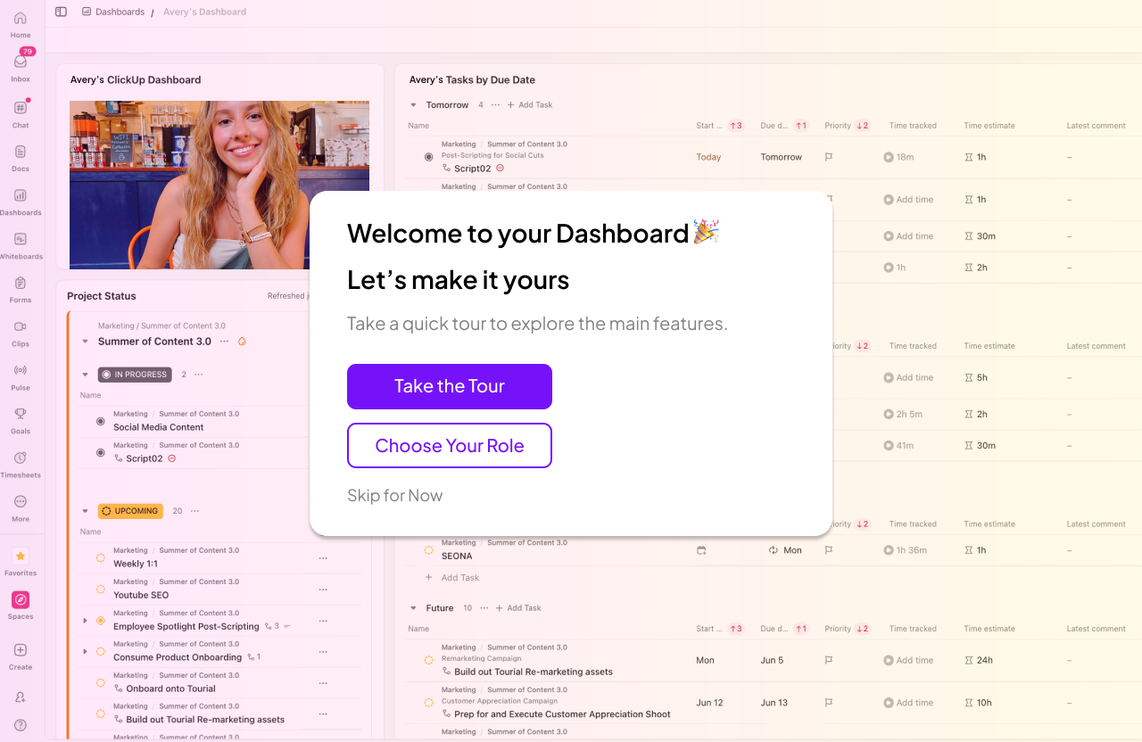

The onboarding introduction (left) and one step of the onboarding process (right).
Upon receiving feedback from my tutorial group, I recognized a few areas to adjust moving forward.
- Darken the background so users can better find the element of discussion
- Center-align my vertical buttons at the start and end of the tutorial
- Make one primary button for going back and forward through the steps
This resulted in:


More saturated background and primary “Back” and “Next” buttons (left) and center-aligned buttons (right).
IV. Results
This redesigned tutorial addresses a critical gap in the ClickUp onboarding experience by making the dashboard feel less overwhelming and more relevant to the user’s role. By offering a guided, role-specific introduction, the experience empowers users to explore key features with greater clarity and confidence.
I learned to be more intentional with my design decisions, such as ensuring user autonomy, I gained experience working within an existing brand system, and I learned how to break down a complex problem using a user journey map, which helped me identify key pain points and uncover opportunities for meaningful solutions.
In future iterations, we would explore making the walkthrough more personalized and incorporating real-time user data to enhance personalization even further.
메타데이터
- post_id
- 910371dcfad0
- slug
- clickup-dashboard-onboarding-redesign-project-910371dcfad0
- url
- https://medium.com/@mgc40604/clickup-dashboard-onboarding-redesign-project-910371dcfad0
- canonical_url
- https://medium.com/@mgc40604/clickup-dashboard-onboarding-redesign-project-910371dcfad0
- author_url
- https://medium.com/@mgc40604
- status
- ok
- fetched_at
- 2026-06-25 16:53:31