Finding a Vacation Week
Week 7: Making Sense of Weather Data — From Confusion to Clarity
Finding a Vacation Week
Week 7: Making Sense of Weather Data — From Confusion to Clarity

This week at the Dataraflow Internship marked a turning point in my journey as I moved from simply analyzing datasets to truly understanding the meaning behind the data. The project for the week focused on weather data analysis, specifically using London’s daily weather records for 2023 to determine the best two weeks of the year based on various meteorological parameters.
At first, the task sounded straightforward, I just have to use Python, Pandas, and Matplotlib to clean, analyze, and visualize weather data and I’m done. But once I opened the dataset, I realized that what seemed simple in theory was actually filled with unfamiliar terms and cryptic abbreviations. Columns like tavg, tsun, prcp, and wspd didn’t make much sense at first glance.
I had to take a step back and learn the language of weather.
I spent time reading about meteorological terms , what exactly do these things measure? Why is mean gust speed important? How does sunshine duration relate to temperature averages? Slowly, I began to see how these variables interact to paint a picture of a region’s climate. That moment of understanding completely changed how I approached the project. I realized that data science is not just about coding, but about context. Without understanding what the variables mean, the analysis can be misleading or shallow.
Breaking Down the Weather Data
The dataset contained daily weather readings, which meant I needed to aggregate them into weekly summaries to identify patterns and trends over time. Using Pandas’ datetime indexing and resampling functions, I was able to group the data week by week and compute the mean values for temperature, precipitation, sunshine, and wind speed.
Each of these parameters plays a different role in determining weather comfort:
Average temperature (tavg): A moderate temperature range is usually ideal for comfort.
Precipitation (prcp): Lower rainfall is desirable for outdoor activities.
Sunshine duration (tsun): More sunshine hours generally correspond to clearer, pleasant days.
Wind speed (wspd): While some breeze can be refreshing, excessive wind can make conditions harsh.
Once I had the weekly summaries, I created a composite score to rank each week. The logic was simple: higher temperature and sunshine hours improve the score, while higher rainfall and wind speed reduce it. This required applying ranking logic in Pandas , ranking some parameters in ascending order (like rainfall) and others in descending order (like sunshine).
After computing the scores, I sorted the weeks to identify the best two weeks of the year based on the combined metrics. The results were fascinating, the best weeks had a balanced mix of warm temperatures, minimal rainfall, and consistent sunshine, all of which contributed to pleasant weather conditions.
weekly_summary['Score'] = (
    weekly_summary['tavg'].rank(ascending=False) +
    weekly_summary['prcp'].rank(ascending=True) +
    weekly_summary['tsun'].rank(ascending=True) +
    weekly_summary['wspd'].rank(ascending=False)
)
best_weeks = weekly_summary.sort_values('Score', ascending=True)
best_weeks.head(10)
Visualizing the Insights
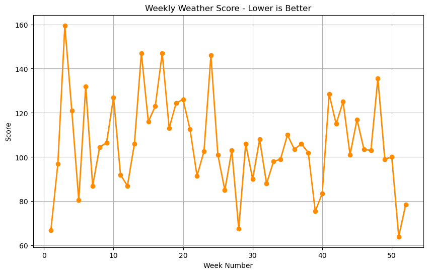
After crunching the numbers, the next step was to visualize the data using Matplotlib. I plotted line graphs for temperature, rainfall, and sunshine hours across the weeks to get a clearer picture of the seasonal variations.
The visuals told stories that raw numbers couldn’t.
I could clearly identify the wettest periods, the sunniest weeks, and the mild, comfortable stretches that likely felt perfect for outdoor activities. It was exciting to see how these visual patterns matched the numerical rankings confirming that my scoring logic worked well.
Interestingly, I also noticed spikes in wind speed around mid-February, suggesting stormy conditions during that period. Such insights highlighted how data visualization makes patterns easier to detect and communicate.
Challenges and Learning Moments
This week was not without its struggles.
Handling missing values, converting date formats, and ensuring correct time-based grouping all presented technical challenges. At one point, I mistakenly used a dropna() function that cleared almost my entire dataset, a small but frustrating bug that taught me the importance of cautious data cleaning.
The most confusing part, however, was understanding the terminology and meteorological context. Initially, I didn’t grasp how these parameters related to real weather behavior. But after reading more and experimenting, everything started connecting. It was rewarding to see how scientific understanding and coding skills complemented each other.
Another major learning moment came when I realized the importance of choosing the right parameters. The idea of “best weather” is subjective, for example, someone who loves hiking might prefer slightly cooler conditions, while someone planning a vacation might prefer higher sunshine. Understanding the purpose of the analysis helped me fine-tune which metrics mattered most.
Reflection
Looking back, this week was one of the most enlightening so far. It reminded me that data analysis is not about the tools, it’s about the story. Tools like Pandas and Matplotlib are powerful, but their real value lies in how they help us translate complex datasets into clear, actionable insights.
Before this week, I mostly saw data as numbers in columns. But now, I see data as a representation of real-world phenomena: temperature fluctuations, rainfall patterns, wind behavior, and seasonal cycles.
Through this weather data project, I also learned patience, because real understanding takes time. From dealing with confusing variables to troubleshooting plotting errors, every challenge pushed me closer to becoming a more thoughtful and context-aware data analyst.
Conclusion
Week 7 was all about turning confusion into clarity. I started off puzzled by strange weather abbreviations and ended the week being able to tell meaningful stories from them. I learned to merge domain understanding with data science tools , a skill that will remain valuable throughout my career.
This week didn’t just make me a better analyst; it made me a better observer of the world.
메타데이터
- post_id
- 92dfd15d6c91
- slug
- finding-a-vacation-week-92dfd15d6c91
- url
- https://medium.com/@ludesam2/finding-a-vacation-week-92dfd15d6c91
- canonical_url
- https://medium.com/@ludesam2/finding-a-vacation-week-92dfd15d6c91
- author_url
- https://medium.com/@ludesam2
- status
- ok
- fetched_at
- 2026-06-26 12:24:55