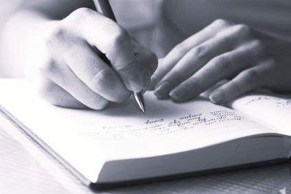
Calligraphy Course taught by Academias Pitman of Argentina
By Martín E. Córdoba (former parliamentary stenographer, former Pitman Shorthand teacher, and shorthand calligrapher)
Calligraphy Course taught by Academias Pitman of Argentina
By Martín E. Córdoba (former parliamentary stenographer, former Pitman Shorthand teacher, and shorthand calligrapher)
These two notebooks shown in the photographs, with theory and practical exercises to learn how to write the English, Bastard, and Gothic scripts, are only part of the study material of the excellent Calligraphy Course taught by Academias Pitman at its Buenos Aires headquarters and across its branches for many years. The complete course included other styles, such as cursive and round. The method was devised by professor Eduardo N. Calcagno, who also served as the institution’s general secretary in 1968, signing diplomas together with professor Juan María Jan, general director of Academias Pitman. On the covers appears the seal of Academias Pitman of Tucumán, the branch that was located at 25 de Mayo 195 in San Miguel de Tucumán.
Below, I transcribe only some parts of the complete theory found in these notebooks:
“Nuevo Método de Caligrafía Pitman. Notebook Nº 2: English Script (21st edition, 1966)
The English script is the master type par excellence and is used not only as ordinary writing but also as ornamental lettering in letterheads, titles, etc., due to the beauty of its strokes. It is a slanted type of script like commercial cursive, but it differs fundamentally in that its strokes are not uniformly thin: it requires both fine and thick strokes; the former, called outlines, are obtained by moving the pen without any pressure that might open its nibs; and the latter, simply called thick strokes, are obtained by applying more or less strong pressure to separate the nibs until the desired width is achieved.”

“Nuevo Método de Caligrafía Pitman. Notebook Nº 3: Bastard Script (22nd edition, 1971)
The Bastard script, so called because it partakes of both the English and the Round scripts, is of Roman origin, which is why it is also called Italian. From the English it takes its slant, approximately 65 degrees, and from the Round it takes its typical features; that is to say, its thick strokes and outlines do not depend, as in the English, on the greater or lesser pressure applied to the pen, but rather result from the cut and position of the pen.”


“Nuevo Método de Caligrafía Pitman. Notebook Nº 3: Gothic Script (22nd edition, 1971)
The Gothic script is of Germanic origin and is characterized by rectilinear and angular strokes with vertical cut. It was widely used in antiquity and still is, especially in its country of origin. It is customary, however, to call Gothic English the one that preserves almost entirely the rectilinear and angular characteristics, and Gothic German the one in which curved strokes predominate.”
The notebooks contained the following sections for each style of lettering: “Body position for writing”, “Pen position”, “Notebook position”, “Letter proportions”, “Slant of letters”, “Preparatory exercises”, “General considerations”, and “Pens to be used”. The section dedicated to slant was particularly relevant in styles such as Bastard and English script, characterized by a marked obliqueness and the need to maintain a constant angle in the strokes
In the section “Preparatory Exercises” of Notebook Nº 4: Commercial Cursive Script (23rd edition, 1975), the following is stated:
“The preparatory exercises found in Notebook Nº 1, pages 1 to 10 inclusive, intended to help the student acquire flexibility of the hand, may be expanded, at the teacher’s discretion, if considered insufficient, or repeated until the student masters the movements of flexion and extension of the hand.”
The following excerpt is part of the section “Position of the Pen” from Notebook Nº 2: Round Script (22nd edition, 1971):
“Since the round script is composed of fine strokes and thick strokes, and these do not depend on the greater or lesser pressure exerted on the pen, but rather on its size, it is especially recommended not to apply any pressure, sliding the pen as smoothly as possible over the paper. The oblique strokes are fine and the vertical strokes are thick. When executing curved strokes, it is not necessary to bend the pen, which should always maintain the same position.”
With these notebooks and several more, under the guidance of a specialized teacher, I studied at Academias Pitman of Tucumán and obtained the Calligraphy certificate in April 1995.
Tribute
In issue number 58 of *Revista Pitman* (volume 10, May 1946), within the section “Nuevos diplomados Pitman” a photograph of Miss Yolanda Bonessi, recently certified in Calligraphy, is included:
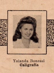
With the mention of Miss Bonessi, I wish to pay tribute to all generations of students who, from the 1930s through the 1990s and beyond, studied calligraphy at Academias Pitman and obtained their certificate. Each of them helped to keep alive a tradition that combines art, discipline, and beauty in writing. I also extend this recognition to the calligraphy teachers, whose dedication and teaching made it possible for this tradition to be transmitted and endure over time.
“Pitman Calligraphy is the art and discipline of writing beautifully by hand” (Martín Córdoba).
Author’s note: Today we know, thanks to recent studies, that handwriting activates multiple areas of the brain, especially enhancing memory and creativity. This conclusion, reported by outlets such as *The Wall Street Journal*, confirms that the practice of calligraphy not only beautifies writing but also constitutes a true intellectual exercise, valid and beneficial even in the digital age.
The notebooks shown in the photographs belong to the author’s private collection.
In the original Academias Pitman notebooks, the term “ronda” was used to designate this style of script. In contemporary Spanish usage, it is more commonly referred to as “redonda”. In this English version, we have chosen to translate it consistently as “Round script” in order to preserve fidelity to the original sources while ensuring clarity for modern readers.
The model in Bastard script of the expression “República Argentina”, which appears in the image, was created by Prof. Eduardo N. Calcagno with a broad‑nib pen Nº 2 (Nuevo Método de Caligrafía Pitman. Notebook Nº 3: Bastard Script [22nd edition, 1971], Exercise Nº 9).
We invite you to visit our blog *Shorthand Calligraphy*, a multilingual project also available in Spanish, French, Portuguese, German, and Italian.
This article is available in Spanish.
© 2026 Martín E. Córdoba. All rights reserved.
메타데이터
- post_id
- 94a9ff997d8a
- slug
- calligraphy-course-of-academias-pitman-of-argentina-94a9ff997d8a
- url
- https://medium.com/@maresteban.cordoba/calligraphy-course-of-academias-pitman-of-argentina-94a9ff997d8a
- canonical_url
- https://medium.com/@maresteban.cordoba/calligraphy-course-of-academias-pitman-of-argentina-94a9ff997d8a
- author_url
- https://medium.com/@maresteban.cordoba
- status
- ok
- fetched_at
- 2026-06-27 07:40:21