UxxU a C4 Model Diagrams Tool
When starting a new software project, there are many cases where the only thing available is the code itself. Understanding what the system…
UxxU a C4 Model Diagrams Tool
When starting a new software project, there are many cases where the only thing available is the code itself. Understanding what the system actually does takes time. We constantly navigate through files, follow entry points, and read implementation details just to build a mental model of how everything fits together.
Usually, after a couple of days, we begin to load the project’s structure into our heads well enough to move around the codebase, make decisions, fix bugs, and start building new functionality.
But even after working on the project for several months, there are often still parts of the system that remain hidden, unclear, or misunderstood. This makes it difficult to make optimal software decisions with confidence. Architecture assumptions become fragile, onboarding new team members takes longer, and even small changes can feel risky.
That is why, for a long time, I have adopted the C4 model to document the architecture of every project I build.
Having these diagrams allows me to quickly understand a project in just a few minutes and use that understanding to start improving the system, fixing issues, or adding new functionality with confidence.
The problem, however, was that I always ended up with a large collection of separate diagrams. Navigating between them became difficult. For example, moving from a System Context diagram to a Container or Component diagram was often more time-consuming than it should have been.
Instead of spending time doing the actual work, I found myself spending too much time searching for the right diagram.
That is why I created **UxxU.io**.
I wanted a tool that would allow me to create System, Container, and Component diagrams while making it easy to navigate seamlessly between them. At the same time, I wanted it to provide a visual map that gives the bigger picture — helping me understand all the diagrams that have been created, their relationships, and how they connect to each other.
To give you an idea of how it works, here is a System Diagram created with UxxU.io. As you can see, diagrams can be seamlessly embedded into Medium, Notion, and other platforms, making it easy to share architecture documentation anywhere your team works.
[embed]
Creating diagrams is easy: simply drag and drop elements such as systems, actors, and groups onto the canvas. Edit them inline for speed, or use the property editor for more advanced customization.
One of the most important capabilities is the ability to reuse existing project elements across multiple diagrams instead of recreating them. This keeps relationships intact across the entire architecture, ensuring that every diagram remains connected and always reflects the bigger picture.


It also makes it easy to define the technologies used across the architecture, attach Markdown documentation, and create custom technology items specific to your project.
This transforms your diagrams into more than just visuals, they become living documentation that brings together architecture, technology choices, and project knowledge in a single navigable workspace.
Now that we have a System Diagram, we can start adding more detail by drilling down into specific parts of the architecture. In this example, let’s focus on the Backend System.
All we need to do is click the plus button on the Backend System and choose Create New Diagram. This automatically creates a Container Diagram, where we can define all the containers that make up the backend system.

And now we can create a container Diagram that give as more detail about the Backend System:
[embed]
From there, we can continue going system by system and container by container, adding more and more detail to our C4 model. This progressive approach gives us a much deeper understanding of the architecture while keeping everything organized and easy to follow.
One of the things I really like as a user is how easy it is to navigate through all these layers of detail.
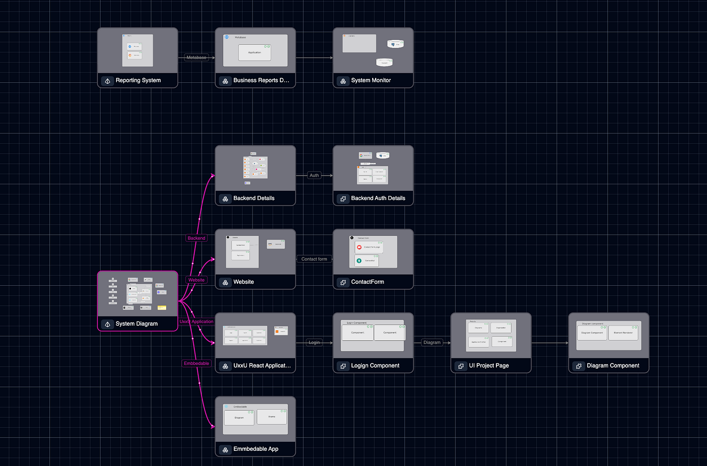
Another feature that stands out is the Diagram Map, essentially a diagram of diagrams. It provides a visual map of all the diagrams that have been created, their relationships, and how they connect to each other, making it easy to understand the bigger picture at a glance.

This is incredibly valuable because, when using other tools, I often lose track of where I am and what each diagram represents.
The Diagram Map completely solves that problem. It not only makes navigation intuitive, but also helps visualize the full complexity of the project, so you can always understand where you are and how every part of the architecture fits together.

Another thing that makes UxxU.io unique, and honestly one of the features I value the most, is the way it goes beyond diagrams and starts giving you real architecture insights.
Most tools stop at visualization. They help you draw the system, but once the diagrams are created, the tool itself does very little to help you understand what those diagrams actually mean from an architectural perspective.
With UxxU.io, I wanted something different.
I wanted the platform to help me understand the size, complexity, and evolution of the architecture over time.
For example, it can give you a clear view of the scale of the system by tracking how many systems, applications, containers, stores, actors, and other architecture elements exist in the project.
It also helps you understand the complexity of your diagrams by providing metrics such as the number of diagrams created and the density of each view.
Another part that I find incredibly useful is the ability to visualize dependencies and usage. This makes it much easier to see how systems depend on one another and quickly identify components that are heavily reused across the architecture.
One feature that becomes especially valuable in long-term projects is technology lifecycle tracking. You can classify technologies as Production, Future, Deprecated, or Removed, which helps teams manage adoption, modernization, and technical debt much more effectively.
UxxU.io also helps track how the architecture evolves over time. Being able to see when new systems, containers, or components are introduced gives teams a better understanding of how the platform is growing.
And perhaps one of the most powerful capabilities is the ability to highlight potential structural risks. For example, it can surface patterns such as highly coupled systems, dependency concentration, or possible single points of failure.
For me, this is where UxxU.io really becomes different.
To finish, another feature I really wanted in UxxU.io was real-time collaboration.
Architecture is rarely something built alone. It is usually a team effort involving developers, architects, product teams, and stakeholders. That is why UxxU allows multiple users to collaborate in real time, making it easy to design, review, and evolve architecture together.
The platform is also free to use for small projects, so it is easy to get started and try it out without any friction.
Give it a try, and let me know what you think, I would genuinely love to hear your feedback.
메타데이터
- post_id
- 9583b6992bb8
- slug
- uxxu-c4-see-the-big-picture-understand-the-details-9583b6992bb8
- url
- https://itnext.io/uxxu-c4-see-the-big-picture-understand-the-details-9583b6992bb8
- canonical_url
- https://itnext.io/uxxu-c4-see-the-big-picture-understand-the-details-9583b6992bb8
- author_url
- https://medium.com/@gquiman
- status
- ok
- fetched_at
- 2026-06-14 11:28:49