Can You Guess the Ugliest Colour in the World?
Apparently, even colours can be too ugly to sell.
Can You Guess the Ugliest Colour in the World?
Apparently, even colours can be too ugly to sell.
Photo by Andy Brown on Unsplash
I never knew that, while scrolling through YouTube, I’d ever come across a video that would tell me whether the ugliest colour even exists.
The internet calls it the ugliest colour in the world.
But the real story starts somewhere else.
In Australia, researchers were looking for a colour that could be used on cigarette packaging, to make it less appealing.
They surveyed smokers and showed them different colours, asking which ones they found least appealing.
Pantone 448 C came out on top, or perhaps, in this case, at the very bottom.
It is a strange shade somewhere between brown and green, muddy, dull, almost like something that has been sitting in the rain for too long.
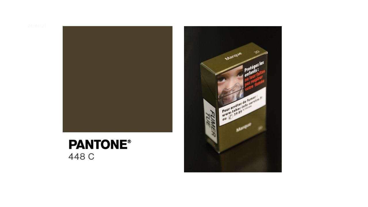
Photo 1 | Photo 2 | Collage created using Canva by Rishita Sharma💗
The idea was simple.
If cigarette packets looked unpleasant enough or even made people feel nauseated, maybe people would be less tempted to buy them.
So this muddy brown-green ended up covering cigarette packaging.
Fun fact
The color was initially described as an “olive green,” but the Australian Olive Association wasn’t particularly happy about that.
They objected because associating olives with a colour deliberately chosen to look unpleasant could affect their marketing.
So the description was changed to “drab dark brown.”
The colour is also popularly known as “Opaque Couche.”
Imagine having a colour so controversial that even the olive industry wanted its name kept away from it.
Did the experiment work?
In a way, it worked.
Smokers found the plain, unattractive packs less appealing, and the health warnings had a stronger impact.
But it didn’t immediately change how much they smoked, so the colour alone couldn’t be credited with making people quit.
Photo by Alexander Schimmeck on Unsplash
Can a colour actually be ugly?
I went looking at pictures of Pantone 448 C and then at videos about it.
The comments were almost comically divided.
Some people said,
“Yes, that’s disgusting.”
Others said, “That’s not even ugly. I’ve seen more ugly colors than this one.”
What fascinated me wasn’t the colour.
It was the idea that a colour could be declared ugly.
There are colours we call elegant, childish, luxurious, cheap, sophisticated, tacky, calming or depressing.
But colours themselves don’t seem to carry those meanings independently. We teach ourselves what they mean.
For instance,
Red for love and passion White for purity and peace Pink for affection and softness Yellow for happiness and optimism Green for nature and growth Etc.
A particular shade becomes fashionable because enough people decide it is fashionable.
We all know what happened with beige lately.
If a celebrity or influencer wears it. A designer puts it on a runway.
Suddenly, the colour we ignored yesterday becomes the colour of the season.
The same thing can happen in reverse.
Pantone 448 C isn’t inherently ugly.
Perhaps it was placed in a context where ugliness was the desired response.
- Put that same colour on a cigarette packet, surrounded by warnings and images of damaged lungs, and it feels unpleasant.
- Put it on a beautifully cut coat, against the right background, and it might look earthy, understated, even expensive.
That’s the real trick of colour.
We don’t just see colours.
We see them in context.
We attach memories, associations and meanings to them. We decide what belongs together and what doesn’t.
So, is Pantone 448 C the ugliest colour in the world?
I don’t think so.
It might be the colour that a group of people found least appealing in a particular experiment, for a very particular purpose.
But ugly?
I’m not sure colours deserve that much blame.
Maybe, nothing is inherently ugly.
We just haven’t seen it in the right light yet.
Thank you for reading!🌷
Source: [Effects of first exposure to plain cigarette packaging on smoking behaviour and attitudes: a randomised controlled study — PubMed Central.](https://pmc.ncbi.nlm.nih.gov/articles/PMC4394558/)
What are your thoughts on this? Did you find it ugly, or was it okay-ish?
Follow me, repost the story. I appreciate you for that, and leave lots of love for me in the claps(50).
Love always Rishita Sharma💗 **Buy me a cupcake!🧁 Connect with me on LinkedIn and Instagram.**
[embed]I May Have Cracked Why My 20s Feel So Lonely, Hard, and Confusing Maybe yours do too.medium.com
[embed]When Death Finds Me Some things I’d like to have sorted before it's time.medium.com
메타데이터
- post_id
- 95f90f20f4b3
- slug
- can-you-guess-the-ugliest-colour-in-the-world-95f90f20f4b3
- url
- https://medium.com/illumination/can-you-guess-the-ugliest-colour-in-the-world-95f90f20f4b3
- canonical_url
- https://medium.com/illumination/can-you-guess-the-ugliest-colour-in-the-world-95f90f20f4b3
- author_url
- https://medium.com/@rishitaaasharmaaa
- status
- ok
- fetched_at
- 2026-08-10 05:41:21