UI vs UX Design: What Business Leaders Must Understand in 2026
UI (User Interface) design is what users see. UX (User Experience) design is what users feel — and do.
UI vs UX Design: What Business Leaders Must Understand in 2026
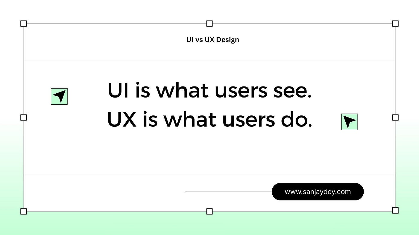
- UI (User Interface) design is what users see. UX (User Experience) design is what users feel — and do.
- Confusing the two leads to products that look polished but fail to convert, retain, or satisfy.
- McKinsey research shows companies that invest in UX design outperform industry benchmarks by 32% in revenue growth.
- Most business teams over-invest in visual UI and under-invest in UX research, task flows, and usability testing.
- The right question is not “should we hire a UI or UX designer?” — it is “do we understand the difference well enough to brief either one?”
Table of Contents
- Why Most Business Leaders Get This Wrong
- Defining UI Design: What It Is and What It Is Not
- Defining UX Design: The Discipline Most Teams Undervalue
- UI vs UX Design: The Core Differences Explained
- How UI and UX Work Together — and When They Break Apart
- The Business Cost of Getting This Wrong
- Real Business Examples: UI vs UX in Action
- UX Design and Conversion: The Numbers That Matter
- How to Build the Right UI/UX Design Strategy for Your Company
- UI vs UX by Market: Regional Context for USA, UK, UAE, Australia, India
- Answer Capsules: Standalone Definitions and Explanations
- FAQ: UI vs UX Design for Business Leaders
Why Most Business Leaders Get This Wrong
I have sat in more client briefings than I can count where the request was the same: “We need a UI redesign.” What followed — every time — was a conversation that revealed the real problem was something the design team could not solve with typography and colour palettes.
One enterprise banking client in the UK was processing complaints that their platform was “confusing.” Their instinct was to commission a visual refresh. After a moderated usability test with 12 representative users, we identified 23 friction points in the task flow — none of which were visual. Users were confused by the information architecture, not the interface aesthetics. A visual redesign would have spent £80,000 and solved nothing.
That is the difference between UI and UX design in practice.
Business leaders are not expected to know the technical vocabulary of design. But when you commission a product, build a SaaS tool, or redesign your website, you are making UI/UX decisions — whether you realise it or not. The vocabulary shapes the brief. The brief shapes the outcome. And the outcome determines whether your digital investment pays off.
This article explains the difference between UI and UX design clearly, grounded in how it affects your business — not in abstract design theory.
Defining UI Design: What It Is and What It Is Not
UI stands for User Interface. It refers to every visual and interactive element a user touches when using your product or website.
Buttons, typography, colour systems, iconography, spacing, form fields, navigation bars, modal windows, loading states — these are all UI design. A UI designer is responsible for how a product looks and how each individual element behaves in isolation.
Good UI design produces:
- Visual consistency — elements look and behave the same way throughout the product
- Brand alignment — the interface reflects the company’s visual identity
- Aesthetic clarity — contrast, hierarchy, and spacing guide the eye without confusion
- Accessible components — colour contrast ratios, font sizes, and interaction targets that meet WCAG 2.2 standards
What UI design does not produce on its own: a product that is easy to use, logical to navigate, or efficient at helping users complete their goals.
A UI designer working without UX research is making visual decisions in the dark. They can produce something beautiful. But without understanding task flows, user goals, and failure points, that beauty is decorative — not functional.
[ALT: A comparison diagram showing UI design elements — buttons, typography, colour palette — on the left and UX design elements — user journey map, information architecture, usability test — on the right]
Defining UX Design: The Discipline Most Teams Undervalue
UX stands for User Experience. It is the practice of designing the entire experience a person has when using your product — before, during, and after any single interaction.
UX design begins before a single pixel exists. It starts with questions: Who are the users? What are they trying to accomplish? Where do they currently fail? What mental models do they bring to this product?
A UX designer’s core outputs include:
- User research — interviews, surveys, contextual inquiry, diary studies
- Personas and empathy maps — synthesised portraits of real user types, their goals, frustrations, and behaviours
- Information architecture — how content and features are organised and labelled
- Task flows and user flows — the sequence of steps a user takes to complete a goal
- Wireframes — low-fidelity structural layouts without visual styling
- Usability testing — testing designs with real users to identify failure points before development
Nielsen Norman Group, the research organisation that defines evidence-based UX practice, describes UX as encompassing “all aspects of the end-user’s interaction with the company, its services, and its products.” That is a deliberately broad definition. It includes the error message a user reads when something fails. It includes how fast your checkout form loads. It includes what happens when a new user opens your SaaS product for the first time and has no idea where to start.
None of that is visual design. All of it is UX design.
If you want to understand how UX research connects to actual design decisions, my article on AI-powered UX research methods in 2026 covers the emerging tools reshaping how research is done.
UI vs UX Design: The Core Differences Explained
Here is the clearest way to frame the distinction:
DimensionUI DesignUX DesignFocusHow the product looksHow the product worksPrimary outputVisual components, style guides, design systemsResearch, wireframes, task flows, prototypesPrimary question”Does this look right?””Does this work for the user?”ToolsFigma, Adobe XD, design tokensUser interviews, card sorts, heuristic evaluations, journey mapsMeasures success byAesthetic quality, brand alignmentTask completion rate, error rate, time-on-taskHappens whenAfter UX defines structureBefore visual design beginsClosest analogyInterior designArchitecture
That architecture analogy is worth expanding. An architect designs the layout of a building — where the rooms are, how people move through the space, where the load-bearing walls go. An interior designer makes that space visually appealing — the colours, the furniture, the lighting. You need both. But if the architect makes fundamental errors in the floor plan, no amount of interior design fixes a building where the kitchen is on the wrong floor.
UX design is architecture. UI design is interior design.
A related and often confused question is whether UX strategy sits above UX design — it does, and I have written about how UX strategy connects to business outcomes in detail.
How UI and UX Work Together — and When They Break Apart
In a well-run product team, UX and UI design are sequential and interdependent.
UX research identifies who the users are and what they need. That research informs information architecture — the skeleton of the product. Wireframes translate that architecture into screen layouts. Usability tests validate those wireframes before visual design begins. Then UI design applies colour, typography, and visual hierarchy to a structure that has already been validated.
That is the process on paper. Here is what actually happens in most organisations.
Development timelines compress. Stakeholders push for something they can see quickly. UX research gets cut or skipped entirely. A designer jumps straight to high-fidelity mockups. The product ships looking polished — and then users cannot figure out how to complete the primary task.
This is not a hypothetical. Baymard Institute’s research on eCommerce checkout usability found that 69.99% of online shopping carts are abandoned before purchase. Their analysis of 44 major eCommerce sites identified 254 checkout usability issues — the vast majority structural, not visual. Users were not leaving because the buttons were the wrong shade of blue. They were leaving because the flow was broken.
The breakdown point is almost always the same: UI design happened without UX design. Or UX research happened but was not connected to the design decisions that followed.
For SaaS products specifically, this dynamic drives churn. When users cannot find features, misunderstand navigation labels, or hit dead ends in a workflow, they do not complain — they leave. I have written about UX design mistakes that lose customers and the patterns are consistent regardless of industry.
The Business Cost of Getting This Wrong
This is where the conversation needs to shift for business leaders. The question is not “What is the difference between UI and UX?” The question is “What does it cost my business when I invest in one without the other?”
The numbers are specific and well-documented.
On UX investment returns: Every £1 invested in UX returns £100 on average — a 9,900% ROI — according to research cited by Forrester. That figure is extreme, but the directional logic is sound: identifying a usability problem in the research phase costs a fraction of what it costs to fix it post-launch.
On cognitive load and conversion: According to Interaction Design Foundation research, reducing cognitive load — the mental effort required to use a product — directly increases conversion. Each additional step, ambiguous label, or confusing interaction pattern adds to the interaction cost a user must pay. When that cost exceeds their motivation, they leave.
On design systems and development speed: Companies with mature design systems — standardised UI component libraries built on UX research — ship products 47% faster and with significantly lower bug rates, according to data compiled by Google’s Material Design team. Design systems are where UI and UX converge into infrastructure.
On mobile: Google’s research shows that 53% of mobile site visits are abandoned if a page takes longer than three seconds to load. That is a UX failure — a performance problem — presenting itself as a business problem. A visual redesign does not fix a slow server. But UX auditing identifies it as a priority.
On SaaS specifically: According to McKinsey’s 2023 research, companies in the top quartile of design maturity outperformed their industry counterparts by 32% in revenue growth over a five-year period. Design maturity, in McKinsey’s framework, means treating UX as a strategic function — not a delivery service at the end of a product roadmap.
If you are a SaaS founder reading this, the implications are direct. I have written about UX design for SaaS revenue growth and the leverage points are consistent across company sizes.
Real Business Examples: UI vs UX in Action
Abstract definitions become concrete fast when you look at what actually changes in a product when UX design is done well.
Example 1: Enterprise Dashboard Redesign
At PwC India, I worked on analytics dashboard redesigns for enterprise clients across manufacturing, banking, and energy sectors. The consistent pattern: existing dashboards were visually well-designed — clean layouts, consistent typography, branded colour systems. But the data was organised around the database schema rather than the user’s mental model.
A plant operations manager does not think in database tables. They think in operational questions: “What failed this week? Where is production behind target? What needs my attention right now?”
We ran contextual inquiry sessions — observational research with users in their actual environment. We mapped their decision-making process, identified the 7 questions they needed answered in the first 30 seconds of opening a dashboard, and restructured the information architecture around those questions.
The visual design barely changed. Task completion time dropped by 41%. Time-to-insight — the time between opening the dashboard and making a decision — dropped from an average of 14 minutes to under 4 minutes.
That is UX design producing a business outcome. The UI design was fine all along.
Example 2: SaaS Onboarding
For a B2B SaaS product serving recruitment teams, activation rates — the percentage of new users who completed a meaningful action in their first session — sat at 23%. The product team’s instinct was to redesign the onboarding UI.
A UX audit using heuristic evaluation and session replay analysis revealed the problem: users arrived at the dashboard after signup with no contextual guidance and no clear first action. The interface was clean. The product was capable. But new users had no idea where to start.
The fix was structural — progressive disclosure, a contextual onboarding checklist, and an empty state that explained what to do rather than just showing a blank screen. I have written extensively about zero state UX design for engagement — the empty screen is one of the most underdesigned moments in any product.
Activation rates increased to 61% within 90 days. No visual redesign was required.
Example 3: eCommerce Checkout
For an eCommerce client running on Shopify, cart abandonment sat at 74% — five points above Baymard Institute’s industry average. Analysis using user session recordings and funnel analytics identified three specific UX failures:
- The shipping cost was not visible until the final checkout step
- Account creation was mandatory before purchase was possible
- The error messages on the payment form were generic and did not identify the specific field that failed
Three structural changes, no visual redesign: show shipping cost at the cart stage, add guest checkout, rewrite error messages to name the failing field. Cart abandonment dropped to 58% within six weeks.
That is UX research directly connected to revenue. For Shopify-specific UX patterns, see my article on mobile commerce UX to reduce cart abandonment.
The UX Design Process: What Actually Happens
Business leaders often approve UX work without understanding what is actually being produced at each stage. That gap creates unrealistic timelines, misaligned expectations, and the recurring mistake of skipping phases that look slow but are the most valuable.
Here is what a rigorous UX design process looks like — and what each stage produces.
Phase 1: Discovery Research (2–4 weeks)
Discovery research is where UX design begins. The goal is to understand the user population before designing for them.
Methods used:
- User interviews — structured or semi-structured conversations with 8–12 representative users. Qualitative, not quantitative. The goal is to understand mental models, current behaviours, and unmet needs.
- Contextual inquiry — observing users in their actual environment while they perform relevant tasks. This is not a lab study. Watching a plant manager use an enterprise dashboard in a noisy control room reveals behaviours no interview can capture.
- Diary studies — participants log their interactions with a product or workflow over days or weeks. Useful for understanding episodic or infrequent behaviours.
- Survey research — quantitative data from larger user populations. Useful for validating patterns identified in qualitative research, not for discovering them.
Deliverables: affinity diagrams, research synthesis reports, user personas, and empathy maps.
Nielsen Norman Group’s model of empathy mapping — plotting what users say, think, do, and feel — is one of the most practical tools for turning raw research into design decisions. It makes user needs visible to the entire product team, not just the designers.
Phase 2: Information Architecture (1–2 weeks)
Information architecture (IA) is the discipline of organising and labelling content so users can navigate it intuitively. Poor IA is responsible for more usability failures than any other single design problem.
Methods: card sorting (open and closed), tree testing, sitemap design, content audits.
A card sort asks users to group content items into categories that make sense to them — then label those categories. The result reveals how users mentally organise information, which is almost always different from how the product team has organised it.
Tree testing validates a proposed navigation structure. Users are given tasks and asked to find where they would expect to complete them, using only the navigation labels — no visual design. If users consistently choose the wrong branch, the label or hierarchy is wrong.
This is where most enterprise software fails. Menus organised around internal business functions rather than user goals produce products where users cannot find anything.
Phase 3: Wireframing and Prototyping (2–4 weeks)
Wireframes are structural blueprints of screens — no colour, no photography, no brand styling. They show layout, content hierarchy, and interaction logic.
The purpose of low-fidelity wireframes is to test structure without the distraction of aesthetics. Stakeholders who see a polished prototype respond to visual choices. They respond to wireframes with structural feedback — which is what is needed at this stage.
High-fidelity prototypes come later, once structure has been validated. They simulate real interactions and are used in usability testing to measure user behaviour against tasks.
Phase 4: Usability Testing (1–2 weeks)
Usability testing is where assumptions are challenged with evidence.
A moderated usability test involves 5–8 participants who are given tasks to complete while a researcher observes. The researcher does not help. They watch where users hesitate, misinterpret labels, click the wrong element, or abandon the task entirely.
Nielsen Norman Group’s research established that 5 users will find approximately 85% of usability problems in any given interface. This is not a small sample — it is an efficient one. Beyond 5 users in a single round, you are hearing the same problems repeated.
Unmoderated remote testing — through tools like UserTesting or Maze — scales this process. Participants complete tasks at home on their own devices. Session recordings and click maps reveal patterns across larger samples.
Phase 5: Iteration and Handoff
Usability testing produces a prioritised list of issues. The UX designer addresses structural problems in a second or third wireframe iteration — not by patching the existing design, but by re-examining the underlying flow.
Once the structure is stable and validated, UI design begins. The handoff from UX to UI should include annotated wireframes, interaction specifications, and a documented list of edge cases. Anything undocumented in the handoff will be designed inconsistently by the UI designer or interpreted arbitrarily by the developer.
This is where design tokens and design systems become essential — and why investing in UI design systems and component libraries at scale pays for itself through development efficiency alone.
The Role of Accessibility in UI and UX Design
Accessibility is not an optional feature layer. It is a design discipline that sits across both UI and UX — and it affects a larger audience than most product teams realise.
The World Health Organization estimates that 1.3 billion people globally live with some form of disability. In the US, approximately 26% of adults have a disability that affects how they use digital products. In the UK, the Equality Act 2010 places legal obligations on organisations to ensure digital products are accessible.
From the UX side: Accessibility in UX means designing task flows that work for users with cognitive disabilities, low digital literacy, or situational impairments (using a phone in sunlight with one hand). It means writing microcopy that is clear without relying on visual cues alone. It means ensuring that error states and feedback are communicated through multiple channels — not just colour.
From the UI side: Accessibility in UI means colour contrast ratios that meet WCAG 2.2 AA requirements (4.5:1 for normal text), focus states that are visible for keyboard navigation users, touch targets that are large enough for motor-impaired users (minimum 44×44 pixels per Apple’s Human Interface Guidelines), and screen reader-compatible semantic HTML.
The business case for accessibility is separate from the legal obligation. Accessible products are better products. When you design for the edges of the user spectrum — users with slow connections, small screens, motor impairments, or low literacy — you improve the experience for everyone. This principle is known as the “curb cut effect.”
For a detailed technical and design guide, my article on accessibility-first design and WCAG 2.2 standards covers implementation for complex UI components.
Design Systems: Where UI and UX Converge
A design system is the infrastructure that connects UX research to UI output — and keeps both aligned over time.
At its core, a design system is a shared library of reusable UI components (buttons, forms, cards, navigation patterns) built on documented design decisions that trace back to UX research. It includes design tokens — the raw values that define colour, spacing, typography, and elevation — and the rules that govern how components are used.
Without a design system, UI design produces inconsistency. Different designers use different button sizes. Different screens handle error states differently. The visual language fragments as the product grows.
With a design system, UI decisions are made once and applied everywhere. Development speeds up because engineers consume pre-built components rather than interpreting design files. Design reviews shrink because consistency is structural, not dependent on individual attention.
For UX, the design system serves a different function: it encodes validated interaction patterns. When a UX designer has established through testing that a particular modal confirmation pattern reduces accidental data deletion, that pattern goes into the design system — and every product team inherits the validated behaviour.
The largest technology companies in the world — Google (Material Design), Apple (Human Interface Guidelines), IBM (Carbon Design System) — have published their design systems as public resources. This is partly altruistic, but mostly strategic: they benefit from an ecosystem of products that behave consistently with their platforms.
For mid-market SaaS companies building their own systems, the ROI calculation is straightforward. Shopify’s Polaris design system reportedly cut design review time by 40% and reduced UI-related development bugs significantly after its implementation. The investment in system documentation pays back in reduced iteration cycles and faster feature development.
I have written in depth about atomic design systems and component architecture for those building or scaling a design system for the first time.
Common Misconceptions About UI vs UX Design
Getting the distinction right matters — but so does correcting the misconceptions that persist in most organisations.
Misconception 1: UX is just wireframing
Wireframing is one output of UX design. It is not the whole discipline. A designer who produces wireframes without conducting user research is not doing UX design — they are doing structural guesswork. Wireframes without research are hypotheses. Wireframes grounded in observed user behaviour are validated structure.
Misconception 2: A good UI makes up for bad UX
It does not — and the evidence is consistent. Aesthetic quality builds initial trust. But users encounter UX failures within minutes of using a product. Beautiful interfaces with broken task flows create a specific kind of frustration: users feel cheated by the promise of quality that the experience does not deliver.
Misconception 3: UX research takes too long for startup timelines
Five moderated usability tests take two to three days to conduct and can be scheduled within a week. A card sort with 30 participants takes a day to set up and a week to run. The idea that UX research is incompatible with startup speed is based on a misunderstanding of the methods available. Guerrilla usability testing — informal, unmoderated, conducted with whichever representative users are accessible — can produce directionally valid findings within 48 hours.
The question is not “do we have time for research?” The question is “can we afford to build the wrong thing and rebuild it later?”
Misconception 4: UX and UI design are the same job
Some designers work across both disciplines. But the skills are distinct, and in any organisation of scale, they require separate function. Merging the roles under budget pressure means one discipline will be consistently under-resourced. Typically, it is UX research — the less visible, harder-to-evaluate discipline — that gets cut.
Misconception 5: UX is only relevant for consumer products
B2B product UX research has historically been thin compared to consumer research. The assumption was that enterprise users are trained, patient, and captive. None of those assumptions hold any longer.
Enterprise software is now benchmarked against consumer products. When a finance analyst uses Monzo on their personal phone and then opens your enterprise finance dashboard, they are making a comparison. Gartner’s research on enterprise software adoption consistently identifies UX quality as one of the top three factors in purchase decisions and renewal rates.
UX Design and Conversion: The Numbers That Matter
Key Statistics Block
MetricSourceFigureCart abandonment rate (average, all industries)Baymard Institute, 202469.99%Revenue increase from superior UX designMcKinsey, 2023Up to 32%ROI on UX investmentForrester Research$100 return per $1 investedMobile site visits abandoned after 3-second loadGoogle, 202453%Improvement in task completion with progressive disclosureNielsen Norman GroupUp to 20%Increase in conversion from improved checkout UXBaymard InstituteUp to 35.26%Companies with design-led culture outperforming S&PMcKinsey Design Index2x
These are not soft metrics. They are revenue, retention, and operational efficiency figures — and they all trace back to UX design decisions, not visual design decisions.
How to Build the Right UI/UX Design Strategy for Your Company
There is no universal answer to “should we hire a UI designer or a UX designer?” The answer depends on where your product is in its lifecycle and where your current failures are.
Here is how to think about it.
Step 1: Diagnose Before You Design
Before commissioning any design work, identify the actual failure mode.
Are users confused about what your product does? That is a UX problem — likely information architecture or onboarding. Are users abandoning a specific flow? That is a UX problem — likely task flow friction or missing feedback states. Does your product work fine but look inconsistent or outdated? That is a UI problem — likely design system debt.
Most digital products have both problems simultaneously. The sequence matters: fix the structure before polishing the surface.
Step 2: Define Your UX Maturity Level
Nielsen Norman Group’s UX maturity model describes six stages from “Absent” (no UX practice) through “Systematic” (UX is embedded in every product decision). Most organisations sit at stage 2 or 3: UX exists but is reactive, project-based, and disconnected from strategy.
Moving from reactive to systematic UX requires treating research as infrastructure — not a one-off project before a major launch. That means user research cadence, design systems, documented design principles, and cross-functional collaboration between design, product, and development.
My UX roadmap framework covers how to structure this progression for organisations at different maturity levels.
Step 3: Build Your Design Team Around the Problem — Not the Job Title
A common mistake: hiring a “UI/UX designer” and expecting them to perform both roles at full depth simultaneously. The disciplines are related but require different skills, different tools, and different mindsets.
At early product stage — pre-product-market fit — you need UX research skills most. Understanding user needs before building saves months of rework. At growth stage, you need UX optimisation and UI consistency — design systems, component libraries, and conversion-focused interaction patterns. At scale, you need both disciplines as separate functions.
If budget forces a generalist hire, prioritise UX research capability over visual polish. A product with rough UI that solves the right problem will always outperform a beautiful product that solves the wrong one.
Step 4: Measure the Right Things
Most companies measure design through subjective approval — “does the stakeholder like how it looks?” That is a UI metric applied to a UX question.
Measure UX with:
- Task completion rate — what percentage of users complete the intended goal?
- Time on task — how long does it take to complete a core workflow?
- Error rate — how often do users make recoverable mistakes?
- System Usability Scale (SUS) — a validated 10-item questionnaire that produces a usability score comparable across products
- Net Promoter Score by segment — are usability issues driving detractor responses?
Measure UI with:
- Brand consistency audits — are design system components being used correctly?
- Accessibility compliance scores — WCAG 2.2 pass rates across screens
- Design-to-development handoff errors — how many visual inconsistencies appear in the built product?
These are different instruments for different questions. Use the right one for what you are actually trying to learn.
For a detailed look at how UX improvements translate to measurable customer trust metrics, see my analysis of UX improvements that build customer trust in 2026.
Step 5: Connect Design Decisions to Business Outcomes
Every design decision should be traceable to a business metric. This is the discipline that separates strategic UX practice from aesthetic exercise.
When a UX designer recommends progressive disclosure in a complex form — revealing fields only when relevant — the rationale is not “it looks cleaner.” The rationale is: “Reducing field count in the initial view decreases perceived task complexity, which reduces abandonment at this step by an estimated 15–22% based on Baymard Institute’s benchmark data.”
That is a design rationale a CFO can evaluate. That is how design earns organisational trust.
UI vs UX by Market: Regional Context
United States
US-based SaaS companies face the highest competitive pressure on UX quality. American users have high digital literacy and low tolerance for friction. The average US consumer uses 9.5 apps per day (Salesforce, 2024), meaning they bring comparative benchmarks to every product they touch. UX failure in the US market translates quickly to churn and negative App Store reviews. Companies like Stripe and Linear have set product UX benchmarks that B2B SaaS founders are now measured against, regardless of their category.
United Kingdom
UK digital product teams operate under dual pressure: WCAG 2.2 accessibility compliance (legally required for public sector and strongly expected in regulated sectors like financial services) and post-Brexit data residency considerations that affect how UX research is conducted. NatWest, Lloyds, and HSBC have all invested significantly in UX maturity in recent years — raising the bar for any financial service product entering the UK market. UK users respond strongly to microcopy and tone-of-voice — UI design that gets the words wrong loses trust fast.
UAE / Middle East
UAE digital product adoption is among the highest globally — smartphone penetration exceeds 97% and mobile-first usage dominates. Arabic language support requires right-to-left (RTL) interface design, which is a specialist UX and UI challenge most Western-designed products handle poorly. Government e-services in the UAE (through portals like UAE Pass) have set a high standard for clean, multilingual UX that private sector products are expected to match. UX localisation is not optional in this market.
Australia / New Zealand
Australian businesses have invested heavily in digital transformation since 2020, with UX maturity growing fastest in financial services, healthcare, and retail sectors. The Australian Consumer Law places specific obligations on digital product clarity — confusing UI that obscures pricing or terms carries regulatory risk. UX research in Australia also needs to account for significant regional variation in digital access, particularly for users outside major metropolitan areas.
India
India’s digital product market is the fastest-growing in the world — 800 million internet users and rising. UX design for India must account for device diversity (a large proportion of users on low-to-mid-range Android devices), connection variability, and multilingual user bases. Performance UX — lightweight interfaces that load fast on slower connections — is as important as visual quality. The Indian government’s Digital India initiative has raised baseline UX expectations through services like DigiLocker and UMANG. B2B SaaS products targeting Indian enterprise buyers face increasingly sophisticated UX expectations.
Answer Capsules
What is the difference between UI and UX design?
UI design (User Interface design) refers to the visual elements of a digital product — buttons, typography, colour, iconography, and layout. UX design (User Experience design) refers to the entire experience a person has when using a product, including the logic of how it is organised, how easy it is to navigate, and how well it serves user goals. UI design is a subset of UX design. A product can have exceptional UI and poor UX — it will look polished and be difficult to use. The reverse — strong UX with average UI — tends to retain users and drive conversions more reliably than the opposite.
Why does UX design matter more than UI design for business growth?
UX design determines whether users can accomplish their goals efficiently. When users complete goals efficiently, they convert, return, and recommend. When they fail — because the flow is confusing, the navigation is unclear, or the product does not match their mental model — they leave. UI design influences first impressions and brand perception. UX design influences task completion, retention, and revenue. McKinsey’s research across 300 publicly listed companies found that businesses in the top quartile of design investment grew revenue 32% faster than their industry peers over five years. That growth was driven by UX maturity, not visual aesthetics.
How do UI and UX design impact customer experience and conversions?
UI design affects initial credibility — users form visual trust assessments within 50 milliseconds of landing on a page (Nielsen Norman Group). UX design affects what happens after that first impression. If the navigation is confusing, the form requires unnecessary steps, or the error messages are cryptic, users abandon — regardless of how good the UI looks. Baymard Institute’s data shows that 69.99% of eCommerce shopping carts are abandoned. Of their documented 254 usability issues on major eCommerce sites, the majority are structural UX failures, not visual ones. Improving UX on checkout flows alone can increase completion rates by up to 35.26%.
FAQ: UI vs UX Design for Business Leaders
What is UI design?
UI design — User Interface design — is the practice of designing the visual and interactive elements of a digital product. This includes buttons, forms, navigation, typography, colour systems, spacing, and iconography. A UI designer is responsible for what users see on screen and how individual elements behave. UI design follows established design systems and visual brand guidelines. It is the discipline that makes a product look polished, consistent, and aligned with a company’s identity. UI design is necessary but not sufficient — without UX design defining the underlying structure, visual polish has no functional foundation to sit on.
What is UX design?
UX design — User Experience design — is the practice of designing the complete experience a person has when using a product or service. UX design starts with research: who are the users, what are their goals, where do they currently fail? It produces information architecture, task flows, wireframes, and prototypes — all before any visual design begins. UX design is validated through usability testing with real users. It measures success through task completion rates, error rates, and time-on-task — not aesthetics. Nielsen Norman Group defines UX as encompassing “all aspects of the end-user’s interaction with the company, its services, and its products.”
UI vs UX — what is the key difference for business leaders?
UI vs UX design — the key difference is scope and sequence. UX design defines what a product does and how it is structured. UI design defines how it looks. UX comes first; UI follows. A business leader commissioning a “design project” without this distinction risks spending budget on visual improvements that leave structural problems untouched. The diagnostic question is: are users struggling because the product looks bad, or because the product is confusing to use? The answer determines whether you need UI work, UX work, or — most commonly — both, in the right sequence.
Why do most businesses over-invest in UI and under-invest in UX?
UI is visible. Stakeholders can review a design file, react to a colour palette, and approve or reject a visual treatment in a meeting. UX research outputs — user journey maps, affinity diagrams, task flow analyses — require interpretation and confidence in the research process. There is also a timeline pressure dynamic: usability testing takes 2–3 weeks; a visual refresh can be presented in days. The result is that UX research gets compressed or skipped entirely under deadline pressure. The cost is paid later — in low activation rates, high churn, and post-launch redesigns that cost significantly more than the research would have.
To choose the right UI/UX strategy for your company, what should you do first?
To choose the right UI/UX strategy, you need to diagnose the actual failure point before commissioning any design work. Run a heuristic evaluation of your current product against Nielsen Norman Group’s 10 usability heuristics. Conduct at least 5 moderated usability tests with representative users. Analyse task completion data from your analytics — where do users drop off? The results will show you whether the problem is structural (UX) or surface-level (UI). Most products have both — but prioritising the wrong one is an expensive mistake.
How much does UX design cost compared to UI design?
UX design typically costs more upfront than UI design because it involves research, synthesis, testing, and iteration before any visual work begins. A thorough UX research and design phase for a SaaS product might run from £15,000 to £80,000 depending on scope and complexity. UI design for the same product — component library, visual design system, screen designs — might run £10,000 to £40,000. However, Forrester Research estimates that every £1 invested in UX returns £100 — because the cost of fixing structural problems post-launch is 10 to 100 times higher than identifying them during research. The cheaper option is always the one that finds the problem first.
What is the difference between a UI designer and a UX designer in terms of skills?
A UI designer’s core skills include visual design, typography, colour theory, design system management, and component-level interaction design. They work primarily in tools like Figma or Adobe XD to produce high-fidelity design files. A UX designer’s core skills include user research methods (interviews, surveys, contextual inquiry, card sorting), information architecture, wireframing, usability testing, and data synthesis. They are as comfortable with a spreadsheet of research findings as they are with a wireframing tool. In practice, many designers work across both disciplines — but rarely with equal depth. Understanding which discipline you need for which phase of your project prevents expensive mismatches between brief and skill set.
How does UX design affect SEO and organic search performance?
UX design affects SEO through three measurable mechanisms. First, Core Web Vitals — Google’s performance metrics covering page load speed, layout stability, and interaction responsiveness — are direct ranking factors. These are UX metrics, not SEO metrics. Second, bounce rate and dwell time signal to search engines whether users found what they came for. Poor UX drives bounces; strong UX keeps users on-page. Third, accessibility — WCAG 2.2 compliance — correlates with clean HTML structure and semantic markup, which benefits crawlability. I have written in detail about how good UX design boosts SEO rankings for those who want the technical breakdown.
Conclusion and Next Step
The UI vs UX distinction is not academic vocabulary. It is the difference between investing in how your product looks and investing in whether your product works.
Most businesses already have design spending in their budgets. The question is whether that spending is directed at the right problems, in the right sequence, with the right measures of success.
What I have seen consistently — across enterprise dashboards for global MNC clients, SaaS products for growth-stage startups, and eCommerce platforms in competitive markets — is that UX research prevents the most expensive mistakes. Visual polish earns the first impression. Structural soundness earns the second visit, the conversion, and the renewal.
If you are building or redesigning a digital product in 2026, start with a UX audit before commissioning any design work. Understand where users actually fail — not where stakeholders assume they fail. Then design with that evidence.
If you want an independent assessment of where your product stands, I offer UX and web design consultation at sanjaydey.com. The conversation starts with your specific product challenge — not a generic sales presentation.
Book a free UX consultation to discuss your product’s UX and UI design challenges with a practitioner who has seen these patterns across industries and geographies.
About the Author
Sanjay Kumar Dey is a Senior UX/UI Designer and Digital Strategist with over 20 years of experience across web, mobile, and enterprise analytics dashboard design. He has delivered UX and interaction design for global clients including ArcelorMittal, Adobe, NatWest Bank UK, Adani, Indian Oil, and the Government of India’s NSDC initiative. Certified by the Interaction Design Foundation and Google (Coursera), Sanjay publishes practitioner-grade design strategy content at sanjaydey.com. He works with SaaS founders, agency owners, and enterprise product teams across the USA, UK, UAE, Australia, and India.
메타데이터
- post_id
- 97ab226bb2dd
- slug
- ui-vs-ux-design-business-leaders-97ab226bb2dd
- url
- https://medium.com/@webdesignerindia/ui-vs-ux-design-business-leaders-97ab226bb2dd
- canonical_url
- https://medium.com/@webdesignerindia/ui-vs-ux-design-business-leaders-97ab226bb2dd
- author_url
- https://medium.com/@webdesignerindia
- status
- ok
- fetched_at
- 2026-06-09 15:37:30