Signifiers vs Affordance — Explained Through a Simple Story (UX for Humans)
The Morning That Taught Me UX
Signifiers vs Affordance — Explained Through a Simple Story (UX for Humans)
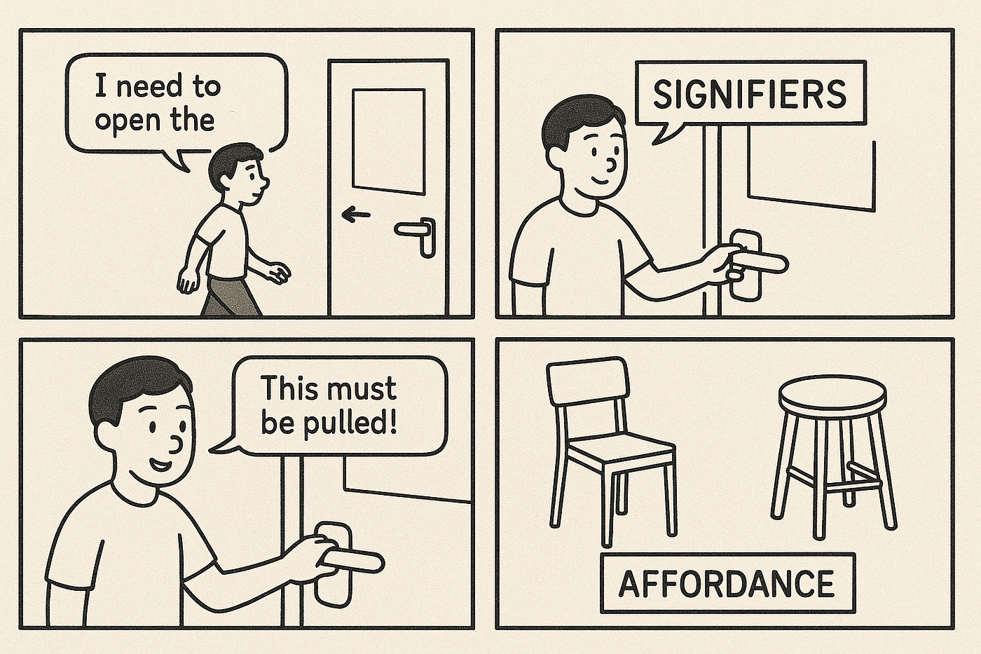
The Morning That Taught Me UX
One random Tuesday morning, I walked up to a café door, tugged it confidently… …and it didn’t move.
I pulled harder. Nothing.
Then a woman gently tapped my shoulder and said:
“It’s a push door.”
I looked again. Right above the handle was a tiny sticker: PUSH — faint, faded, and exactly where nobody looks.
That moment embarrassed me for 3 seconds… and taught me UX for life.
The Simple Secret: Signifiers vs Affordance
That door gave me an affordance — a horizontal bar that looked like something meant to be pushed.
But it didn’t give me a clear signifier — a visual clue that tells me what action to take.
That’s the difference:
Affordance
“What the object can do.” It's an inherent property.
Signifier
“What the object invites you to do.” The visible cue.
The Story Continues…
I finally entered the café. The barista said:
“Tap the screen to order.”
The screen showed: Bright button → “Start Order” A tiny bouncing arrow A glow around the CTA
I didn’t need instructions. The screen told me exactly what to do.
👉 This is a signifier done right.
Later, I placed my bag on a tall stool instead of a chair. Why? Because stools, by design, have a flatter, simpler surface.
👉 That’s affordance — the object itself suggests how it should be used.
Real-World Examples (So You Never Forget)
Doors
- Pull Handle → Affordance: can be grabbed
- “PULL” label → Signifier: tells you to pull
Light Switch
- The switch shape → Affordance
- The bulb icon → Signifier
A Login Form
- Text field → Affordance: you can type
- Blinking cursor, label “Username” → Signifier
Play Button in Apps
- Triangle symbol → Universal Signifier
Why UX Designers Must Care
Bad UX happens when: — Affordance exists — But the signifier is missing → like my café door.
Great UX happens when: — What users can do
- — What users should do → Are perfectly aligned.
This alignment reduces friction, errors, hesitation, and cognitive load.
The Takeaway (Explain Like You’re 12)
- Affordance = the object’s ability
- Signifier = the clue that guides you
- Without signifiers, users guess.
- Without affordance, users struggle.
- UX becomes magical when they work together.
Closing Line for Medium
Next time you’re stuck at a door, tapping a screen, or clicking a button — smile a little. You just met the invisible heroes of design: Signifiers & Affordance.
메타데이터
- post_id
- 98e5cba67698
- slug
- signifiers-vs-affordance-explained-through-a-simple-story-ux-for-humans-98e5cba67698
- url
- https://medium.com/design-bootcamp/signifiers-vs-affordance-explained-through-a-simple-story-ux-for-humans-98e5cba67698
- canonical_url
- https://medium.com/design-bootcamp/signifiers-vs-affordance-explained-through-a-simple-story-ux-for-humans-98e5cba67698
- author_url
- https://medium.com/@supreeth.gani
- status
- ok
- fetched_at
- 2026-07-19 02:03:27



