Doherty Threshold, Goal-Gradient Effect: The UX Laws Behind Loading States, Progress Bars, and User…
I once watched a user abandon a checkout flow at step 4 of 5. Not because it was broken. Because it took 1.8 seconds to move to the next…
Doherty Threshold, Goal-Gradient Effect: The UX Laws Behind Loading States, Progress Bars, and User Abandonment
I once watched a user abandon a checkout flow at step 4 of 5. Not because it was broken. Because it took 1.8 seconds to move to the next step, and in that 1.8 seconds they opened Instagram. By the time the page loaded, they were gone. Not frustrated, not confused. Just gone.
The interface had no feedback state. No skeleton, no progress, nothing. The gap between click and response was long enough for the brain to decide there was nothing happening and look for something that was.
These two laws are both about the same thing: momentum. Flow that gets interrupted is hard to recover. Progress that is visible is motivating. Progress that is invisible might as well not exist.
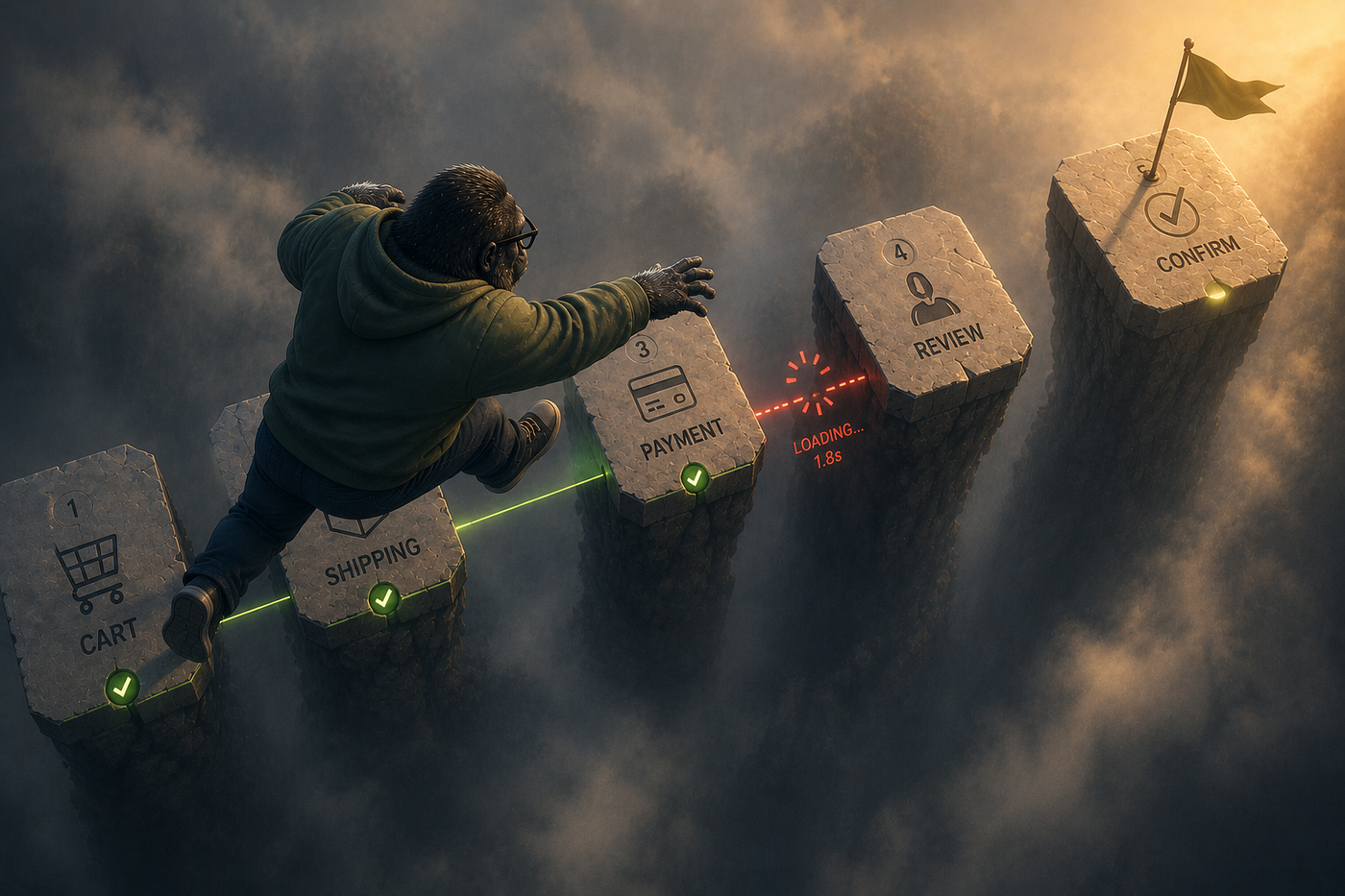
Doherty Threshold: 400ms is where flow breaks
In 1982, Walter Doherty and Ahrvind Thadani published research at IBM showing that productivity soars when a computer and its users interact at a pace under 400 milliseconds. Below that threshold, the system feels like an extension of the user’s thought. Above it, the user starts waiting. At 1 second, they start switching context. At 10 seconds, they’re often gone (source: lawsofux.com).
The original finding was about productivity in enterprise computing, but the mechanism applies everywhere: under 400ms, the human and the system feel coupled. Above it, there’s a perceptible gap, and the brain fills that gap with distraction.

400ms is where flow breaks. Actual performance is engineering’s job. Perceived performance is design’s.
The distinction between actual and perceived performance is where most teams leave real value on the table. Actual performance is how fast the server responds. It’s important, it matters, and it usually requires engineering work to improve. Perceived performance is how fast the interface feels. It’s always improvable. It’s almost entirely a design decision.
Skeleton screens that show the layout before content loads, research shows, reduce perceived wait time by 20 to 30 percent with zero change to actual load time (source: logrocket.com). Optimistic UI that shows the result of an action before the server confirms it makes interactions feel instant. Progress indicators that communicate what is happening eliminate the void that the brain fills with “is this broken.”
The spinner is the worst of the options. It communicates nothing except that something is happening. No structure, no expected duration, no sense of progress. The user stares at it and waits, and every second past 400ms increases the chance they stop waiting.
In 2026, shipping a spinner where a skeleton screen is possible is a design decision that costs real engagement. It costs most in the moments that matter: first use, onboarding, critical flows.

Actual load time is fixed. Perceived load time is a design decision.
Goal-Gradient Effect: the closer to the finish, the faster we run
Clark Hull described the goal-gradient effect in 1932 after observing that rats in a maze ran progressively faster as they approached the food reward at the end (source: lawsofux.com). The principle: motivation to complete a goal increases as the perceived distance to that goal decreases.
This isn’t specific to rats or mazes. Kivetz, Urminsky, and Zheng demonstrated it in 2006 with loyalty cards: customers given a card that required 10 stamps, with 2 already stamped as a head start, completed the card at a significantly higher rate than customers given a fresh card requiring 8 stamps. The same actual requirement. Different perceived proximity to the goal. Measurably different completion behavior (source: home.uchicago.edu).
In UX, this is the mechanism behind progress bars, onboarding step counters, profile completion percentages, and every other indicator that shows users where they are relative to where they need to be.

The closer to the finish, the faster we run. And an artificially advanced start feels like real progress.
The practical implication has two parts.
First: make progress visible. An onboarding flow without a step indicator is asking users to trust that it ends somewhere reasonable. Most won’t. Progress that is invisible might as well not exist, because it generates none of the motivational pull that visible progress does.
Second: consider endowed progress. Starting users at step 1 of 5 with 0% complete is the coldest possible start. Starting them at step 1 of 5 with “account created” already checked off, moving the progress bar to 20%, changes the psychological framing from “I haven’t started” to “I’ve already started.” The Zeigarnik Effect (covered in the previous article) handles the rest: the open loop of incompleteness pulls toward completion.
How the two work together
Doherty and Goal-Gradient are both about maintaining the state of engagement. They operate at different timescales but serve the same function.
Doherty operates at the millisecond level: keep the response fast enough that the user never has a gap to fill with something else. When response is instant, the user stays in the task. When response is slow, the loop opens and external things compete for attention.
Goal-Gradient operates at the session and flow level: show users how far they’ve come and how close they are to done. When progress is visible, motivation builds toward the end. When progress is invisible, the question “how much longer is this?” has no answer, and users fill that uncertainty with abandonment.
Together they describe the same underlying principle: flow is fragile, and the interface has to actively maintain it. Not through persuasion or dark patterns, but through mechanical honesty. Fast responses. Visible progress. Clear proximity to the finish.
Where teams get this wrong
Spinners instead of skeletons. The reflex is to add a spinner because it’s easy and “shows something is happening.” It shows the minimum possible. Replace spinners with skeletons wherever the layout is predictable. It’s nearly always predictable.
No feedback on slow actions. A button that does something expensive and shows nothing for 2 seconds will be clicked again. And again. And then the user will assume it’s broken. Every action that takes over 400ms needs visible feedback. Every action over 1 second needs a progress indicator.
Onboarding that starts at zero. If the user has already created an account, that’s a step. Mark it complete. Show it in the progress. Starting at 0% when the user is technically at 20% throws away motivation that already exists.
Progress bars with no relationship to actual progress. A bar that sits at 40% for 8 seconds and then jumps to 100% is a lie. It’s worse than no progress bar because it breaks trust at the moment it should be building it. If the actual progress is unknown, show an indeterminate indicator honestly rather than a fake percentage.
Multi-step flows with no step count. “Next” with no context of how many nexts remain is an open-ended commitment. Users accept open-ended commitments less often than bounded ones. “Step 2 of 4” is a contract. “Next” is an unknown.
A practical checklist
Doherty Threshold:
- Audit every primary action for response time. Which ones take over 400ms?
- For actions over 400ms: is there a loading state? Does it communicate structure (skeleton) or just activity (spinner)?
- For actions over 1 second: is there a progress indicator with meaningful information?
- Optimistic UI: which actions can show the result immediately and confirm async?
Goal-Gradient:
- Every multi-step flow: is there a visible step counter or progress bar?
- Does the progress bar start at 0%, or can any completed prerequisite (account creation, email confirmation) be credited to give an endowed start?
- Does progress feel proportional to actual effort, or does it stall and jump?
- What is the endpoint of the flow, and is it clearly visible from the beginning?
Flow is fragile. Momentum is earned.
Both laws point at the same thing: engaged users are not a stable state. They require active maintenance. Not through persuasion, notifications, or tricks, but through the basic mechanical honesty of an interface that responds fast and shows progress clearly.
The 1.8-second checkout gap that cost the order in the opening paragraph wasn’t an engineering failure. The server was fine. It was a design failure: no feedback state, no perceived progress, nothing to hold the user in the task for the two seconds the system needed.
That’s fixable with a skeleton. That’s fixable with an optimistic UI. That’s fixable with a progress indicator. None of those require a backend change.
They require the team to believe that 1.8 seconds of nothing is a product decision worth fixing.
I audit interfaces against Miller’s Law and 29 other UX principles using a Claude skill called Prism. Prism 👉 my Claude skill for UX audits
메타데이터
- post_id
- 99aacaa27bb6
- slug
- doherty-threshold-goal-gradient-effect-the-ux-laws-behind-loading-states-progress-bars-and-user-99aacaa27bb6
- url
- https://medium.com/@chukreiev/doherty-threshold-goal-gradient-effect-the-ux-laws-behind-loading-states-progress-bars-and-user-99aacaa27bb6
- canonical_url
- https://medium.com/@chukreiev/doherty-threshold-goal-gradient-effect-the-ux-laws-behind-loading-states-progress-bars-and-user-99aacaa27bb6
- author_url
- https://medium.com/@chukreiev
- status
- ok
- fetched_at
- 2026-07-13 06:23:13