Dimensionality Reduction: Dive into PCA, t-SNE, and UMAP
ML Quickies #31
Dimensionality Reduction: Dive into PCA, t-SNE, and UMAP
ML Quickies #31
In the world of machine learning and data science, we often encounter datasets with hundreds or thousands of features. While high-dimensional data can contain rich information, it also presents challenges: computational complexity, visualization difficulties, and the curse of dimensionality. This is where dimensionality reduction techniques come to the rescue.
Today, we’ll explore three powerful dimensionality reduction methods: Principal Component Analysis (PCA), t-Distributed Stochastic Neighbor Embedding (t-SNE), and Uniform Manifold Approximation and Projection (UMAP). We’ll understand how they work, when to use them, and see practical implementations.
Challenges of High-Dimensional Data
Before diving into solutions, let’s understand the problem. High-dimensional data suffers from several issues:
- Computational Complexity: More dimensions mean more computational resources.
- Visualization Difficulty: Humans can only perceive 2–3 dimensions effectively.
- Curse of Dimensionality: As dimensions increase, data points become increasingly sparse.
- Storage Requirements: High-dimensional data requires more memory.
Dimensionality reduction addresses these challenges by finding lower-dimensional representations that preserve important characteristics of the original data.
Principal Component Analysis (PCA)
How PCA Works
PCA is a linear dimensionality reduction technique that finds the directions (principal components) along which the data varies the most. It transforms the original features into a new coordinate system where:
- The first principal component captures the maximum variance
- Each subsequent component captures the maximum remaining variance orthogonal to previous components
- Components are ordered by the amount of variance they explain
Mathematical Foundation: PCA works by computing the eigen-decomposition of the covariance matrix. The eigenvectors become the principal components, and eigenvalues represent the variance explained by each component (higher the value, the more variance it captures).
When to Use PCA
- Your data has linear relationships.
- Noise reduction is needed.
- Interpretability is important (the principal components have clear meaning).
- Preprocessing for other algorithms.
PCA Implementation
import numpy as np
import matplotlib.pyplot as plt
from sklearn.datasets import load_digits
from sklearn.decomposition import PCA
from sklearn.preprocessing import StandardScaler
import seaborn as sns

# loading data
digits = load_digits()

# eg1: PCA on digits
def apply_pca_digits():
    # data standardization
    scaler = StandardScaler()
    digits_scaled = scaler.fit_transform(digits.data)

    # applying PCA
    pca = PCA()
    digits_pca = pca.fit_transform(digits_scaled)

    # plotting
    sns.set_style("whitegrid")
    _, axes = plt.subplots(1, 2, figsize=(12, 4))

    # cumulative explained variance
    cum_var = np.cumsum(pca.explained_variance_ratio_)
    sns.lineplot(x=np.arange(1, len(cum_var) + 1), y=cum_var, marker="o", ax=axes[0])
    axes[0].set_xlabel('Number of Components')
    axes[0].set_ylabel('Cumulative Explained Variance Ratio')
    axes[0].set_title('PCA: Explained Variance')
    axes[0].grid(True)

    # visualizing first 2 principal components
    sns.scatterplot(x=digits_pca[:, 0], y=digits_pca[:, 1],
                    hue=digits.target, palette='tab10', legend='full',
                    alpha=0.7, ax=axes[1])
    axes[1].set_xlabel(f'PC1 ({pca.explained_variance_ratio_[0]:.2%} variance)')
    axes[1].set_ylabel(f'PC2 ({pca.explained_variance_ratio_[1]:.2%} variance)')
    axes[1].set_title('PCA: First Two Principal Components')

    plt.tight_layout()
    plt.show()

# eg2: PCA with different n_components
def pca_reconstruction_example():
    # use a sample for clearer visualization
    random_index = np.random.randint(0, len(digits.data))
    sample_digit = digits.data[random_index].reshape(8, 8)

    # applying PCA with different numbers of components
    components = [1, 5, 10, 20, 40, 50]
    _, axes = plt.subplots(1, len(components) + 1, figsize=(15, 3))

    # plotting the chosen digit
    axes[0].imshow(sample_digit, cmap='gray')
    axes[0].set_title('Original (ie with all 64 components)')
    axes[0].axis('off')

    scaler = StandardScaler()
    data_scaled = scaler.fit_transform(digits.data)

    for i, n in enumerate(components):
        pca = PCA(n_components=n)
        data_pca = pca.fit_transform(data_scaled)
        data_reconstructed = pca.inverse_transform(data_pca)
        data_reconstructed = scaler.inverse_transform(data_reconstructed)

        digit_reconstructed = data_reconstructed[random_index].reshape(8, 8)
        axes[i + 1].imshow(digit_reconstructed, cmap='gray')
        axes[i + 1].set_title(f'{n} Components')
        axes[i + 1].axis('off')

    plt.suptitle('PCA Reconstruction with Different Components')
    plt.tight_layout()
    plt.show()

apply_pca_digits()
pca_reconstruction_example()
Output:
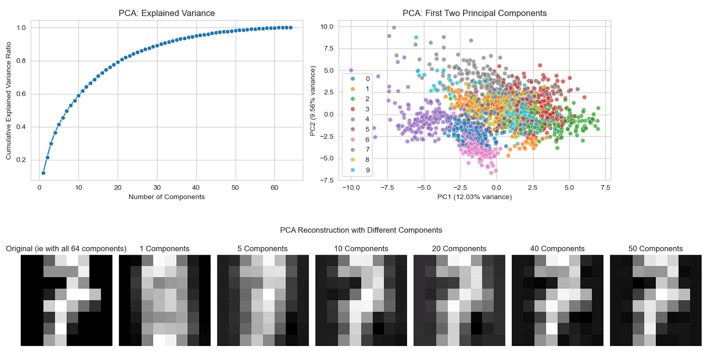
PCA Output
t-Distributed Stochastic Neighbor Embedding (t-SNE)
How t-SNE Works
t-SNE is a non-linear dimensionality reduction technique that excels at preserving local structure. It works in two steps:
- High-dimensional space: Compute pairwise similarities using Gaussian distribution
- Low-dimensional space: Use Student’s t-distribution to model similarities and minimize divergence
The algorithm iteratively adjusts points in low-dimensional space to match the similarity structure from high-dimensional space.
Key Insight: t-SNE focuses on preserving local neighborhoods rather than global structure, making it excellent for cluster visualization.
When to Use t-SNE
- Cluster visualization is the primary goal.
- Non-linear relationships exist in your data.
- Local structure is more important than global structure.
- Exploratory data analysis and pattern discovery.
- Small to medium datasets (computational complexity is high).
t-SNE Implementation
from sklearn.manifold import TSNE
import time
import numpy as np
import matplotlib.pyplot as plt
from sklearn.datasets import load_digits
from sklearn.decomposition import PCA
from sklearn.preprocessing import StandardScaler
import seaborn as sns

# loading data
digits = load_digits()

def apply_tsne():
    # data standardization
    scaler = StandardScaler()
    digits_scaled = scaler.fit_transform(digits.data)

    # applying t-SNE with different parameters
    perplexities = [5, 30, 50]
    _, axes = plt.subplots(1, len(perplexities), figsize=(15, 5))

    for i, perplexity in enumerate(perplexities):
        print(f"Running t-SNE with perplexity={perplexity}...")
        start_time = time.time()
        tsne = TSNE(n_components=2, perplexity=perplexity,
                   random_state=69, max_iter=1000)
        digits_tsne = tsne.fit_transform(digits_scaled)
        end_time = time.time()
        print(f"Completed in {end_time - start_time:.3f} seconds")

        # plotting results
        if i==0:
            sns.scatterplot(x=digits_tsne[:, 0], y=digits_tsne[:, 1],
                        hue=digits.target, palette='tab10', alpha=0.7, ax=axes[i], legend=True)
        else:
            sns.scatterplot(x=digits_tsne[:, 0], y=digits_tsne[:, 1],
                        hue=digits.target, palette='tab10', alpha=0.7, ax=axes[i], legend=False)
        axes[i].set_title(f't-SNE (perplexity={perplexity})')
        axes[i].set_xlabel('t-SNE 1')
        axes[i].set_ylabel('t-SNE 2')

    plt.suptitle('t-SNE: Effect of Perplexity')
    plt.show()

# Advanced t-SNE example with parameter exploration
def tsne_parameter_comparison():
    # Use a subset for faster computation
    n_samples = 1000
    indices = np.random.choice(len(digits.data), n_samples, replace=False)
    data_subset = digits.data[indices]
    target_subset = digits.target[indices]

    scaler = StandardScaler()
    data_scaled = scaler.fit_transform(data_subset)

    # Compare different learning rates
    learning_rates = [50, 200, 500]
    _, axes = plt.subplots(1, len(learning_rates), figsize=(15, 5))

    for i, lr in enumerate(learning_rates):
        print(f"Running t-SNE with learning_rate={lr}...")
        start_time = time.time()
        tsne = TSNE(n_components=2, learning_rate=lr,
                   random_state=69, max_iter=1000)
        result = tsne.fit_transform(data_scaled)
        end_time = time.time()
        print(f"Completed in {end_time - start_time:.3f} seconds")

        if i==0:
            sns.scatterplot(x=result[:, 0], y=result[:, 1],
                        hue=target_subset, palette='tab10', alpha=0.7, ax=axes[i], legend=True)
        else:
            sns.scatterplot(x=result[:, 0], y=result[:, 1],
                        hue=target_subset, palette='tab10', alpha=0.7, ax=axes[i], legend=False)
        axes[i].set_title(f't-SNE (learning_rate={lr})')
        axes[i].set_xlabel('t-SNE 1')
        axes[i].set_ylabel('t-SNE 2')

    plt.suptitle('t-SNE: Effect of Learning Rate')
    plt.show()

apply_tsne()
tsne_parameter_comparison()
Output:
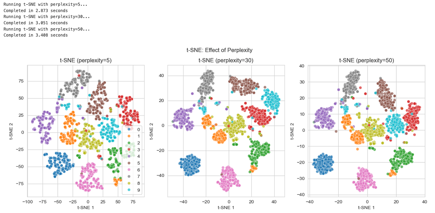
t-SNE: Effect of Perplexity
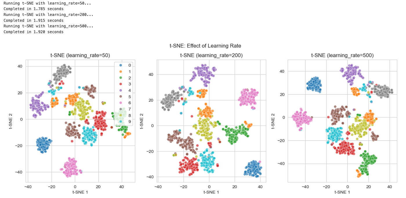
t-SNE: Effect of Learning Rate
Uniform Manifold Approximation and Projection (UMAP)
How UMAP Works
UMAP is a relatively new technique that combines the best of both worlds: speed and quality. It’s based on manifold learning and topological data analysis:
- Local approximation: Build a fuzzy topological representation of the data
- Global optimization: Find a low-dimensional representation that best preserves the topological structure
Key Advantages: UMAP preserves both local and global structure better than t-SNE while being significantly faster.
When to Use UMAP
- Large datasets (scales better than t-SNE).
- Both local and global structure preservation needed.
- Faster computation is required.
- General-purpose dimensionality reduction.
- Robust to noise in the data.
UMAP Implementation
from umap import UMAP
import time
import numpy as np
import matplotlib.pyplot as plt
from sklearn.datasets import load_digits
from sklearn.decomposition import PCA
from sklearn.preprocessing import StandardScaler
import seaborn as sns

# loading data
digits = load_digits()

def apply_umap():

    # data standardization
    scaler = StandardScaler()
    digits_scaled = scaler.fit_transform(digits.data)

    # applying UMAP
    n_neighbors = [5, 15, 30]
    _, axes = plt.subplots(1, len(n_neighbors), figsize=(15, 5))

    for i, n in enumerate(n_neighbors):
        print(f"Running UMAP with n_neighbors={n}...")
        start_time = time.time()
        umap = UMAP(n_neighbors=n, n_components=2)
        digits_umap = umap.fit_transform(digits_scaled)
        end_time = time.time()
        print(f"Completed in {end_time - start_time:.2f} seconds")

        # plotting results
        # scatter = axes[i].scatter(digits_umap[:, 0], digits_umap[:, 1],
        #                         c=digits.target, cmap='tab10', alpha=0.7)

        if i==0:
            sns.scatterplot(x=digits_umap[:, 0], y=digits_umap[:, 1],
                        hue=digits.target, palette='tab10', alpha=0.7, ax=axes[i], legend=True)
        else:
            sns.scatterplot(x=digits_umap[:, 0], y=digits_umap[:, 1],
                        hue=digits.target, palette='tab10', alpha=0.7, ax=axes[i], legend=False)
        axes[i].set_title(f'UMAP (n_neighbors={n})')
        axes[i].set_xlabel('UMAP 1')
        axes[i].set_ylabel('UMAP 2')

    plt.suptitle('UMAP: Effect of n_neighbors Parameter')
    plt.show()

def umap_parameter_exploration():
    scaler = StandardScaler()
    digits_scaled = scaler.fit_transform(digits.data)

    # trying min_dist parameter
    min_dists = [0.1, 0.5, 0.9]
    _, axes = plt.subplots(1, len(min_dists), figsize=(15, 5))

    for i, min_ in enumerate(min_dists):
        print(f"Running UMAP with min_dist={min_}...")
        start_time = time.time()
        umap = UMAP(n_neighbors=15, min_dist=min_, n_components=2)
        result = umap.fit_transform(digits_scaled)
        end_time = time.time()
        print(f"Completed in {end_time - start_time:.2f} seconds")

        if i==0:
            sns.scatterplot(x=result[:, 0], y=result[:, 1],
                        hue=digits.target, palette='tab10', alpha=0.7, ax=axes[i], legend=True)
        else:
            sns.scatterplot(x=result[:, 0], y=result[:, 1],
                        hue=digits.target, palette='tab10', alpha=0.7, ax=axes[i], legend=False)

        axes[i].set_title(f'UMAP (min_dist={min_})')
        axes[i].set_xlabel('UMAP 1')
        axes[i].set_ylabel('UMAP 2')

    plt.suptitle('UMAP: Effect of min_dist Parameter')
    plt.show()

apply_umap()
umap_parameter_exploration()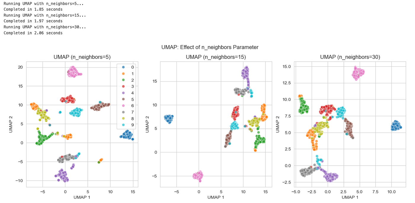
UMAP : Effect of n_neighbors
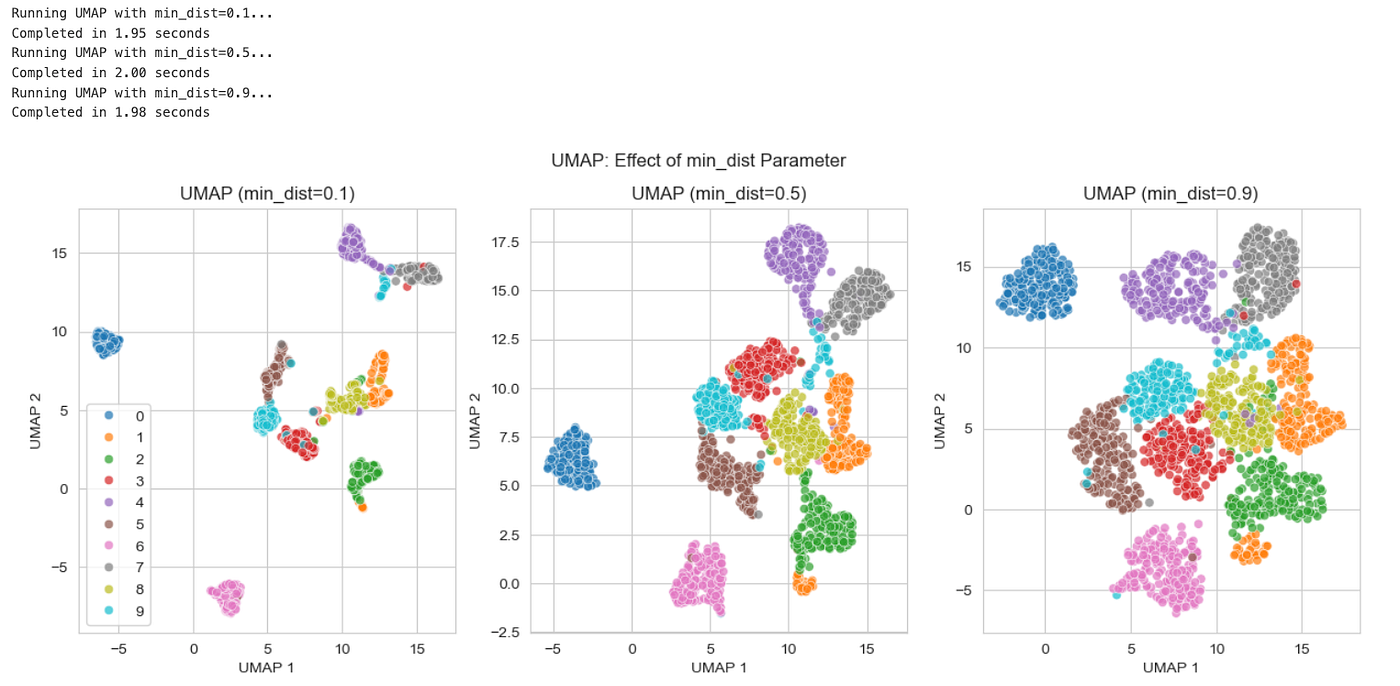
UMAP : Effect of min_dist
Comparative Analysis
Let’s create a comprehensive comparison of all three techniques:
from sklearn.datasets import load_digits
from sklearn.decomposition import PCA
from sklearn.manifold import TSNE
from umap import UMAP
from sklearn.preprocessing import StandardScaler
import numpy as np
import pandas as pd
import matplotlib.pyplot as plt
import time
import seaborn as sns

# load data
digits=load_digits()

def compare_all_methods():
    # we use a subset of the digits data
    n_samples = 1000
    indices = np.random.choice(len(digits.data), n_samples, replace=False)
    data_subset = digits.data[indices]
    target_subset = digits.target[indices]

    # data standardization
    scaler = StandardScaler()
    data_scaled = scaler.fit_transform(data_subset)

    # PCA
    start_time = time.time()
    pca = PCA(n_components=2, random_state=42)
    pca_result = pca.fit_transform(data_scaled)
    pca_time = time.time() - start_time

    # t-SNE
    start_time = time.time()
    tsne = TSNE(n_components=2, random_state=42, max_iter=1000)
    tsne_result = tsne.fit_transform(data_scaled)
    tsne_time = time.time() - start_time

    # UMAP
    start_time = time.time()
    umap = UMAP(n_components=2, random_state=42)
    umap_result = umap.fit_transform(data_scaled)
    umap_time = time.time() - start_time

    methods = ['PCA', 't-SNE', 'UMAP']
    results = [pca_result, tsne_result, umap_result]
    times = [pca_time, tsne_time, umap_time]


    # comparison plot
    _, axes = plt.subplots(1, len(methods), figsize=(5 * len(methods), 5))

    for i, (method, result, exec_time) in enumerate(zip(methods, results, times)):

        sns.scatterplot(x=result[:, 0], y=result[:, 1],
                        hue=target_subset, palette='tab10', alpha=0.7, ax=axes[i], legend=False)
        axes[i].set_title(f'{method}\n(Time: {exec_time:.4f}s)')
        axes[i].set_xlabel(f'{method} 1')
        axes[i].set_ylabel(f'{method} 2')
    plt.suptitle('Comparison of Dimensionality Reduction Methods')
    plt.show()


    print("\nPerformance Summary:")
    print("-" * 40)
    for method, exec_time in zip(methods, times):
        print(f"{method:>6}: {exec_time:6.4f} seconds")

# Run comparison
compare_all_methods()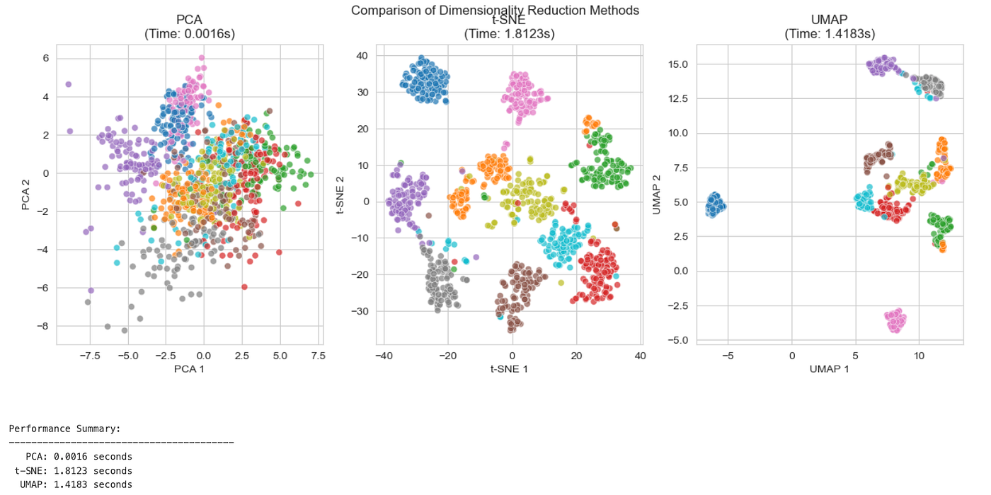
Comparison Plots
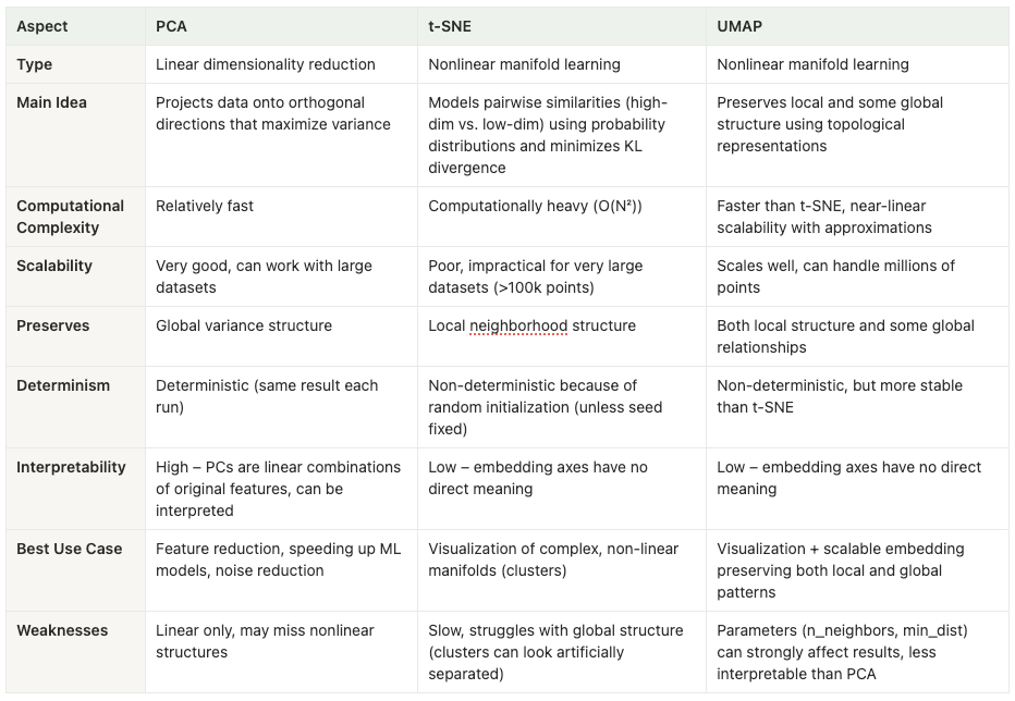
Comparison Table
Choose PCA when:
- Your data has linear relationships.
- You need fast computation.
- Interpretability is crucial.
- You’re preprocessing for other algorithms.
- You want to reduce noise.
Choose t-SNE when:
- You want to visualize clusters.
- Local structure is more important than global.
- You have non-linear data.
- Dataset size is manageable.
- You’re doing exploratory analysis.
Choose UMAP when:
- You have large datasets.
- You want both local and global structure.
- Speed is important.
- You need a general-purpose solution.
- Your data is noisy.
Best Practices
- Always standardize your data before applying dimensionality reduction.
- Start with PCA for initial exploration and preprocessing.
- Use t-SNE for visualization of clusters and non-linear patterns.
- Consider UMAP for large datasets or when you need balanced structure preservation.
- Tune hyperparameters systematically.
- Validate results using domain knowledge.
- Don’t over-interpret 2D projections of high-dimensional data.
Dimensionality reduction is both an art and a science. Each technique has its strengths and ideal use cases. PCA provides a solid foundation with interpretable results, t-SNE excels at revealing hidden clusters, and UMAP offers a modern balance of speed and quality.
The key is to understand your data, define your goals clearly, and choose the right tool for the job. Often, the best approach is to try multiple methods and compare their results, as each can reveal different aspects of your data’s structure.
Remember: dimensionality reduction is a tool for understanding and working with data, not an end in itself. Always validate your findings and consider the broader context of your analysis.
Until next time:)
메타데이터
- post_id
- 9af37f6d9cb3
- slug
- dimensionality-reduction-dive-into-pca-t-sne-and-umap-9af37f6d9cb3
- url
- https://medium.com/@prathik.codes/dimensionality-reduction-dive-into-pca-t-sne-and-umap-9af37f6d9cb3
- canonical_url
- https://medium.com/@prathik.codes/dimensionality-reduction-dive-into-pca-t-sne-and-umap-9af37f6d9cb3
- author_url
- https://medium.com/@prathik.codes
- status
- ok
- fetched_at
- 2026-06-09 15:37:30