Simpson’s Paradox: Your Correlation Reversed When I Split the Data
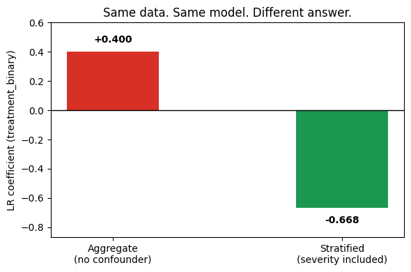
Same data, same model, but the coefficient changed sign
Simpson’s Paradox: Your Correlation Reversed When I Split the Data
Same data, same model, but the coefficient changed sign
The same logistic regression, the same data, the same hyperparameters. One version says Treatment B increases mortality, while the other says Treatment B saves lives. Both are real outputs from the same algorithm on the same dataset. The only difference between the two models is one column: patient severity.
Source: author
This is known as Simpson’s Paradox, a statistical phenomenon where the direction of a trend in aggregate data reverses when the data is split into subgroups. It shows up in clinical trials, hiring decisions, salary analyses, and A/B tests. In every case, a model trained on the aggregate recommends the wrong action.
Below, I describe the project built for four synthetic datasets where the paradox is guaranteed by construction, wrote a detector that flags it automatically, and measured the human cost of following the wrong model’s advice.
Here, a Streamlit app lets you upload your own CSV and scan for sign reversals without writing any Python:

Source: author
All project code is publicly available at GitHub:
Let’s dive in!
A dataset where the aggregate lies
Five thousand synthetic patients. Each has a severity level (mild, moderate, severe), a treatment assignment (A or B), and a mortality outcome.
def generate_healthcare(n: int = 5000, seed: int = 42) -> pd.DataFrame:
    rng = np.random.default_rng(seed)
    severity = rng.choice(["mild", "moderate", "severe"], size=n, p=[0.50, 0.30, 0.20])

# Sicker patients are more likely to receive Treatment B
    treatment_b_probs = {"mild": 0.20, "moderate": 0.50, "severe": 0.80}
    treatment_b = rng.binomial(1, [treatment_b_probs[s] for s in severity]).astype(bool)
    # Treatment B has lower mortality in every group
    mortality_a = {"mild": 0.10, "moderate": 0.20, "severe": 0.45}
    mortality_b = {"mild": 0.02, "moderate": 0.12, "severe": 0.37}
    base_prob = np.where(
        treatment_b,
        [mortality_b[s] for s in severity],
        [mortality_a[s] for s in severity],
    )
    mortality = rng.binomial(1, base_prob).astype(bool)
    return pd.DataFrame({
        "severity": severity,
        "treatment": np.where(treatment_b, "B", "A"),
        "treatment_binary": treatment_b.astype(int),
        "mortality": mortality.astype(int),
    })
The two critical design choices are in the assignment probabilities. P(Treatment B | severe) = 0.80 means 80% of severe patients get Treatment B. P(Treatment B | mild) = 0.20 means only 20% of mild patients get it. This creates the confounding. At the same time, Treatment B reduces mortality by 8 to 10 percentage points within every group.
The aggregate numbers: Treatment A mortality 0.160, Treatment B mortality 0.241. Overall B looks worse, but within every severity group, B is better.

Source: author
The causal mechanism
Sicker patients receive Treatment B more often because doctors assign it to harder cases. Severity drives both the treatment choice and the outcome. Aggregating across severity groups mixes these populations together, and the composition distorts the signal.
A directed acyclic graph (DAG) makes this visible. A DAG is a diagram where each arrow represents a causal relationship: the variable at the tail influences the variable at the tip. “Acyclic” means there are no loops: if A causes B and B causes C, then C cannot also cause A. When a variable has arrows pointing to both the treatment and the outcome, it is a confounder: a common cause that creates a spurious statistical association between treatment and outcome.

Source: author
The backdoor criterion is a rule from causal inference for deciding which variables to condition on. You check whether any common cause of both treatment and outcome can reach the outcome without passing through the treatment itself. If it can, that path must be blocked by conditioning on the common cause. In code, this means removing the treatment node from the graph and checking whether any of its parents can still reach the outcome:
def has_backdoor_path(dag: nx.DiGraph, treatment: str, outcome: str) -> bool:
    dag_copy = dag.copy()
    dag_copy.remove_node(treatment)
    return any(
        nx.has_path(dag_copy, parent, outcome)
        for parent in dag.predecessors(treatment)
    )
When this returns True, an aggregate model will produce a biased coefficient.
The coefficient that flips the correlation
A logistic regression is a classifier that predicts the probability of a binary outcome (here, death or survival) as a function of input features. The output is a set of coefficients, one per feature, where a positive coefficient means the feature increases the predicted probability and a negative coefficient means it decreases it.
Trained on the aggregate data with only the treatment column as input:
agg_model = AggregateModel()
agg_model.fit(df[["treatment_binary"]], df["mortality"])
print(f"Aggregate coefficient: {agg_model.treatment_coefficient('treatment_binary'):+.4f}")
# Aggregate coefficient: +0.4003
The coefficient is positive. The model predicts Treatment B increases mortality. Now add severity as a feature and retrain:
strat_model = StratifiedModel()
strat_model.fit(df, ["treatment_binary"], "mortality", "severity")
print(f"Stratified coefficient: {strat_model.treatment_coefficient('treatment_binary'):+.4f}")
# Stratified coefficient: -0.6682
Here, the coefficient is negative. Same algorithm, same data. The stratified model correctly identifies Treatment B as beneficial.
The practical cost of trusting the wrong model: in a simulation of 1,000 new patients with the same severity distribution, following the aggregate model’s recommendation (prescribe Treatment A to everyone) produces roughly 80 additional deaths compared to using the stratified model (prescribe Treatment B to everyone). That number comes from the difference in within-group mortality rates applied across the severity mix. It is an expected value from the DGP, not a single stochastic draw.
Four domains, one structure
The healthcare case is dramatic because it involves mortality. The same structure appears in contexts where nobody would think to look for it.
Admissions (10,000 applicants). Women apply disproportionately to departments A and B, which accept between 15% and 20% of applicants. Men apply to departments E and F, which accept between 55% and 65%. Aggregate: women have a lower admission rate (39% vs 49%). Within every department: women are admitted at equal or higher rates. The entire aggregate gap is driven by application patterns, not by departmental bias. This is modeled on the 1973 Berkeley admissions study, one of the earliest documented cases of Simpson’s Paradox in practice.

Source: author

Source: author
The admissions case involves selection bias in applications. Compensation shows the same reversal in a corporate context where the confounding is about career progression rather than self-selection.
Compensation (3,000 employees). Men are concentrated in senior and executive roles due to historical promotion patterns. Aggregate salary gap: men earn roughly 18% more. Within every job level from junior to executive: women earn 2–5% more. The aggregate gap is a composition effect. An HR team reporting the aggregate number would conclude there is pay discrimination. An HR team reporting the within-level numbers would conclude there is none. Both are looking at the same data.

Source: author
The compensation case is about promotion history. The next example shows how a technical bug can produce the same paradox in an A/B test, a context where most teams assume randomization makes confounding impossible.
A rollout bug sent 70% of power-user traffic to Variant B. Power users convert at 3x the base rate regardless of variant. A/B test (20,000 sessions). Aggregate: B wins (13.1% vs 12.6%). Within every user segment (power, casual, new): A wins. The bug created an imbalance that mimics confounding even in a supposedly randomized experiment.

Source: author
Detecting the paradox
The healthcare example worked because I knew severity was the confounder. On a new dataset, you often do not know what to look for. The detector scans all feature-confounder pairs and flags sign reversals using Pearson correlation, which measures the linear relationship between two variables on a scale from -1 to +1:
def detect_paradox(
    df: pd.DataFrame, target: str, feature: str, confounder: str,
) -> dict:
    agg_corr, _ = pearsonr(df[feature], df[target])
    group_corrs = {}
    for group, sub in df.groupby(confounder, observed=True):
        if len(sub) > 2:
            r, _ = pearsonr(sub[feature], sub[target])
            group_corrs[str(group)] = round(r, 4)
    paradox = bool(group_corrs) and all(
        (agg_corr > 0) != (r > 0) for r in group_corrs.values()
    )
    return {"aggregate_correlation": round(agg_corr, 4),
            "group_correlations": group_corrs, "paradox_detected": paradox}
On the healthcare dataset: aggregate correlation +0.145, within-group correlations all negative (-0.170, -0.129, -0.097). Paradox detected.
One important limitation to mention: the detector uses Pearson correlation, which only captures linear monotonic relationships. A nonlinear version of the paradox (where the direction reverses but the relationship is curved) would require Spearman rank correlation or a comparison of group means instead. The scanner also checks one confounder at a time. In real datasets, multiple variables might confound simultaneously. Joint confounding requires a multivariate approach that this detector does not cover.
The Streamlit app includes a CSV upload tab where you can run this scanner on your own data without cloning the repo.
When stratification makes things worse
Most articles about Simpson’s Paradox end with “always stratify by the confounder.” That advice is incomplete.
Lord’s Paradox demonstrates the opposite failure. In a synthetic weight-loss dataset, two diet programs produce identical average weight change. Both groups lose the same amount on average. When you condition on initial weight (fitting separate regression lines for each treatment within initial-weight bands), a spurious difference between the programs appears: one group looks like it loses more weight than the other.

Source: author
The problem is that initial weight in this DGP is a collider: a variable that is influenced by (or statistically associated with) both the treatment group and factors related to the outcome. When a confounder has arrows pointing to both treatment and outcome, conditioning on it removes bias. When a collider has arrows pointing from treatment and outcome (or their shared causes) toward itself, conditioning on it introduces bias by opening a path that was previously closed.
The practical implication: if someone tells you to “just control for everything,” they might be introducing Lord’s Paradox. Adding a variable to your model is not always safer than leaving it out. The causal graph tells you which variables are confounders (condition on them) and which are colliders (leave them alone). Without the graph, you are guessing which direction the bias runs.
Conclusions: what to do about it
If you can measure the confounder, add it to the model. That is what the stratified model does above. In the healthcare case, severity is recorded in the patient chart. In the admissions case, department is on the application form. In the A/B test, user segment is in the event log. When the confounder is available, the fix is mechanical: include it as a feature and check whether the coefficient of interest changes sign.
If you suspect a confounder exists but cannot measure it, draw a DAG. Ask: what else could cause both the treatment assignment and the outcome? If you find a candidate, check whether including a proxy for it changes the sign of your coefficient. If the sign flips, you have evidence of confounding even without a direct measurement.
If you are running an A/B test and you control the assignment, use stratified randomization. Assign treatment and control proportionally within each segment. This removes the imbalance before it can distort the aggregate. The A/B test dataset in this project exists because a rollout bug broke that balance. Stratified randomization is the prevention.
The aggregate is not useless: it describes what happened to the population as observed. But if you are deciding what to do next, prescribing a treatment, admitting a student, adjusting a salary band, shipping a product variant, you need the within-group answer.
One more caveat about the datasets in this project. The DGPs use categorical confounders (three severity levels, six departments, four job levels) with clean separation between groups. Real observational data has continuous confounders, partial overlap between treatment groups, and treatment effects that vary across the confounder range. The paradox still occurs with continuous confounders, but the coefficient flip is less dramatic and harder to detect visually. The categorical examples here are pedagogical. Production data requires more careful confounder adjustment, often through propensity score matching or inverse probability weighting rather than simple stratification.
Running it yourself
git clone https://github.com/Dima806/simpsons_paradox_lab
make setup      # uv + deps, 2 CPUs / 8 GB sufficient
make test       # 45 tests, ~10 sec
make notebooks  # 5 notebooks, < 2 min each
make run        # Streamlit app on :8501
The Streamlit app has three tabs: a paradox visualizer where you pick any dataset and confounder and see the reversal, a paradox detector where you upload your own CSV and scan for sign reversals across all column pairs, and a model comparison tab showing the coefficient flip and the simulated death count from following the wrong recommendation.
Drop your questions in the comments below 😊
메타데이터
- post_id
- 9fe2763fa7bc
- slug
- simpsons-paradox-your-correlation-reversed-when-i-split-the-data-9fe2763fa7bc
- url
- https://medium.com/data-and-beyond/simpsons-paradox-your-correlation-reversed-when-i-split-the-data-9fe2763fa7bc
- canonical_url
- https://medium.com/data-and-beyond/simpsons-paradox-your-correlation-reversed-when-i-split-the-data-9fe2763fa7bc
- author_url
- https://medium.com/@dimaiakubovskyi
- status
- ok
- fetched_at
- 2026-06-12 22:02:08