Python for Data Science — Mini Project: Visual Storytelling with Data
Throughout this section, we’ve learned how to create and interpret different types of visualizations:
Python for Data Science — Mini Project: Visual Storytelling with Data
Throughout this section, we’ve learned how to create and interpret different types of visualizations:
We’ve also discussed:
- **Matplotlib**
- **Seaborn**
- Visualization best practices
- **Common visualization mistakes**
But real-world data science is not about creating isolated charts.
A good analyst uses visualizations to answer questions, communicate findings, and tell a coherent story.
This is often called Visual Storytelling with Data.
The goal is not simply to show charts.
The goal is to help people understand what the data is saying.
The Scenario
Imagine you’re working for an online retail company.
Management has noticed that revenue growth has slowed during the last few months.
They want answers to questions such as:
- Are sales actually declining?
- Which customer segments are driving revenue?
- Are certain regions underperforming?
- Are customer behaviors changing?
You receive a dataset containing:
- customer information
- sales transactions
- regions
- purchase history
- revenue metrics
Your task is not to build a machine learning model.
Your task is to understand the business situation and communicate your findings visually.
Step 1: Start with the Main Question
A common beginner mistake is creating random charts.
Professional analysts start differently.
They begin with a question.
In our case:
Why has revenue growth slowed?
This question guides every visualization that follows.
Step 2: Examine Revenue Over Time
The first thing we want to understand is:
Is revenue actually slowing?
A line chart is the appropriate choice.
Visualization
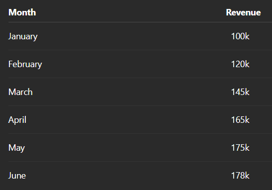
Monthly Revenue Trend
Suppose the chart shows:
Observation:
Revenue is still increasing, but the growth rate has slowed significantly since April.
Notice that we are not simply describing the chart.
We are extracting insight from it.
Step 3: Compare Revenue Across Regions
Next question:
Are some regions performing better than others?
A bar chart is appropriate.
Visualization
Revenue by Region
Suppose the results are:

Observation:
The South region generates the highest revenue, while the East region lags behind all other regions.
This creates a new question:
Why is the East region underperforming?
Good visualizations often generate additional questions.
Step 4: Understand Customer Spending
Now we investigate customer behavior.
A histogram helps us examine the distribution of spending.
Visualization
Customer Spending Distribution
Suppose we observe:
- Most customers spend modest amounts.
- A small number spend very large amounts.
Observation:
Customer spending is heavily right-skewed, indicating that a small group of high-value customers contributes disproportionately to revenue.
This is a valuable business insight.
Step 5: Detect High-Value Customers
A boxplot can help identify unusual spending patterns.
Visualization
Customer Spending Boxplot
Suppose several extreme outliers appear.
Observation:
A small number of customers spend substantially more than the average customer.
This suggests that retention of high-value customers may be strategically important.
Step 6: Explore Relationships
Now we ask:
Does income influence spending?
A scatter plot is appropriate.
Visualization
Income vs Spending
Suppose the chart reveals a clear upward trend.
Observation:
Higher-income customers generally spend more, suggesting a positive relationship between income and purchasing activity.
Again, we are moving beyond visualization into interpretation.
Step 7: Investigate Multiple Relationships
The dataset contains many numerical variables:
- Income
- Spending
- Age
- Purchase Frequency
- Customer Value
A heatmap helps summarize correlations.
Visualization
Correlation Heatmap
Suppose the strongest relationships are:

Observation:
Purchase frequency appears more strongly associated with revenue than age or demographic factors.
This may influence future business strategy.
Step 8: Connect the Insights
At this stage, we have multiple findings.
The mistake many beginners make is presenting them separately.
Instead, analysts build a narrative.
For example:
Finding 1
Revenue growth is slowing.
↓
Finding 2
The East region is underperforming.
↓
Finding 3
Revenue depends heavily on a small group of high-value customers.
↓
Finding 4
Purchase frequency strongly influences revenue.
Now the individual charts form a connected story.
The Difference Between Charts and Storytelling
Consider these two approaches.
Approach 1: Reporting
- Chart 1
- Chart 2
- Chart 3
- Chart 4
No explanation.
No connection.
No narrative.
Approach 2: Storytelling
Question:
Why has revenue growth slowed?
Evidence:
- Revenue growth has plateaued.
- One region underperforms.
- Revenue depends heavily on a small customer segment.
- Purchase frequency drives revenue.
Conclusion:
Improving customer engagement in underperforming regions may help restore growth.
Now the analysis becomes actionable.
What Makes Visual Storytelling Effective?
Good visual storytelling:
Starts with a Question
Every chart should contribute to answering it.
Uses Appropriate Visualizations
Choose charts that support the analytical goal.
Builds a Logical Flow
One insight should naturally lead to the next.
Focuses on Key Findings
Not every chart deserves equal attention.
Ends with a Conclusion
The audience should understand what the analysis suggests.
Common Beginner Mistakes
Mistake 1: Creating Too Many Charts
More charts do not automatically create better analysis.
Mistake 2: Presenting Charts Without Interpretation
Charts provide evidence.
Analysts provide meaning.
Mistake 3: Focusing on Visual Design Alone
A beautiful chart with no insight has limited value.
Mistake 4: Ignoring the Narrative
People remember stories more easily than isolated statistics.
Thinking Like an Analyst
Beginners often think:
My job is to create charts.
Experienced analysts think:
My job is to communicate understanding.
That difference is important.
Because stakeholders rarely want dozens of charts.
They want answers.
Visualization is simply one of the tools that helps deliver those answers.
Final Thoughts
Data visualization becomes most powerful when it is used to tell a story.
A collection of charts may show information.
A well-structured narrative creates understanding.
The best analysts use visualizations not as decoration, but as evidence that supports a clear and meaningful message.
Because ultimately, the goal of data science is not to produce charts.
The goal is to help people make better decisions.
Key Takeaway
Visual storytelling combines charts, analysis, and narrative to transform data into insights that people can understand, remember, and act upon.
메타데이터
- post_id
- a08670b62049
- slug
- python-for-data-science-mini-project-visual-storytelling-with-data-a08670b62049
- url
- https://medium.com/@sudhamsr/python-for-data-science-mini-project-visual-storytelling-with-data-a08670b62049
- canonical_url
- https://medium.com/@sudhamsr/python-for-data-science-mini-project-visual-storytelling-with-data-a08670b62049
- author_url
- https://medium.com/@sudhamsr
- status
- ok
- fetched_at
- 2026-07-09 17:12:49