Juxtaposition in Art, Aesthetic
When Opposites Sit Together and Secretly Start a Conversation
Juxtaposition in Art, Aesthetic

When Opposites Sit Together and Secretly Start a Conversation
Have you ever noticed how a single candle looks brighter in a dark room than it does in daylight? The candle hasn’t changed — the surroundings have. That small shift in context completely transforms how we experience it. This quiet trick of perception is at the heart of something artists love to use: juxtaposition.
What Is Juxtaposition, Really?
In simple terms, juxtaposition means placing two elements side by side so that their differences (or similarities) become more noticeable. It’s not about changing the objects themselves — it’s about changing how we see them by placing them together.
Think of it like a conversation. One object speaks, the other responds. And suddenly, meaning appears between them.
Why Artists Use Juxtaposition
Artists are not just showing things — they are guiding how we feel about them. Juxtaposition helps them do this without explaining anything directly. Instead of telling you what to think, they place elements together and let you figure it out.
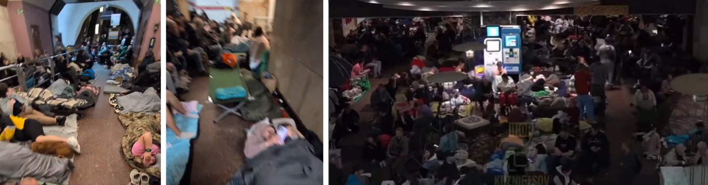
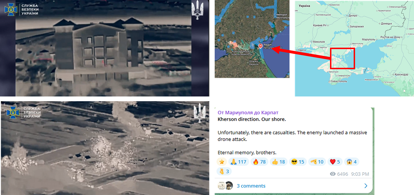
For example, imagine a painting where a child is playing happily in the middle of a ruined, abandoned building. The child represents innocence, while the broken space suggests loss or history. Together, they create a feeling that neither could create alone.
This is why juxtaposition is powerful — it adds layers without adding words.
Types of Juxtaposition You Often See
Juxtaposition can appear in many forms, and once you start noticing it, you’ll see it everywhere.
Visual Contrast: Light vs dark, large vs small, smooth vs rough. A bright object in a dull setting immediately grabs attention.
Conceptual Contrast: Ideas that don’t usually go together — like luxury and poverty, tradition and modernity — placed side by side to spark thought.
Emotional Contrast: A calm scene with a subtle disturbing detail, or a chaotic environment with one peaceful element. This creates tension or surprise.
Time-Based Contrast: Old and new existing together — like ancient architecture next to modern buildings — reminding us of change and continuity.
How Juxtaposition Changes Meaning
Here’s the interesting part: the meaning of an object can shift completely depending on what it’s placed next to.
A simple apple on a table feels ordinary. But place that same apple next to a skull, and suddenly it may suggest life and death. The apple didn’t change — but its meaning did.
This is how artists communicate complex ideas without being direct. They rely on your natural instinct to compare, contrast, and interpret.
Relatable Examples from Everyday Life
You don’t have to visit a gallery to experience juxtaposition — it’s already around you.
A street filled with shiny billboards and, right below them, a small roadside stall. A peaceful park sitting beside a busy highway. A traditional outfit worn in a modern office. These moments stand out because of contrast.
Even in photography, people often place unexpected elements together — a formal suit in a messy environment, or a serious face in a playful setting — to create interest.
Creating Mood Without Saying a Word
Juxtaposition is not always loud or dramatic. Sometimes it works quietly in the background.
A soft light falling on a rough surface can make the scene feel calm yet grounded. A single broken object in an otherwise perfect setting can create unease. These subtle choices shape how we feel, even if we don’t consciously notice them.
It’s like adding a small twist to a familiar story — it keeps the viewer engaged.
There Are No Fixed Rules
One of the best things about juxtaposition is its flexibility. There’s no right or wrong way to use it. It can be serious, playful, emotional, or even humorous.
An artist might place something completely out of context — like a giant object in a tiny room — just to surprise you. Or they might use very subtle contrasts that slowly reveal themselves.
The goal isn’t perfection. It’s to create a reaction.
Why It Stays With You
Art that uses juxtaposition often lingers in your mind. You might walk away and still think about it later. That’s because your brain is trying to resolve the contrast, to understand the relationship between the elements.
And in that process, the artwork becomes personal. Each viewer might interpret it differently, based on their own experiences.
Seeing It Differently Next Time
The next time you look at a painting, photograph, or even a real-life scene that feels “interesting,” pause for a moment. Instead of asking what it is, ask what is placed next to what.
Notice the contrasts. Notice the tension or harmony. That’s where the meaning often lives.
Juxtaposition doesn’t shout for attention — it quietly places opposites together and lets your mind do the rest. And somehow, that makes the experience feel more real, more human, and a lot more memorable.
Source : ABCD-WXYZ-123
[embed]
메타데이터
- post_id
- a08698cd49cd
- slug
- juxtaposition-in-art-aesthetic-a08698cd49cd
- url
- https://medium.com/@manyantra123/juxtaposition-in-art-aesthetic-a08698cd49cd
- canonical_url
- https://medium.com/@manyantra123/juxtaposition-in-art-aesthetic-a08698cd49cd
- author_url
- https://medium.com/@manyantra123
- status
- ok
- fetched_at
- 2026-08-12 21:32:53