Design Systems, Methodologies & Token Architecture in Flutter: The Complete Senior Developer’s…
Series context: After 5 years building production Flutter apps, I’ve converged on Clean Architecture with data/domain/presentation layers…
Design Systems, Methodologies & Token Architecture in Flutter: The Complete Senior Developer’s Guide
Series context: After 5 years building production Flutter apps, I’ve converged on Clean Architecture with data/domain/presentation layers per feature. It scales well — until the UI layer of a large app becomes a maintenance nightmare. This article documents my research into solving that problem through design systems, design system methodologies, and design tokens.
Table of Contents
- What Is a Design System — and What Does It Include?
- Types of Design Systems
- Design System Methodologies — A Deep Comparison
- Design Tokens: The Advanced Layer
- The Relationship: Design System × Methodology × Tokens
- Flutter Implementation — Code Examples
- Book References & Further Reading
1. What Is a Design System?
A design system is not a style guide. It is not a component library. It is not a Figma file. It is the single source of truth that governs how a product looks, behaves, and communicates — across every surface, every team, and every platform.
The classic definition comes from Brad Frost’s Atomic Design (2016):
A design system is an interconnected set of patterns, shared practices, and tools that enables teams to build products faster and more cohesively.
What a Design System Includes
A mature design system is composed of six interconnected layers:
- 1. Foundations (Design Primitives) The raw building blocks everything else derives from:
- Color — palette, semantic color roles (primary, surface, error…)
- Typography — typefaces, scale, line heights, weights
- Spacing — a scale system (4px, 8px, 16px, 24px…)
- Elevation — shadow levels, z-axis hierarchy
- Motion — duration curves, easing functions, animation principles
- Grid & Layout — columns, gutters, breakpoints
- Iconography — icon family, sizing rules, stroke consistency
- Imagery & Illustration — photographic style, illustration guidelines
2. Design Tokens The abstraction layer that maps raw values to semantic meanings. (See Section 4 for full coverage.) These are the bridge between foundations and components.
3. Component Library Reusable UI building blocks — buttons, cards, inputs, dialogs, navigation bars. Each component has defined:
- Anatomy (the parts that make it up)
- States (default, hover, pressed, disabled, error, loading)
- Variants (sizes, colors, shapes)
- Behavior specifications
- Accessibility requirements (WCAG compliance, semantic roles)
4. Patterns & Compositions Higher-level combinations of components that solve common UX problems — search patterns, empty states, onboarding flows, form validation patterns. These are not components; they are recipes for combining components.
5. Documentation The system is useless without its manual. Documentation includes:
- Usage guidelines (when to use what)
- Do/Don’t examples
- Code snippets and API reference
- Design principles (why decisions were made)
6. Governance & Process How the system evolves:
- Who owns it (dedicated team vs. distributed contribution)
- How components get added/deprecated
- Version control and changelog
- Contribution guidelines
Why It Matters for Flutter at Scale
In a small Flutter project, you can get away with putting colors in constants.dart and calling TextStyle(fontSize: 16) inline. At scale — multiple developers, multiple screens, a design team using Figma — this breaks down. You end up with:
- 12 slightly different shades of blue across screens
- Buttons with 6 slightly different border radii
- No way to implement a dark mode without touching hundreds of files
- A design team that can’t make global changes without a multi-week engineering sprint
A design system solves all of these by making visual decisions centralized, named, and version-controlled.
2. Types of Design Systems
Design systems vary by scope, audience, and ownership model. Understanding the type helps you choose the right approach.
2.1 By Ownership Model
Centralized (Soloist) A single dedicated team owns the design system. They build it, maintain it, and publish it. Other product teams consume it.
- Pros: High consistency, clear ownership, fast decision-making
- Cons: Can become a bottleneck; risks being out of sync with product team needs
- Examples: Google’s Material Design, Apple’s Human Interface Guidelines
Federated (Distributed) Multiple product teams contribute to a shared system, with a small core team curating.
- Pros: Evolves organically with real product needs; broader buy-in
- Cons: Requires strong governance; risk of fragmentation
- Examples: Spotify’s Encore, Shopify’s Polaris
Hybrid A core library managed centrally, with team-level extension points.
- Best for: Large orgs with many products on a shared platform
2.2 By Scope
Product Design System Built for a single product or app. Optimized for speed within that context.
- What you’ll build for most Flutter apps.
Platform Design System Cross-platform guidelines (web, mobile, TV). Platform-specific components extend a shared foundation.
- Example: Google’s Material 3 with its Flutter, Android, iOS, and Web variants
Multi-brand Design System A single system with theming that supports multiple brand identities — same architecture, different visual expression.
- Common in agency work or white-label Flutter apps
- Requires mature token architecture (see Section 4)
Open-Source Design System Published for external consumption. The component API and documentation must be production-grade.
- Examples: Material UI, Fluent UI, Chakra UI
2.3 By Maturity Level (the Nielsen Norman Phases)
Based on the Nielsen Norman Group’s research, design systems evolve through phases:
Phase Description Flutter Signal 0 — None Ad hoc styling, no consistency Inline TextStyle(), hardcoded hex colors 1 — Inconsistent Partial constants, some reuse AppColors class with some values 2 — Centralized Full token structure, component library ThemeData + custom tokens + component widgets 3 — Systematic Governance, contribution process, docs Separate package with changelog and usage docs 4 — Mature Token pipeline, multi-brand, automated testing Token generation from Figma + visual regression tests
Most production Flutter apps should target Phase 2–3. Aiming for Phase 4 from day one is premature optimization.
3. Design System Methodologies — A Deep Comparison
A methodology is the organizational framework for how you structure and name your UI primitives. Several competing philosophies exist; each makes different tradeoffs between granularity, learnability, and flexibility.
3.1 Atomic Design (Brad Frost, 2016)
The most widely adopted methodology. Borrowed from chemistry: matter is made of atoms, atoms combine into molecules, molecules into organisms.
The 5 Levels:
Atoms → Molecules → Organisms → Templates → PagesLevel Description Flutter Example Atoms Smallest indivisible UI element. Cannot be broken down further. AppButton, AppText, AppIcon, AppAvatar, InputField Molecules A functional group of atoms. Has a single responsibility. SearchBar (Icon + InputField), LabeledInput (Text + InputField) Organisms Complex UI sections composed of molecules and atoms. AppBar, ProductCard, NavigationDrawer, CheckoutForm Templates Page layout with placeholder content. The wireframe. HomeTemplate, DetailTemplate, OnboardingTemplate Pages Templates populated with real content. The final instance. HomePage, ProductDetailPage, CheckoutPage
Strengths:
- Excellent mental model — team alignment is fast
- Natural component hierarchy maps to Flutter widget tree
- Works well with Storybook-style component documentation
Weaknesses:
- The line between “molecule” and “organism” is frequently debated
- “Templates” and “Pages” often conflate with route/navigation concerns
- No built-in story for design tokens
Best for: Apps where the development team and design team want to share vocabulary. Almost universally applicable.
3.2 ITCSS — Inverted Triangle CSS (Harry Roberts, ~2014)
Originally for CSS, but the principle of specificity-ordered layers applies to any theming system, including Flutter’s ThemeData.
The layers (most generic → most specific):
Settings → Tools → Generic → Elements → Objects → Components → UtilitiesLayer CSS Meaning Flutter Equivalent Settings Variables, config Design tokens (AppColors, AppSpacing) Tools Mixins, functions Theme extensions, helper methods Generic Resets, normalize MaterialApp defaults Elements Bare HTML tags TextTheme, IconTheme, ButtonTheme Objects Layout patterns (OOCSS) Layout widgets (Scaffold, Column, Row) Components UI components AppButton, ProductCard, etc. Utilities Overrides, helpers Modifier widgets, Padding, Opacity
The key insight from ITCSS is that you should define your system from generic to specific, with later layers having more specificity and less reach. This maps directly to Flutter’s widget override precedence.
Best for: Teams that need to reason carefully about override priority and theming scope.
3.3 BEM — Block Element Modifier (Yandex, 2009)
A naming convention rather than an architecture. Defines how to name UI blocks and their sub-parts.
Syntax: Block__Element--Modifier
// BEM Naming
ProductCard             → Block
ProductCard__Image      → Element
ProductCard__Title      → Element
ProductCard--Featured   → Modifier
ProductCard--Disabled   → Modifier
In Flutter this translates to widget names and variant parameters:
// Block
class ProductCard extends StatelessWidget { }
// Element (internal sub-widgets or named constructors)
class ProductCard extends StatelessWidget {
final Widget image; // __Image
final String title; // __Title
}// Modifier (variant factory constructors or enums)
class ProductCard extends StatelessWidget {
const ProductCard.featured({...}); // --Featured
const ProductCard.compact({...}); // --Compact
}Strengths:
- Eliminates naming ambiguity on large teams
- Easy to search/grep in a codebase
Weaknesses:
- Verbose
- Does not address hierarchy or token structure
Best for: Teams that suffer from naming inconsistency. Best combined with Atomic Design.
3.4 OOCSS — Object Oriented CSS (Nicole Sullivan, 2009)
Two principles:
- Separate structure from skin — layout rules and visual rules should not be coupled
- Separate container from content — a component should not depend on its context for its appearance
In Flutter, this maps to:
// ❌ OOCSS violation: skin coupled to structure
Container(
  padding: EdgeInsets.all(16),    // structure
  color: AppColors.primary,       // skin
  child: Text('Button'),
)
// ✅ OOCSS compliant: separate concerns
AppCard(
padding: AppSpacing.md, // structure object
child: AppText.body('Content'), // content object independent of container
)Best for: Systems where the same visual “skin” needs to be applied to multiple structural shapes (e.g., a white card used in grids, lists, and headers).
3.5 SMACSS — Scalable and Modular Architecture (Jonathan Snook, 2012)
Categorizes CSS into 5 rule types. Its value for Flutter teams is the category thinking:
SMACSS Category Flutter Equivalent Base Global ThemeData defaults Layout Page-level scaffold and column/grid widgets Module Reusable component widgets State Widget states — loading, error, disabled Theme Token swap for dark mode or brand variants
The State category is particularly valuable. SMACSS argues that state should be expressible as a modifier on any component, which maps to Flutter’s approach of WidgetState (formerly MaterialState).
Methodology Comparison Table
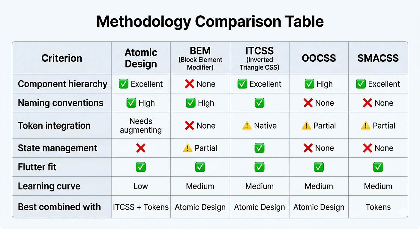
My recommendation: Combine Atomic Design (hierarchy) + BEM naming (consistency) + ITCSS layer order (theme architecture) + Design Tokens (the actual values). These four are complementary, not competing.
4. Design Tokens: The Advanced Layer
Design tokens are the most important concept in modern design system architecture. They were formalized by Salesforce’s Lightning Design System team and have since been standardized in the W3C Design Tokens Format specification.
What Is a Design Token?
A design token is a named, platform-agnostic representation of a design decision.
Instead of using raw values:
// ❌ Raw values — not a design token
Text('Hello', style: TextStyle(color: Color(0xFF1A73E8), fontSize: 16))
You use named tokens:
// ✅ Design token — the name carries semantic meaning
Text('Hello', style: AppTextStyle.bodyMedium.copyWith(color: AppColors.interactive))
The token AppColors.interactive encodes a decision — "this color is used for interactive elements" — not merely a hex value.
The 3-Tier Token Architecture
This is the advanced pattern that enables multi-theming and scales to large systems. Based on the work of Nathan Curtis (Modular Web Design, 2009) and the Salesforce Lightning Design System.
Tier 1: Global Tokens (Raw values)
         ↓
Tier 2: Alias Tokens (Semantic meaning)
         ↓
Tier 3: Component Tokens (Component-specific decisions)
Tier 1 — Global Tokens (Palette)
The complete set of raw values. No semantic meaning. No component coupling.
// global_tokens.dart
abstract class GlobalTokens {
  // Colors — full palette
  static const colorBlue100 = Color(0xFFE8F0FE);
  static const colorBlue500 = Color(0xFF1A73E8);
  static const colorBlue700 = Color(0xFF1557B0);
  static const colorBlue900 = Color(0xFF0B3D91);
static const colorRed100 = Color(0xFFFCE8E6);
static const colorRed500 = Color(0xFFD93025);
static const colorRed700 = Color(0xFFB31412); static const colorGray50 = Color(0xFFF8F9FA);
static const colorGray100 = Color(0xFFF1F3F4);
static const colorGray900 = Color(0xFF202124); static const colorWhite = Color(0xFFFFFFFF);
static const colorBlack = Color(0xFF000000); // Typography — raw scale
static const fontSizeXS = 11.0;
static const fontSizeSM = 13.0;
static const fontSizeMD = 16.0;
static const fontSizeLG = 20.0;
static const fontSizeXL = 24.0;
static const fontSize2XL = 32.0; // Spacing — 4px grid
static const spacing1 = 4.0;
static const spacing2 = 8.0;
static const spacing3 = 12.0;
static const spacing4 = 16.0;
static const spacing6 = 24.0;
static const spacing8 = 32.0;
static const spacing12 = 48.0;
static const spacing16 = 64.0; // Border radius
static const radiusNone = 0.0;
static const radiusSM = 4.0;
static const radiusMD = 8.0;
static const radiusLG = 16.0;
static const radiusFull = 999.0;
}Tier 2 — Alias Tokens (Semantic)
These tokens assign meaning to global values. This is where theme switching happens. The same semantic token resolves to a different global token depending on the active theme.
// alias_tokens.dart — Light Theme
abstract class AliasTokensLight {
  // Surface colors
  static const colorBackground          = GlobalTokens.colorGray50;
  static const colorSurface             = GlobalTokens.colorWhite;
  static const colorSurfaceElevated     = GlobalTokens.colorWhite;
// Content colors
static const colorContentPrimary = GlobalTokens.colorGray900;
static const colorContentSecondary = Color(0xFF5F6368); // gray600
static const colorContentDisabled = Color(0xFF9AA0A6); // gray500 // Interactive colors
static const colorInteractive = GlobalTokens.colorBlue500;
static const colorInteractiveHover = GlobalTokens.colorBlue700;
static const colorInteractivePressed = GlobalTokens.colorBlue900; // Semantic colors
static const colorDanger = GlobalTokens.colorRed500;
static const colorDangerSubtle = GlobalTokens.colorRed100;
static const colorSuccess = Color(0xFF137333);
static const colorWarning = Color(0xFFF29900); // Border
static const colorBorderDefault = Color(0xFFDADCE0);
static const colorBorderFocus = GlobalTokens.colorBlue500;
}// alias_tokens.dart — Dark Theme
abstract class AliasTokensDark {
static const colorBackground = Color(0xFF121212);
static const colorSurface = Color(0xFF1E1E1E);
static const colorSurfaceElevated = Color(0xFF2C2C2C); static const colorContentPrimary = Color(0xFFE8EAED);
static const colorContentSecondary = Color(0xFF9AA0A6);
static const colorContentDisabled = Color(0xFF5F6368); static const colorInteractive = Color(0xFF8AB4F8); // blue300 for dark bg
static const colorInteractiveHover = Color(0xFFAECBFA);
static const colorInteractivePressed = Color(0xFFD2E3FC); static const colorDanger = Color(0xFFF28B82);
static const colorDangerSubtle = Color(0xFF3C1414);
static const colorSuccess = Color(0xFF81C995);
static const colorWarning = Color(0xFFFDD663); static const colorBorderDefault = Color(0xFF3C4043);
static const colorBorderFocus = Color(0xFF8AB4F8);
}Tier 3 — Component Tokens
The most specific tier. Maps semantic alias tokens to specific component anatomy parts. Not every system needs this tier, but it’s essential for large systems where the same semantic color is used differently across components.
// component_tokens.dart
abstract class ButtonTokens {
  // Anatomy-specific tokens — all derived from alias tokens
  static const backgroundDefault  = AliasTokensLight.colorInteractive;
  static const backgroundHover    = AliasTokensLight.colorInteractiveHover;
  static const backgroundDisabled = AliasTokensLight.colorContentDisabled;
  static const foreground         = GlobalTokens.colorWhite;
  static const borderRadius       = GlobalTokens.radiusMD;
  static const paddingHorizontal  = GlobalTokens.spacing4;
  static const paddingVertical    = GlobalTokens.spacing2;
  static const labelSize          = GlobalTokens.fontSizeMD;
}
abstract class CardTokens {
static const background = AliasTokensLight.colorSurface;
static const border = AliasTokensLight.colorBorderDefault;
static const borderRadius = GlobalTokens.radiusLG;
static const padding = GlobalTokens.spacing4;
static const elevation = 1.0;
}The W3C Design Tokens Format
The W3C has a community group standardizing a JSON format for design tokens that tools like Figma Tokens, Style Dictionary, and Theo consume. Understanding this format is useful for automating token generation from Figma.
{
  "color": {
    "blue": {
      "500": {
        "$value": "#1A73E8",
        "$type": "color",
        "$description": "Primary interactive blue"
      }
    },
    "interactive": {
      "$value": "{color.blue.500}",
      "$type": "color",
      "$description": "Default color for interactive elements"
    }
  },
  "spacing": {
    "md": {
      "$value": "16px",
      "$type": "dimension"
    }
  }
}
Tools like Style Dictionary (Amazon) consume this format and generate platform-specific outputs — Dart files for Flutter, Swift for iOS, Kotlin for Android, CSS for web — from the same token definitions.
5. The Relationship: Design System × Methodology × Tokens
These three concepts are often confused or treated as alternatives. They are not. They operate at different levels and are composable.
┌─────────────────────────────────────────────────────────┐
│                    DESIGN SYSTEM                         │
│   The "what" — the complete product design language      │
│                                                          │
│  ┌──────────────────────────────────────────────────┐   │
│  │              METHODOLOGY                         │   │
│  │  The "how" — how components are organized        │   │
│  │  and named (Atomic Design + BEM + ITCSS)         │   │
│  │                                                  │   │
│  │  ┌────────────────────────────────────────────┐  │   │
│  │  │            DESIGN TOKENS                   │  │   │
│  │  │  The "values" — the actual decisions        │  │   │
│  │  │  stored as named, platform-agnostic         │  │   │
│  │  │  variables (Global → Alias → Component)     │  │   │
│  │  └────────────────────────────────────────────┘  │   │
│  └──────────────────────────────────────────────────┘   │
└─────────────────────────────────────────────────────────┘
Analogy:
Think of building a house:
- The design system is the blueprint + building code + material specifications
- The methodology (Atomic Design) is the construction technique — how you assemble modules, what order you build in
- The design tokens are the material specifications — “exterior walls use R-20 insulation” (not “put some stuff in the walls”)
In practice, for Flutter:
- Tokens define your values (colors, spacing, typography, elevation)
- Methodology (Atomic Design) tells you how to organize your widget library into atoms → molecules → organisms
- The design system combines tokens + widget library + documentation + governance into the complete product
The information flow:
Figma design file
       │
       ▼ (exported via Figma Tokens plugin)
Design Tokens JSON (W3C format)
       │
       ▼ (Style Dictionary transforms)
Dart token files (GlobalTokens, AliasTokens)
       │
       ▼ (Flutter ThemeExtension)
ThemeData with token-driven values
       │
       ▼ (Atomic components consume tokens)
Atoms → Molecules → Organisms → Pages
Why this matters for dark mode and white-labeling:
When a user switches to dark mode, only the alias tokens layer changes — colorBackground resolves to a dark value instead of a light value. Every component token, every atom, every organism automatically reflects the change without a single widget needing to be rewritten.
For a white-label Flutter app serving multiple brands:
- Global tokens stay the same (blue500, spacing4…)
- A per-brand alias token file maps the brand’s primary color to
colorInteractive - Every interactive element in the app immediately reflects the brand
6. Flutter Implementation — Code Examples
Now we connect theory to practice. This section implements a complete, production-grade design system for Flutter following Clean Architecture principles.
Project Structure
This integrates with the Clean Architecture you’re already using:
lib/
├── core/
│   ├── design_system/
│   │   ├── tokens/
│   │   │   ├── global_tokens.dart
│   │   │   ├── alias_tokens.dart        ← per theme
│   │   │   └── component_tokens.dart
│   │   ├── theme/
│   │   │   ├── app_theme.dart
│   │   │   ├── app_theme_extensions.dart
│   │   │   └── app_text_theme.dart
│   │   ├── atoms/
│   │   │   ├── app_button.dart
│   │   │   ├── app_text.dart
│   │   │   ├── app_icon.dart
│   │   │   └── app_input_field.dart
│   │   ├── molecules/
│   │   │   ├── search_bar.dart
│   │   │   └── labeled_input.dart
│   │   └── organisms/
│   │       ├── app_bar.dart
│   │       └── product_card.dart
│   └── ...
└── features/
    └── ...
Step 1: Global Tokens
// lib/core/design_system/tokens/global_tokens.dartimport 'package:flutter/material.dart';/// Tier 1: Raw values — no semantic meaning.
/// These are NEVER used directly in widgets; only via alias tokens.
abstract class GlobalTokens {
// ── Color Palette ────────────────────────────────────────────
static const colorBlue50 = Color(0xFFE8F0FE);
static const colorBlue100 = Color(0xFFC5D9FB);
static const colorBlue300 = Color(0xFF8AB4F8);
static const colorBlue500 = Color(0xFF1A73E8);
static const colorBlue700 = Color(0xFF1557B0);
static const colorBlue900 = Color(0xFF0B3D91); static const colorRed50 = Color(0xFFFCE8E6);
static const colorRed500 = Color(0xFFD93025);
static const colorRed700 = Color(0xFFB31412); static const colorGreen50 = Color(0xFFE6F4EA);
static const colorGreen600 = Color(0xFF137333); static const colorYellow50 = Color(0xFFFEF7E0);
static const colorYellow600 = Color(0xFFF29900); static const colorGray50 = Color(0xFFF8F9FA);
static const colorGray100 = Color(0xFFF1F3F4);
static const colorGray200 = Color(0xFFE8EAED);
static const colorGray400 = Color(0xFFBDC1C6);
static const colorGray500 = Color(0xFF9AA0A6);
static const colorGray600 = Color(0xFF80868B);
static const colorGray700 = Color(0xFF5F6368);
static const colorGray900 = Color(0xFF202124); static const colorWhite = Color(0xFFFFFFFF);
static const colorBlack = Color(0xFF000000); // Dark mode palette
static const colorDarkSurface0 = Color(0xFF121212);
static const colorDarkSurface1 = Color(0xFF1E1E1E);
static const colorDarkSurface2 = Color(0xFF2C2C2C);
static const colorDarkSurface3 = Color(0xFF383838); // ── Typography Scale ─────────────────────────────────────────
static const fontSizeXS = 11.0;
static const fontSizeSM = 13.0;
static const fontSizeMD = 16.0;
static const fontSizeLG = 20.0;
static const fontSizeXL = 24.0;
static const fontSize2XL = 32.0;
static const fontSize3XL = 40.0; static const fontWeightRegular = FontWeight.w400;
static const fontWeightMedium = FontWeight.w500;
static const fontWeightSemiBold= FontWeight.w600;
static const fontWeightBold = FontWeight.w700; static const lineHeightTight = 1.2;
static const lineHeightNormal = 1.5;
static const lineHeightRelaxed = 1.7; // ── Spacing (4px grid) ───────────────────────────────────────
static const spacing0 = 0.0;
static const spacing1 = 4.0;
static const spacing2 = 8.0;
static const spacing3 = 12.0;
static const spacing4 = 16.0;
static const spacing5 = 20.0;
static const spacing6 = 24.0;
static const spacing8 = 32.0;
static const spacing10 = 40.0;
static const spacing12 = 48.0;
static const spacing16 = 64.0; // ── Border Radius ────────────────────────────────────────────
static const radiusNone = 0.0;
static const radiusXS = 2.0;
static const radiusSM = 4.0;
static const radiusMD = 8.0;
static const radiusLG = 16.0;
static const radiusXL = 24.0;
static const radiusFull = 999.0; // ── Elevation ────────────────────────────────────────────────
static const elevation0 = 0.0;
static const elevation1 = 1.0;
static const elevation2 = 2.0;
static const elevation4 = 4.0;
static const elevation8 = 8.0; // ── Duration ─────────────────────────────────────────────────
static const durationFast = Duration(milliseconds: 100);
static const durationNormal = Duration(milliseconds: 200);
static const durationSlow = Duration(milliseconds: 350);
static const durationXSlow = Duration(milliseconds: 500); static const curveDefault = Curves.easeInOut;
static const curveEnter = Curves.easeOut;
static const curveExit = Curves.easeIn;
static const curveSpring = Curves.elasticOut;
}Step 2: Alias Tokens (Semantic Layer)
// lib/core/design_system/tokens/alias_tokens.dartimport 'package:flutter/material.dart';
import 'global_tokens.dart';/// Tier 2: Semantic tokens. Map raw values to meaning.
/// This is the only layer that changes between themes.
/// Components ALWAYS reference alias tokens, never global tokens.abstract class AliasTokens {
// Surface
Color get colorBackground;
Color get colorSurface;
Color get colorSurfaceElevated;
Color get colorSurfaceOverlay; // Content
Color get colorContentPrimary;
Color get colorContentSecondary;
Color get colorContentTertiary;
Color get colorContentDisabled;
Color get colorContentInverse; // Interactive
Color get colorInteractive;
Color get colorInteractiveHover;
Color get colorInteractivePressed;
Color get colorInteractiveFocused;
Color get colorInteractiveDisabled; // Semantic
Color get colorSuccess;
Color get colorSuccessSubtle;
Color get colorWarning;
Color get colorWarningSubtle;
Color get colorDanger;
Color get colorDangerSubtle;
Color get colorInfo;
Color get colorInfoSubtle; // Border
Color get colorBorderDefault;
Color get colorBorderStrong;
Color get colorBorderFocus;
Color get colorBorderDanger;
}class LightAliasTokens implements AliasTokens {
const LightAliasTokens(); @override Color get colorBackground => GlobalTokens.colorGray50;
@override Color get colorSurface => GlobalTokens.colorWhite;
@override Color get colorSurfaceElevated => GlobalTokens.colorWhite;
@override Color get colorSurfaceOverlay => GlobalTokens.colorBlack.withOpacity(0.04); @override Color get colorContentPrimary => GlobalTokens.colorGray900;
@override Color get colorContentSecondary => GlobalTokens.colorGray700;
@override Color get colorContentTertiary => GlobalTokens.colorGray600;
@override Color get colorContentDisabled => GlobalTokens.colorGray500;
@override Color get colorContentInverse => GlobalTokens.colorWhite; @override Color get colorInteractive => GlobalTokens.colorBlue500;
@override Color get colorInteractiveHover => GlobalTokens.colorBlue700;
@override Color get colorInteractivePressed => GlobalTokens.colorBlue900;
@override Color get colorInteractiveFocused => GlobalTokens.colorBlue500.withOpacity(0.12);
@override Color get colorInteractiveDisabled => GlobalTokens.colorGray400; @override Color get colorSuccess => GlobalTokens.colorGreen600;
@override Color get colorSuccessSubtle => GlobalTokens.colorGreen50;
@override Color get colorWarning => GlobalTokens.colorYellow600;
@override Color get colorWarningSubtle => GlobalTokens.colorYellow50;
@override Color get colorDanger => GlobalTokens.colorRed500;
@override Color get colorDangerSubtle => GlobalTokens.colorRed50;
@override Color get colorInfo => GlobalTokens.colorBlue500;
@override Color get colorInfoSubtle => GlobalTokens.colorBlue50; @override Color get colorBorderDefault => GlobalTokens.colorGray200;
@override Color get colorBorderStrong => GlobalTokens.colorGray400;
@override Color get colorBorderFocus => GlobalTokens.colorBlue500;
@override Color get colorBorderDanger => GlobalTokens.colorRed500;
}class DarkAliasTokens implements AliasTokens {
const DarkAliasTokens(); @override Color get colorBackground => GlobalTokens.colorDarkSurface0;
@override Color get colorSurface => GlobalTokens.colorDarkSurface1;
@override Color get colorSurfaceElevated => GlobalTokens.colorDarkSurface2;
@override Color get colorSurfaceOverlay => GlobalTokens.colorWhite.withOpacity(0.06); @override Color get colorContentPrimary => GlobalTokens.colorGray200;
@override Color get colorContentSecondary => GlobalTokens.colorGray500;
@override Color get colorContentTertiary => GlobalTokens.colorGray600;
@override Color get colorContentDisabled => GlobalTokens.colorGray700;
@override Color get colorContentInverse => GlobalTokens.colorGray900; @override Color get colorInteractive => GlobalTokens.colorBlue300;
@override Color get colorInteractiveHover => const Color(0xFFAECBFA);
@override Color get colorInteractivePressed => const Color(0xFFD2E3FC);
@override Color get colorInteractiveFocused => GlobalTokens.colorBlue300.withOpacity(0.16);
@override Color get colorInteractiveDisabled => GlobalTokens.colorGray700; @override Color get colorSuccess => const Color(0xFF81C995);
@override Color get colorSuccessSubtle => const Color(0xFF1A3622);
@override Color get colorWarning => const Color(0xFFFDD663);
@override Color get colorWarningSubtle => const Color(0xFF3D2E00);
@override Color get colorDanger => const Color(0xFFF28B82);
@override Color get colorDangerSubtle => const Color(0xFF3C1414);
@override Color get colorInfo => GlobalTokens.colorBlue300;
@override Color get colorInfoSubtle => const Color(0xFF1A2D4A); @override Color get colorBorderDefault => GlobalTokens.colorDarkSurface3;
@override Color get colorBorderStrong => const Color(0xFF5F6368);
@override Color get colorBorderFocus => GlobalTokens.colorBlue300;
@override Color get colorBorderDanger => const Color(0xFFF28B82);
}Step 3: ThemeExtension — Injecting Tokens into Flutter’s Theme
// lib/core/design_system/theme/app_theme_extensions.dartimport 'package:flutter/material.dart';
import '../tokens/alias_tokens.dart';
import '../tokens/global_tokens.dart';/// Flutter ThemeExtension — makes design tokens accessible
/// anywhere in the widget tree via Theme.of(context).extension<AppColors>()
@immutable
class AppColors extends ThemeExtension<AppColors> {
const AppColors({
required this.background,
required this.surface,
required this.surfaceElevated,
required this.contentPrimary,
required this.contentSecondary,
required this.contentDisabled,
required this.contentInverse,
required this.interactive,
required this.interactiveHover,
required this.interactivePressed,
required this.interactiveDisabled,
required this.success,
required this.successSubtle,
required this.warning,
required this.warningSubtle,
required this.danger,
required this.dangerSubtle,
required this.borderDefault,
required this.borderFocus,
required this.borderDanger,
}); final Color background;
final Color surface;
final Color surfaceElevated;
final Color contentPrimary;
final Color contentSecondary;
final Color contentDisabled;
final Color contentInverse;
final Color interactive;
final Color interactiveHover;
final Color interactivePressed;
final Color interactiveDisabled;
final Color success;
final Color successSubtle;
final Color warning;
final Color warningSubtle;
final Color danger;
final Color dangerSubtle;
final Color borderDefault;
final Color borderFocus;
final Color borderDanger; /// Factory constructors from alias token implementations
factory AppColors.light() {
const t = LightAliasTokens();
return AppColors(
background: t.colorBackground,
surface: t.colorSurface,
surfaceElevated: t.colorSurfaceElevated,
contentPrimary: t.colorContentPrimary,
contentSecondary: t.colorContentSecondary,
contentDisabled: t.colorContentDisabled,
contentInverse: t.colorContentInverse,
interactive: t.colorInteractive,
interactiveHover: t.colorInteractiveHover,
interactivePressed: t.colorInteractivePressed,
interactiveDisabled: t.colorInteractiveDisabled,
success: t.colorSuccess,
successSubtle: t.colorSuccessSubtle,
warning: t.colorWarning,
warningSubtle: t.colorWarningSubtle,
danger: t.colorDanger,
dangerSubtle: t.colorDangerSubtle,
borderDefault: t.colorBorderDefault,
borderFocus: t.colorBorderFocus,
borderDanger: t.colorBorderDanger,
);
} factory AppColors.dark() {
const t = DarkAliasTokens();
return AppColors(
background: t.colorBackground,
surface: t.colorSurface,
surfaceElevated: t.colorSurfaceElevated,
contentPrimary: t.colorContentPrimary,
contentSecondary: t.colorContentSecondary,
contentDisabled: t.colorContentDisabled,
contentInverse: t.colorContentInverse,
interactive: t.colorInteractive,
interactiveHover: t.colorInteractiveHover,
interactivePressed: t.colorInteractivePressed,
interactiveDisabled: t.colorInteractiveDisabled,
success: t.colorSuccess,
successSubtle: t.colorSuccessSubtle,
warning: t.colorWarning,
warningSubtle: t.colorWarningSubtle,
danger: t.colorDanger,
dangerSubtle: t.colorDangerSubtle,
borderDefault: t.colorBorderDefault,
borderFocus: t.colorBorderFocus,
borderDanger: t.colorBorderDanger,
);
} @override
AppColors copyWith({Color? background, /* ... */}) {
return AppColors(
background: background ?? this.background,
surface: surface,
surfaceElevated: surfaceElevated,
contentPrimary: contentPrimary,
contentSecondary: contentSecondary,
contentDisabled: contentDisabled,
contentInverse: contentInverse,
interactive: interactive,
interactiveHover: interactiveHover,
interactivePressed: interactivePressed,
interactiveDisabled: interactiveDisabled,
success: success,
successSubtle: successSubtle,
warning: warning,
warningSubtle: warningSubtle,
danger: danger,
dangerSubtle: dangerSubtle,
borderDefault: borderDefault,
borderFocus: borderFocus,
borderDanger: borderDanger,
);
} @override
AppColors lerp(ThemeExtension<AppColors>? other, double t) {
if (other is! AppColors) return this;
return AppColors(
background: Color.lerp(background, other.background, t)!,
surface: Color.lerp(surface, other.surface, t)!,
surfaceElevated: Color.lerp(surfaceElevated, other.surfaceElevated, t)!,
contentPrimary: Color.lerp(contentPrimary, other.contentPrimary, t)!,
contentSecondary: Color.lerp(contentSecondary, other.contentSecondary, t)!,
contentDisabled: Color.lerp(contentDisabled, other.contentDisabled, t)!,
contentInverse: Color.lerp(contentInverse, other.contentInverse, t)!,
interactive: Color.lerp(interactive, other.interactive, t)!,
interactiveHover: Color.lerp(interactiveHover, other.interactiveHover, t)!,
interactivePressed: Color.lerp(interactivePressed, other.interactivePressed, t)!,
interactiveDisabled: Color.lerp(interactiveDisabled, other.interactiveDisabled, t)!,
success: Color.lerp(success, other.success, t)!,
successSubtle: Color.lerp(successSubtle, other.successSubtle, t)!,
warning: Color.lerp(warning, other.warning, t)!,
warningSubtle: Color.lerp(warningSubtle, other.warningSubtle, t)!,
danger: Color.lerp(danger, other.danger, t)!,
dangerSubtle: Color.lerp(dangerSubtle, other.dangerSubtle, t)!,
borderDefault: Color.lerp(borderDefault, other.borderDefault, t)!,
borderFocus: Color.lerp(borderFocus, other.borderFocus, t)!,
borderDanger: Color.lerp(borderDanger, other.borderDanger, t)!,
);
}
}/// Spacing extension
@immutable
class AppSpacing extends ThemeExtension<AppSpacing> {
const AppSpacing({
required this.xs,
required this.sm,
required this.md,
required this.lg,
required this.xl,
required this.xxl,
}); final double xs;
final double sm;
final double md;
final double lg;
final double xl;
final double xxl; factory AppSpacing.standard() => const AppSpacing(
xs: GlobalTokens.spacing1,
sm: GlobalTokens.spacing2,
md: GlobalTokens.spacing4,
lg: GlobalTokens.spacing6,
xl: GlobalTokens.spacing8,
xxl: GlobalTokens.spacing12,
); @override AppSpacing copyWith({double? xs, double? sm, double? md, double? lg, double? xl, double? xxl}) =>
AppSpacing(xs: xs ?? this.xs, sm: sm ?? this.sm, md: md ?? this.md,
lg: lg ?? this.lg, xl: xl ?? this.xl, xxl: xxl ?? this.xxl); @override AppSpacing lerp(ThemeExtension<AppSpacing>? other, double t) {
if (other is! AppSpacing) return this;
return AppSpacing(
xs: lerpDouble(xs, other.xs, t)!, sm: lerpDouble(sm, other.sm, t)!,
md: lerpDouble(md, other.md, t)!, lg: lerpDouble(lg, other.lg, t)!,
xl: lerpDouble(xl, other.xl, t)!, xxl: lerpDouble(xxl, other.xxl, t)!,
);
}
}// Convenience extension on BuildContext
extension AppThemeContext on BuildContext {
AppColors get colors => Theme.of(this).extension<AppColors>()!;
AppSpacing get spacing => Theme.of(this).extension<AppSpacing>()!;
}Step 4: App Theme — Assembling the ThemeData
// lib/core/design_system/theme/app_theme.dartimport 'package:flutter/material.dart';
import '../tokens/global_tokens.dart';
import 'app_theme_extensions.dart';class AppTheme {
static ThemeData light() {
final colors = AppColors.light();
final spacing = AppSpacing.standard(); return ThemeData(
useMaterial3: true,
brightness: Brightness.light,
scaffoldBackgroundColor: colors.background,
colorScheme: ColorScheme.light(
primary: colors.interactive,
onPrimary: colors.contentInverse,
surface: colors.surface,
onSurface: colors.contentPrimary,
error: colors.danger,
onError: colors.contentInverse,
),
textTheme: _buildTextTheme(colors.contentPrimary, colors.contentSecondary),
extensions: [colors, spacing],
);
} static ThemeData dark() {
final colors = AppColors.dark();
final spacing = AppSpacing.standard(); return ThemeData(
useMaterial3: true,
brightness: Brightness.dark,
scaffoldBackgroundColor: colors.background,
colorScheme: ColorScheme.dark(
primary: colors.interactive,
onPrimary: colors.contentInverse,
surface: colors.surface,
onSurface: colors.contentPrimary,
error: colors.danger,
onError: colors.contentInverse,
),
textTheme: _buildTextTheme(colors.contentPrimary, colors.contentSecondary),
extensions: [colors, spacing],
);
} static TextTheme _buildTextTheme(Color primary, Color secondary) {
return TextTheme(
displayLarge: TextStyle(fontSize: GlobalTokens.fontSize3XL, fontWeight: GlobalTokens.fontWeightBold, color: primary, height: GlobalTokens.lineHeightTight),
displayMedium: TextStyle(fontSize: GlobalTokens.fontSize2XL, fontWeight: GlobalTokens.fontWeightBold, color: primary, height: GlobalTokens.lineHeightTight),
headlineLarge: TextStyle(fontSize: GlobalTokens.fontSizeXL, fontWeight: GlobalTokens.fontWeightSemiBold, color: primary, height: GlobalTokens.lineHeightNormal),
headlineMedium:TextStyle(fontSize: GlobalTokens.fontSizeLG, fontWeight: GlobalTokens.fontWeightSemiBold, color: primary, height: GlobalTokens.lineHeightNormal),
titleLarge: TextStyle(fontSize: GlobalTokens.fontSizeMD, fontWeight: GlobalTokens.fontWeightSemiBold, color: primary, height: GlobalTokens.lineHeightNormal),
bodyLarge: TextStyle(fontSize: GlobalTokens.fontSizeMD, fontWeight: GlobalTokens.fontWeightRegular, color: primary, height: GlobalTokens.lineHeightRelaxed),
bodyMedium: TextStyle(fontSize: GlobalTokens.fontSizeSM, fontWeight: GlobalTokens.fontWeightRegular, color: secondary, height: GlobalTokens.lineHeightRelaxed),
labelLarge: TextStyle(fontSize: GlobalTokens.fontSizeMD, fontWeight: GlobalTokens.fontWeightMedium, color: primary, height: GlobalTokens.lineHeightNormal),
labelSmall: TextStyle(fontSize: GlobalTokens.fontSizeXS, fontWeight: GlobalTokens.fontWeightMedium, color: secondary, height: GlobalTokens.lineHeightNormal),
);
}
}Step 5: Atoms (following Atomic Design)
// lib/core/design_system/atoms/app_button.dartimport 'package:flutter/material.dart';
import '../tokens/global_tokens.dart';
import '../theme/app_theme_extensions.dart';enum AppButtonVariant { primary, secondary, ghost, danger }
enum AppButtonSize { sm, md, lg }class AppButton extends StatelessWidget {
const AppButton({
super.key,
required this.label,
required this.onPressed,
this.variant = AppButtonVariant.primary,
this.size = AppButtonSize.md,
this.leadingIcon,
this.isLoading = false,
this.isFullWidth = false,
}); final String label;
final VoidCallback? onPressed;
final AppButtonVariant variant;
final AppButtonSize size;
final IconData? leadingIcon;
final bool isLoading;
final bool isFullWidth; @override
Widget build(BuildContext context) {
final colors = context.colors;
final isDisabled = onPressed == null || isLoading; final (bg, fg, border) = _resolveColors(variant, colors, isDisabled);
final (hPad, vPad, fontSize, iconSize) = _resolveSize(size);
final borderRadius = BorderRadius.circular(GlobalTokens.radiusMD); Widget buttonChild = Row(
mainAxisSize: isFullWidth ? MainAxisSize.max : MainAxisSize.min,
mainAxisAlignment: MainAxisAlignment.center,
children: [
if (isLoading)
SizedBox(
width: iconSize,
height: iconSize,
child: CircularProgressIndicator(strokeWidth: 2, color: fg),
)
else if (leadingIcon != null) ...[
Icon(leadingIcon, size: iconSize, color: fg),
SizedBox(width: GlobalTokens.spacing2),
],
if (!isLoading)
Text(
label,
style: TextStyle(
fontSize: fontSize,
fontWeight: GlobalTokens.fontWeightMedium,
color: fg,
),
),
],
); return AnimatedContainer(
duration: GlobalTokens.durationFast,
width: isFullWidth ? double.infinity : null,
decoration: BoxDecoration(
color: bg,
borderRadius: borderRadius,
border: border != null ? Border.all(color: border, width: 1.5) : null,
),
child: Material(
color: Colors.transparent,
borderRadius: borderRadius,
child: InkWell(
borderRadius: borderRadius,
onTap: isDisabled ? null : onPressed,
splashColor: fg.withOpacity(0.12),
highlightColor: fg.withOpacity(0.06),
child: Padding(
padding: EdgeInsets.symmetric(horizontal: hPad, vertical: vPad),
child: buttonChild,
),
),
),
);
} (Color bg, Color fg, Color? border) _resolveColors(
AppButtonVariant variant,
AppColors colors,
bool isDisabled,
) {
if (isDisabled) {
return (colors.interactiveDisabled, colors.contentDisabled, null);
}
return switch (variant) {
AppButtonVariant.primary => (colors.interactive, colors.contentInverse, null),
AppButtonVariant.secondary => (colors.surface, colors.interactive, colors.interactive),
AppButtonVariant.ghost => (Colors.transparent, colors.interactive, null),
AppButtonVariant.danger => (colors.danger, colors.contentInverse, null),
};
} (double hPad, double vPad, double fontSize, double iconSize) _resolveSize(AppButtonSize size) {
return switch (size) {
AppButtonSize.sm => (GlobalTokens.spacing3, GlobalTokens.spacing1, GlobalTokens.fontSizeSM, 14.0),
AppButtonSize.md => (GlobalTokens.spacing4, GlobalTokens.spacing2, GlobalTokens.fontSizeMD, 16.0),
AppButtonSize.lg => (GlobalTokens.spacing6, GlobalTokens.spacing3, GlobalTokens.fontSizeLG, 20.0),
};
}
}Step 6: Organisms — ProductCard
// lib/core/design_system/organisms/product_card.dartimport 'package:flutter/material.dart';
import '../tokens/global_tokens.dart';
import '../theme/app_theme_extensions.dart';
import '../atoms/app_button.dart';class ProductCard extends StatelessWidget {
const ProductCard({
super.key,
required this.title,
required this.subtitle,
required this.price,
required this.imageUrl,
this.onAddToCart,
this.isFeatured = false,
this.badge,
}); /// Named constructor: --Featured modifier (BEM-inspired)
const ProductCard.featured({
super.key,
required this.title,
required this.subtitle,
required this.price,
required this.imageUrl,
this.onAddToCart,
this.badge,
}) : isFeatured = true; final String title;
final String subtitle;
final String price;
final String imageUrl;
final VoidCallback? onAddToCart;
final bool isFeatured;
final String? badge; @override
Widget build(BuildContext context) {
final colors = context.colors;
final spacing = context.spacing; return Container(
decoration: BoxDecoration(
color: colors.surface,
borderRadius: BorderRadius.circular(GlobalTokens.radiusLG),
border: isFeatured
? Border.all(color: colors.interactive, width: 2)
: Border.all(color: colors.borderDefault, width: 1),
boxShadow: [
BoxShadow(
color: Colors.black.withOpacity(0.06),
blurRadius: 8,
offset: const Offset(0, 2),
),
],
),
child: Column(
crossAxisAlignment: CrossAxisAlignment.start,
children: [
// Image section
Stack(
children: [
ClipRRect(
borderRadius: BorderRadius.vertical(
top: Radius.circular(GlobalTokens.radiusLG),
),
child: AspectRatio(
aspectRatio: 16 / 9,
child: Image.network(
imageUrl,
fit: BoxFit.cover,
errorBuilder: (_, __, ___) => Container(
color: colors.surfaceElevated,
child: Icon(Icons.image_outlined, color: colors.contentDisabled, size: 40),
),
),
),
),
if (badge != null)
Positioned(
top: spacing.sm,
left: spacing.sm,
child: _Badge(label: badge!, colors: colors),
),
],
), // Content section
Padding(
padding: EdgeInsets.all(spacing.md),
child: Column(
crossAxisAlignment: CrossAxisAlignment.start,
children: [
Text(
title,
style: Theme.of(context).textTheme.titleLarge,
maxLines: 2,
overflow: TextOverflow.ellipsis,
),
SizedBox(height: spacing.xs),
Text(
subtitle,
style: Theme.of(context).textTheme.bodyMedium,
maxLines: 2,
overflow: TextOverflow.ellipsis,
),
SizedBox(height: spacing.md),
Row(
mainAxisAlignment: MainAxisAlignment.spaceBetween,
crossAxisAlignment: CrossAxisAlignment.center,
children: [
Text(
price,
style: Theme.of(context).textTheme.headlineMedium?.copyWith(
color: isFeatured ? colors.interactive : colors.contentPrimary,
),
),
AppButton(
label: 'Add to Cart',
onPressed: onAddToCart,
size: AppButtonSize.sm,
variant: AppButtonVariant.primary,
),
],
),
],
),
),
],
),
);
}
}class _Badge extends StatelessWidget {
const _Badge({required this.label, required this.colors});
final String label;
final AppColors colors; @override
Widget build(BuildContext context) {
return Container(
padding: const EdgeInsets.symmetric(
horizontal: GlobalTokens.spacing2,
vertical: GlobalTokens.spacing1,
),
decoration: BoxDecoration(
color: colors.interactive,
borderRadius: BorderRadius.circular(GlobalTokens.radiusSM),
),
child: Text(
label,
style: TextStyle(
fontSize: GlobalTokens.fontSizeXS,
fontWeight: GlobalTokens.fontWeightSemiBold,
color: colors.contentInverse,
),
),
);
}
}Step 7: Using the Design System in a Feature
// lib/features/shop/presentation/pages/shop_page.dartimport 'package:flutter/material.dart';
import '../../../../core/design_system/atoms/app_button.dart';
import '../../../../core/design_system/organisms/product_card.dart';
import '../../../../core/design_system/theme/app_theme_extensions.dart';class ShopPage extends StatelessWidget {
const ShopPage({super.key}); @override
Widget build(BuildContext context) {
final colors = context.colors;
final spacing = context.spacing; return Scaffold(
backgroundColor: colors.background,
body: CustomScrollView(
slivers: [
SliverAppBar(
backgroundColor: colors.surface,
title: Text('Shop', style: Theme.of(context).textTheme.headlineLarge),
floating: true,
),
SliverPadding(
padding: EdgeInsets.all(spacing.md),
sliver: SliverGrid(
gridDelegate: const SliverGridDelegateWithFixedCrossAxisCount(
crossAxisCount: 2,
crossAxisSpacing: GlobalTokens.spacing3,
mainAxisSpacing: GlobalTokens.spacing3,
childAspectRatio: 0.75,
),
delegate: SliverChildBuilderDelegate(
(context, index) => index == 0
? ProductCard.featured(
title: 'Premium Widget Pro',
subtitle: 'The best widget in its class',
price: '\$49.99',
imageUrl: 'https://example.com/product.jpg',
badge: 'NEW',
onAddToCart: () {},
)
: ProductCard(
title: 'Standard Widget',
subtitle: 'A reliable everyday choice',
price: '\$19.99',
imageUrl: 'https://example.com/product2.jpg',
onAddToCart: () {},
),
childCount: 10,
),
),
),
],
),
);
}
}Step 8: Multi-brand / White-label Support
// lib/core/design_system/tokens/brand_tokens.dart/// For white-label apps: a brand manifest overrides alias tokens
class BrandManifest {
const BrandManifest({
required this.primaryColor,
required this.primaryColorDark,
required this.logoAsset,
required this.appName,
}); final Color primaryColor;
final Color primaryColorDark;
final String logoAsset;
final String appName;
}// In AppTheme, accept a BrandManifest:
class AppTheme {
static ThemeData light({BrandManifest? brand}) {
final colors = AppColors.light();
// Override interactive colors with brand colors
final brandedColors = brand != null
? colors.copyWith(interactive: brand.primaryColor)
: colors;
// ... rest of theme build using brandedColors
}
}7. Book References & Further Reading
Essential Books
1. Brad Frost — Atomic Design (2016) The foundational text for component-based UI systems. Free online at atomicdesign.bradfrost.com. Chapter 2 covers the atom–molecule–organism hierarchy in depth. Required reading for any Flutter developer building component libraries.
2. Nathan Curtis — Modular Web Design (2009) New Riders. Predates modern design systems but establishes the modular component thinking that all subsequent methodologies build on. Curtis’s work on pattern libraries is directly applicable to Flutter widget organization.
3. Alla Kholmatova — Design Systems (2017) Smashing Magazine. Focuses on the governance and team dynamics of design systems — the human side that pure technical articles miss. Her distinction between “functional patterns” and “perceptual patterns” is invaluable for documentation.
4. Vitaly Friedman (ed.) — Smashing Book 5: Real-Life Responsive Web Design (2015) Smashing Magazine. Multiple chapters on design system implementation, token-based theming, and scaling consistency across teams.
5. Jonathan Snook — SMACSS: Scalable and Modular Architecture for CSS (2012) Free online at smacss.com. Even though it’s CSS-specific, its category system (Base, Layout, Module, State, Theme) maps directly to Flutter’s ThemeData architecture.
6. Harry Roberts — CSS Guidelines (ongoing) cssguidelin.es. The source for ITCSS. Roberts’s writing on specificity management and cascade architecture is the clearest explanation of why token layers exist.
7. Chromatic — Storybook Design System (online docs) storybook.js.org/tutorials/design-systems-for-developers. A practical, code-first tutorial that walks through building a complete design system. The Flutter equivalent of having a Storybook is packages like widgetbook.
Flutter-Specific References
8. Flutter Team — Material Design 3 Implementation (flutter.dev) Flutter’s own Material 3 implementation (ThemeData, ColorScheme, ThemeExtension) is itself a reference design system. Study the source code of material/app.dart and material/color_scheme.dart to understand how Google applies token thinking to Flutter.
9. W3C Design Tokens Community Group — Design Tokens Format Module (W3C) tr.designtokens.org. The emerging standard for token file format. Understanding this spec is essential for building Figma → Style Dictionary → Flutter pipelines.
10. Style Dictionary (Amazon) — Documentation amzn.github.io/style-dictionary. The tool for transforming design token JSON into platform-specific outputs (including Dart). If you’re building a Figma → Flutter token pipeline, this is the core tool.
Recommended Articles
- “Everything you need to know about Design Tokens” — Louis Chenais, Specify Blog
- “Design Tokens W3C Spec Explained” — Nathan Curtis, EightShapes
- “From Design System to Flutter: A Token-Driven Architecture” — multiple authors, Medium
- “Atomic Design and Flutter” — Andrea Bizzotto, codewithandrea.com
Conclusion
After 5 years of Flutter production experience, I believe the missing layer in most Flutter architectures is not at the data or domain level — it’s at the visual language level.
Clean Architecture handles how your app fetches and processes data beautifully. But it says nothing about how your ProductCard should relate to your FeatureCard, or how a global rebrand propagates through 200 screens without a multi-week refactor.
Design tokens + Atomic Design + clean widget hierarchy is the answer. The architecture is:
Clean Architecture (data/domain/presentation per feature)
        +
Design System (tokens/atoms/molecules/organisms in core/design_system)
        =
A Flutter codebase that is maintainable, scalable, and themeable
at any size.
The implementation isn’t optional at scale — it’s the difference between a codebase you can maintain alone and one that requires an army, between a dark mode you can ship in a sprint and one that takes a quarter.
Start with tokens. They pay off immediately.
If this article helped you, clap and follow for the next part of this series: Building a Flutter Widget Catalog with Widgetbook — Visual Testing for Your Design System.
Tags: Flutter · Mobile Development · Design Systems · Clean Architecture · Atomic Design · Design Tokens · Flutter Architecture · Mobile UI
메타데이터
- post_id
- a0e440882c35
- slug
- design-systems-methodologies-token-architecture-in-flutter-the-complete-senior-developers-a0e440882c35
- url
- https://medium.com/@kh.abo.eltohamy/design-systems-methodologies-token-architecture-in-flutter-the-complete-senior-developers-a0e440882c35
- canonical_url
- https://medium.com/@kh.abo.eltohamy/design-systems-methodologies-token-architecture-in-flutter-the-complete-senior-developers-a0e440882c35
- author_url
- https://medium.com/@kh.abo.eltohamy
- status
- ok
- fetched_at
- 2026-06-09 15:37:30