The Impact of Your Words: Crafting Effective Microcopy for Modal Components
When designing content for your modal, it’s important to keep in mind adopting an approach that resonates with your users.

The Impact of Your Words: Crafting Effective Microcopy for Modal Components
When designing content for your modal, it’s important to keep in mind adopting an approach that resonates with your users.
Alert dialog boxes (modals) are those that display important information users need to be aware of. They appear over the interface and can serve two functions: either block further interactions until an action is chosen or display crucial messages, such as system alerts.
I’ll share some best practices with illustrated examples that I utilized when designing the UX content strategy at **PayCapp**. But before that, let’s first define the foundations. 🚀
Types of modals
According to the Material Design 3.0 design system, there are two types of dialogs: basic and full-screen.
Dialogs — Images from Material Design System 3.0
In this case, we are going to delve into more details about basic dialogs.
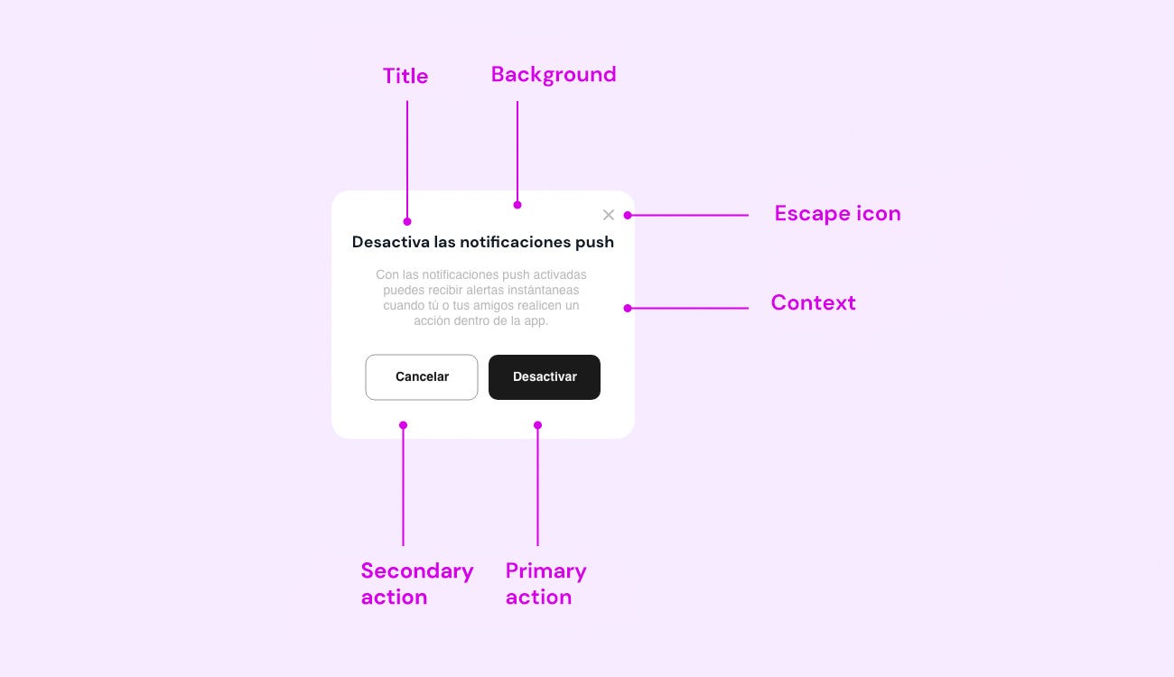
Example created by me for mid-fidelity wireframes depicting the UX tone and voice of PayCapp
Anatomy of a Basic Modal
1. Title
All alert dialogs should have a title. The title should appear in bold, hold a higher hierarchy at the top of the dialog box, and use a few words to convey the outcome of what will happen if a user proceeds with an action.
2. Description
Alert dialogs should include a description as this succinctly communicates any additional information or context a user needs to know, whether to make decisions displayed or to have alert details.
It is recommended for the title to use an infinitive verb that encourages action. To provide ample context to users, use the {verb}+{noun} format in actions.
3. Button
Primary Action Button: When an alert dialog box contains a button, the label for the primary action is for the first button, which will be placed further to the right in case of two options. The button should communicate what the button will do with a concise and understandable phrase to describe the next step if selected or to acknowledge and close the dialog.
Secondary Action Button: An alert dialog box can have a total of 3 buttons if the label for the secondary value button is determined. If not defined, the button won’t appear. The label of the secondary value button communicates what the button will do with a concise and understandable phrase to describe what will happen in the next step if selected. This button should appear to the left, before the primary action button.
Tertiary Action Button: An alert dialog box with a tertiary button provides an option to go back, suspend, or request support. The action will have a label of “Cancel,” “Help,” or “Back” by default.
4. Exit Option
Escape Button: It’s a button in the top-right corner (or another suitable location) of the modal that allows the user to close it. It’s often represented as an “x.”
Overlay: An area that can cover part of the main interface to focus attention on the modal. Clicking on the overlay (outside the modal) generally closes it.
Variants
- Confirmation: We use a confirmation variant to prompt a user to confirm a choice. This alert dialog box features a primary button with greater emphasis to highlight a strong preference for which action to take, in contrast to the secondary action or cancel (depending on the context).
- Warning: Warning dialog boxes convey important information to users regarding an issue that needs acknowledgment but doesn’t prevent the user from proceeding. It includes a warning icon near the title to reinforce its significance.
- Destructive: Destructive alert dialogs are used when a user needs to confirm an action that will impact their data or experience in a potentially negative way, such as deleting files or contacts.
- Error: Error alert dialogs communicate critical information about a problem that a user must recognize. This alert dialog box includes a warning icon to reinforce its importance and prevents the user from proceeding with their action.
- Informative: Informative alert dialogs convey an important message that a user should know. Before using this type of alert dialog, ensure that the context of communication is appropriate for the message.
It is important to consider that you must provide context to the user, guiding them to take immediate action based on the prompt.
Table of Prompt Variants
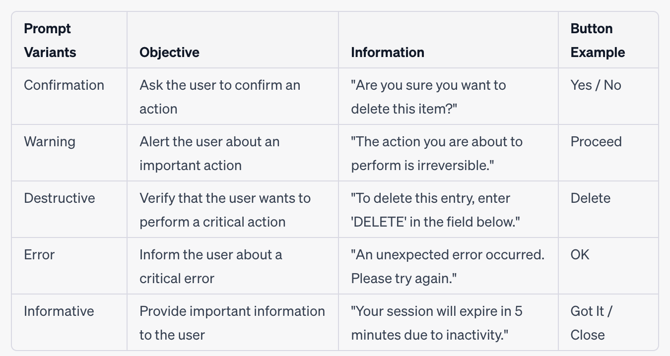
Image create by me
Best practices for writing
1. Active and Passive Voice
Active voice
In most cases, use active voice and employ passive voice sparingly.
- Active voice makes sentences simpler, shorter, clearer, and more conversational.
- Passive voice can be used to soften and create distance in select situations (e.g., notification of a disabled account).
Use active voice when users need to do something or have taken an action. It should be evident that the subject is the one performing the action.
Example: Not recommended: Your transaction has been successfully processed. Recommended: You successfully processed your transaction.
Avoid passive voice by redirecting the focus.
Generally, you can rephrase a message to focus on the object or actions someone might take, as an alternative way to avoid passive voice.
Example:
Not recommended: You made a mistake. No search results were found. Recommended: Something went wrong. There are no search results.
Passive Voice
At times, active voice can sound too harsh. In such cases, employ passive voice. This separates the doer from the action enough to soften a sentence.
In a passive sentence, the most important person or thing becomes the subject of the sentence.
Example:
Not recommended: We declined your transaction. Recommended: Your transaction has been declined.
2. Verbs
Generally, use simple verb tenses: past, present, and future. Simple verb tenses are used to describe actions without specifying whether the actions are completed (perfect tenses) or ongoing (progressive tenses).
When to Use a Modal?
Dialogs are considered intrusive for users, so it’s essential to understand the context of when they should be used. Consider the following key points:
- If an action involves a high level of risk and a user confirmation is required, then dialog boxes should be used.
- For actions that block a specific operation for the user.
If the user’s action doesn’t fall into these options, you can resort to using other types of components, such as toast alerts, bottom sheets, sticky header to the top, or snackbars, which provide a less invasive experience.

Example of Digo Hispanic Network Utilizing a Fixed Header Instead of an Intrusive Popup
Later, I will continue writing about best practices for alert and notification components. Just remember, every word you choose holds the power to shape user experiences, just like UI Design.
메타데이터
- post_id
- a0fcd062fdf2
- slug
- the-impact-of-your-words-crafting-effective-microcopy-for-modal-components-a0fcd062fdf2
- url
- https://medium.com/design-bootcamp/the-impact-of-your-words-crafting-effective-microcopy-for-modal-components-a0fcd062fdf2
- canonical_url
- https://medium.com/design-bootcamp/the-impact-of-your-words-crafting-effective-microcopy-for-modal-components-a0fcd062fdf2
- author_url
- https://medium.com/@bagiarez
- status
- ok
- fetched_at
- 2026-06-17 10:21:25