What Building a Five-Page Power BI Dashboard Actually Taught Me
The story behind a dashboard in my data analytics portfolio including a map that refused to cooperate, and what I noticed once I stopped…
What Building a Five-Page Power BI Dashboard Actually Taught Me
The story behind a dashboard in my data analytics portfolio including a map that refused to cooperate, and what I noticed once I stopped just building and started reading my own work
This is one of the dashboards in my data analytics portfolio, and it started life as a coursework assignment I was given a retail sales dataset (furniture, office supplies, and technology sold across four US regions between 2010 and 2013) and asked to turn it into something a manager could actually use. I ended up branding it under a company name of my own, Grace and Co. Limited, mostly because it made the whole thing feel less like a school exercise and more like something real I was responsible for.
I didn’t start with design. I started with a blank page of DAX measures, scattered wherever there was room, just to prove to myself the numbers were right before I trusted them near anything polished.
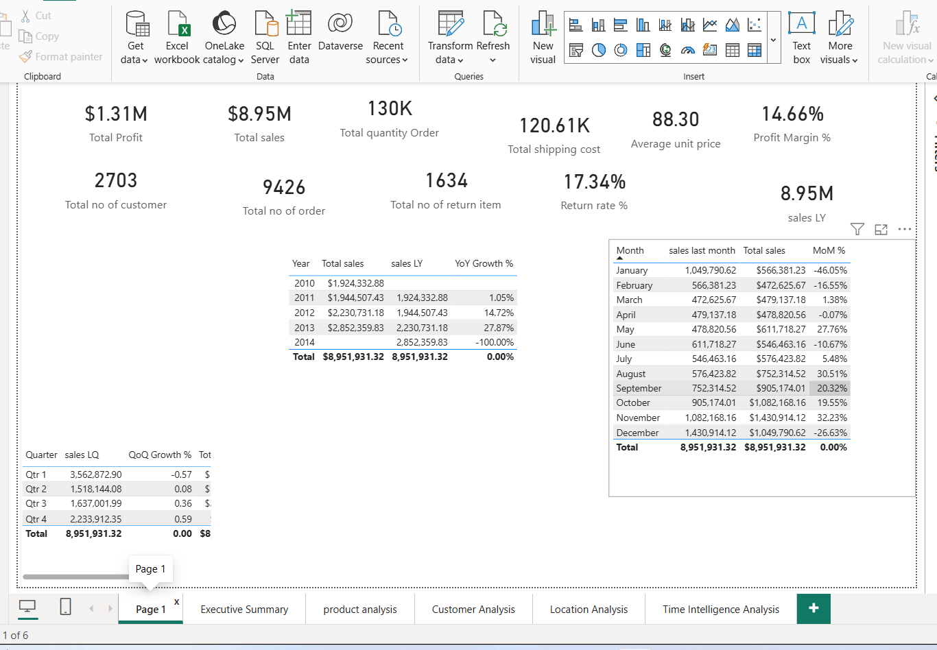
Total Profit sitting at $1.31M against $8.95M in sales. A 17.34% return rate that felt higher than I expected. A year-over-year table showing sales climbing steadily until a 27.87% jump in 2013. None of it was styled. It didn’t need to be yet I just needed to know the numbers held up before I built anything on top of them.
Getting the front page right
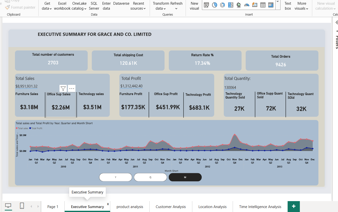
Once I trusted the numbers, I rebuilt the whole thing as a five-page report, starting with an Executive Summary the one page I imagined an actual manager would open first and maybe never scroll past.
Executive Summary
I kept the top row to four numbers only: 2,703 customers, 120.61K in shipping cost, that same 17.34% return rate, 9,426 orders. Underneath, Total Sales and Total Profit broken down by category side by side and that’s where I noticed something that shaped the rest of the dashboard. Furniture and Technology were close on sales ($3.18M vs $3.51M), but nowhere close on profit ($177.35K vs $683.1K). That gap is what made me build a whole page just for products.
Chasing the Furniture margin problem
Product Analysis
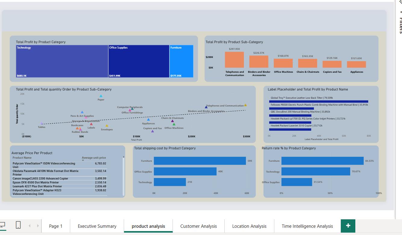
This page exists because of that one gap from the summary page. Breaking profit down by sub-category, it was Telephones and Communication ($297.95K) and Binders and Binder Accessories ($226.57K) doing most of the actual profit work not the categories with the biggest sales numbers. The scatter plot of profit against quantity made it click for me: Paper sells in huge volume but barely moves the profit needle, while Telephones sits at the opposite end lower volume, disproportionate profit.
I also noticed the return rate by category showing Furniture at 84.53%, way above Office Supplies at 31.54%. I don’t think that’s a real insight so much as a data quality flag if this were an actual business, I’d be asking someone why that number is that high before I put it in front of a manager as fact.
Who’s actually buying
Customer Analysis
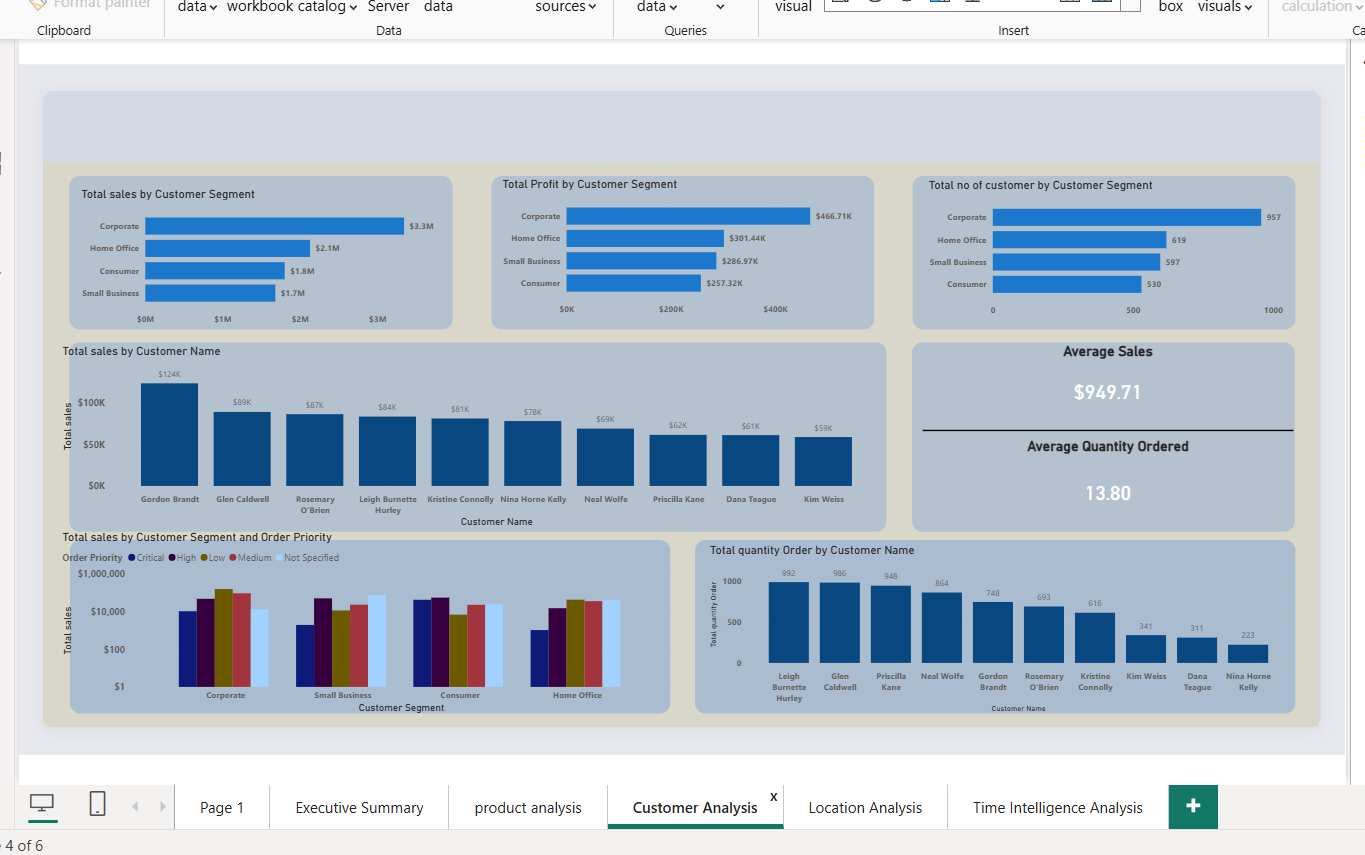
Segment by segment, Corporate led on sales ($3.3M), profit ($466.71K), and customer count (957) all at once not just the biggest segment, proportionally the healthiest too. I added a Top 10 customers list on purpose, because it’s easy to talk about “Corporate” as an abstract segment and forget it’s an actual list of named accounts Gordon Brandt at $124K, Glen Caldwell right behind him.
The map that wouldn’t cooperate
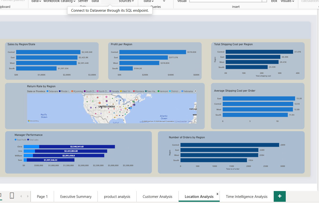
Location Analysis
This page is where I got properly stuck. I wanted a map showing return rate by state, and for a while it just wouldn’t show it the map rendered, the states were there, but the return rate values weren’t coming through the way I expected.
I spent a while going back and forth on it, checking the field I’d dropped into the visual, before I actually figured out what was going wrong with how the measure and the geography field were interacting. It wasn’t a quick fix, and it’s honestly the part of this dashboard I’m least confident I’d get right immediately if I had to rebuild it from scratch.
Once it was working, the regional numbers underneath were more straightforward: Central led on sales ($2,540.34K) and profit ($519.83K), while South trailed on both ($1,597.35K, $104.2K). What I’m glad I added was the Manager Performance chart next to it because “Central is outperforming” is an abstract regional fact, but “Chris runs Central and Chris’s numbers are $2,540,341.62” is a specific person and a specific conversation. Same for Sam in South.
Closing the loop with time
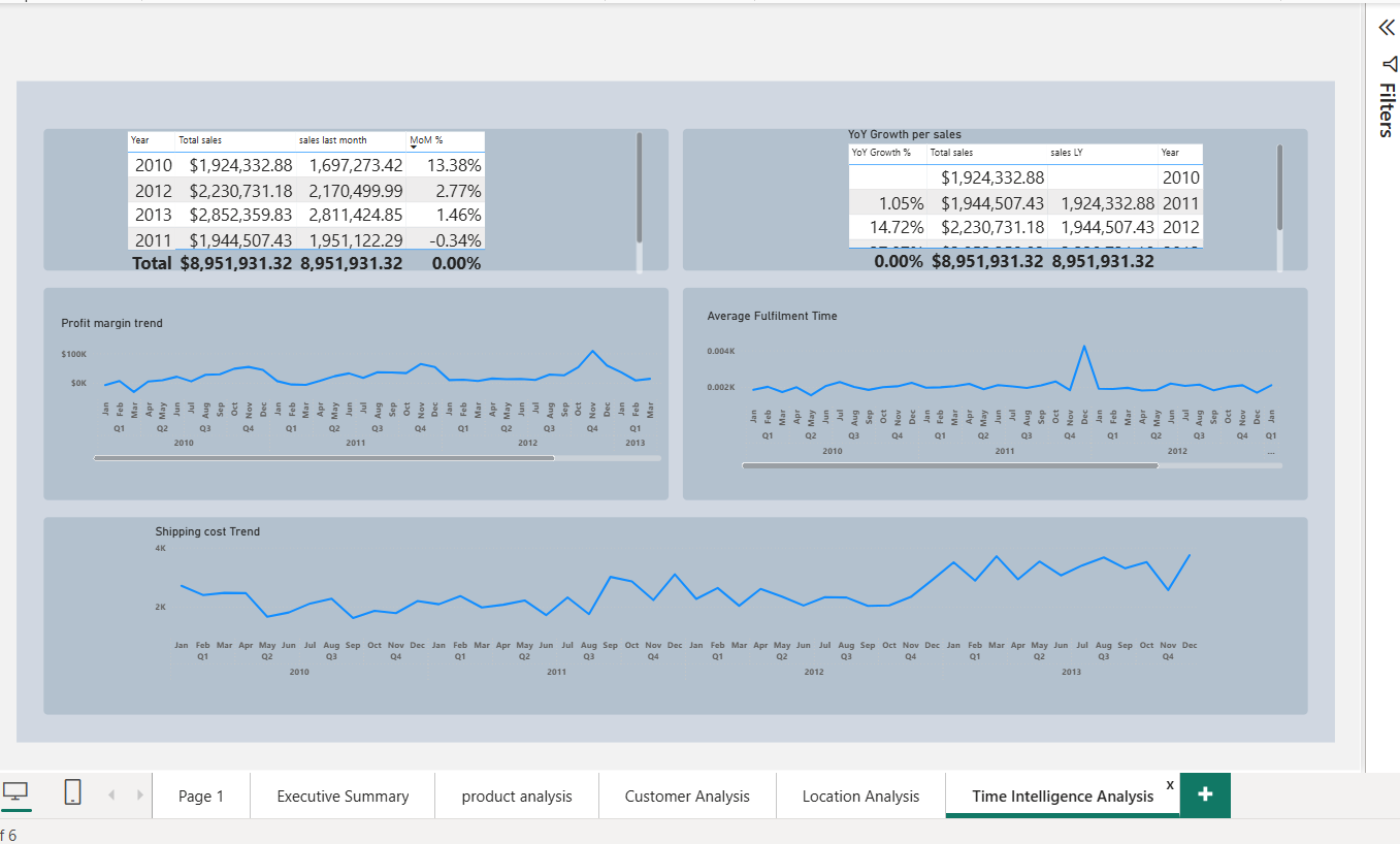
Time Intelligence Analysis
This page is the direct descendant of that very first rough YoY table. Once the growth measures were clean, I wanted to see them as trends rather than tables. The profit margin trend stays fairly flat while shipping cost trends upward across the four years which makes me wonder, without fully knowing yet, whether rising shipping cost is quietly working against the profit growth the yearly numbers seem to show. I don’t think this version of the dashboard answers that. I think it’s the next thing worth checking.
What I actually took away from this
The map issue is the part I keep coming back to, honestly. It wasn’t a big dramatic failure, just a stretch of not understanding why a visual wasn’t showing what I expected, and having to slow down and actually look at what the measure was doing instead of assuming the visual was just broken.
That’s a small thing, but it’s the part of this project that taught me the most more than any of the polished pages did.
I also didn’t plan for one page to raise a question the next page answered. That happened because I kept looking at what I’d just built and asking what it didn’t explain yet, instead of moving on once it looked finished. I think that’s the actual difference between a dashboard that just displays numbers and one that tells you something whether you let yourself keep questioning it after it looks done.
메타데이터
- post_id
- a2c3cd264a96
- slug
- what-building-a-five-page-power-bi-dashboard-actually-taught-me-a2c3cd264a96
- url
- https://medium.com/@temiloluwa153/what-building-a-five-page-power-bi-dashboard-actually-taught-me-a2c3cd264a96
- canonical_url
- https://medium.com/@temiloluwa153/what-building-a-five-page-power-bi-dashboard-actually-taught-me-a2c3cd264a96
- author_url
- https://medium.com/@temiloluwa153
- status
- ok
- fetched_at
- 2026-07-27 07:25:31



