Best 10+ Shadcn Dialog Components and Blocks (Radix + Base UI)
Dialogs are one of the most sensitive UI components in any app. If they break, users lose context, miss actions, or get stuck in flows.
Best 10+ Shadcn Dialog Components and Blocks (Radix + Base UI)
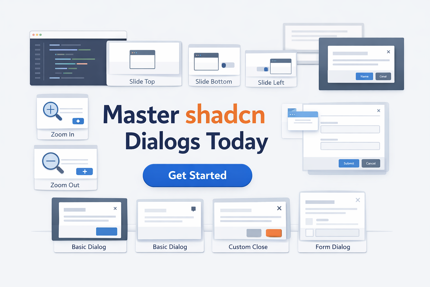
Best 10+ Shadcn Dialog Components and Blocks (Radix + Base UI)
Dialogs are one of the most sensitive UI components in any app. If they break, users lose context, miss actions, or get stuck in flows.
A dialog is not just a pop-up. It blocks background interaction, traps focus, and forces a decision before continuing. This is why it needs proper handling at both the UI and logic levels.
In Shadcn, dialogs are built on top of Radix UI and Base UI primitives. These handle complex parts like focus trapping, keyboard navigation, ARIA roles, and state management out of the box.
That means you don’t spend time rebuilding accessibility or interaction logic. You only control structure, styling, and behavior.
This blog focuses on real dialog patterns used in production, not visual variations. Every component listed here is based on:
- Actual behavior (focus, scroll, state)
- CLI install and reuse
- Same API across all variants
- Use-case driven implementation
You’ll see a total of 10 **Shadcn dialog components **here, all using the same core structure:
Dialog → DialogTrigger → DialogContentEach component below is written from a developer's perspective:
- What it does
- how it behaves
- When to use it
No design fluff. Only implementation clarity.
Best Shadcn Dialog Components and Blocks
All the components listed below are free and open source, and you can install some of these components via the CLI Command.
Slide from Top

Slide from Top
This pattern is used when you want to interrupt the user without changing their layout. It renders near the top viewport, so the user sees it instantly without scanning.
It works best when the content is short, and action is required immediately. Avoid using it for forms because vertical space is limited.
Key Features:
- Transform:
translateY(-100%) → 0 - Mounts quickly, minimal repaint
- Keeps the main layout visible
- Works well with small DialogContent
Best for: alert dialogs and destructive confirmations
Slide from Bottom

Slide from Bottom
This behaves like a bottom sheet and is more natural for input-heavy flows. It keeps the dialog closer to the interaction area, especially on mobile.
You can stack multiple inputs and still maintain usability because scrolling is contained inside the dialog.
Key Features:
- Transform:
translateY(100%) → 0 - Supports internal scroll area
- Easy sticky footer (submit button always visible)
- Better touch interaction
Best for: forms, multi-field inputs, mobile flows
**Checkout Slide from Bottom**
Slide from Left

Slide from Left
This turns your dialog into a functional sidebar. It does not fully break context, which helps when users need to compare or adjust something quickly.
It’s often reused as a filter panel or settings drawer in dashboards.
Key Features:
- Transform:
translateX(-100%) → 0 - Full-height container support
- Can persist state between opens
- Easy to reuse as a layout component
Best for: filters, navigation panels, quick settings
Slide from Right

Slide from Right
This is the most used pattern in SaaS dashboards. It lets you open details without navigating away from the page.
Users can inspect, edit, and close without losing context.
Key Features:
- Transform:
translateX(100%) → 0 - Supports async data fetch on open
- Works well with a controlled state
- Keeps the background visible for reference
Best for: detail views, edit panels, analytics drill-down
Zoom In

Zoom In
This pattern focuses attention on a single action. It reduces distraction because the dialog appears centered and scaled.
It’s best when the user needs to make a quick decision.
Key Features:
- Scale:
0.95 → 1with opacity - Smooth entry with minimal movement
- Low layout shift
- Works well with small content
Best for: login, confirmation, short actions
Zoom Out

Zoom Out
This is not an entry pattern; it improves exit behavior. Without this, dialogs disappear abruptly and feel broken.
It helps maintain visual continuity when closing.
Key Features:
- Controlled exit animation
- Prevents instant unmount
- Can be synced with state updates
- Improves perceived performance
Best for: closing transitions and success states
Basic Dialog

Basic Dialog
This is the default dialog with no animation customization. It uses center positioning and is the base for all other variants.
You should always start from this when building new dialog behavior instead of jumping into animations directly.
Key Features:
- Default centered modal layout
- Uses Dialog → Trigger → Content structure
- Built-in focus trap and keyboard handling
- Minimal setup, no animation config needed
Best for: simple alerts, confirmations, default modal usage
Dialog With Custom Close

Dialog With Custom Close
This variant gives you full control over how and when the dialog closes. It is useful when the default close behavior is not safe.
You can override close triggers and attach logic like validation or confirmation before closing.
Key Features:
- Custom close button or handler
- Override
onOpenChangelogic - Block close on Escape or outside click
- Supports conditional closing (based on state)
Best for: critical flows like delete, payment, or unsaved changes
**Checkout Dialog With Custom Close**
Dialog With Form

Dialog With Form
This combines dialog with form handling and validation. It is commonly used in dashboards where users input or update data.
You need a controlled state here to avoid losing input or closing prematurely.
Key Features:
- Controlled state (
open,onOpenChange) - Prevent closing on an invalid form.
- Supports async submission (API calls)
- Works with validation libraries (Zod, React Hook Form)
Best for: user input, data creation, and edit forms
Newsletter Subscription Dialog

Newsletter Subscription Dialog
This is a real block that combines dialog + form + validation. Unlike animation variants, this handles actual business logic.
You control when it opens, when it should not close, and how submission behaves.
Key Features:
- Controlled state (
open,onOpenChange) - Prevent closing on invalid input.
- Async submit support (API call inside dialog)
- Contains 5 elements: input, CTA, title, description, close
Best for: email capture and website analytics flows
**Checkout Newsletter Subscription Dialog**
FAQs
1. Why does my dialog close during form submission?
Dialog allows outside clicks and escape by default. Disable it using onPointerDownOutside and onEscapeKeyDown.
2. Why is my dialog flickering or opening twice?
This happens when controlled and uncontrolled states are mixed. Use only one state pattern.
3. How do I persist data after the dialog closes?
Dialog unmount removes internal state. Store data in parent or global state.
Final Verdict
**Shadcn dialog** is not multiple components; it is one consistent system where only the behavior changes. You reuse the same structure and API, which reduces bugs and keeps implementation predictable across projects.
In real projects, default to Slide from Right with controlled state. Focus on state handling and correct usage, because accessibility, focus management, and core logic are already handled internally.
메타데이터
- post_id
- a3722fda9bbf
- slug
- best-shadcn-dialog-components-and-blocks-radix-base-ui-a3722fda9bbf
- url
- https://medium.com/write-a-catalyst/best-shadcn-dialog-components-and-blocks-radix-base-ui-a3722fda9bbf
- canonical_url
- https://medium.com/write-a-catalyst/best-shadcn-dialog-components-and-blocks-radix-base-ui-a3722fda9bbf
- author_url
- https://medium.com/@ivaibhavgupta
- status
- ok
- fetched_at
- 2026-07-11 14:23:40