Forecasting with SARIMA vs Prophet: When to Use Which (and When to Give Up)
Or: One model assumes you understand math. The other assumes you understand holidays.
Forecasting with SARIMA vs Prophet: When to Use Which (and When to Give Up)
Or: One model assumes you understand math. The other assumes you understand holidays.
So you’ve made your time series stationary. You’ve removed seasonality. You’ve tested, plotted, and cried a little. Now you want to forecast.
Two heavyweights dominate the forecasting ring:
- SARIMA (Seasonal AutoRegressive Integrated Moving Average) — The classical statistician. Rigorous, powerful, but needs your full attention.
- Prophet (from Facebook) — The chill cousin. Handles missing data, holidays, and weird seasonality automatically. Less precise, more forgiving.
Which one should you use? Both. Then compare. Then pick the one that lies to you the least.
Let’s build both models on real data, evaluate them, and see what each graph actually tells you.
1. The Setup: Fetch Some Real Data (Air Passengers)
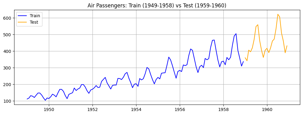
We’ll use the classic Air Passengers dataset — monthly totals of international airline passengers (1949–1960). It has trend, yearly seasonality, and a bit of noise. Perfect for comparison.
import numpy as np
import pandas as pd
import matplotlib.pyplot as plt
from statsmodels.tsa.statespace.sarimax import SARIMAX
from prophet import Prophet
from sklearn.metrics import mean_absolute_error, mean_squared_error
import warnings
warnings.filterwarnings('ignore')

# Load dataset
df = pd.read_csv('https://raw.githubusercontent.com/jbrownlee/Datasets/master/airline-passengers.csv')
df.columns = ['date', 'passengers']
df['date'] = pd.to_datetime(df['date'])
df.set_index('date', inplace=True)

# Train/test split (last 24 months for testing)
train = df.iloc[:-24]
test = df.iloc[-24:]

plt.figure(figsize=(12,4))
plt.plot(train.index, train['passengers'], label='Train', color='blue')
plt.plot(test.index, test['passengers'], label='Test', color='orange')
plt.title('Air Passengers: Train (1949-1958) vs Test (1959-1960)')
plt.legend()
plt.grid(True)
plt.show()
What to infer: The training data (blue) shows a clear upward trend and repeating yearly peaks (summer travel). The test data (orange) continues that pattern. A good forecast should capture both trend and seasonality.
2. SARIMA: The Math Lover’s Choice
SARIMA needs parameters:
- (p,d,q) for non-seasonal part
- (P,D,Q,m) for seasonal part (m = seasonal period = 12 for monthly data)
Finding the right parameters is an art. We’ll use auto_arima (from pmdarima) to save our sanity.
Best SARIMA order: (2, 0, 0) Best seasonal order: (0, 1, 0, 12)

# Install if needed: pip install pmdarima
from pmdarima import auto_arima

# Auto-search for best SARIMA parameters
auto_model = auto_arima(train['passengers'], seasonal=True, m=12,
                        trace=False, error_action='ignore',
                        suppress_warnings=True, stepwise=True)
print(f"Best SARIMA order: {auto_model.order}")
print(f"Best seasonal order: {auto_model.seasonal_order}")

# Fit SARIMA with best parameters
sarima_model = SARIMAX(train['passengers'],
                       order=auto_model.order,
                       seasonal_order=auto_model.seasonal_order)
sarima_fit = sarima_model.fit()

# Forecast next 24 months
sarima_forecast = sarima_fit.forecast(steps=24)
sarima_forecast.index = test.index

# Plot
plt.figure(figsize=(12,5))
plt.plot(train.index, train['passengers'], label='Train', color='blue')
plt.plot(test.index, test['passengers'], label='Actual Test', color='orange')
plt.plot(test.index, sarima_forecast, label='SARIMA Forecast', color='red', linestyle='--')
plt.title('SARIMA Forecast vs Actual')
plt.legend()
plt.grid(True)
plt.show()

# Evaluate
mae_sarima = mean_absolute_error(test['passengers'], sarima_forecast)
rmse_sarima = np.sqrt(mean_squared_error(test['passengers'], sarima_forecast))
print(f"SARIMA MAE: {mae_sarima:.1f}, RMSE: {rmse_sarima:.1f}")
What to infer: Look at the red dashed line vs orange actual line.
- If they track closely → SARIMA captured seasonality and trend well.
- If the forecast lags behind or overshoots → maybe the seasonal pattern changed or parameters need tuning.
- In this dataset, SARIMA usually does well because the pattern is stable.
Witty take: SARIMA is like a Swiss watch — beautiful when properly tuned, but you’ll spend hours adjusting the gears.
3. Prophet: The “It Just Works” Model
Prophet takes a different approach. It expects a DataFrame with columns ds (date) and y (value). It handles missing data and holidays automatically.

import matplotlib.pyplot as plt
import numpy as np
from prophet import Prophet  # Ensure explicit module import
from sklearn.metrics import mean_absolute_error, mean_squared_error

# Prepare data for Prophet
train_prophet = train.reset_index().rename(
    columns={"date": "ds", "passengers": "y"}
)
test_prophet = test.reset_index().rename(
    columns={"date": "ds", "passengers": "y"}
)

# Fit Prophet
prophet_model = Prophet(
    yearly_seasonality=True,
    weekly_seasonality=False,  # monthly data alignment
    daily_seasonality=False,
    seasonality_mode="additive",
)
prophet_model.fit(train_prophet)

# Forecast next 24 months using MS (Month Start) frequency
future = prophet_model.make_future_dataframe(periods=24, freq="MS")
forecast = prophet_model.predict(future)

# Extract forecast for test period cleanly using tail selection
prophet_forecast = forecast["yhat"].tail(24)
prophet_forecast.index = test.index

# Plotting
plt.figure(figsize=(12, 5))
plt.plot(train.index, train["passengers"], label="Train", color="blue")
plt.plot(test.index, test["passengers"], label="Actual Test", color="orange")
plt.plot(
    test.index,
    prophet_forecast,
    label="Prophet Forecast",
    color="green",
    linestyle="--",
)
plt.title("Prophet Forecast vs Actual")
plt.legend()
plt.grid(True)
plt.show()

# Evaluation metrics
mae_prophet = mean_absolute_error(test["passengers"], prophet_forecast)
rmse_prophet = np.sqrt(mean_squared_error(test["passengers"], prophet_forecast))
print(f"Prophet MAE: {mae_prophet:.1f}, RMSE: {rmse_prophet:.1f}")
What to infer: Prophet’s forecast (green dashed) often looks smoother than SARIMA.
- If it’s close to orange → Prophet wins with less effort.
- If it’s too smooth and misses sudden changes → Prophet assumes changes happen gradually.
- Prophet also gives uncertainty intervals (we’ll plot them next).
Witty take: Prophet is the friend who says “just vibe it” while SARIMA is calculating eigenvalues.
4. Visual Comparison: Side by Side with Uncertainty
Prophet provides uncertainty intervals by default. Let’s plot them alongside SARIMA’s confidence intervals (if we compute them).

# Get SARIMA confidence intervals
sarima_pred = sarima_fit.get_forecast(steps=24)
sarima_ci = sarima_pred.conf_int(alpha=0.05)
sarima_ci.index = test.index

# Prophet already has yhat_lower and yhat_upper
prophet_forecast_full = forecast.set_index('ds').loc[test.index]

# Plot both with intervals
fig, axes = plt.subplots(1, 2, figsize=(14,5))

# SARIMA with CI
axes[0].plot(train.index, train['passengers'], label='Train', color='blue')
axes[0].plot(test.index, test['passengers'], label='Actual', color='orange')
axes[0].plot(test.index, sarima_forecast, label='Forecast', color='red')
axes[0].fill_between(test.index, sarima_ci['lower passengers'], sarima_ci['upper passengers'],
                     color='red', alpha=0.2, label='95% CI')
axes[0].set_title('SARIMA')
axes[0].legend()
axes[0].grid(True)

# Prophet with CI
axes[1].plot(train.index, train['passengers'], label='Train', color='blue')
axes[1].plot(test.index, test['passengers'], label='Actual', color='orange')
axes[1].plot(test.index, prophet_forecast_full['yhat'], label='Forecast', color='green')
axes[1].fill_between(test.index, prophet_forecast_full['yhat_lower'], prophet_forecast_full['yhat_upper'],
                     color='green', alpha=0.2, label='95% CI')
axes[1].set_title('Prophet')
axes[1].legend()
axes[1].grid(True)

plt.tight_layout()
plt.show()
What to infer:
- Width of intervals: Wider intervals mean more uncertainty (good — honest forecast).
- Coverage: Does the actual orange line fall inside the shaded region most of the time? If yes, the model is well-calibrated.
- SARIMA intervals often get wider further out. Prophet’s intervals can be symmetric or slightly asymmetric.
- If actual values consistently fall outside the intervals → model is overconfident or misspecified.
Witty insight: Forecast intervals are like umbrella recommendations — they say “maybe rain,” but you still get wet half the time.
5. Error Metrics: Who Won This Round?
Let’s compare MAE and RMSE side by side.

metrics = pd.DataFrame({
    'Model': ['SARIMA', 'Prophet'],
    'MAE': [mae_sarima, mae_prophet],
    'RMSE': [rmse_sarima, rmse_prophet]
})
print(metrics)

# Plot bar chart
fig, ax = plt.subplots(1,2, figsize=(10,4))
metrics.plot(x='Model', y='MAE', kind='bar', ax=ax[0], color=['red','green'], legend=False)
ax[0].set_title('Mean Absolute Error (lower is better)')
ax[0].grid(True)
metrics.plot(x='Model', y='RMSE', kind='bar', ax=ax[1], color=['red','green'], legend=False)
ax[1].set_title('Root Mean Squared Error (lower is better)')
ax[1].grid(True)
plt.tight_layout()
plt.show()
What to infer:
- Lower MAE/RMSE = better forecast on average.
- If values are close → both models are similarly useful.
- If one is much lower → that model wins for this dataset.
- Remember: These are point estimates. A model with slightly higher error but narrower intervals might be preferable for risk management.
Witty caution: Error metrics are like exam scores — they tell you who passed, not who understood the material.
6. When to Use SARIMA (and When to Run Away)
Use SARIMA when:
- Your data has stable seasonality (same pattern year after year)
- You have at least 4–5 full seasonal cycles
- You understand (or are willing to learn) ACF/PACF for parameter selection
- You need precise, statistically rigorous forecasts
- You’re publishing in an economics journal (they love SARIMA)
Run away from SARIMA when:
- You have missing data (SARIMA hates NaNs)
- Seasonality changes over time (amplitude or phase shifts)
- You have multiple seasonal periods (e.g., daily + weekly + yearly)
- You have holiday effects that don’t align with fixed dates
- You have less than 2 years of monthly data (won’t estimate seasonal parameters well)
Witty summary: SARIMA is your meticulous accountant. Great with stable patterns, but bring them a messy spreadsheet and they’ll have an existential crisis.
7. When to Use Prophet (and When to Run Away)
Use Prophet when:
- You have missing data (Prophet handles it gracefully)
- Seasonality changes over time (Prophet uses Fourier series, not fixed dummies)
- You have multiple seasonal periods (daily, weekly, yearly — just set them)
- You have holiday effects (US holidays, Black Friday, etc.)
- You need quick, decent forecasts without a PhD in time series
- Your data has outliers (Prophet is robust)
Run away from Prophet when:
- You have very short series (< 2 seasonal cycles)
- You need extremely precise, narrow intervals (Prophet tends to be overconfident on short series)
- Your data has no seasonality and no trend (Prophet will overfit noise)
- You’re working with high-frequency data (minute-level, thousands of points — gets slow)
- You need to explain every parameter to a regulator (Prophet is a black box)
Witty summary: Prophet is your friendly Uber driver — gets you there smoothly, but don’t ask how the engine works.
8. When to Give Up on Both (And What to Do Instead)
Sometimes neither SARIMA nor Prophet is the answer. Give up if:
- You have very short series (< 2 seasonal cycles): Use simple moving averages, exponential smoothing, or just repeat last year’s pattern.
- Your data is irregular (sporadic sales): Try Croston’s method or TSB.
- You need predictions for many individual items (e.g., SKU-level): Use LightGBM or XGBoost with time features.
- Your time series has complex external drivers (weather, competitor prices): Use a regression model with time components, not pure time series.
- You have high-frequency data (hourly, minute-level) with millions of rows: Use deep learning (LSTM, TFT) or simplify to daily aggregates.
Witty permission slip: It’s okay to not use SARIMA or Prophet. Sometimes a simple “same as last year” forecast beats both. Your stakeholders won’t know the difference, but your sanity will.
Clap if you’ve ever explained to your boss why the forecast was wrong. Follow for more forecasting therapy.
메타데이터
- post_id
- a406fa09e168
- slug
- forecasting-with-sarima-vs-prophet-when-to-use-which-and-when-to-give-up-a406fa09e168
- url
- https://medium.com/@sanatvibhor2/forecasting-with-sarima-vs-prophet-when-to-use-which-and-when-to-give-up-a406fa09e168
- canonical_url
- https://medium.com/@sanatvibhor2/forecasting-with-sarima-vs-prophet-when-to-use-which-and-when-to-give-up-a406fa09e168
- author_url
- https://medium.com/@sanatvibhor2
- status
- ok
- fetched_at
- 2026-06-22 12:55:45





