Your Dashboard Is Lying to You
Every productivity tool on the market promises to ‘give you clarity.’ What they actually give you is a beautifully designed anxiety…
Your Dashboard Is Lying to You
Every productivity tool on the market promises to ‘give you clarity.’ What they actually give you is a beautifully designed anxiety generator.

If you are unable to read this article in its entirety, click here.
You open your project management dashboard. Seventeen cards are in progress. Four are overdue. Three have red labels. Two have comments you have not read. There is a graph in the corner showing velocity trends over the last six sprints. You have no idea what velocity means in this context, but the line is going down, which feels bad.
You close the tab. You make coffee. You have accomplished nothing except confirming that you are behind, overwhelmed, and possibly illiterate in whatever language this tool speaks.
This is the trap. We build systems to carry weight, and the system itself becomes something else to carry.
The Illusion of Control
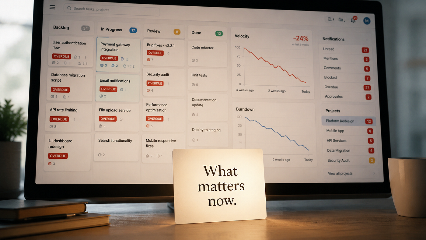
Dashboards seduce us because they look like competence. Charts and metrics and color-coded statuses create the impression that we are managing complexity. But managing complexity is not the same as doing the work. Often it is the opposite.
I have watched clients pour hours into customizing their Notion dashboards. They build relational databases with seventeen properties. They create filtered views for every conceivable scenario. They write formulas that would make a spreadsheet weep. And then they never use them because the cognitive load of navigating the system exceeds the cognitive load of just remembering what they need to do.
The tool became a second job. A job nobody applied for and nobody gets paid to do.
This is not a user failure. This is a design failure dressed up as a feature set.
What Focus Actually Looks Like
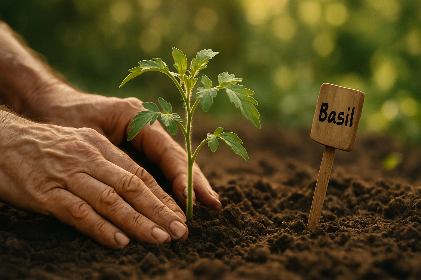
I garden. I have a small plot, and every spring I face the same question: is it safe to put the tomatoes in the ground yet? One wrong frost and a month of careful seedling work is gone.
I built Brown’s Garden Buddy to answer exactly that. It pulls a weather API, gives me a one-week forecast, and tells me straight up whether it is safe to plant. It also drops companion planting advice so I know what grows well together without digging through a gardening encyclopedia or scrolling through ten blog posts full of ads.
That is it. No soil pH history. No five-year yield projection. No weather trend analysis. Just: here is the forecast, here is the answer, and while you are here, plant the basil near the tomatoes because they like each other.
The tool is not simple because it is unsophisticated. It is simple because my mental bandwidth belongs to the garden, not to the tool.
That same principle applies whether you’re tending a garden or designing software.
Sentrya works the same way. You talk to it. You tell it what is happening with your body, your symptoms, your day. It does not hand you back a chart comparing this month to last month. It tells you what matters right now. What to watch. What to do next. The human is not required to become a data analyst to understand their own health.
That is the difference between a tool and a burden. A tool serves the person. A burden demands the person serve it.
DobieCore does not dump a content calendar, brand guidelines, analytics, and a half-finished strategy document in your lap and wish you luck. It surfaces the task that unlocks everything else. The one thing. Not the ten things. Because on a day when your brain is only firing at sixty percent, you cannot process ten things. You need to know what happens first.
Even my Notion setup, which could absolutely become a monster if I let it, is rigged to show me only what needs my eyes right now. I do not browse my workspace. I interrogate it. I ask specific questions and it gives specific answers. If it ever starts requiring me to maintain it more than I use it, I strip it down. Ruthlessly.
Designing for Ordinary Days
This is where most tools fail. They are designed for peak performance. For the ideal morning when you slept eight hours, your coffee was perfect, nobody interrupted you, and your brain is operating at full capacity.
Those mornings do not happen often. And they are not the mornings that determine whether a system works.
A system is only as good as its performance on the bad days. The days when you are running on four hours of sleep because your dad was up wandering again. The days when your vestibular migraine is making screens swim. The days when your dog’s CDA is flaring and you are worried about him, and your concentration is shot, and the last thing you need is a dashboard asking you to analyze trends.
The best tool is not the one with the most features. It is the one that keeps functioning when your features are depleted.
This is not minimalism for its own sake. It is an ethical stance. It says that the human using the tool matters more than the tool itself. That accessibility is not a checkbox but a core design principle. That a system which only works when everything is easy is not a system. It is a fantasy.
The Cost of Complexity

Every additional feature, every new metric, every optional view adds a decision. Should I look at this? Do I need to care about that? Is this red thing important or just red because the threshold is set wrong?
Decision fatigue is real, and productivity tools are some of its worst offenders. They multiply decisions under the guise of providing information. They create work about work.
I have seen this in my own projects. Pleasant Valley Bulk Foods had five hundred SKUs and a client who shared no assets. The complexity was not the problem. The problem was that every step of the process required the client to make another decision they were not equipped to make. The system I built had to absorb that complexity so they did not have to.
That is what good tools do. They carry the weight so the human does not have to.
The Takeaway
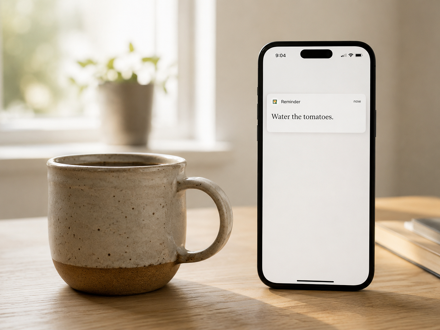
Stop asking your tools to show you everything. Start asking them to show you the next thing.
If your dashboard, your CRM, your project management system, or your health tracker requires you to become a systems analyst before you can take action, it has failed you. A tool that adds mental weight is not a tool. It is a job you did not apply for. It is another open tab in a browser full of open tabs, all of them screaming for attention, none of them giving you clarity.
Build light. Build for the day when everything is hard. Build so the next step is obvious even when nothing else is.
The gardener does not need to understand data visualization to know the tomatoes need to go in the ground. The person managing a chronic condition does not need to trend their numbers to know what their body needs today. The solopreneur does not need a command center to write the next sentence, ship the next feature, have the next conversation.
They need to know what matters now. Everything else is noise.
Build systems that remember that. Build them for the ordinary days. Build them so they still work when you do not.
The goal isn’t to do everything. It’s to notice what matters now.
If this piece helped you think differently about work, systems, or building a life that can hold real human limits, follow Bluedobie Dialogues for more essays on sustainable business architecture, practical workflows, and the human side of building things.
Melanie Brown is the founder of Bluedobie Developing, a rural Kentucky-based SaaS and web development company, and the creator of DobieCore — an AI content platform engineered to give small business owners professional results without the prompt engineering learning curve. She writes the Bluedobie Dialogues series about systems thinking, sustainable business architecture, and what durability actually looks like in practice.
메타데이터
- post_id
- a6a53cd327da
- slug
- your-dashboard-is-lying-to-you-a6a53cd327da
- url
- https://medium.com/bluedobie-dialogues/your-dashboard-is-lying-to-you-a6a53cd327da
- canonical_url
- https://medium.com/bluedobie-dialogues/your-dashboard-is-lying-to-you-a6a53cd327da
- author_url
- https://medium.com/@sabrebluedobie
- status
- ok
- fetched_at
- 2026-07-09 08:02:55