When does throwing a strike matter the most in college baseball?
The relationship between strike percentage and total bases by pitch count
When does throwing a strike matter the most in college baseball?
The relationship between strike percentage and total bases by pitch count
by Adam Maloof and Joe Haumacher
In baseball, when calling a pitch, one big decision you have to make is whether to throw a strike. Do you want to try to get ahead in the count with a strike, or do you want to throw a ball out of the zone to induce a chase, brush the batter back, or just change the batter’s eye level?
Recently, we showed that Total Bases per Innings Pitched (TBIP) is a simple, but powerful, statistic for predicting Runs allowed per Innings Pitched (R/IP). And we consider R/IP the main currency for winning ball games. So in this article, we use TBIP as a measure of the damage done (or avoided) in a plate appearance (PA) when throwing a strike in different counts.
Abbreviations:
D1:    Division 1 college baseball
R:     Runs
H:     Hits
TB:    Total bases, here defined as BB + HBP + 1B + 2*2B + 3*3B + 4*HR
BB:    Walk
HBP:   Hit by Pitch
K:     Strikeout
1B:    Single
2B:    Double
3B:    Triple
HR:    Home run
IP:    Innings pitched
Count: The pitch count is written as Balls-Strikes.
PA:    Plate appearance
AVG:   Batting average, H/AB
SLG:   Slugging percentage, (1B + 2*2B + 3*3B + 4*HR) / AB
TBIP:  Total bases per innings pitched
R/IP:  Runs per inning pitched
You frequently hear that it is important to throw a first pitch strike, because total bases drop precipitously when you go from an 0–0 count to an 0–1 count (Figure 1 Right). That said, total bases peak in 0–0 counts (Figure 1 Right), probably because so many pitchers try to groove a pitch right down the middle on 0–0 to get ahead (Kaden Kram, Seeing more pitches…). And even if pitchers are trying to get ahead, 0–0 counts actually have the second lowest strike percentage, exceeding only 0–2 counts (Figure 1 Left).
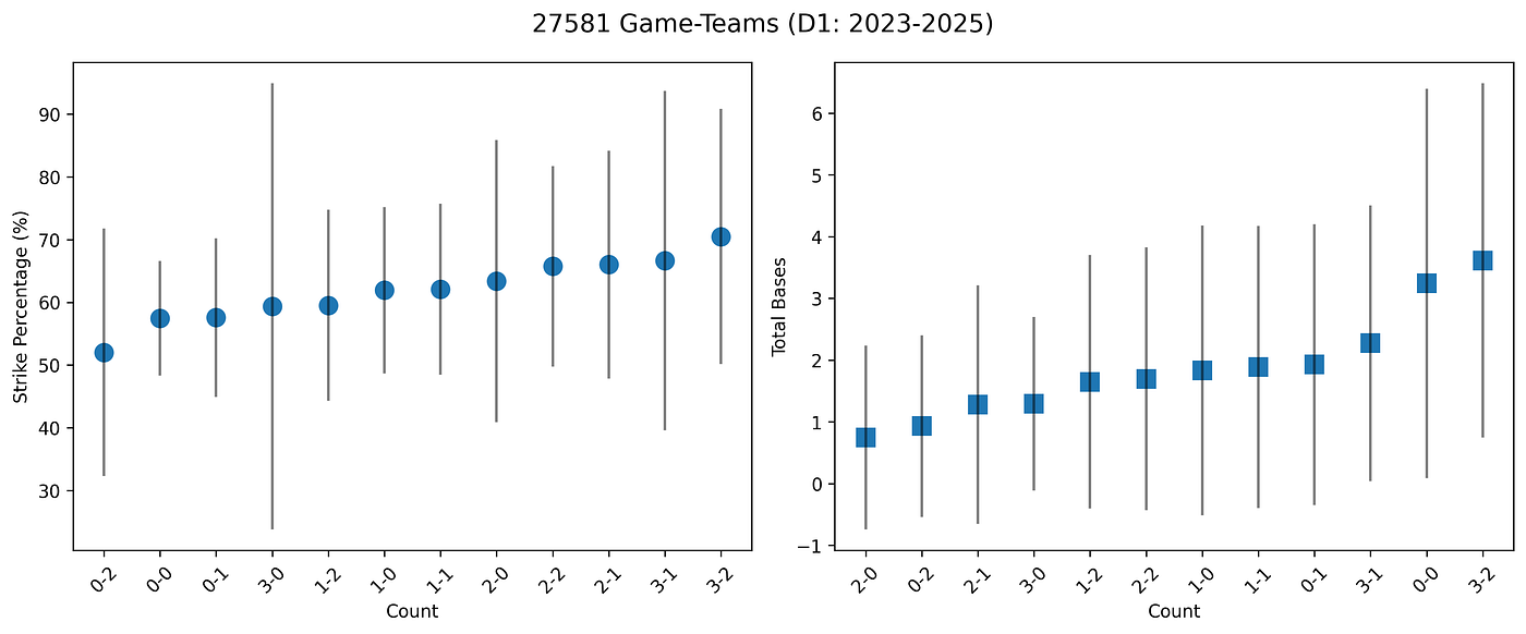
Figure 1. For every D1 game recorded by Trackman since February 2023, we compute the strike percentage and total bases allowed by count, for each team game. For example, if team X played a game where their pitcher’s reached 2–1 counts 20 times, we record their strike% and total bases allowed in that counts, and that becomes one data point in the distributions depicted here. We work with 27,581 game-team combinations and 4,564,700 pitches after removing 16 game-teams that contained erroneous counts. Each plot symbol depicts the mean plus/minus one standard deviation for strike percentage (Left) and total bases per game (Right) by pitch count. The x-axis (pitch count) is arranged in ascending order by strike percentage (Left) or total bases (Right).
You also hear about the 1–1 count being crucial in MLB, because hitters have a much lower batting average in 1–2 counts than in 2–1 counts. However, in D1 baseball, the difference in total bases when a pitcher throws a 1–1 strike versus a 1–1 ball is relatively minor (Figure 1 Right). So in what count is it most crucial for a pitcher to throw a strike?
Figure 2 depicts the impact of strike percentage on TBIP for different counts. In some counts, like 3–0, 3–1, and 0–2, strike percentage has almost no impact on TBIP. In all other counts, increasing strike percentage drives a consistent reduction in TBIP. Not surprisingly, pitchers that throw more strikes generally give up fewer bases.

Figure 2. Strike percentage versus total bases per inning (TBIP), by count. Blue bars depict 25th to 75th percentiles, while horizontal black lines represent means.
To really answer the question about what pitch counts are most important to throw strikes in, we cannot just consider the outcomes (e.g., total bases) in that count. Instead, we need to ask how the plate appearance ends after a strike or a ball was thrown in a particular count. This question is more challenging to answer because the relationship between strike percentage in a particular count, and total bases at the end of a PA is non-linear, interdependent (the effect of strike percentage in one count may depend on and impact the effect of strike percentage other counts), and very noisy (there is a lot of randomness in baseball outcomes). We adopt a random forest model, which is a machine learning approach that is flexible enough to find patterns in complex non-linear relationships, but simple and robust enough to avoid overfitting to random noise.
A random forest is a type of predictive model that works by building many individual decision trees, each trained to make its own estimate — for example, how many total bases a team might allow in an inning, based on the team’s strike percentages in 0–2 counts. Each decision tree is a simple rule-based system: the tree might say, “If strike percentage in 1–1 counts is above 65%, and strike percentage in 3–2 counts is below 70%, then expect 2.8 bases per inning.” But instead of relying on just one such rule tree, the random forest creates hundreds of them, each trained on a slightly different slice of the data and using different combinations of counts. This built-in randomness ensures the trees do not all make the same assumptions, or overfit quirks in the data. When all the trees make their predictions, the forest averages them, producing a final result that’s more accurate and reliable than any single tree. In our case, it means the model learns how different combinations of strike percentages across counts contribute to run prevention (through TBIP), even when the relationships are complex, non-linear, and noisy from game to game.
Figure 3 depicts the results from our random forest model. One quick way to evaluate how important it is to throw a strike in a particular count is to take the range of cell values from left to right. Ranking first is the 0–0 count, with a range of +0.08 to -0.46 = 0.52 TBIP as you increase strike percentage (Figure 3)— it turns out getting ahead in the count is important! The next most important counts for strike throwing are 1–0 (0.37 TBIP range) and 1–1 (0.32 TBIP range).

Figure 3. Random forest model results. Each row is a different pitch count. Each column represents a different change in Strike% percentage points (e.g., for an 0–0 count, +4 means going from D1 mean of µ=57.4% to 61.4% strikes). Each cell is labeled and colored by the change in total bases allowed per inning pitched (TBIP), assuming no change in Strike% in the other counts. We code the heatmap so that blue is good for pitchers (reduction in TBIP), and red is bad for pitchers. You can read the table as follows: “A +6 ΔStrike% in 2–1 counts (72%, compared to the D1 mean strike percentage in 2–1 counts of 66%) leads to a decrease of 0.04 total bases allowed per inning pitched.” 0–1, 1–1, 2–1, 2–2, and 3–2 counts show fairly steady decreases in TBIP for each increase in Strike%. In contrast, for 0–0, 1–0, and 2–0 counts, increasing Strike% relative to the league mean has a much more drastic impact on TBIP than decreasing Strike%. In 3–0, 0–2, and 1–2 counts, neither increasing nor decreasing Strike% change TBIP much.
Non-linear machine learning approaches like random forests must be evaluated carefully for overfitting. The more complex the model, the more likely that part of the good fit (as measured by how much of the variance in the data the model explains, R²) comes from fitting noise. Fitting noise might increase R², but it usually reduces the model’s ability to predict unseen data (i.e., fitness).
We start with a cross-validation step, where the data are split into multiple parts (e.g., 80/20 splits of data for training/testing). Importantly we split data both randomly, and by conference, to avoid overestimating model performance in cases where there are conference biases that random sampling does not see. This approach allows us to see how variable model parameters and fit are for different subsets of data, and simulates how well the model will perform on unseen data. We find that the model explains 19.5 ± 2.3% of the variance (Figure 4). On the one hand, this result means that 80% of the variance remains unexplained, and strike percentage by count is far from the only control on TBIP. On the other hand, the small ±2.3% change in variance explained by all the different cross validation experiments suggests that the model is stable, not overfit, and performing consistently on unseen data.
These simulations also reveal a root-mean-squared error (RMSE) of 1.31, indicating that, on average, the model predictions are off by about 1.3 bases per inning pitched. The overall distribution of TBIP across 22,212 game-team combinations is 2.64 ± 1.50. This standard deviation of 1.50 bases per inning suggests that the model captures a meaningful portion of the variation in TBIP — roughly as precise as you can get using only strike percentages by count as a predictor. While strike percentage is not the only (or most important) factor influencing run prevention, this level of error demonstrates that these pitch-level details still explain a substantial and repeatable signal in team performance. I interpret the model as a partial lens: the model isolates the influence of strike percentage while holding all other factors constant, helping quantify how many fewer bases (and ultimately runs) a team allows based on what counts they throw strikes in.

Figure 4. Read each subplot as a cross-section (from left to right) along a row (pitch count) of the table in Figure 3. However, instead of reporting a single number for ΔTBIP, we conduct a bootstrap resampling sensitivity analysis and depict the mean (red diamond), median (black circle), and interquartile range (black vertical line) for ΔTBIP at each ΔStrike%. This figure shows all the same patterns as figure 3, but the interquartile range allows us to see which model predictions are most stable and reliable. Large interquartile ranges on predictions, such as for big changes in strike percentage in 0–0 counts, suggest lower model confidence. However, in every single case depicted above, the interquartile range is smaller than the change in mean from reductions in strike percentage to increases in strike percentage, suggesting that all the pattern seen in Figures 3 are robust.
Beyond overall model performance, we also want to understand how confident we can be in the model’s predictions when we simulate specific changes in strike percentage in particular counts. For example, if you tell a pitcher to increase their strike percentage by 10 percentage points in 1–0 counts, how confident are we that they will allow 0.27 fewer bases per inning (Figure 3)? And can we be more confident in model predictions for some counts and strike percent changes than others? To answer these questions, we employ bootstrap resampling sensitivity analysis. The idea is to ask the model a question (like the one about 1–0 counts), give it 100 different random subsets of data (that’s the bootstrap resampling), and see how variable its answers are (that’s the sensitivity analysis). Figure 4 illustrates that the signals in Figure 3 are much larger than the noise, and we can use this model with confidence.
It appears that the best way to reduce total bases allowed, and thus runs per inning, is to throw more strikes than league average in 0–0 and 1–0 counts. This result is nuanced, because batting average and slugging percentage also are at their highest in 0–0 and 1–0 counts (Kaden Kram; *Seeing more pitches…*). We think the moral of this story is that teams should throw strikes early, but make sure you are throwing your good stuff, and not just grooving a fastball down the middle to get ahead.
Another significant conclusion is that the 1–1 count is particularly important in D1 baseball, as MLB sages like Zack Greinke have said before. After 0–0 and 1–0, increasing team strike percentage in 1–1 counts has the next most dramatic impact on bases allowed.
메타데이터
- post_id
- a8023d61a531
- slug
- when-does-throwing-a-strike-matter-the-most-in-college-baseball-a8023d61a531
- url
- https://medium.com/sabr-tooth-tigers/when-does-throwing-a-strike-matter-the-most-in-college-baseball-a8023d61a531
- canonical_url
- https://medium.com/sabr-tooth-tigers/when-does-throwing-a-strike-matter-the-most-in-college-baseball-a8023d61a531
- author_url
- https://medium.com/@maloofa
- status
- ok
- fetched_at
- 2026-06-15 20:49:13