從 Figma 到 Android/iOS:用 Design Token 打通設計與開發的最後一哩路
每次 Designer 增改了專案所使用的顏色, 工程師就要搜尋程式裡所有的顏色色碼, 並進行修改,很是麻煩。
從 Figma 到 Android/iOS:用 Design Token 打通設計與開發的最後一哩路
每次 Designer 增改了專案所使用的顏色, 工程師就要搜尋程式裡所有的顏色色碼, 並進行修改,很是麻煩。
這篇文章記錄我嘗試建立 Design Token Workflow, 讓 Figma 裡的 color variables 能自動轉換成 Android 和 iOS 可直接使用的 color resource, 並且同時支援 Light / Dark mode。
為什麼需要 Design Token?
在沒有 Design Token 的專案裡,設計與開發之間的色彩管理通常長這樣:
- Designer 在 Figma 用
#7759FF定義品牌主色 - 工程師在 Android 的
colors.xml寫<color name="brand_primary">#7759FF</color> - iOS 的
Assets.xcassets裡再手動建一個對應的 colorset - 哪天 Designer 把品牌主色改成
#6644EE,工程師要自己發現、自己找、自己改
我對 Design Token 的核心概念的理解是: 色彩定義只存在一個地方, 所有平台都從這個 Single Source of Truth 產生。
我的 Figma variable 架構
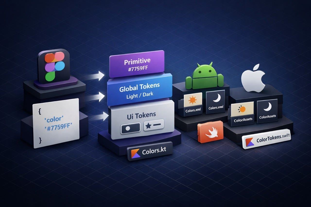
在開始之前,先了解 Figma 這端的結構。 我嘗試的設計系統使用三層 token 架構, 全部放在同一個 Figma file 的 Variables 裡:
Primitive (tier1)
└── purple/500 = #7759FF
└── grey/800 = #232A31
    ↓
Global Brand/Theme (tier2)  ← 有 light / dark 兩個 Mode
└── text-icon/basic/primary → grey/800  (light)
└── text-icon/basic/primary → grey/100  (dark)
    ↓
UI/Light-Dark (tier3)  ← 元件專用,只有 Component 一個 Mode
└── button/text-icon/active-brandPrimary → brand/primary
這種三層設計的好處是: 當顏色需要調整, 只要改 tier1 的原始值, 所有引用都會跟著更新。
遇到的第一個限制:Figma Variables REST API
理想情境是寫一個腳本, 直接呼叫 Figma REST API 抓取 variables, 然後自動 commit 到 repo。
但現實是:Figma Variables REST API 只開放給 Enterprise plan。
如果 Figma 是使用 Professional plan, 就無法採用這個方案。 我的替代方案是使用 Figma 內建的 Variables Export 功能, 直接把 variables 匯出成 JSON 檔案。
匯出的格式是 W3C Design Token Community Group(DTCG)標準,長這樣:
{
  "text-icon": {
    "basic": {
      "primary": {
        "$type": "color",
        "$value": {
          "hex": "#232A31",
          "alpha": 1
        },
        "$description": "主要文字用色"
      }
    }
  }
}
值得注意的是, Figma export 出來的值基本上已經是 resolved 的最終 hex, 不需要自己追蹤三層的 alias 引用, 大幅簡化了處理邏輯。
我的 Workflow 架構
確認了輸入格式之後,整個 workflow 的設計如下:
Designer 在 Figma export variables JSON
        ↓
commit 到 Git repo 的 tokens/ 資料夾
        ↓
npm run build(Style Dictionary v5)
        ↓
┌─────────────────────────────────────┐
│ Android                             │
│ ├── values/colors.xml       (light) │
│ ├── values-night/colors.xml (dark)  │
│ └── Colors.kt               (both)  │
├─────────────────────────────────────┤
│ iOS                                 │
│ ├── ColorTokens.swift               │
│ └── ColorAssets.xcassets/           │
└─────────────────────────────────────┘
輸出格式設計
Android
Android 的 Light/Dark mode 切換依賴資料夾結構,系統會根據裝置設定自動選擇:
<!-- res/values/colors.xml(light) -->
<resources>
  <color name="text_icon_basic_primary">#FF232A31</color>
  <color name="brand_primary">#FF7759FF</color>
</resources>

<!-- res/values-night/colors.xml(dark) -->
<resources>
  <color name="text_icon_basic_primary">#FFF5F8FA</color>
  <color name="brand_primary">#FF7759FF</color>
</resources>
Kotlin 的部分則輸出兩個 object,方便在 Jetpack Compose 的 MaterialTheme 裡使用:
object LightColors {
    val textIconBasicPrimary = Color(0xFF232A31)
    val brandPrimary = Color(0xFF7759FF)
}

object DarkColors {
    val textIconBasicPrimary = Color(0xFFF5F8FA)
    val brandPrimary = Color(0xFF7759FF)
}
iOS
iOS 輸出兩種格式,分別對應 SwiftUI 和 UIKit:
ColorTokens.swift(SwiftUI 用):
enum ColorTokens {
    enum Light {
        static let textIconBasicPrimary = Color(red: 0.137, green: 0.165, blue: 0.192)
        static let brandPrimary = Color(red: 0.467, green: 0.349, blue: 1.0)
    }
    enum Dark {
        static let textIconBasicPrimary = Color(red: 0.961, green: 0.973, blue: 0.980)
        static let brandPrimary = Color(red: 0.467, green: 0.349, blue: 1.0)
    }
}ColorAssets.xcassets(UIKit 用):
每個 token 對應一個 .colorset,Light 和 Dark appearance 各自設定,
iOS 系統自動切換,不需要寫任何判斷邏輯。
額外的 Audit 工具
導入 design token 到現有專案時,還有一個實際問題: 原本 app 裡已經有幾百個色碼,要怎麼對齊?
為此我多做了兩個工具: 可以把原本專案中的色碼跟新的 design token 比對, 產出一份報告,分三類:
- 自動 match:hex 完全一致,可以直接寫進 mapping 替換
- 需人工確認:多個舊名對應同一 token,或色差極小的近似色
- 無對應 token:可能是設計師漏掉的,需要討論該怎麼處理
這份報告讓 designer 和 engineer 可以坐在一起, 有憑有據地討論每個舊色碼的去留, 而不是各自憑印象猜測。
下一步
目前探索的 workflow 沒有使用 Variables REST API, 但未來有幾個方向可以讓流程更自動化:
Figma Plugin: 用 Plugin API 讀取 variables, 然後透過 GitHub API 直接 commit 到 repo。 Designer 按一個按鈕,應該可以 trigger 同步 token 的流程。
升級 Organization/Enterprise plan:
解鎖 Variables REST API 後,可以配合 LIBRARY_PUBLISH webhook,
在 Designer publish library 的自動觸發整個流程,
完全不需要任何手動步驟。
總結
這個 POC 驗證了幾件事:
- Figma 的 Variables Export 功能輸出的是標準 DTCG JSON,可以直接作為 pipeline 的輸入
- 可以使用 Style Dictionary 這個 npm pacakge 處理 token 架構和多平台輸出
- Audit 工具或可以幫助導入既有專案,不過還需要實際驗證
整個 pipeline 的程式碼放在 GitHub:ddsakura/design-token
如果你的團隊也在面對設計與開發色彩不同步的問題, 希望這篇文章能提供一些參考方向。 也歡迎分享作法,大家一起交流喔!
PS: 這個專案在開發過程中使用了 Claude Code 輔助實作,包含 Style Dictionary 的自訂 transform、audit 腳本的比對邏輯等,讓整個 POC 的建立速度快了不少。
메타데이터
- post_id
- a8afd00a92d1
- slug
- 從-figma-到-android-ios-用-design-token-打通設計與開發的最後一哩路-a8afd00a92d1
- url
- https://medium.com/ddsakura-blog/%E5%BE%9E-figma-%E5%88%B0-android-ios-%E7%94%A8-design-token-%E6%89%93%E9%80%9A%E8%A8%AD%E8%A8%88%E8%88%87%E9%96%8B%E7%99%BC%E7%9A%84%E6%9C%80%E5%BE%8C%E4%B8%80%E5%93%A9%E8%B7%AF-a8afd00a92d1
- canonical_url
- https://medium.com/ddsakura-blog/%E5%BE%9E-figma-%E5%88%B0-android-ios-%E7%94%A8-design-token-%E6%89%93%E9%80%9A%E8%A8%AD%E8%A8%88%E8%88%87%E9%96%8B%E7%99%BC%E7%9A%84%E6%9C%80%E5%BE%8C%E4%B8%80%E5%93%A9%E8%B7%AF-a8afd00a92d1
- author_url
- https://medium.com/@ddsakura
- status
- ok
- fetched_at
- 2026-06-09 15:37:30