Stop Misusing Grouped Bar Charts: Use Them the Right Way
Learn when grouped bar charts add clarity and when they create confusion.
Stop Misusing Grouped Bar Charts: Use Them the Right Way
Learn when grouped bar charts add clarity and when they create confusion.
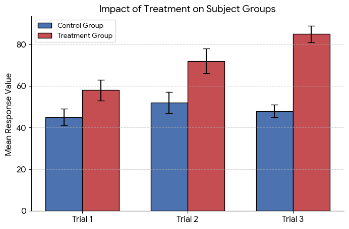
Source: Created by the author
This article is about learning the correct use of this chart. by correct, it mainly focuses on when, how, and where to use the grouped chart, and when you should choose it.
basically, this article will walk you through the practical use of the chart.
lets first understand what a grouped bar chart is. as you can see, it has x and y axis, and bars are placed side by side in small groups. these grouped bars represent different categories within the same main category.
this is a simple example of a grouped bar chart. once you understand this, the next step is to learn how to use it properly.
1. Role Number One:
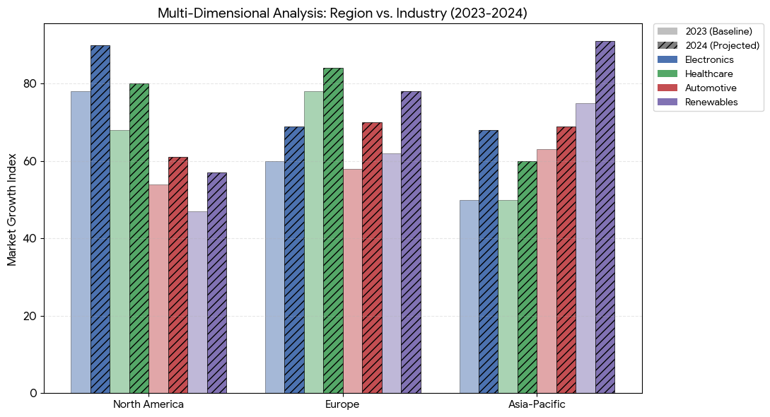
as you can see, a grouped bar chart looks good when the bars have one or two dimensions. but when the dimensions become too large, the grouped bars become hard to read and look cluttered.
so the conclusion is simple. a grouped bar chart is only a good choice when you have two or three dimensions in your data.
for example, you can take this one: do not chiise the grouod bar chart when the data have too many dimentions
Source: Created by the author
2. Rule Number Second:
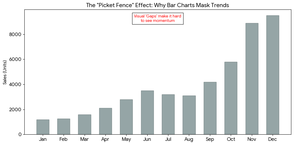
don’t use a grouped bar chart for trends. why? because trend data is connected over time. each point depends on the previous one, and we usually want to understand how things change step by step.
A grouped bar chart is not good for this. it does not clearly show the flow of data over time.
you can think of a grouped bar chart like a report card. one group shows marks of different subjects for one student, and another group shows marks for another student. it is good for comparison, but not for showing how performance changes over time.
so when you try to use it for trend analysis, it looks poor and less informative.
Source: Created by the author
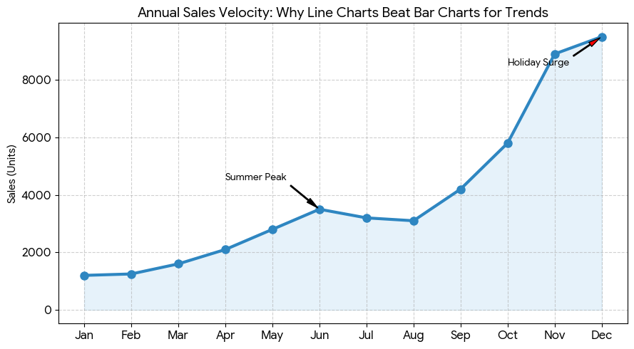
If not trend, then which chart is best for trend analysis?
The answer is a line chart. as you can see below, a line chart is a perfect example for trend visualization because it clearly shows how data changes over time.
Source: Created by the author
3. Rule Number Three:
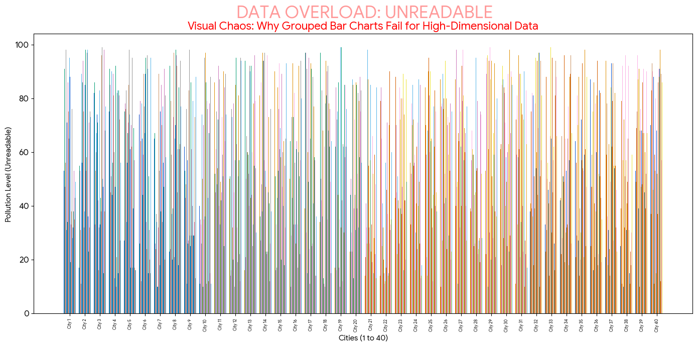
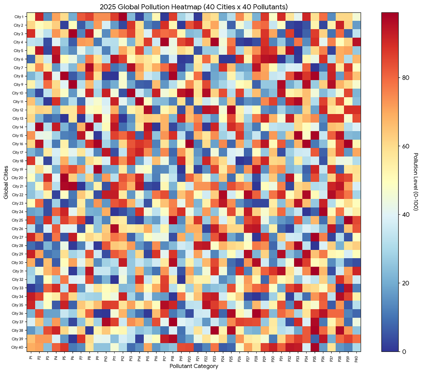
Don’t use a grouped bar chart when there are too many categories. in the first example, we saw that having two or three categories is fine. but when the number of categories becomes too large, the chart becomes messy and hard to read.
it becomes difficult to focus on any single value, and the overall clarity is lost. the same chart that looked good earlier starts to feel cluttered when more categories are added.
in such cases, it is better to avoid a grouped bar chart. instead, i would prefer using a table, because it keeps the data clear and easy to scan.
Source: Created by the author
if a grouped bar chart is not good for this, then which chart is more suitable?
the answer is a heatmap chart. as you can see below, the same data in a heatmap looks more interactive and gives a better overall view.
Even though it may look a bit dense at first, don’t worry. in a live dashboard, it becomes much more informative and easier to explore compared to a cluttered grouped bar chart.
Source: Created by the author
Hey there, I’m Ajay a passionate engineer, writer on Medium, and a huge Python enthusiast. Thanks for sticking with me till the end!
If you enjoyed this content and want to support my work, the best ways are:
- Drop a Clap 👏 and share your thoughts 💬 below!
- Follow me here on Medium.
- Connect with me on LinkedIn.
- Follow me on X here.
- Join my email list so you never miss another article.
- And don’t forget to follow **The Visual Analyst** for more stories like this.
Thanks again for reading! 😊
메타데이터
- post_id
- a8b634c7545a
- slug
- stop-misusing-grouped-bar-charts-use-them-the-right-way-a8b634c7545a
- url
- https://medium.com/the-visual-analyst/stop-misusing-grouped-bar-charts-use-them-the-right-way-a8b634c7545a
- canonical_url
- https://medium.com/the-visual-analyst/stop-misusing-grouped-bar-charts-use-them-the-right-way-a8b634c7545a
- author_url
- https://medium.com/@ajayparmar7058
- status
- ok
- fetched_at
- 2026-06-14 11:28:49