What Defines the Retro Aesthetic in 20th-Century Inspired Graphic Design?
Retro graphic design is everywhere: posters, packaging, cafe branding, album covers, fashion graphics, digital illustrations, restaurant…
What Defines the Retro Aesthetic in 20th-Century Inspired Graphic Design?
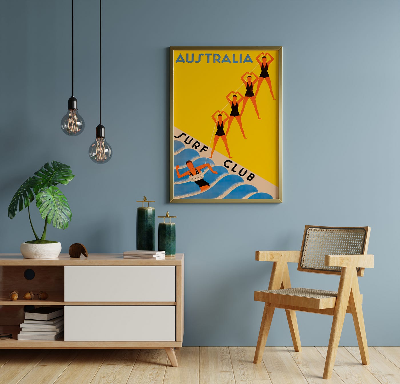
Retro graphic design is everywhere: posters, packaging, cafe branding, album covers, fashion graphics, digital illustrations, restaurant menus, wall art and social media campaigns. But “retro” is often used loosely. Sometimes it means colourful. Sometimes it means old. Sometimes it means vintage, mid-century, nostalgic or simply not minimal.
A clearer definition is this: the retro aesthetic in graphic design is a modern interpretation of older visual styles, especially those connected to the 20th century. It is not necessarily original vintage design. It is design made today that borrows from the past through colour, typography, composition, texture, illustration and subject matter.
This distinction is important. Vintage design is genuinely old or directly from a past period. Retro design is usually new, but it looks back.
Retro is designed memory
The strongest retro graphics do not copy the past completely. They select the parts of the past that people recognise quickly. A 1970s-inspired poster may use warm orange, brown and cream. A mid-century inspired print may use clean geometry and furniture-like shapes. A travel poster may use a simplified landscape and bold destination typography.
These cues work because they trigger memory. Even if the viewer cannot name the decade, the design feels connected to older advertising, printed posters, record sleeves, cinema graphics, food packaging or interior culture.
That is why retro design is so effective. It carries emotional meaning before the viewer reads a single word.
Colour is the fastest retro signal
Retro colour palettes tend to feel warmer and more physical than many contemporary digital palettes. Mustard yellow, olive green, burnt orange, faded red, cream, dusty blue, brown and teal all appear frequently in retro-inspired design.
These colours feel connected to printed paper, wood furniture, old kitchens, travel posters, magazine ads and album artwork. They are strong, but not necessarily harsh. They can be bold and still feel warm.
In interiors, this is why retro wall art works so well. A clean white wall can feel unfinished. A retro poster adds colour without requiring the whole room to become maximalist. One orange and cream travel print can warm up a neutral living room. A food poster can make a kitchen feel more social. A music poster can give a studio or office a clearer identity.
Typography gives retro design its personality
Typography is one of the most important parts of retro design. The wrong font can make a retro concept feel fake. The right type can immediately connect a design to a specific visual world.
Common retro type styles include condensed sans serif lettering, slab serifs, rounded display fonts, bold uppercase titles and hand-drawn scripts. In travel posters, type often feels confident and architectural. In food and drink design, it may be softer, warmer or more playful. In music graphics, it may be expressive, loud or rhythmic.
Good retro typography is not just decoration. It gives the design a voice.
Simplified illustration makes the design readable
A lot of 20th-century inspired graphic design uses simplified forms. Instead of showing every detail, it reduces objects into clear shapes. Mountains become layers. Waves become curves. Furniture becomes silhouette. A bicycle becomes movement. A cocktail becomes atmosphere.
This comes from poster logic. Posters need to communicate quickly. They need to be readable from a distance. They need to create impact before they explain.
That same principle still works today. A simplified retro illustration is often easier to remember than a generic photograph. It can also work better as wall art because it adds personality without creating too much visual noise.
Texture creates a physical feeling
Retro design often uses texture: paper grain, faded ink, screen-print effects, halftone patterns, soft edges or slight imperfections. These details make the design feel less digital and more tactile.
This does not mean the design should look dirty or damaged. The best retro texture is subtle. It creates warmth, not chaos. It reminds the viewer of physical printing without making the artwork look poorly produced.
For printed posters, matte paper often supports this effect better than glossy paper because it reduces glare and makes colour feel softer. This is why retro and vintage-inspired wall art often looks more natural on matte stock.
Retro is not the same as vintage or mid-century modern
Retro, vintage and mid-century modern overlap, but they are not identical.
Retro is a broad term for new design inspired by older styles. It can reference the 1920s, 1950s, 1970s, 1980s or several decades at once.
Vintage usually suggests something older, softer or more collected. It may feel like an original poster, antique illustration, aged print or historical object.
Mid-century modern is more specific. It usually refers to design language associated with the 1940s, 1950s and 1960s: clean lines, organic shapes, warm neutrals, geometric forms and modernist clarity.
A retro poster can be mid-century inspired, but not all retro design is mid-century. A 1970s music poster, an 1980s grid composition and a 1930s-style travel print can all be retro in different ways.
Common sources of retro inspiration
20th-century inspired graphic design often draws from several areas: Travel advertising, especially railway, airline and tourism posters. Food and drink packaging, including diner menus, coffee labels, wine graphics and fruit illustrations. Music culture, including jazz posters, rock flyers, festival artwork and record sleeves. Sport and hobby graphics, including cycling, motorsport, skiing and tennis posters. Interior and furniture design, especially mid-century chairs, lamps and architectural forms. Cinema and entertainment posters, where typography and composition create drama. Commercial print design, including signage, magazines and advertising layouts.
These sources explain why retro design can feel so broad. It is not one style. It is a family of styles connected by nostalgia, visual clarity and print-era references.
Why retro design works in modern interiors
Retro wall art works because many modern rooms need contrast. Contemporary interiors often use clean furniture, simple walls and neutral colours. That can be elegant, but it can also feel unfinished. Retro posters add warmth and identity.
A large retro travel poster can become the focal point above a sofa. A pair of kitchen prints can make a dining area feel more inviting. A cycling print can make a home office or training corner feel personal. A music poster can make a studio feel more expressive.
The key is balance. A very colourful poster usually works best in a calmer room. A softer vintage-style print can work in a more layered space. A black frame can make retro artwork feel modern. A wooden frame can make it warmer.
How to choose retro wall art
Start with the room problem. If the wall feels empty, choose a larger print. If the room feels cold, choose warmer colours. If the room lacks identity, choose a subject connected to your interests: music, travel, cycling, food, architecture or film.
Then choose size. Small prints work well on shelves, narrow walls and gallery walls. Medium prints work well in kitchens, bedrooms and offices. Larger prints work best above sofas, sideboards and statement walls.
You Got Prints offers retro-inspired posters in common formats such as A4, A3, A2, A1, B4, B3, B2 and ARCH D. For room-based sizing, the size guide is useful: https://yougotprints.com/pages/size-guide
For browsing by style, the retro wall art collection is here: https://yougotprints.com/collections/retro-wall-art
How to avoid making retro design look dated
The best way to use retro design is to avoid overloading it. Do not use every nostalgic cue at once. A retro colour palette with a clean layout can feel modern. A bold vintage-inspired typeface with plenty of white space can feel sharp. A textured illustration in a simple frame can feel timeless.
Retro design starts to look dated when it becomes costume. It works when the past is translated, not copied.
Final thoughts
The retro aesthetic in 20th-century inspired graphic design is defined by selective nostalgia. It uses older visual cues to create modern emotional impact. Colour, typography, simplified illustration, texture and composition all contribute to the feeling.
Retro design remains popular because it solves a real visual problem. It makes modern spaces and brands feel less anonymous. It adds memory, warmth, personality and cultural reference.
The best retro design does not simply look old. It feels familiar, intentional and alive in the present.
메타데이터
- post_id
- a8e2a25117c7
- slug
- what-defines-the-retro-aesthetic-in-20th-century-inspired-graphic-design-a8e2a25117c7
- url
- https://medium.com/@yougotprints/what-defines-the-retro-aesthetic-in-20th-century-inspired-graphic-design-a8e2a25117c7
- canonical_url
- https://medium.com/@yougotprints/what-defines-the-retro-aesthetic-in-20th-century-inspired-graphic-design-a8e2a25117c7
- author_url
- https://medium.com/@yougotprints
- status
- ok
- fetched_at
- 2026-06-21 12:17:11