Why Abstract Backgrounds Are a Smart Choice for LinkedIn Profiles
Choosing a LinkedIn background can be surprisingly difficult. There are thousands of images and designs available online, but not every one…
Why Abstract Backgrounds Are a Smart Choice for LinkedIn Profiles
Choosing a LinkedIn background can be surprisingly difficult. There are thousands of images and designs available online, but not every one looks right on a professional profile. Some are too busy. Some have too much text. Others look more like social media graphics than something you’d expect to see on a professional profile.

If you’re looking for something simple that works with almost any career, an abstract background is worth considering. Abstract designs can give your profile a modern look without making it feel like you’re trying too hard to stand out.
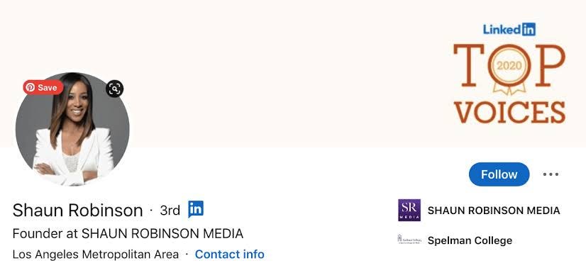
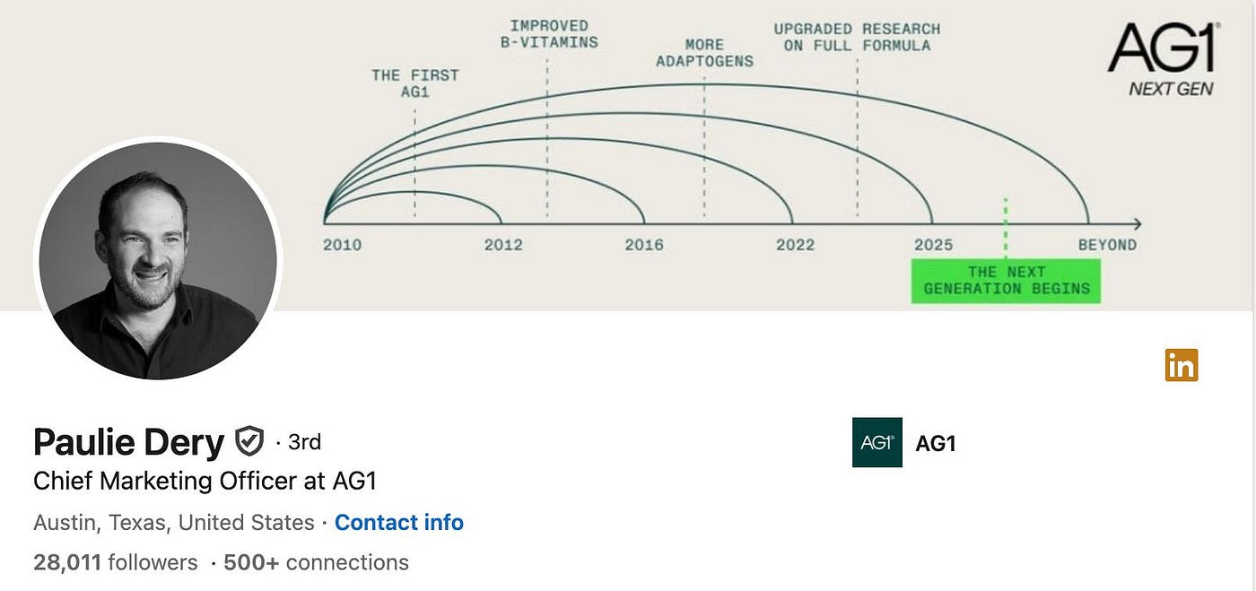
You Don’t Have to Show Your Job in the Banner
One reason abstract backgrounds work so well is that they don’t have to represent a specific profession. A software developer doesn’t necessarily need a picture of a computer. A lawyer doesn’t need a photo of a courthouse. And a marketing professional doesn’t need a collection of social media icons.
Sometimes, a background can simply look good. Abstract designs give you that freedom. Shapes, lines, gradients, textures, and patterns can create an attractive background without telling people exactly what you do. Your headline and experience sections can take care of that.
They Work With Different Professional Styles
Your career may change over time. You might work in marketing today and move into business development a few years later. You might start as a junior developer and eventually become a project manager. A very specific banner can feel out of place after a career change. An abstract background is more flexible. Since it isn’t tied to one particular job, you can keep it for longer without worrying that it no longer represents you.
Simple Designs Don’t Get in the Way
Your LinkedIn banner sits behind your profile photo and near your headline. That means there’s already a lot happening in that area of your profile. A background with too many details can make everything feel crowded. Abstract designs can solve that problem by giving you something visually interesting while leaving enough space for your profile information to remain easy to see. This is especially useful when the design uses softer colors or simple shapes.

Color Can Change the Feel of Your Profile
One of the nice things about abstract designs is the range of colors available.
- A blue background can create a calm and professional feel.
- Green can give the profile a fresh and relaxed appearance.
- Dark colors can make a profile look more serious and modern.
- Brighter colors can work well if you’re in a creative field or simply want your profile to have more personality.
You don’t need to overthink the psychology of every color. Pick something that looks good and fits the image you want to present.
Abstract Doesn’t Mean Boring
There is a big difference between simple and boring. A good abstract design might use overlapping shapes, subtle gradients, flowing lines, or geometric patterns to create depth. It can look interesting without becoming distracting. That’s often the sweet spot for a LinkedIn profile. You want people to notice your banner, but you don’t want them staring at the banner instead of reading about your experience.
Consider Your Profile Photo
Before choosing an abstract background, look at how it works with your profile picture. Some designs have bright colors or strong patterns in areas that can make the profile photo harder to see. Others may have important elements positioned where LinkedIn places your photo. A good banner should leave enough visual breathing room around the profile picture. If you’re choosing between two designs, the one that gives your profile photo more space may be the better option.
Don’t Fill It With Words
You might be tempted to add your job title, website, phone number, and a motivational quote to your banner. You probably don’t need to. Your LinkedIn profile already gives you plenty of places to share this information. The banner works better when it stays relatively clean. If you do decide to use text, keep it short and make sure it’s easy to read.
Abstract Backgrounds Can Work for Personal Branding
Personal branding isn’t only about logos and colors. It’s also about creating a consistent look across your online presence. If you use certain colors on your website, portfolio, or other professional profiles, choosing a LinkedIn banner that complements those colors can help tie everything together. You don’t have to make every platform identical. A little consistency is usually enough.
Where to Look for Ideas
If you’re not sure what kind of abstract design would suit your profile, looking at several examples can help. You can see which colors catch your attention, which layouts feel professional, and which styles would work well with your profile photo.
For more ideas, you can browse different Abstract LinkedIn Banners. Looking through different styles can make it easier to find a background that feels right for your career and personal taste.
A Good Choice When You’re Not Sure
Sometimes you simply don’t know what kind of banner to choose. That’s completely normal. If you’re stuck between a city photo, a business graphic, a nature scene, and several other options, an abstract background is a safe middle ground. It looks professional without being too formal, and it gives you some personality without becoming distracting.
Final Thoughts
Your LinkedIn banner doesn’t have to explain your entire career. It just needs to make your profile look good and support the impression you’re trying to create. Abstract backgrounds are a smart option because they’re flexible, modern, and suitable for people in many different industries. They can also stay relevant even when your career changes. If you want something that looks professional without being overly specific, a simple abstract design may be exactly what your LinkedIn profile needs.
메타데이터
- post_id
- ab2fcbf3d803
- slug
- why-abstract-backgrounds-are-a-smart-choice-for-linkedin-profiles-ab2fcbf3d803
- url
- https://medium.com/@profilebrandinghub/why-abstract-backgrounds-are-a-smart-choice-for-linkedin-profiles-ab2fcbf3d803
- canonical_url
- https://medium.com/@profilebrandinghub/why-abstract-backgrounds-are-a-smart-choice-for-linkedin-profiles-ab2fcbf3d803
- author_url
- https://medium.com/@profilebrandinghub
- status
- ok
- fetched_at
- 2026-08-08 19:18:33