Redesigning Safety Experience in Gojek: Making Users Feel Secure, Not Just Safe
Project Overview 🚀
Redesigning Safety Experience in Gojek: Making Users Feel Secure, Not Just Safe
Project Overview 🚀
-Role: UI/UX Designer -Project Type: UX/UI Revamp (Conceptual Case) -Focus Area: Safety & Emergency Features -Platform: Mobile App
Safety is one of the most critical aspects of ride-hailing services. While many platforms provide safety features, the real question is:
Do users actually feel safe when they need it the most?
This project focuses on redesigning the safety experience in Gojek by improving accessibility, clarity, and user confidence during critical moments.
The Problem ⚠️
Safety features in ride-hailing apps often exist but they are not always visible, accessible, or intuitive when users actually need them.
From initial analysis, I identified several key issues:
- Safety features are hard to find in urgent situations
- Users may feel uncertain about what happens after pressing emergency buttons
- Lack of clear guidance during stressful moments
- Safety interactions are not designed for high-pressure scenarios
In emergency situations, users don’t think they react. The interface must support that behavior.

My Approach 😇
Instead of redesigning everything, I focused on one principle:
“Reduce thinking. Increase clarity.”
Key design directions:
- Make safety features instantly accessible
- Provide clear system feedback
- Design for panic scenarios, not normal conditions
What I did:
- Evaluated existing safety flows
- Identified friction points in critical interactions
- Prioritized features based on urgency and usability

The Solution 💡
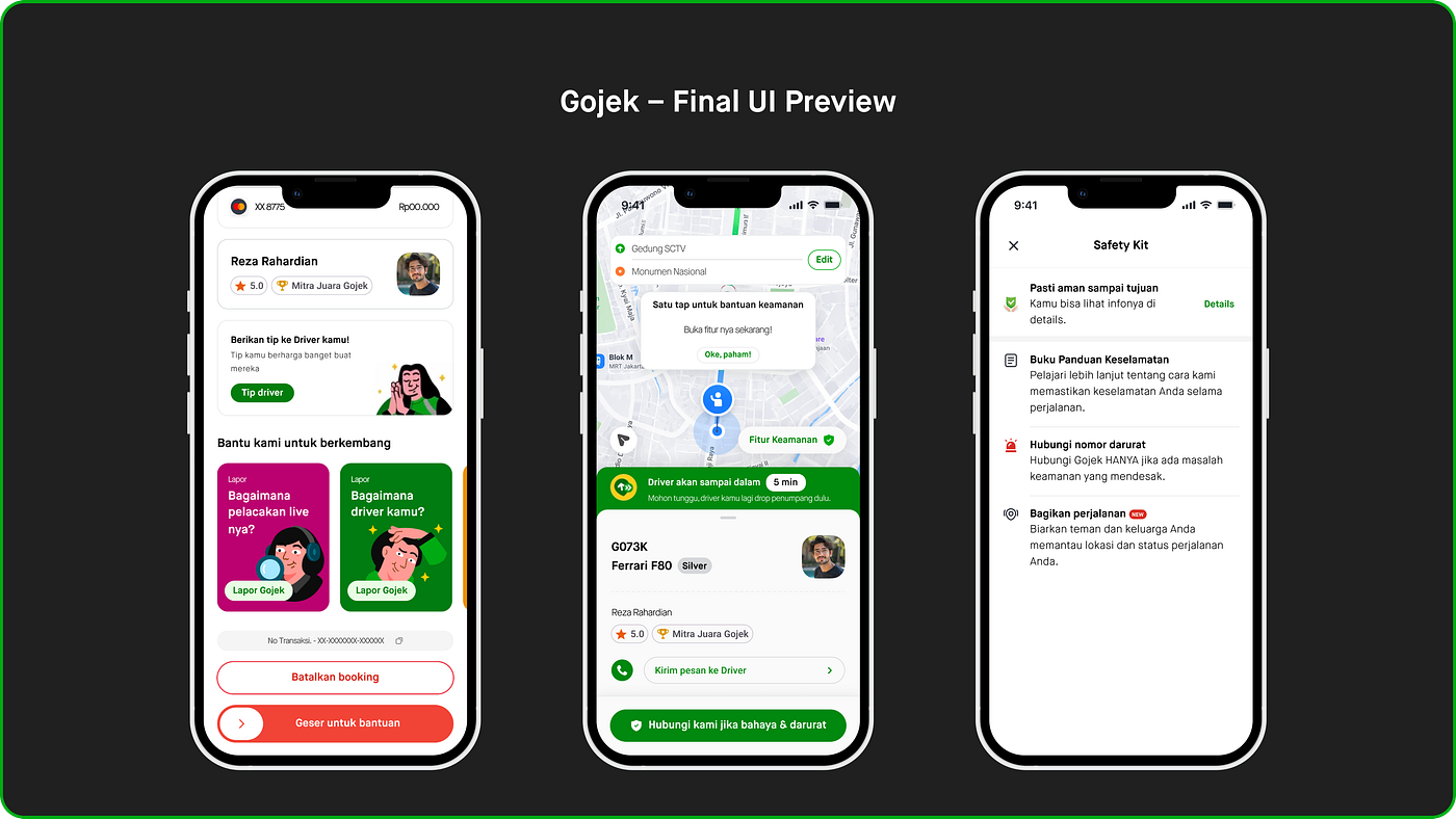
1. More Accessible Safety Entry Point
Users should not struggle to find safety features.
- Repositioned safety access into a more visible and reachable area
- Reduced steps required to trigger emergency actions

2. Clear Emergency Actions
In critical situations, users need certainty, not confusion.
- Introduced clearer action labels (e.g., Emergency Call, Share Trip)
- Simplified decision-making with focused options

3. Real-Time Feedback & Guidance
One of the biggest gaps was lack of reassurance.
- Added confirmation states after triggering actions
- Designed feedback to ensure users know:
- What is happening
- Who is being contacted
- What they should do next

4. Designed for Stressful Moments
Most interfaces assume calm users. This one doesn’t.
- Larger touch targets for faster interaction
- Reduced cognitive load by minimizing choices
- Clear visual hierarchy for quick scanning

Impact 📈
Although this is a conceptual redesign, the improvements are focused on measurable UX outcomes:
- Faster access to safety features
- Reduced hesitation during emergency situations
- Increased user confidence when using safety tools
- More intuitive and guided experience under pressure
Good safety design is not just about features it’s about how users feel when everything goes wrong.
Key Takeaways 🛑
This project reinforced an important principle:
- Designing for edge cases (like emergencies) requires a different mindset
- Clarity is more important than completeness
- UX is not just about usability, it’s about emotional assurance
If I had more time, I would:
- Validate the solution through usability testing
- Measure response time improvements
- Explore integration with real-time support systems
Closing 🙏🏻
Safety is not just a feature it’s a responsibility.
Through this redesign, I aimed to create an experience where users don’t have to think twice when they need help the most.
메타데이터
- post_id
- aedbb87ceb8e
- slug
- redesigning-safety-experience-in-gojek-making-users-feel-secure-not-just-safe-aedbb87ceb8e
- url
- https://medium.com/@zanblog/redesigning-safety-experience-in-gojek-making-users-feel-secure-not-just-safe-aedbb87ceb8e
- canonical_url
- https://medium.com/@zanblog/redesigning-safety-experience-in-gojek-making-users-feel-secure-not-just-safe-aedbb87ceb8e
- author_url
- https://medium.com/@zanblog
- status
- ok
- fetched_at
- 2026-06-16 19:09:56