Designing Page Layouts to Meet Reader Expectations
Some practical considerations that don’t get lost in the theory
Designing Page Layouts to Meet Reader Expectations
Some practical considerations that don’t get lost in the theory
As a journalist or writer, it is always a pleasure to see your scruffy drafts make their way onto the page and into published articles. The written word alone is a powerful, almost magical, means of communication. Text can convey facts and figures, sentiments and emotions. It can inspire and inform. Yet nothing does it more justice than when words are rendered in beautiful typography and neatly arranged into sections and columns — the essence of good layout and effective communication design.
Applying the principles of “good” book and magazine design often relies on the expertise of editors, typesetters and graphic designers to transform words and images into something extraordinary. That much is undeniable. Adding visuals and imagery to complement your writing helps amplify their impact, making them even more impactful and profound.
Then there are the practical considerations. There is often a need to convey information with a certain ‘immediacy’. Readers must be hooked quickly so that they will engage further with what you have to say. You then need to nurture their attention, guiding them through a complex mass of words to arrive at a desired conclusion where they retain an underlying message or vital piece of information.
Layout design governs how content is arranged and aligned on the page to create an “experience”. The opposite is also true: despite a writer’s best intentions, bad design fails to deliver content in a way that is appealing or engaging for the reader.
Trying your hand at laying out your writing and articles in a certain format has a number of advantages. Firstly, even with rudimentary design skills, there are plenty of opportunities to use existing tools to embellish your work. Secondly, once you have grasped the basics, you’ll be surprised at how it can become an integral part of your workflow — helping to improve structure and perfect your work for publication.
Trying your hand at designing layouts (real or imagined) is the visual equivalent of a self-imposed deadline. The added pressure to “conform” is both motivating and instructive. It helps you assess and review the suitability of your work, especially for the printed format. If you are aiming to pitch your work to agents and editors of print publications, or are simply building a portfolio, it enables you to display your work in a believable, if not realistic, context.
So today, let’s return to some fundamentals which you can use as part of your own process. I’ll be using simple methods that are better suited for publishing software like InDesign or Affinity, but which, at a push, can also be adapted to other applications of choice. The principles remain the same.
Thumbnails and wireframing
Effective graphic design and layout work for articles hinges on capturing the reader’s attention and then guiding them through the information. It should minimise disruption and feel effortless for the reader. Maintaining a logical flow in line with reader expectations is key.
A useful technique in magazine design and digital prototyping consists of mapping page layouts as wireframes or simple thumbnails. Each thumbnail broadly represents the distribution of information on the page, such as text combined with images or graphics.
I often use this ‘low-fidelity’ approach to quickly explore how my article might appear in an intended destination magazine, where specifications (word count, number of columns and images) are broadly defined in advance. But the method can also be applied if I want to impose a particular creative direction for my work, to create an extract or present an idea which I can share as a mockup with others.
In fact, creating thumbnails for an entire magazine and other types of publications is a viable way of planning and concepting before committing to the detailed design phase. But with a full magazine layout numbering hundreds of pages, my advice is to start with typical “sections” and build out your library of thumbnails from there.
A quick method in Affinity
Using the Layout workspace of Affinity, you can quickly create wireframes for your pages using just a few basic tools. It’s as simple as dragging out rectangles using the Picture Frame placeholder tool and drawing rectangles to represent text columns:
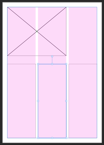
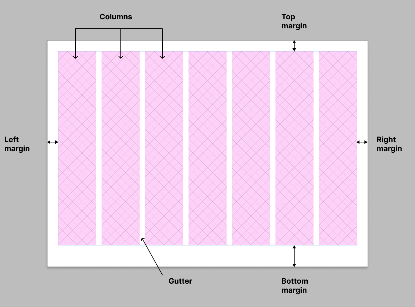
In the example above, I have set guides to indicate a basic 3-column layout with appropriate values for the gutters and margins. You can learn more about these in my previous article here. At this stage, however, we just want to get a feel for possible arrangements of information on the page, without getting bogged down in too much detail. This allows us to quickly generate and experiment with different iterations and variations.
Nevertheless, our “wireframe” still feels a little bare. Let’s add some detail that clearly distinguishes which boxes contain text by switching over to the Vector workspace in the top bar. After selecting one of the rectangles, I used the fill tool to apply a custom hatch pattern:
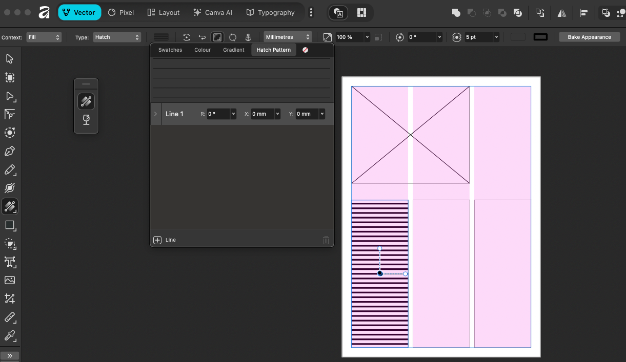
When you select the fill type for your rectangle, one of the options is Hatch, which normally defaults to a preset pattern swatch. From there, I simply customised the pattern to create horizontal lines and spacing in proportion to the page size. Once this new “swatch” is created, you can apply it to other rectangles. It’s as simple as selecting each rectangle and then clicking on your hatch pattern swatch, which will appear in the “recent” section in the colour picker area:
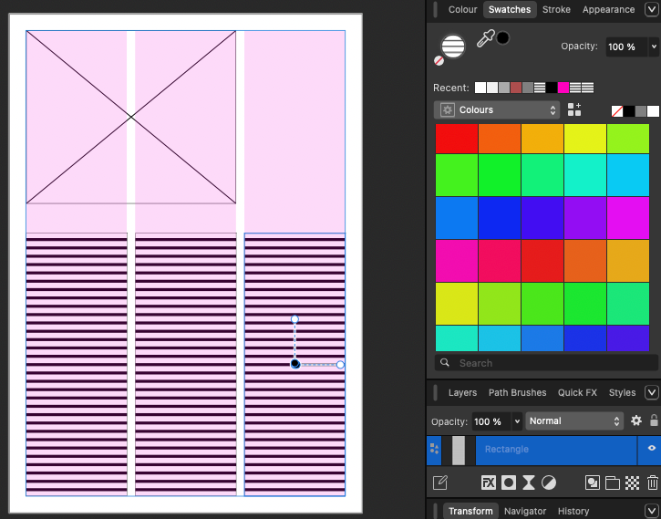
Here’s a quick tip that will save you a bit of frustration if you resize a text column that is filled with your hatch pattern. Depending on your global settings, you may find that the pattern distorts:
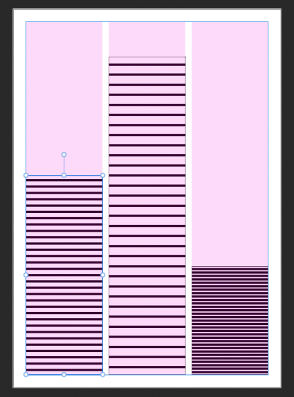
Example with the centre column stretched, and the third column reduced in size
However, there’s a simple fix. With the Fill Tool active, click on the “distorted” column and then choose Reset Transformation from the context menu (it’s the button with the circling arrows to the left of the anchor symbol):
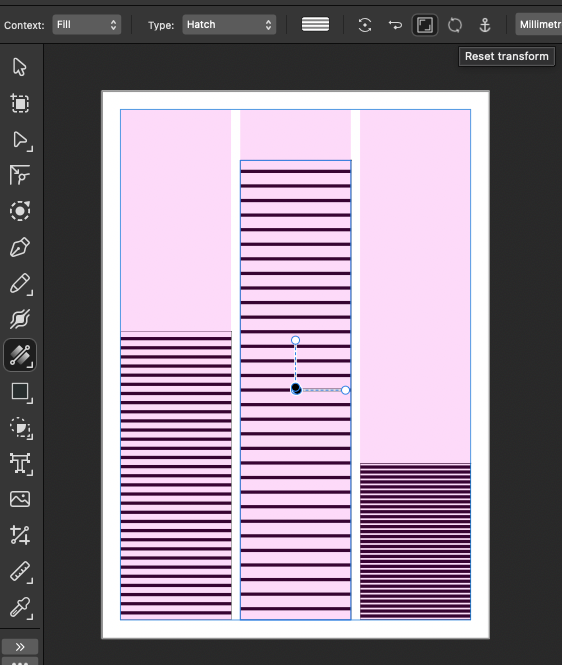
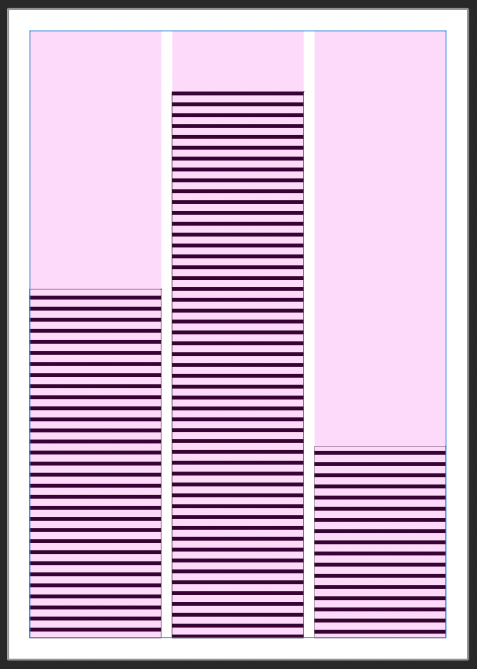
Use reset transformation if your hatch pattern is distorted after scaling or resizing your columns
Now you might be wondering if all this is a bit laborious for the sake of creating “dumb” wireframes that are devoid of actual content. One advantage, however, is that you can quickly build a library of different designs from which to pick and “apply” the most appropriate ones to your final document. It is also a way to maintain a library of different styles you can reuse in future projects.
In this example, I have created several “masters” for one-page articles, two-page spreads, full-page ads, an infographics page, etc. While they are not fully-fledged templates, they can be dragged and dropped into the various pages of your document to quickly build and preview an entire section of a magazine:
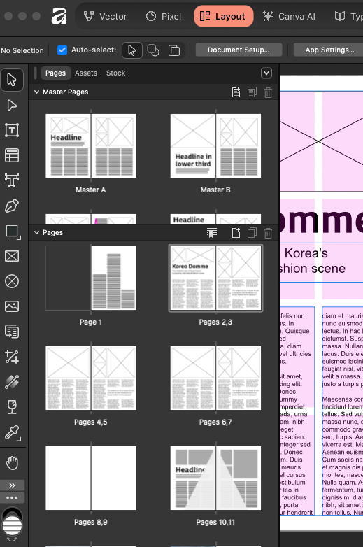
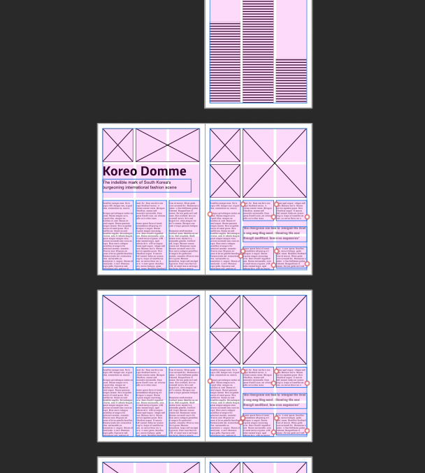
The Master layouts can be dragged and dropped to compile your document
Alternatively, you can skip the masters and work directly in the document’s pages to create wireframe layouts. In some ways, this is a preferred option for some, as it makes it easier to copy and paste elements between artboards.
I generally use a mix of the two — a basic master layout with images and text boxes in key positions, and then real text frames for Headlines, subtitles and pull quotes, to give myself a bit more flexibility.
Either way, the main idea to retain is that wireframing is quick, relatively easy to do, and a powerful visual method for anticipating how your article will evolve across pages and spreads.
Start with a spread (and the reader in mind)
A typical magazine spread of two facing pages will be viewed as one by the reader. It must therefore work together in terms of consistency and continuity. The goal is always to make the page as easy to follow as possible, encouraging the reader's eye to go where you want it to, rather than expect the reader to search for information.
One thing to bear in mind is that many people “scan-read” as they flip through a magazine or document before choosing what they will engage further with. Even for on-screen content, the placement of denser, “darker” areas (such as images) will draw the eye towards them first.
In the case of a magazine spread such as the one shown below, the eye generally gravitates towards the images in the top-left and top-right positions, and fleetingly registers the presence of a headline (or largest text on a page). The centre and footer area, denoted by the triangle in the diagram below, is likely to be the least “visible” for the reader during their first encounter.
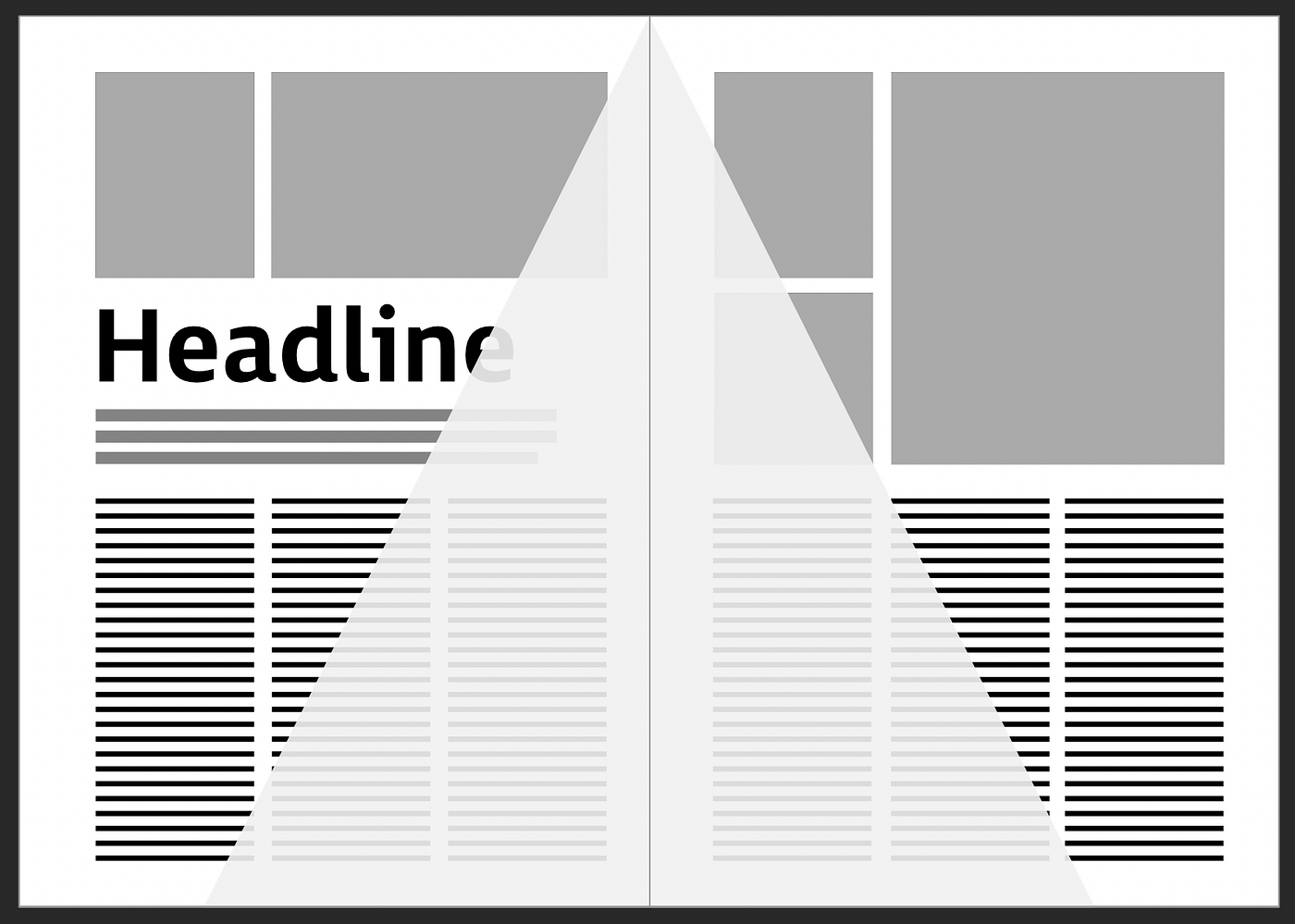
Placement of headines and key images in the most “visible” areas
With that in mind, it makes sense to keep your most relevant and important information in the “upper” areas. This is the material that will act as a shortcut for the reader and help them understand what the article is about. The bottom area is the least visible on this first “reading”. That isn’t to say it is less important, but rather that it won’t be picked up on by someone initially scanning the page. Information within this triangle is more suited to the second mechanism, which comes into play once a reader has committed to reading, in which case it becomes more important to lead their eye easily from one column to the next.
Conversely, it doesn’t make sense to place Titles and Headers (or images for that matter) in an area that is not the most obvious, or “visible”, to someone scanning a page for meaning and relevance. As in this example:
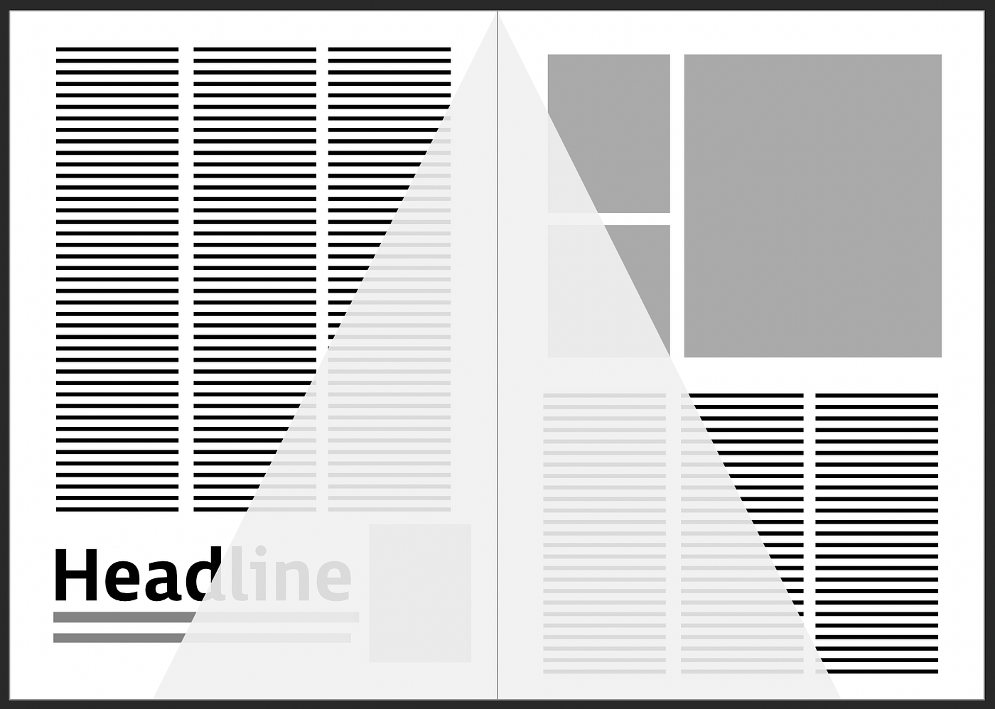
The eye has to “search” for the headline and image on the first scan-reading of the spread
There are exceptions to this, of course, yet you’ll see that we are still designing where the eye goes. Here are a couple of commonly used variations which are considered acceptable solutions for placing your headline in the lower half of a page:
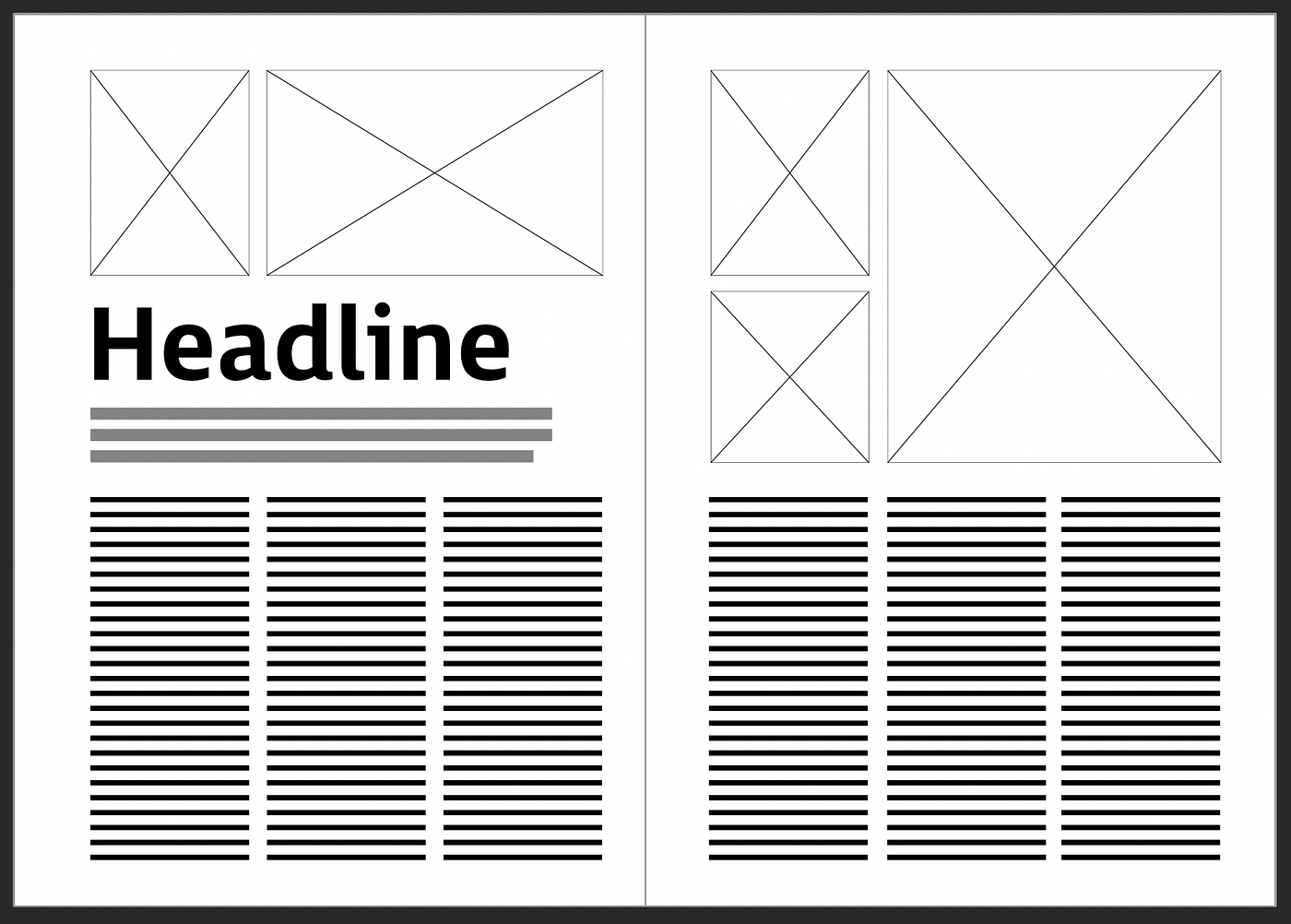
(i) The upper half contains an image, and the Title/Subtitle is arranged in the lower half of the page. This works because there is still sufficient contrast between the left and right page arrangements. After viewing the image in the top left, the eye is drawn to the largest type on the page (the headline/subtitle combination).
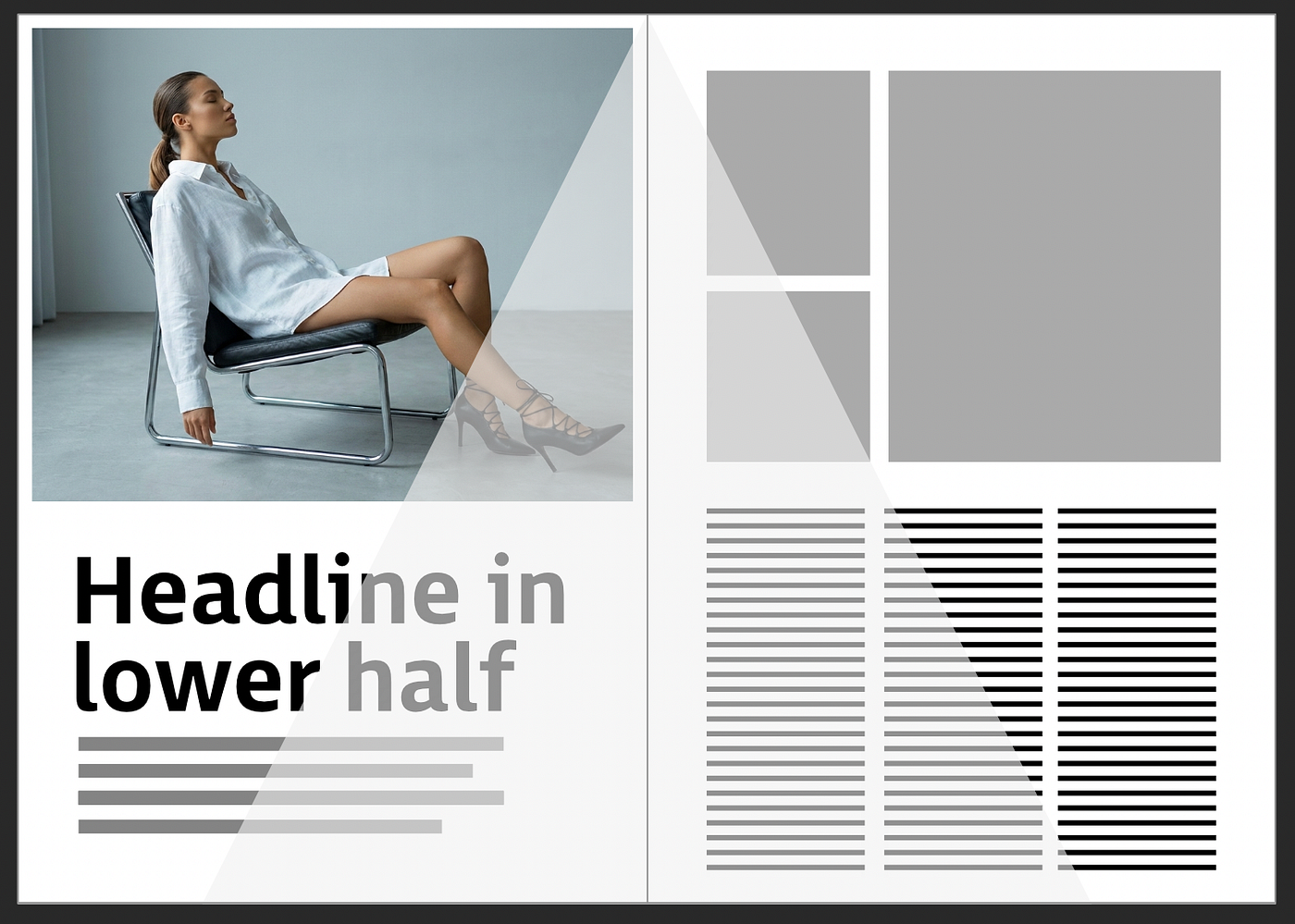
After the image, the eye is still drawn to the largest type on the page (the headline)
(ii) A full-bleed image fills the entire page, with contrasting overlay text. This works well, particularly for introducing a section or featuring a pull-quote. In both cases, the eye sees the image first, and is then drawn towards the inset Headline, despite its location in a “less visible” zone on the page.
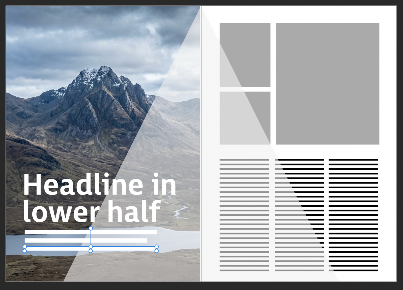
Copy flow: guiding your reader
Once a reader has chosen to engage with an article, our layout considerations turn to the task of retaining their interest by making the experience as frictionless as possible. Arranging your copy in columns makes it easier for the eye to navigate information throughout the article:
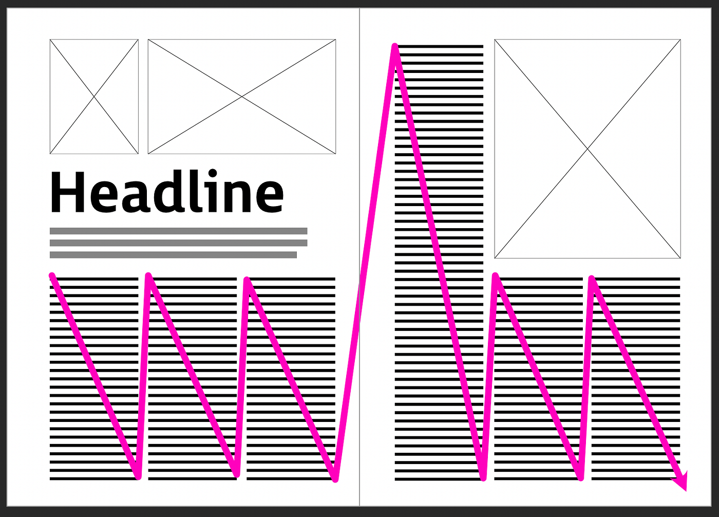
There are exceptions, particularly in Travel or Lifestyle magazines, where a variety of short articles and other information will be densely packed on the page. That could still work, but always try to anticipate what the final experience might be like for the reader.
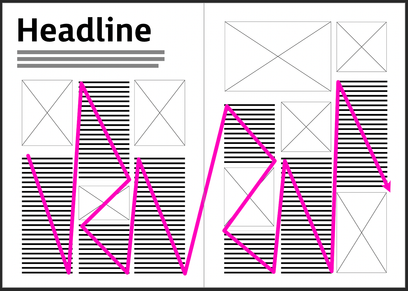
Where possible, avoid this kind of burden on the reader:
Although a grid is used, the reading experience becomes chaotic
As always, creating variety (at least, between sections) is key to generating and maintaining the interest of the reader. But also crucial to devising a ‘successful’ layout is the simple fact that information has to be organised and consistently presented. For this reason, I recommend establishing a grid (even at the wireframing phase) to help structure the information and content. Don’t be afraid to use several grids or to vary the widths of columns throughout a magazine. Just be aware that the more complex the design, the more difficult it becomes to balance everything and make it look right.
Another important aspect when you start to populate your columns with real copy is to ensure that the ‘snap to baseline grid’ is set up and enabled. This essentially forces text to align horizontally on the page, even when it appears in separate columns. See the section on “what to avoid/check” at the end of this article for more details.
Creating variety in layouts
Grids provide structure but shouldn’t be seen as restrictive. Quite the contrary: they allow us to try various creative arrangements with the same material to see what fits best. Here are some thumbnails that are designed to present an almost equivalent amount of information on each page, yet they will impact a reader’s perception by shifting emphasis and focus in a subtly different way.
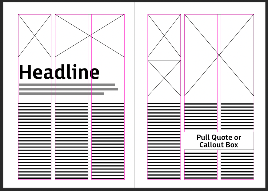
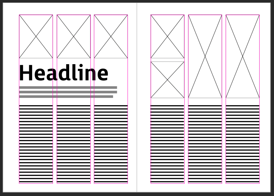
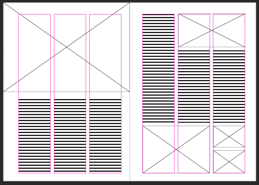
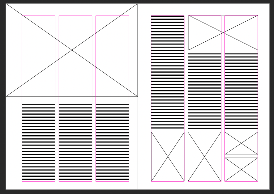
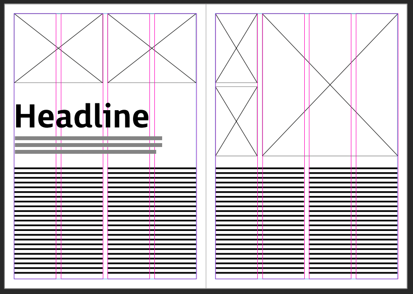
The layouts you design or choose for your own articles will depend a lot on the images used to illustrate them, and where they are positioned (e.g. in relation to text that refers to an image). For instance, if we take a look at the two “Headline” layouts above, it would make more sense to choose the layout that has three separate images above the Headline on the left page, if those images relate to three topics covered in the text columns below. However, if the text covers a broader introductory theme, then a large single image or a two-image arrangement might be a better choice.
The advantage of working with thumbnails or wireframes is that it is easy to quickly reposition and resize placeholders and re-arrange elements to suit your text. You also obtain a fairly good overview of how other elements and spacing are interacting across the page or spread. This becomes even more relevant when you move to 4 or 6-column grid layouts, which, in themselves, are a canvas for introducing variety. The simple wireframes make it far easier to make changes than having to reposition everything each time you want to try a different idea.
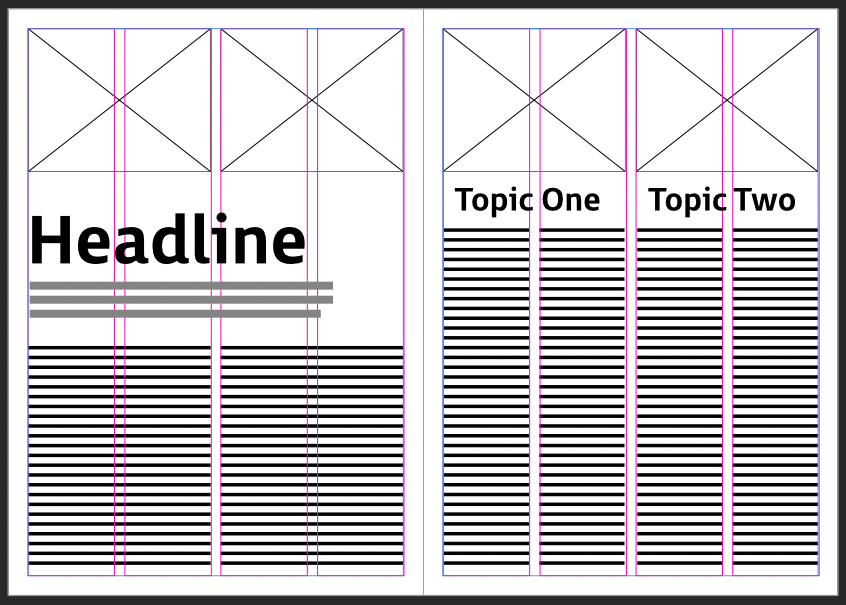
The examples below, based on a 4-column grid, allow you to vary the widths of your columns and subdivide your article into distinct, self-contained areas.
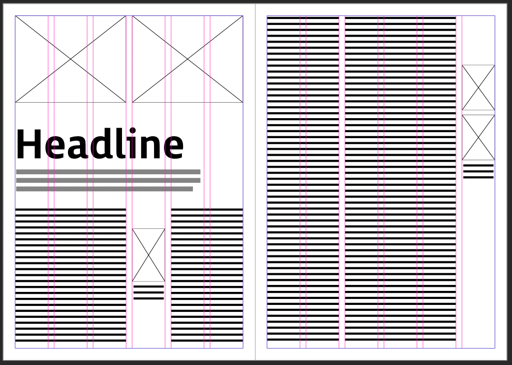
The 6-column grid example below is another variation where text is the main focus of the article, but smaller images with captions can be inserted in the appropriate places to help illustrate a particular point. This is commonly seen in literary magazines but applies to many other cases.
Note that some of the variety (and balance) comes from a considered choice of column widths for the body text. The left page uses a 3-column + 2-column layout for the body text. The right page uses a 2-column + 3-column arrangement. The images on both pages are constrained to a single column, and are kept small to provide the necessary “breathing space”.
Design flaws to avoid (or check!)
As with any ‘approximation’, thumbnails only give you a broad overview of what a page might or could look like. They are a convenient first mapping of the main zones where you intend to place your text, images, icons and other graphics to deliver an article in the most appealing and effective way.
But the devil is in the details, as the saying goes. Once you start to populate a page with text that is set in specific fonts and sizes, with spacing applied, and so on, there are always details that need to be checked.
Column lengths and widths
When you create wireframes, it is easy to get carried away repositioning text blocks and images on the fly as you create different layouts. Depending on your snapping options, baseline grid settings, etc., some of the text may be out of alignment when you create your final document. The key to success here is, yes, you guessed it, maintaining adherence to a grid.
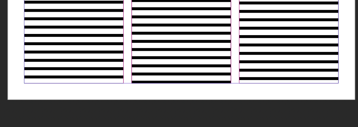
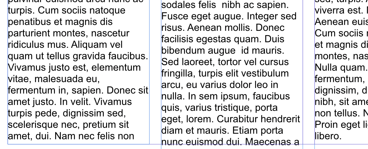
For example, if we zoom in on this particular wireframe, the lines representing the text are not aligned, which would look sloppy when rendered as real text:
In other words, they would look something like this:
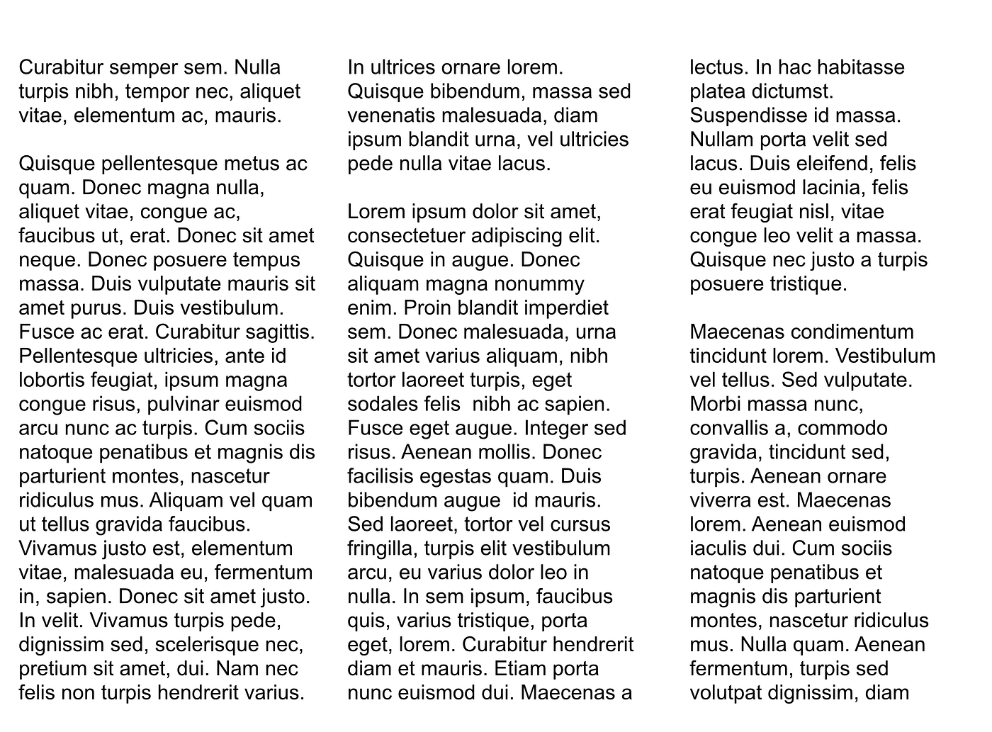
In general, the fix is always to use a baseline grid, as mentioned earlier. This ensures that text aligns across the entire page, even for text that belongs in different columns:

Applying a baseline grid in Affinity
Another common error occurs when the text boxes in the wireframe are not exactly aligned with the gutters between them. This usually occurs in wireframes if you are not using a grid or snapping, and are only approximately resizing columns as you create your different layouts.
In this example, the gutter widths between text columns are not the same and have ‘drifted’:
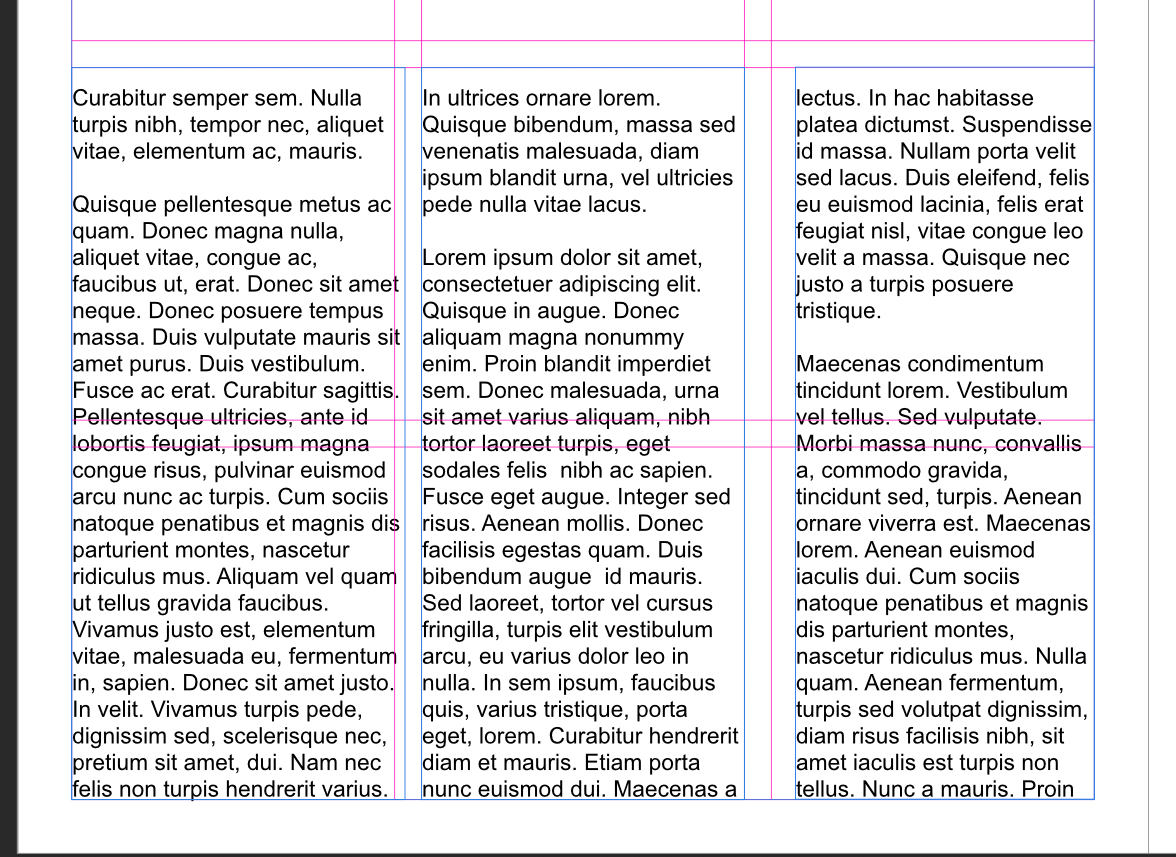
These columns (in blue) are no longer of equal width or aligned with the gutter spacing
This also happens in production when less scrupulous designers try to force text to ‘fit’ a particular column length by adjusting relative widths and positions. However, even if those adjustments are made in small increments, it will create a distracting mess of the layout and will be noticed by the reader.
To avoid creating these types of subconscious interruptions, always ensure that you check alignment and adhere to the grid when you go from a wireframe to your finished layout:
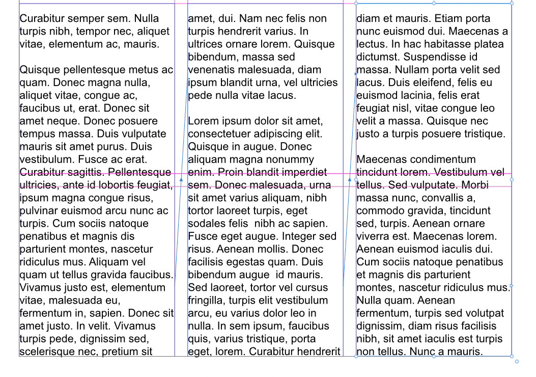
Columns aligned to gutters and grid
Remember also that a spread will be read as “one” entity. So be certain to check the adherence of your content to gutters and grid spacing at a page level and across both pages. Here is a slightly exaggerated example to show what might happen if we allow values to drift:
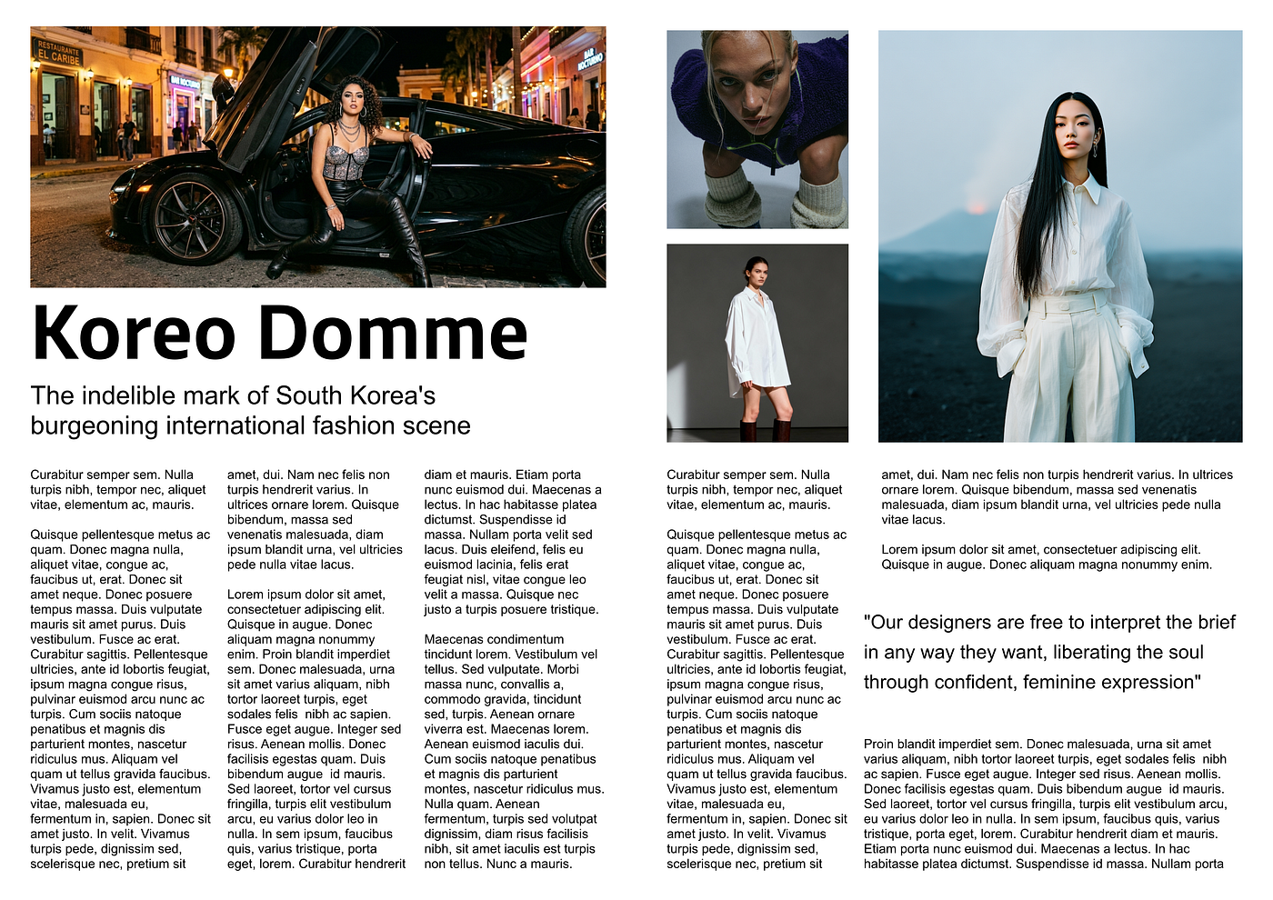
While the gutters and grids look “about right” and are uniform across the left page, there is a noticeable departure on the right-hand page, leaving unsightly gaps between the images and between the columns of text.
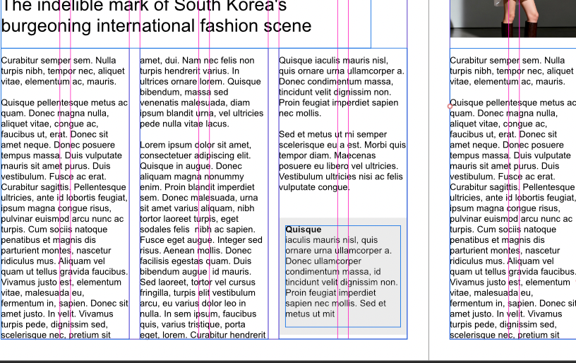
Finally, also be prepared to tackle and challenge the reality of your final layout versus the “idealised” layout you will see in a wireframe. Specifically, when it comes to small but significant details. For instance, you may find that your text doesn’t quite fill a column exactly, leaving an odd gap, as in the third column in this example:

These types of situations can easily be solved if the information in that area is significant enough to be promoted to a “callout box”. Otherwise, you can do that elsewhere in the article to make up some of the “gaps” and push the text into the available space across all columns. A bit of juggling, I know, but such is life…
Here is how I might tackle the problem:
Place the closing paragraph into a box which acts as ‘padding’. In this way, the text remains inline and within the bounds of its assigned column and therefore maintains its relevance and relationship with the surrounding article. But visually, its ‘reach’ now extends vertically and therefore closes the gap we saw previously:
Conclusion
Building a library of wireframe thumbnails might seem labour-intensive in the beginning, but they’ll serve you well for your future projects by providing a personalised, “go-to” reference for anticipating how your actual content could be structured and presented.
As you refine these layouts and adapt them to your needs, you’ll soon be able to quickly choose the most appropriate ‘models’ to match the intended flow and sections for your work.
Nigel Reyes is a brand content designer & certified copywriter with regular contributions to the Herald Tribune, New York Times, New Yorker, New Zealand Herald & The Guardian (UK & AU). The independent views and articles expressed on @Medium are my own and non-commissioned. Your readership, claps, comments, encouragement and interaction are highly appreciated.
You may also like:
[embed]Magazine layout and setup using Affinity My method in Affinity Publisher 2 and Affinity 3medium.com
메타데이터
- post_id
- af3c48250eef
- slug
- designing-page-layouts-to-meet-reader-expectations-af3c48250eef
- url
- https://medium.com/brandmanagementdesign/designing-page-layouts-to-meet-reader-expectations-af3c48250eef
- canonical_url
- https://medium.com/brandmanagementdesign/designing-page-layouts-to-meet-reader-expectations-af3c48250eef
- author_url
- https://medium.com/@nigel_reyes
- status
- ok
- fetched_at
- 2026-06-09 15:37:30