Really Good Week — Day 1
What brings me here & typographic creative work
Really Good Week — Day 1
What brings me here & typographic poster design process
Hi everyone!
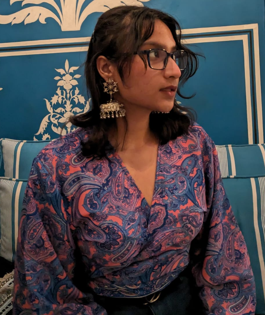
If you don’t know me → I’m Efe — studying design at METU and working as a designer.
Why am I here today? → First of all, it is an 8–5 job-free week for me cuz it’s holiday thanks to Muslims. It should be something like Ramadan, but I really don’t know; already, what matters only is the holiday which brings me a tremendous amount of time to hopefully give to my creative processes and, therefore, me. Actually, it is only Thursday and Friday, which is a holidays. However, the company I work for (I-AM) decided to make a whole week’s holiday, which is fantastic! This week I have hugeeee!! time slots. During very standard weeks for me, two laptops are on the desk; one is busy with class Zoom sessions, and on the other, I’m working for the company. It is hard to find or create any time for the creative works I would like to make and publish. It is a huge pain, so finding gaps like that makes me really happy, & as you can see, creative! Yes, that is the first reason. Now, let’s move towards the second and the most important, and be ready to read some thoughts of mine on “being snowflake/unique.”
The second thing is, of course, I like to do that; in other words, I would love to die for that → the creative process. I take great pleasure in producing; if I have created something good, I sincerely enjoy sharing it. But of course, I don’t want to share just an image on my Instagram account. I want you to learn the story behind it, the things in my head, how they affect me and my work, how attached I am to the creation of myself, and so, finding myself. I want to tell you the stories which fly inside me. But the roots of my incline to share and be heard lie inside the desire to write a book (the first one will be something like an autobiography cuz I don’t want to suck it, so I chose the thing I know best to write).
I am experiencing things and feeling something with them; sometimes, I feel without living it, but it’s a different & different topic for a text. And these experiences and feelings cause me to come up with something. I go and do creative work, and so on. I never thought that these were unique things. Even I was going to write that they can’t be unique, but then, I suddenly stopped cuz, you know, everyone is different — seeing or hearing the same, but these things are being recreated inside them, and everyone’s method or way is on’n’only. Let me tell you how → I don’t know if we’re snowflakes or not, but I believe that everyone’s feelings in their body and soul are entirely different. Everyone may be experiencing the same things, seeing the same people, and experiencing the same things, but I feel like they are being reflected in them. That is, the emotions they create are completely different. That’s because, in essence, we’re all human or similar beings or people who have lived through the same things and passed through the same places, but we are building ourselves completely differently. The things you will see here are the visuals that come out of my kneading, the forms of those who are all my interpretations, embodied by me.
Now, I’m assuming I made myself clear about why I’m here — don’t know if that was needed or not. I just wanted to write some “opening” 🤡 — let me move on with the second part of the text, where I describe today’s artwork, made by me while getting bored in the ID302 course, in 30 minutes-1 hour.
Finalized Artwork ↓
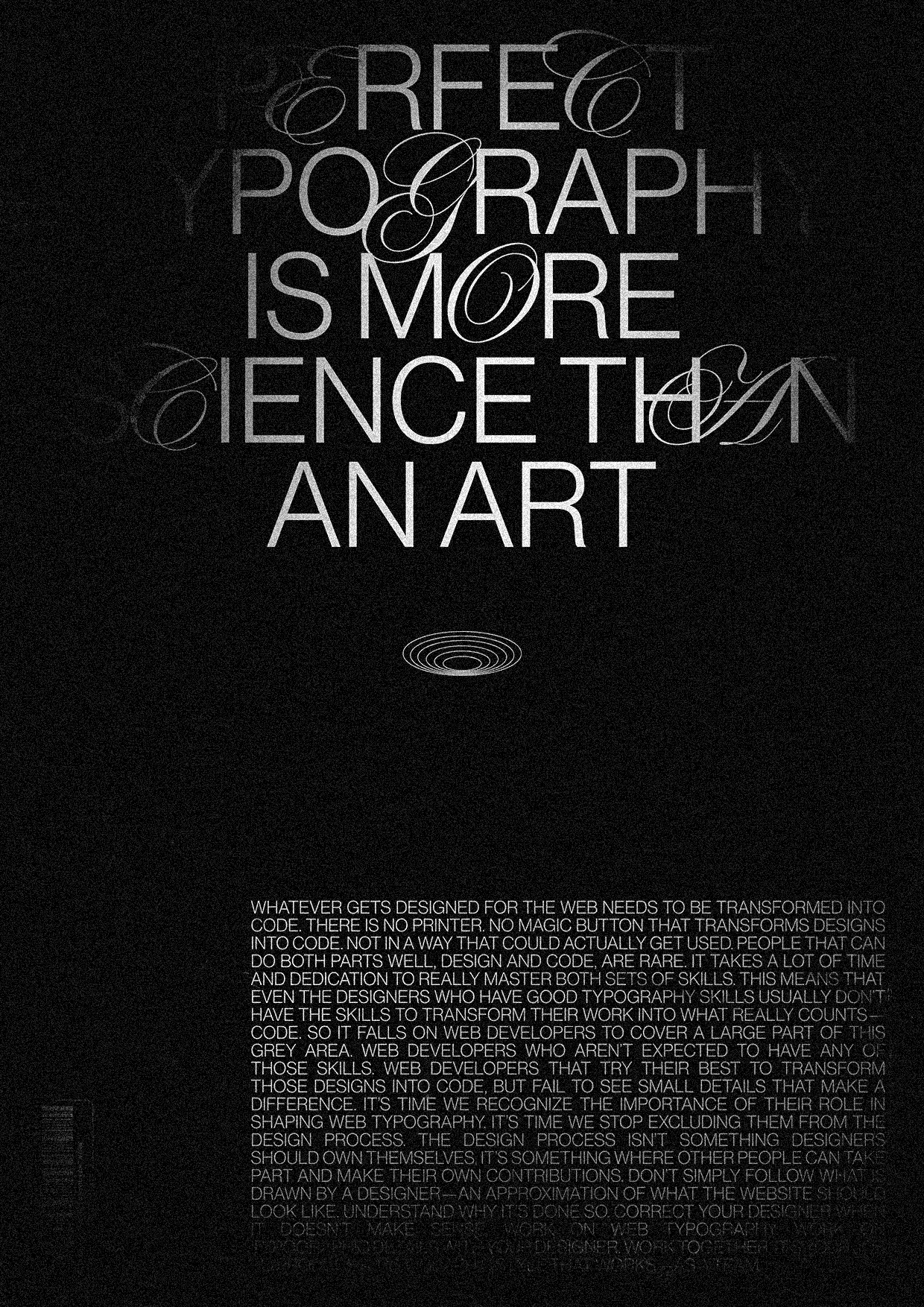
in the name of → “Bipolarity.”
Why “finalized”? → I created this piece of digital paper in Figma. While creating something straightforward, even if it is a graphical poster or some complicated stuff, I prefer Figma cuz PS and AI work slows as fuck. Okay, maybe not that slow but, not as fast as the tools I use for this work. I hate being limited by technology and things that I don’t have any control over.
Back to the topic, why it is named finalized → texture + noise.
Yes, that’s all, nothing more than that. In Photoshop, on top of the design layer, which is in the clearance of coming out of Figma, and no texture or another scrappy additional, there were two layers of texture, both were paper texture, and one was to give it dotty texture all papers have (tomorrow I’ll be adding texture images too, believe me. Sorry for now), other was for the scratchy effect. But, as you can(t) see, there is no sign of scratch cuz, just for today, I wanted to make textures almost transparent, cuz again, I liked the look of neat out-of-Figma design. Why is it just for today → I did it for the first time. There were only 2–3 times I didn’t use any textures for the posters I made in my entire design career, which is 3 years 🤡). I’m in love with textures as they have the power of gods that can change the mood of the design entirely and give it a new look & feel. I never use them less than 50 percent. But today is an exception, and I’m thrilled with that exception.
How was the process? → A lot of CTRL/CMD+Z 😫
Both texts you see are from a mail subscription content which was only for 7 days, and the context was typography. The purpose of the mail was for me to learn that — I believe — typography is more than art. But, If you ask me If I learned that or not, the answer is → No, cuz I did nothing other than adding flags to emails 🤡 Oh, thanks to awwwards I recently bought a course related to typography again, and there I am learning about that, and up to now, I finished terminology, and history like a chapter, who knows maybe I write a different article for these topics.
I got them from the mail articles and made use of them.
How I decided on the layout → It is A3 sizes but in pixels. 2480x3508 px, I think in 300dpi, but not sure. There is a row and 4 columns. Both grids’ margins are 96 px, and the gutters are 48 px. But, ef☻ how did u decide on them? Hmm, 8-point grid. I didn’t want them to be very far from the edges as it feels like significant artwork, or I don’t know, banana taped on the wall??? Also, I like to use high-value margins while using images or trying to create more elegant??? look.
Oh, I just realized I really am not sure about many things in this chapter. Anyway, let’s move on.
Why is text symmetrical? → Just started it that way and never felt the urgency or need to change its alignment. But, one time during the design process, I aligned it to the left in it and on the poster, but the script letters became so close to each other horizontally that they started to weigh in one place on the poster. Then, I pressed CTRL+Z 🤡
By the way, I just wrote the “what about the text below” section and realized that my design processes are most of the time like deciding on something (an element on a poster) without any constraints and then putting/using other elements regarding the rules came with the first element I put without any limitations & it’s like a chain)
What about the text below? → Okay, this is more unclear for me than the above one. First, I was not sure how to fill the bottom of the poster. The first thing that came to my mind was using images. I said, “Okay, let’s find an image for this poster, but what type of image???”. That was the question I dropped using the image idea. Then, the second option uses text, but smaller, more, and aligned to one of the sides, cuz y’know →, contrast, hierarchy, balance (basic design sh*t). Again, I made use of the mail, copied a text from there, and pasted it, aligned it, justified it. Why it is on the right → Script letters are mainly on the left side of the page, so, to be able to create balance, I needed it to be on the bottom right.
Fonts? → Initial idea was to create a typographic poster for the first day and maybe reflect some brand identity. So, I created the typo by combining two fonts: Neue Naas & Edwardian. One is Grotesk, and the other is Script typefaces. And the combination of these two → 🌟hilarious 🌟
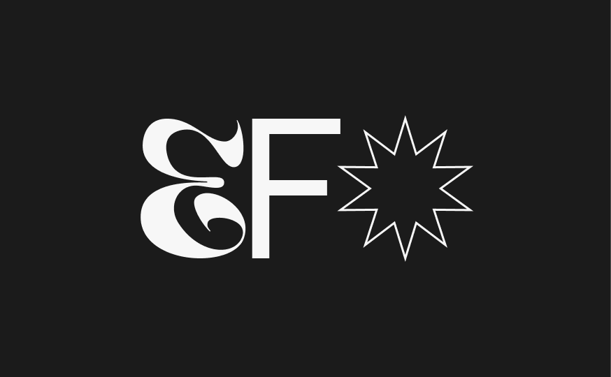
current logo — check for the identity
Please don’t look for any reasoning; they look good when combined.
Cloudy look → And for the last part, I have to describe the cloudy look of the poster, but I’m tired and hoping to do it again tomorrow, explaining it in another article. But, just know that I wanted to create some light effects cuz they are popular (the most shitty reason you may be heard today 🤮) and therefore used PNGs with a window shape and gave them blur, and changed their layer attribute.
Other variations ↓
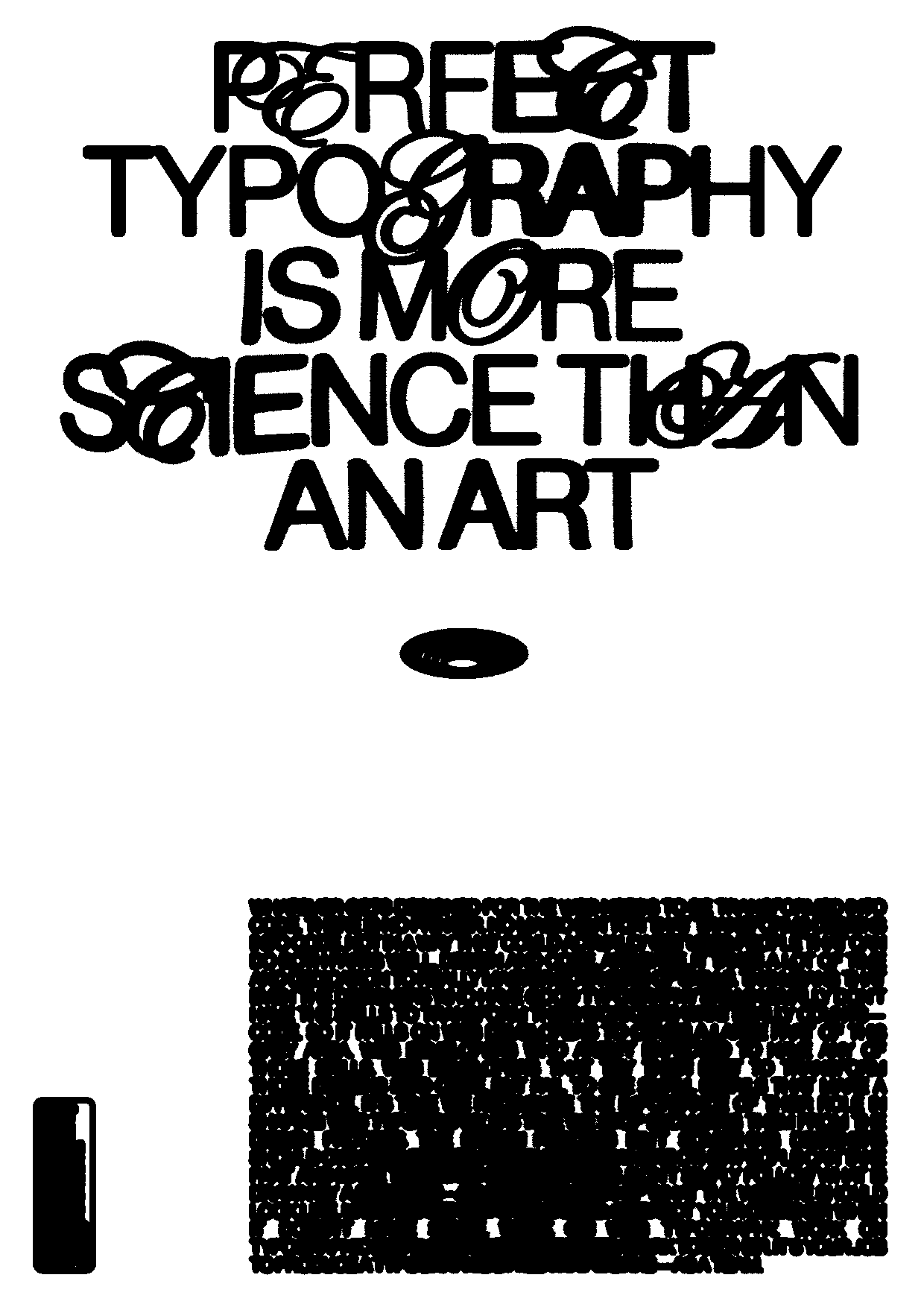
textured — inverted — inkbleed effect
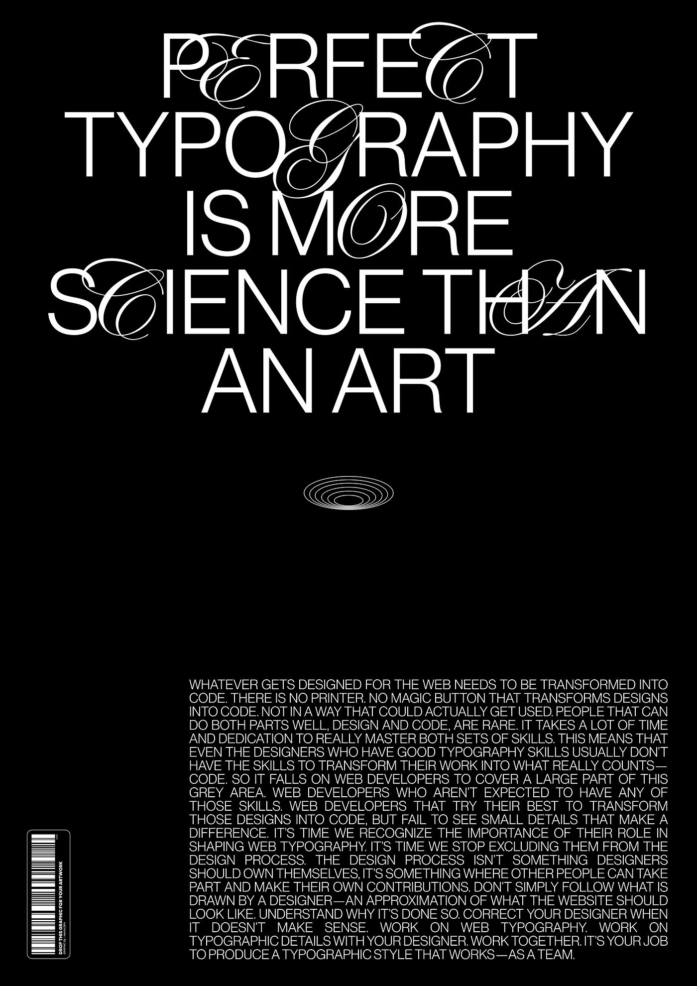
w/o texture & noise
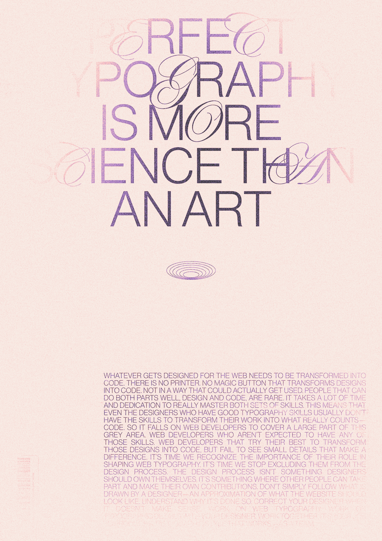
❤️🔥gradient — mapped❤️🔥
Thank you!
메타데이터
- post_id
- b170a387b0a7
- slug
- really-good-week-day-1-b170a387b0a7
- url
- https://medium.com/@efbakir/really-good-week-day-1-b170a387b0a7
- canonical_url
- https://medium.com/@efbakir/really-good-week-day-1-b170a387b0a7
- author_url
- https://medium.com/@efbakir
- status
- ok
- fetched_at
- 2026-07-25 21:31:30