Working With NetCDF Data and Creating Time Series Animation from It (R vs Python vs GEE) — Part 1
NetCDF (Network Common Data Form) is a file format and software library commonly used in the geospatial and scientific research…
Working With NetCDF Data and Creating Time Series Animation from It (R vs Python vs GEE) — Part 1
Photo by USGS on Unsplash
NetCDF (Network Common Data Form) is a file format and software library commonly used in the geospatial and scientific research communities to store and distribute large datasets. NetCDF files are particularly popular in fields like climate science, meteorology, oceanography, and remote sensing. Its metadata includes information such as variable names, units, and dimensions, making it easier for researchers to understand and work with the data. NetCDF supports multidimensional data, it can represent data in the form of arrays, grids, and time series. Since NetCDF is platform-independent, meaning we can create, read, and manipulate NetCDF files across different operating systems and programming languages. So, in this article I am trying to show you on working with NetCDF data and demonstrate how to create captivating time series animations from it, utilizing three distinct platforms: R, Python, and Google Earth Engine (GEE).
*Disclaimer: this article is some kind of my online journal of my journey in learning spatial data science, it is possible that you will find a better and more effective way out there than what I wrote here. So, let’s learn together!
You can find various NetCDF data from various providers, in this article we will try to work with ERA5-land temperature data provided by Copernicus. ERA5-Land is part of the Copernicus Climate Change Service (C3S) and is a dataset that provides high-quality, high-resolution climate and environmental information for land areas. It is an extension of the ERA5 reanalysis dataset, which focuses on the Earth’s atmosphere, and it specifically targets land surfaces. ERA5-Land is developed by the European Centre for Medium-Range Weather Forecasts (ECMWF). Before we start to work with the data, below some steps you need to follow first:
- We have to create an account, you need to go to https://cds.climate.copernicus.eu/cdsapp#!/home and click on Login/register button on the top right.

Copernicus Climate Data Store (CDS) Webpage (source: author)
- Next, you have to fill out several data, like Email, First name, Surname, Country, Sector, Organization and the most important one, Captcha. After that, you will get your account activation email, just follow the steps and log in to your account.

Sign Up Page on Copernicus CDS (source: author)
- Click on your profile on the top right screen, and then you will find your UID and API Key one the bottom of your page. We need this UID and API Key to be able to download the NetCDF data we need.

Your CDS API (source: author)
- After all the processes above are fulfilled, let’s try to work with the data. For initial notes, we will try to analyze land temperature data for the last 12 months (We are gonna set the time frame around October 2022 — October 2023).
R
The first platform we will try is using R. Before we start it, I took the inspiration from Milos’ work, you can check his youtube channel here. Big up to him! So, let’s get it started.
- First, you need to set the working directory, especially folder where you want to store your downloaded NetCDF data.
# SET WORKING DIRECTORY

setwd("your_working_dir")
main_dir <- getwd()
dir.create("weather")
weather_dir_path <- main_dir |>
  paste0("/", "weather")
setwd(weather_dir_path)- The next step is you have to install the required library, the easiest way you can go to the Packages then search the required library, namely sf, giscoR, tidyverse and tidyr to manipulating data, classInt, RColorBrewer, gganimate and gifski to visualizing data, and the key library to download the data: KrigR that made by Erik Kusch (to install this library we need some special step, you can find it below). For more information about KrigR you can read it here. Below is the step on how you install the KrigR and load all the libraries we need.
# INSTALL AND LOAD LIBRARIES

install.packages("devtools")
devtools::install_github("https://github.com/ErikKusch/KrigR")

# to download the data
library(KrigR)
# to manipulate the data
library(sf)
library(giscoR)
library(tidyverse)
library(tidyr)
# to visualize the data
library(classInt)
library(RColorBrewer)
library(gganimate)
library(gifski)- After we set the working directory, we have to set the ROI (region of interest). I am trying to analyze the temperature data of New Zealand, so we will set the New Zealand as the ROI using the giscoR library.
# SET ROI

nz_sf <- giscoR::gisco_get_countries(
  country = "NZ",
  resolution = "10"
)- Since we are working with ERA5 data, we can use KrigR library to download it directly from R. Some key values you need to set are range of date (start_date, end_date) of the data we want to download and your UID (my_api) and API key (my_key) from your CDS account.
# DOWNLOAD THE DATA

start_date <- "2022-09-30"
end_date <- "2023-09-30"

my_api <- *****
my_key <- ("***********************")

nz_temp <- KrigR::download_ERA(
  Variable = "2m_temperature",
  DataSet = "era5-land",
  DateStart = start_date,
  DateStop = end_date,
  TResolution = "month",
  TStep = 1,
  Dir = weather_dir_path,
  FileName = "NZ_2m_temperature_20222023",
  Extent = as(nz_sf, "Spatial"),
  API_User = my_api,
  API_Key = my_key
)

head(nz_temp)- Since we are trying to analize monthly temperature of New Zealand, set the Variable to ‘2m_temperature’, TResolution to ‘month’ and extent to nz_sf as the ROI. Also, don’t forget to set the Dir with your weather_dir_path that we did in the first step. Below is the structure and metadata of the data we’ve downloaded (in *.nc format).

Structure of nz_temp (source: author)
- So, let’s trying to plot it as the first test with the script below.
# test plot
nz_temp[["X2022.11.30"]] |>
  as.data.frame(xy = T, na.rm = T) |>
  ggplot() +
  geom_tile(aes(x = x, y = y, fill = X2022.11.30)) +
  coord_sf() +
  scale_fill_viridis_c(option = "plasma") +
  theme_void()
Test Plot of NZ Temperature (source: author)
- Next step is to make the data tidier. Firstly, we need to convert the data as dataframe, then make the ‘dates’ to be value of layer column. This is gonna looks like this.
# NC TO DF

nz_temp_df <- as.data.frame(
  nz_temp,
  xy = T, na.rm = T
)

head(nz_temp_df)

nz_temp_long <- nz_temp_df |>
  tidyr::pivot_longer(
    !c(x, y),
    names_to = "layer",
    values_to = "value"
  )

head(nz_temp_long)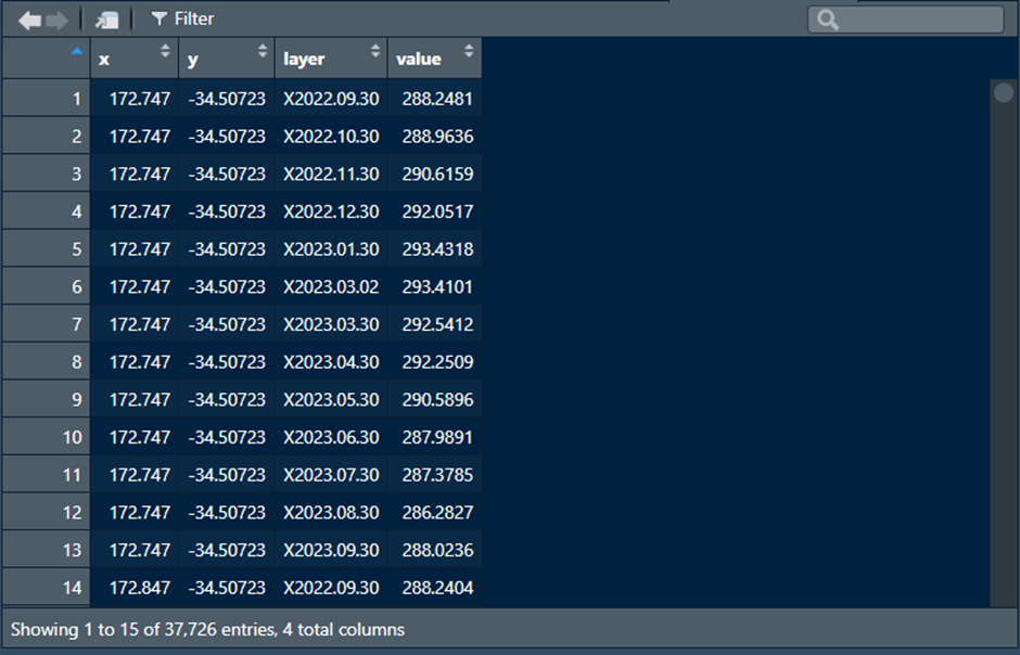
Converting nc data to dataframe (source: author)
- After that, we have to make a new column of dates. We can make it from that ‘layer’ column and convert the temperature value from kelvin to celsius degree.
# GET DATES

nz_temp_long$datum <- sub(
  ".", "", as.character(nz_temp_long$layer)
)

head(nz_temp_long)

# run it twice to remove all of the dot (.)
nz_temp_long$datum <- str_replace(nz_temp_long$datum, "[^[:alnum:]]" ,"")
nz_temp_long$datum <- str_replace(nz_temp_long$datum, "[^[:alnum:]]" ,"")

# change value to Date format
nz_temp_long$datum <- as.Date(nz_temp_long$datum, "%Y%m%d")

# drop some column and create celcius column
nz_temp_dates <- nz_temp_long |>
  dplyr::mutate(
    celsius = value - 273.15
  ) |>
  dplyr::select(
    -layer, -value
  )

head(nz_temp_dates)- The final dataframe is gonna looks like this.

Final dataframe (source: author)
- Let’s make a chart from dataframe above with one simple script.
# TEST CHART

ggplot(nz_temp_dates, aes(datum, celsius)) +
  geom_smooth() +
  theme_bw() +
  xlab("") +
ylab("Temp (Celsius)")- As you can see from the chart, average monthly temperature in New Zealand seems fluctuative, the coldest is in the winter season between June to August 2023 with the coldest temperature was around 4 degrees celsius and for the hottest temperature was around 15 degrees celsius that happened between December 2022 to February 2023.

Average Temperature Data of NZ (source: author)
- Before we start to visualize the data, we need to create some parameters like minimum and maximum values of temperature and class intervals for the color palette (I am using reversed Spectral color palette) visualization.
# BREAKS

vmin <- min(nz_temp_dates$celsius)
vmax <- max(nz_temp_dates$celsius)

breaks <- classInt::classIntervals(
  nz_temp_dates$celsius,
  n = 14,
  style = "pretty"
)$brks

# COLOR

cols <- colorRampPalette(rev(RColorBrewer::brewer.pal(
  11, "Spectral"
)))- Let’s try to animate the data. You need to pay attention to height, width and resolution for the best visualization. In the country of New Zealand where the country tends to stretch ‘vertically’, I put 1280 as the height and 800 as the width with the resolution of 144. Then, save it as a gif.
# ANIMATE GIF

nz_map <- ggplot(nz_temp_dates) +
  geom_tile(aes(x = x, y = y, fill = celsius)) +
  scale_fill_gradientn(
    name = "Celsius Degree",
    colours = cols(15),
    limits = c(vmin, vmax),
    breaks = breaks
  ) +
  guides(
    fill = guide_legend(
      direction = "horizontal",
      keyheight = unit(1.5, units = "mm"),
      keywidth = unit(10, units = "mm"),
      title.position = "top",
      label.position = "bottom",
      title.hjust = .5,
      label.hjust = .5,
      nrow = 1,
      byrow = T
    )
  ) +
  theme_minimal() +
  theme(
    axis.line = element_blank(),
    axis.title.x = element_blank(),
    axis.title.y = element_blank(),
    axis.text.x = element_blank(),
    axis.text.y = element_blank(),
    axis.ticks = element_blank(),
    legend.position = "bottom",
    legend.title = element_text(
      size = 11, color = "grey10"
    ),
    legend.text = element_text(
      size = 10, color = "grey10"
    ),
    plot.title = element_text(
      size = 20, color = "grey10",
      hjust = .5, vjust = -2
    ),
    plot.subtitle = element_text(
      size = 30, color = "#c43c4e",
      hjust = .5, vjust = -2
    ),
    panel.grid.major = element_blank(),
    panel.grid.minor = element_blank(),
    plot.margin = unit(
      c(t = 1, r = 0, l = 0, b = 0), "lines"
    )
  ) +
  labs(
    x = "",
    y = "",
    title = "Monthly Temperature in New Zealand",
    subtitle = "{as.Date(frame_time)}"
  )

timelapse_nz_map <- nz_map +
  transition_time(time = as.Date(nz_temp_long$datum)) +
  enter_fade() +
  exit_fade() +
  ease_aes("linear", interval = .1)

animated_temp_map <- gganimate::animate(
  timelapse_nz_map,
  nframes = 65,
  duration = 20,
  start_pause = 3,
  end_pause = 10,
  height = 1280,
  width = 800,
  res = 144,
  fps = 10,
  renderer = gifski_renderer(loop = T)
)

gganimate::anim_save(
  "newzealand_temperature_20222023.gif", animated_temp_map,
  path = "output_folder"
)
- Voila! Here’s the result!

Animation of Monthly Temperature in NZ (source: author)
You can check the full code on the link below:
For the next part, we will try to work and analyze NetCDF data using python.
References:
메타데이터
- post_id
- b2693cdc4ff1
- slug
- working-with-netcdf-data-and-creating-time-series-animation-from-it-r-vs-python-vs-gee-part-1-b2693cdc4ff1
- url
- https://blog.devgenius.io/working-with-netcdf-data-and-creating-time-series-animation-from-it-r-vs-python-vs-gee-part-1-b2693cdc4ff1
- canonical_url
- https://blog.devgenius.io/working-with-netcdf-data-and-creating-time-series-animation-from-it-r-vs-python-vs-gee-part-1-b2693cdc4ff1
- author_url
- https://medium.com/@bagasanin
- status
- ok
- fetched_at
- 2026-06-16 19:09:56