How I created a Streamlit Dashboard in less than 5 Minutes with Gemini CLI
Then I created another one in a minute, and I wrote zero code
How I created a Streamlit Dashboard in less than 5 Minutes with Gemini CLI
Then I created another one in a minute, and I wrote zero code
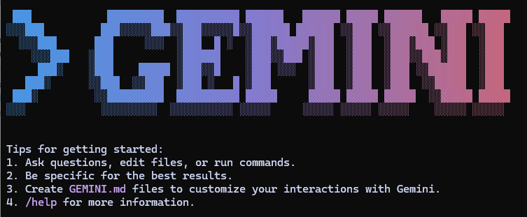
Creating a simple Streamlit dashboard was just a matter of providing the data and saying, in simple, plain English, what I wanted. Gemini CLI works from the command line — no IDE is required. You tell it what to do, accept its suggestions, and like magic, you have an app.
What is Gemini CLI and How to Use It?
Gemini CLI is a command-line interface that brings the power of Google’s Gemini large language model directly to your desktop. It functions as an AI-powered pair programmer that you interact with using natural language prompts.
In this small project, I used it for:
- Code Generation: Writing new code, functions, classes, and even entire applications from a high-level description.
- Code Modification: Refactoring code, adding features, fixing bugs, and changing libraries or frameworks.
- File Operations: Creating, reading, and modifying files and directories.
- Documentation: Generating documentation like README files.
You can also ask it questions about your code, to explain how it works, to run shell commands to run tests, build projects, or start servers.
Interaction is conversational. You provide a prompt, and Gemini responds by either providing information, writing code or creating new files. In this way, you can interactively guide the development process step by step.
While it wasn’t really necessary, so as to monitor more closely what Gemini CLI was up to, I kept a VSCode window open in the working directory. I did not use it other than to read code and other files that were generated by Gemini. I made no edits at all, but it was fascinating to see how Gemini worked.
The application that I will describe here is not complex, and I could have created it quite easily, but Gemini created the code faster than I would have been able to type it, so from a productivity point of view, it was great.
For a more complex task, you might use it to scaffold an application, getting the basic structure in place before adding more detail later by hand or by using Gemini.
Gemini can also operate directly on your local file system, so it can read code or data and understand a project’s structure. It can add files and produce documentation — for example, I used it to create a README.md for this project.
Installation
Installation is easy, but you will need Node installed on your system. Full instructions can be found in the Gemini GitHub repo, so I won’t reproduce them here. Although there are instructions on how to get and use an API key, you don’t need one. There is a free tier that requires no registration and gives you plenty to work with.
How I Developed the Project
The data comes from Our World in Data[1]. I copied it directly from the OWD webpage and put it in a folder called data within the project folder. I then started Gemini CLI in the project folder.
Throughout this entire workflow, the development was driven by conversational prompts, with Gemini handling the file operations, code writing, and modifications.
I started with:
The csv file in tha data directory tracks life expectancy over time.
Create an interactive streamlit application that lets the user explore data
for particular countries or groups of countries
And that was pretty much all it took. Gemini read the files in the data folder and identified the columns of interest in the .csv file. It then went on to produce a simple Streamlit app.
This gave me a perfectly good working app.
import streamlit as st
 import pandas as pd

 # Load the data
 @st.cache_data
 def load_data():
    df = pd.read_csv('data/life-expectancy.csv')
    df.rename(columns={'Period life expectancy at birth': 'Life Expectancy'},
                        inplace=True)
    return df

 df = load_data()

 st.title('Life Expectancy Over Time')

 # Get the list of countries
 countries = df['Entity'].unique()

 # Create a multiselect dropdown for countries
 selected_countries = st.multiselect('Select countries', countries, default=['United
 States', 'Canada', 'Mexico'])

 # Filter the data for the selected countries
 filtered_df = df[df['Entity'].isin(selected_countries)]

 # Create a line chart
 st.line_chart(filtered_df.pivot(index='Year', columns='Entity', values='Life Expectancy'))
I next asked it:
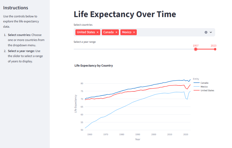
Change the application so that the user can select a range of yearsIt modified the app to add a slider to select a range of years, and I then asked for a couple more modifications: add a sidebar to the application that contains instructions modify the app to use Plotly for the chart.
Gemini responded with the modifications that it was making and duly updated the app.
The result can be seen in the screenshot, and below that is the code.
import streamlit as st
import pandas as pd
import plotly.express as px

# Load the data
@st.cache_data
def load_data():
    df = pd.read_csv('data/life-expectancy.csv')
    df.rename(columns={'Period life expectancy at birth': 'Life Expectancy'}, inplace=True)
    return df

df = load_data()

st.title('Life Expectancy Over Time')

st.sidebar.title("Instructions")
st.sidebar.markdown("""
Use the controls below to explore the life expectancy data.
1.  **Select countries:** Choose one or more countries from the dropdown menu.
2.  **Select a year range:** Use the slider to select a range of years to display.
""")
# Get the list of countries
countries = df['Entity'].unique()
# Create a multiselect dropdown for countries
selected_countries = st.multiselect('Select countries', countries, default=['United States', 'Canada', 'Mexico'])
# Get the min and max year from the data
min_year = int(df['Year'].min())
max_year = int(df['Year'].max())
# Create a slider for selecting a year range
selected_years = st.slider('Select a year range', min_year, max_year, (min_year, max_year))
# Filter the data for the selected countries and year range
filtered_df = df[(df['Entity'].isin(selected_countries)) & (df['Year'] >= selected_years[0]) & (df['Year'] <= selected_years[1])]
# Create a plotly chart
fig = px.line(filtered_df, x='Year', y='Life Expectancy', color='Entity', title='Life Expectancy by Country')
st.plotly_chart(fig)
From downloading the data, starting up Gemini, writing the prompts and running the resulting apps in Streamlit, only a few minutes had elapsed. Indeed, creation of the first app and making each of the modifications were completed in a few 10s of seconds each.
An app in a minute
I developed the app above incrementally, but had I properly formulated what I wanted in the first place, it would have taken a much shorter time.
I decided to test out just how long.
I gave Gemini a slightly more difficult task where I was more explicit in what I wanted:
The CSV file in the data directory tracks life expectancy over time.
Create an interactive Streamlit application that lets the user explore data
for particular countries or groups of countries or areas and allows the user
to select a range of years.
The user should be allowed to select one of two views of the data, one where
the data for selected countries is displayed on the same chart and a second
view where individual charts are displayed for each country.
In this second view, the charts should be arranged in columns and rows with
no more than four charts in a row.
Pre-select four areas: 'World', 'Americas', 'Asia', 'Europe'.
Set the screen mode to be wide.
Add a sidebar to the application that contains instructions on how to use the
app and use Plotly for the charts.
The controls should be in the main window.
The application should be called 'lifedash.py'
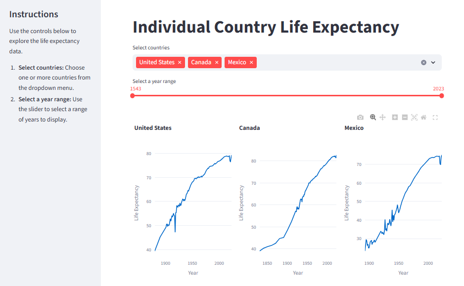
It’s a similar application to the one before, but allows two views of the data: either a single graph or a set of individual ones. This presented a very minor problem, which I’ll come to shortly. But Gemini faithfully generated a perfectly good working application in approximately one minute.
You can see the result with the two different views in the screenshot. (The code is a bit long to insert here, so I’ll append it to the end of the article.)
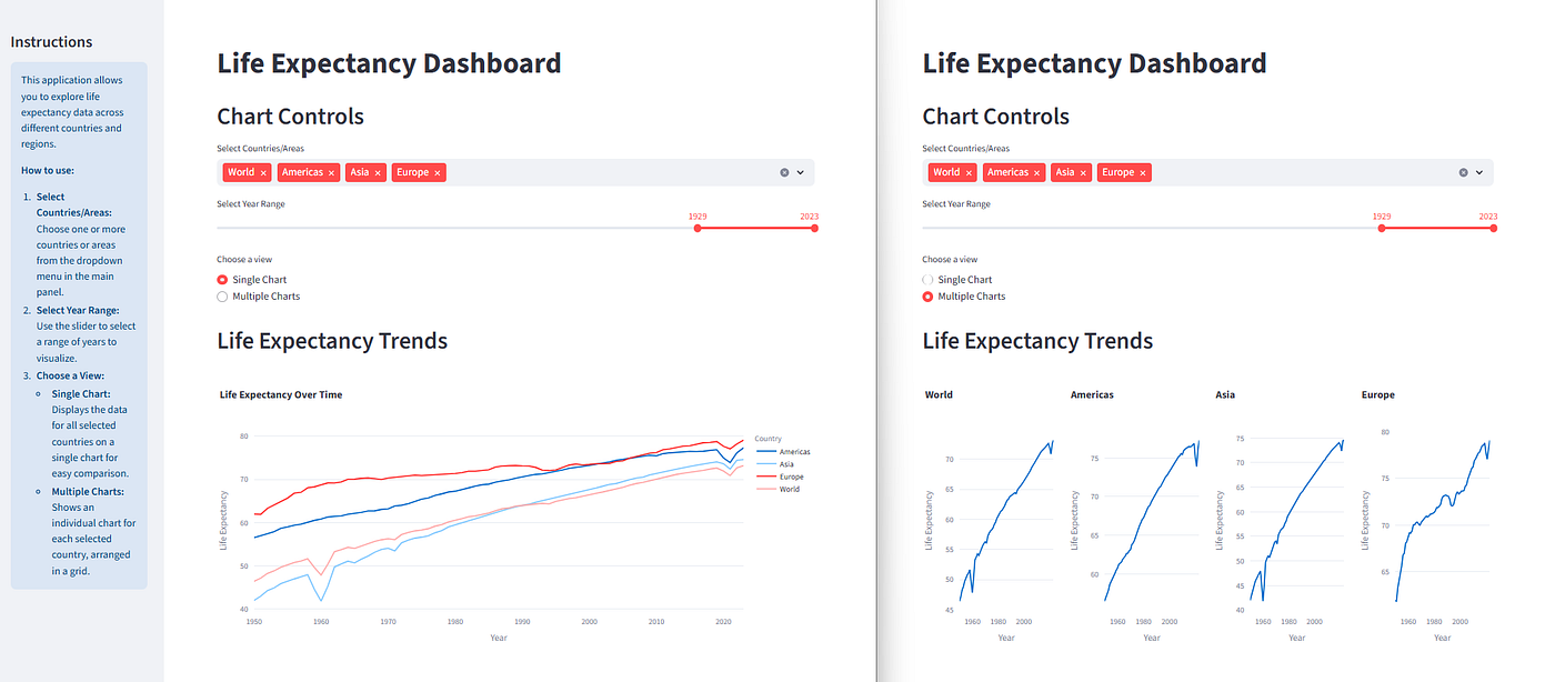
Overlapping views of the same app displaying different charts
The minor problem was that Gemini decided that it wanted to install the dependencies and create a project.toml file. This was a sensible suggestion, but for the fact that those dependencies had already been installed and a project.toml file was unnecessary (this was just an experiment), so I cancelled this suggestion.
Conclusion
Gemini CLI is not the only CLI-based pair programmer out there, and similar things can be done with extensions to VSCode. But the ease of use and response speed made this experiment an enjoyable experience.
One thing that I have not experimented with (yet) is the GEMINI.md file. This lets the user specify a set of instructions that apply to any new project, and I’m thinking that it should be possible to specify a generic application description that would generate a standard dashboard from any number of data files.
But that’s for another day.
I hope that you have enjoyed this short blast through Gemini CLI and have found it useful.
Please follow me here on Medium or subscribe to my Substack newsletter to be notified of more of my work.
References
- Our World in Data life expectancy data. This data is collected from various sources, processed and made available on the OWD web site. All data, visualizations, and code produced by Our World in Data are completely open access under the Creative Commons BY license. Sources: Riley (2005); Zijdeman et al. (2015); HMD (2024); UN WPP (2024) — with major processing by Our World in Data. A full citation can be found on the OWD webpage.
Code
The code for the final app:
import streamlit as st
import pandas as pd
import plotly.express as px

# Load the data
@st.cache_data
def load_data():
    df = pd.read_csv('data/life-expectancy.csv')
    df.columns = ['Country', 'Code', 'Year', 'Life Expectancy']
    return df

df = load_data()

# Sidebar with instructions
st.sidebar.title("Instructions")
st.sidebar.info(
    """
    This application allows you to explore life expectancy data across different countries and regions.

    **How to use:**
    1.  **Select Countries/Areas:** Choose one or more countries or areas from the dropdown menu in the main panel.
    2.  **Select Year Range:** Use the slider to select a range of years to visualize.
    3.  **Choose a View:**
        *   **Single Chart:** Displays the data for all selected countries on a single chart for easy comparison.
        *   **Multiple Charts:** Shows an individual chart for each selected country, arranged in a grid.
    """
)

# Main window
st.title("Life Expectancy Dashboard")

# Set wide mode
st.set_page_config(layout="wide")

# Controls in the main window
st.header("Chart Controls")

# Country selection
countries = df['Country'].unique()
selected_countries = st.multiselect(
    'Select Countries/Areas',
    countries,
    default=['World', 'Americas', 'Asia', 'Europe']
)

# Year selection
min_year, max_year = int(df['Year'].min()), int(df['Year'].max())
selected_years = st.slider(
    'Select Year Range',
    min_year,
    max_year,
    (min_year, max_year)
)

# View selection
view_option = st.radio(
    "Choose a view",
    ('Single Chart', 'Multiple Charts'),
    index=0
)

# Filter data based on selections
filtered_df = df[
    (df['Country'].isin(selected_countries)) &
    (df['Year'] >= selected_years[0]) &
    (df['Year'] <= selected_years[1])
]

# Display charts
st.header("Life Expectancy Trends")

if not filtered_df.empty:
    if view_option == 'Single Chart':
        fig = px.line(
            filtered_df,
            x='Year',
            y='Life Expectancy',
            color='Country',
            title='Life Expectancy Over Time'
        )
        st.plotly_chart(fig, use_container_width=True)
    else:
        num_countries = len(selected_countries)
        cols = st.columns(min(num_countries, 4))
        for i, country in enumerate(selected_countries):
            country_df = filtered_df[filtered_df['Country'] == country]
            with cols[i % 4]:
                if not country_df.empty:
                    fig = px.line(
                        country_df,
                        x='Year',
                        y='Life Expectancy',
                        title=country
                    )
                    st.plotly_chart(fig, use_container_width=True)
else:
    st.warning("No data available for the selected criteria.")
메타데이터
- post_id
- b2b64ecc4bcb
- slug
- i-created-a-documented-streamlit-dashboard-in-less-than-5-minutes-with-gemini-cli-b2b64ecc4bcb
- url
- https://medium.com/codefile/i-created-a-documented-streamlit-dashboard-in-less-than-5-minutes-with-gemini-cli-b2b64ecc4bcb
- canonical_url
- https://medium.com/codefile/i-created-a-documented-streamlit-dashboard-in-less-than-5-minutes-with-gemini-cli-b2b64ecc4bcb
- author_url
- https://medium.com/@alan-jones
- status
- ok
- fetched_at
- 2026-06-10 08:17:25