How FamilyAlbum’s Visual Guidelines Were Created: An Interview on the Background and Process
This article is presented by the Designer Relations Group of the Design Department at MIXI.
How FamilyAlbum’s Visual Guidelines Were Created: An Interview on the Background and Process
This article is presented by the Designer Relations Group of the Design Department at MIXI.
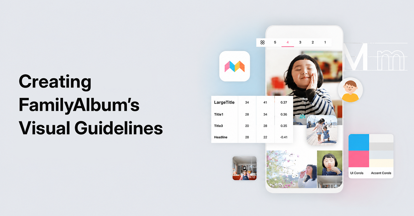
FamilyAlbum has a design system that brings together design concepts, logos, guidelines for colors and photography, and various UI components so that anyone can create high-quality designs for the service efficiently and deliver a consistent user experience.
Among the design system efforts, the four members of the visual design team led the development of the visual guidelines.
Representing the team, we spoke with product designer Miyu Matsumoto about the background behind the creation of the visual design guidelines, the efforts that went into shaping the design concept, and the considerations and refinements involved.
Miyu Matsumoto, Product Designer, FamilyAlbum Business Division
Joined the company as a new graduate product designer in October 2018.
Assigned to the FamilyAlbum Business Division, which she had wanted to join from the start, she handles a wide range of product design work.
In 2021, she created the “Illustration Guidelines” to solve issues in illustration and graphic expression. In addition to design work, she has also made major contributions to FamilyAlbum’s branding.
What Sets FamilyAlbum’s Creatives Apart?
FamilyAlbum is celebrating its 9th anniversary this year. What prompted the discussion about its visual design now?
FamilyAlbum has long had design principles in place, but their wording was somewhat abstract, making it difficult to evoke a shared image or a distinct FamilyAlbum identity.
Also, as the service grew and the number of designers increased, it was not uncommon for new team members and external partners to struggle to understand what makes something feel like FamilyAlbum, and we felt it was necessary to create an environment where everyone could produce creative work that feels true to FamilyAlbum.
That led us to revisit what creative that feels true to FamilyAlbum looks like.

How did you go about developing the visual guidelines?
First, the four designers working on FamilyAlbum, myself included, formed a visual design team and began by discussing the theme, “what FamilyAlbum is and what it represents”.
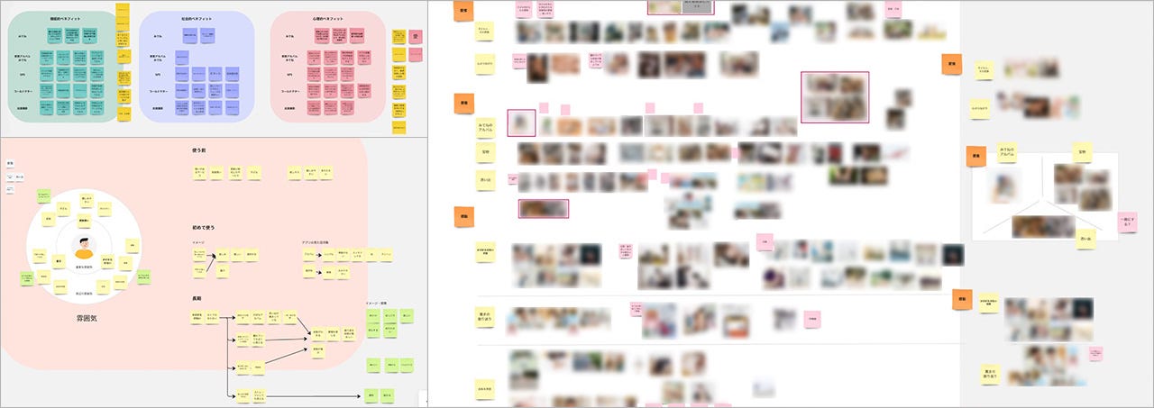
What Does Familyalbum Mean? An In-Depth Exploration To Put It Into Words
Although the four of us could have made all the decisions on our own, we felt strongly that we wanted to build and embed it together with the whole team. So we planned a series of sessions under the banner of a Visual Design Workshop, including an all-hands workshop on defining our personality and another on sharing and embedding the design concept.
The idea was to bring together all the designers involved with FamilyAlbum so they could explore the visual design together in a fun, engaging way.
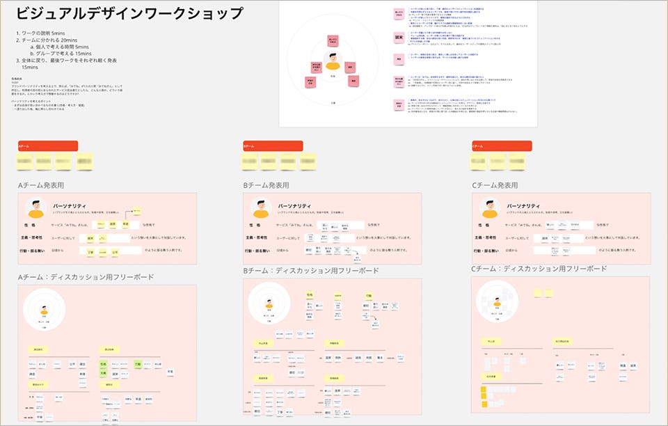
The online whiteboard platform Miro was used
Defining FamilyAlbum’s Brand Personality and Developing a Design Concept from It
Could you talk a bit about the purpose and content of the first “Personality Brainstorming Workshop”?
Although this workshop had “Personality Brainstorming” in the title, its actual purpose was to translate the personality we had defined into a design concept. We moved through this process carefully by conducting the workshop and through repeated discussions within the visual design team.
First, we invited an instructor with expertise in branding and brand personality and held an instructional session. Because participants had varying levels of knowledge, the goal was to build a shared understanding by covering the basics, including why brand personality is important.
After that, we divided the members into several teams and gave them time to discuss the brand personality envisioned by FamilyAlbum designers.
Once we started discussing it, a wide range of keywords came up, leading to a very interesting discussion.
FamilyAlbum is characterized by qualities such as kindness, brightness, and approachability. We grouped these into several categories and explored them in depth, asking questions like: Where did these words come from? What aspects of FamilyAlbum give people that impression?
For example, for the key phrase “ease of understanding,” we formed a concrete image of things like the streamlined amount of information in FamilyAlbum and how easy it is to understand without much thought.
Ultimately, we established four guiding principles: simple, comforting, thoughtful, and heartwarming. Based on each of these principles, the teams held brainstorming sessions and worked to articulate FamilyAlbum’s brand personality.
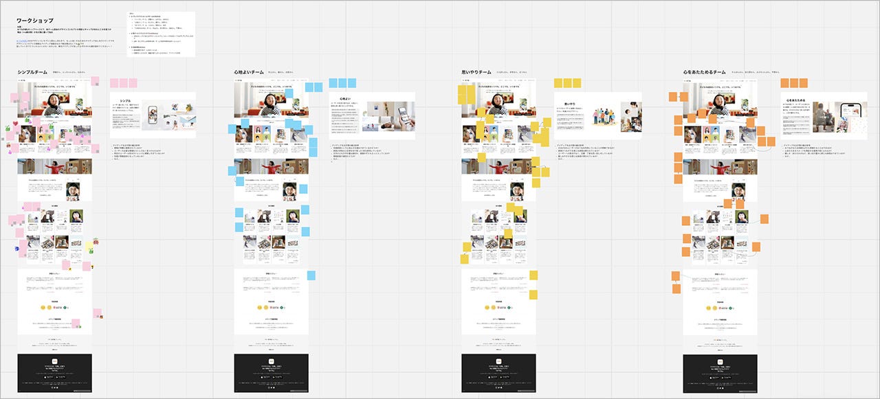
Work organized around the four guiding principles
In addition, we created a mood board for these four guiding principles. We used photos that capture the atmosphere suited to each principle to make each one easier to grasp at a glance.
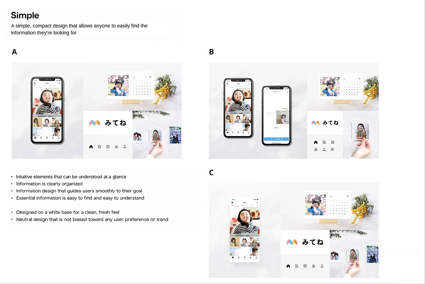
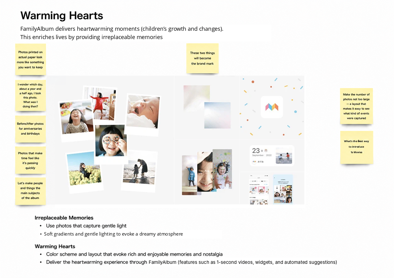
Excerpts from the mood board development process
Ultimately, the design concept came together by combining the copy text and the mood board.
While words alone can lead to differences in interpretation, I believe that adding visual information made it easier to develop a shared understanding.
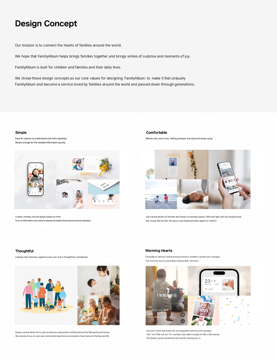
Updated design concept following the workshop
What feedback did you receive from workshop participants?
In the post-event survey, we received comments such as, “I got a clear picture of the personality”, “It was a great learning experience”, and “It’s great to have opportunities like this to reflect.” Overall, the feedback showed a high level of satisfaction, and I feel the session was very successful.
Another positive for the FamilyAlbum Business Division was that, at a time when remote work is the norm, the workshop gave people a chance to meet face to face. I think it was also a valuable opportunity for all the designers to come together to think about something, which had rarely happened before, and to gain new inspiration.
Making the Concept Ubiquitous and Understandable Through the Design Concept Workshop
Please tell me the purpose and content of the second workshop on embedding the design concept.
Even though the design concept had been completed, I felt that simply sharing it with the design team would not be enough for it to truly take hold.
So, we decided to hold a Design Concept Workshop not only to deepen understanding, but also to show through concrete examples how it could be used in actual work. We wanted it to be an opportunity for each person to think about how to bring the FamilyAlbum identity into the work they are responsible for.
Specifically, participants were split into teams to review FamilyAlbum’s official website against the design concept and identify areas for improvement. Each team was assigned one theme from the four principles: “simple”, “comfortable”, “thoughtful”, and “heartwarming”, so they could come up with ideas from that perspective.
We wrote the areas for improvement on sticky notes, and many comments were raised.
For example, the team responsible for the “simple” section suggested things like, “There is too much text here, so could we cut it down a bit more?” and “The way the features are presented is hard to understand, so we may need to find a better way to show them.”
Did you do anything in particular to generate more feedback on areas for improvement?
I thought it might be difficult to ask everyone to come up with ideas right away, so I prepared some hints for each of the four perspectives to help them think about possible improvements.
For example, in the case of “simple”, we presented a clearly-defined lens to view it from, namely, whether the information was clearly organized and whether users could find the information they needed without getting frustrated.
By presenting these clearly-defined lenses to view things from, I think participants found it easier to contribute, which may have led to a significant number of the improvement suggestions.
Creating Visual Guidelines Based on the Design Concept
What is the purpose of the visual design guidelines you are creating?
To maintain a consistent, distinctive identity, it is essential to have shared rules for base colors, secondary colors, fonts, icons, logos, and other elements.
At the same time, decisions about how to use those rules and what kind of visuals to create have depended heavily on designers’ experience and intuition, so work has often moved forward based on ambiguous assumptions.
We wanted to clarify the design concept and establish visual design guidelines to prevent inconsistencies in visual expression.
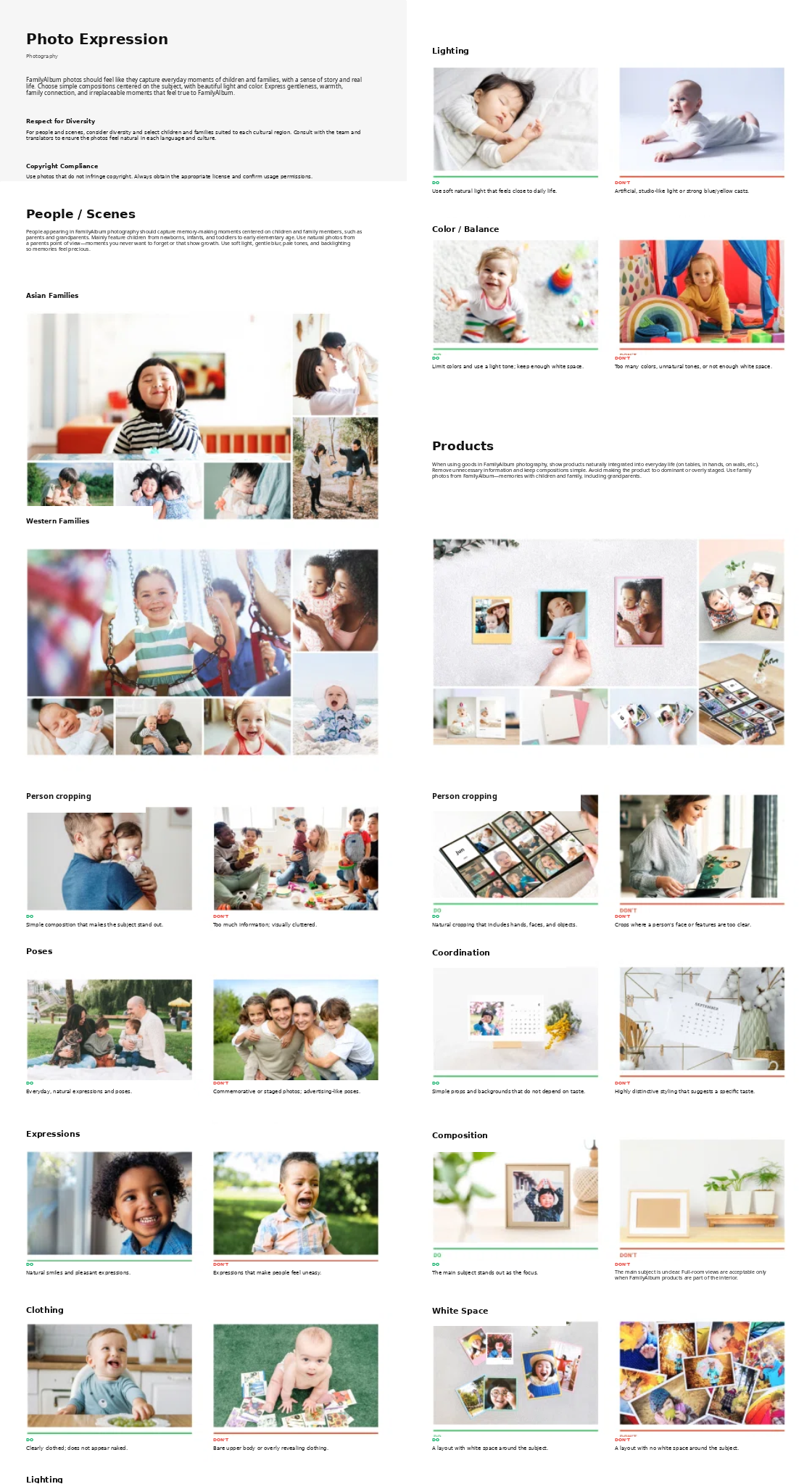
An excerpt from the visual guidelines
Specifically, what initiatives did you work on?
The first thing we tackled was creating guidelines for photos.
At FamilyAlbum, given the nature of the service, we use many photos of children, but the criteria for selecting those photos had become unclear, which had become an issue.
To clarify the criteria for selecting photos, we established specific recommended and prohibited criteria for each region, such as Asia and Europe/North America, including what kinds of photos are appropriate and what facial expressions, clothing, and poses people should have. This helped us organize the guidelines so designers can choose photos without hesitation.
This guideline has been added to and published in the design system accessible to employees, external partners, PR staff, and others involved with FamilyAlbum. As a result, we have put a framework in place that enables anyone to consistently create visual designs that feel true to FamilyAlbum with confidence, efficiency, and a high level of quality.
In addition, we are currently exploring color and graphic elements as part of an ongoing project.
Led by the visual design team, we are brainstorming around themes such as: “What are our brand colors?” and “What kinds of graphic elements feel distinctly
“I want to further increase awareness and help strengthen the FamilyAlbum brand.”
What changes have you felt since establishing the design concept and creating the visual guidelines?
I can feel that it is gradually gaining traction.
More and more external partners are referring to the design concept and using the guidelines when selecting photos, and I’m always glad to hear that.

Looking back, what was most important in this effort?
For the visual design team, we prioritized starting with small initiatives and gradually expanding them. To make improvements, it was important to move forward steadily, one step at a time.
Because this series of initiatives relates to branding, some may feel that it should ideally be handled carefully by the entire department, including the department head. However, this time, we focused on the scope of visual design and prioritized first building a shared understanding with the designers working on FamilyAlbum.
If you are considering developing a design concept or creating a design guide, it may be easier to start small.
Lastly, could you talk about your outlook for the future?
Since this initiative is not yet fully complete, we plan to continue refining it with further updates so that FamilyAlbum’s visual identity can be used more widely across official channels.
Going forward, we aim to further increase its usage, thereby further strengthening FamilyAlbum’s brand.
메타데이터
- post_id
- b311c8d63c14
- slug
- how-familyalbums-visual-guidelines-were-created-an-interview-on-the-background-and-process-b311c8d63c14
- url
- https://medium.com/@mixi_design/how-familyalbums-visual-guidelines-were-created-an-interview-on-the-background-and-process-b311c8d63c14
- canonical_url
- https://medium.com/@mixi_design/how-familyalbums-visual-guidelines-were-created-an-interview-on-the-background-and-process-b311c8d63c14
- author_url
- https://medium.com/@mixi_design
- status
- ok
- fetched_at
- 2026-06-09 15:37:30