Inside the Box — Part 1: iOS, Liquid Glass, and the Universe Apple Built
“OMG. That’s perfect.”
Inside the Box — Part 1: iOS, Liquid Glass, and the Universe Apple Built
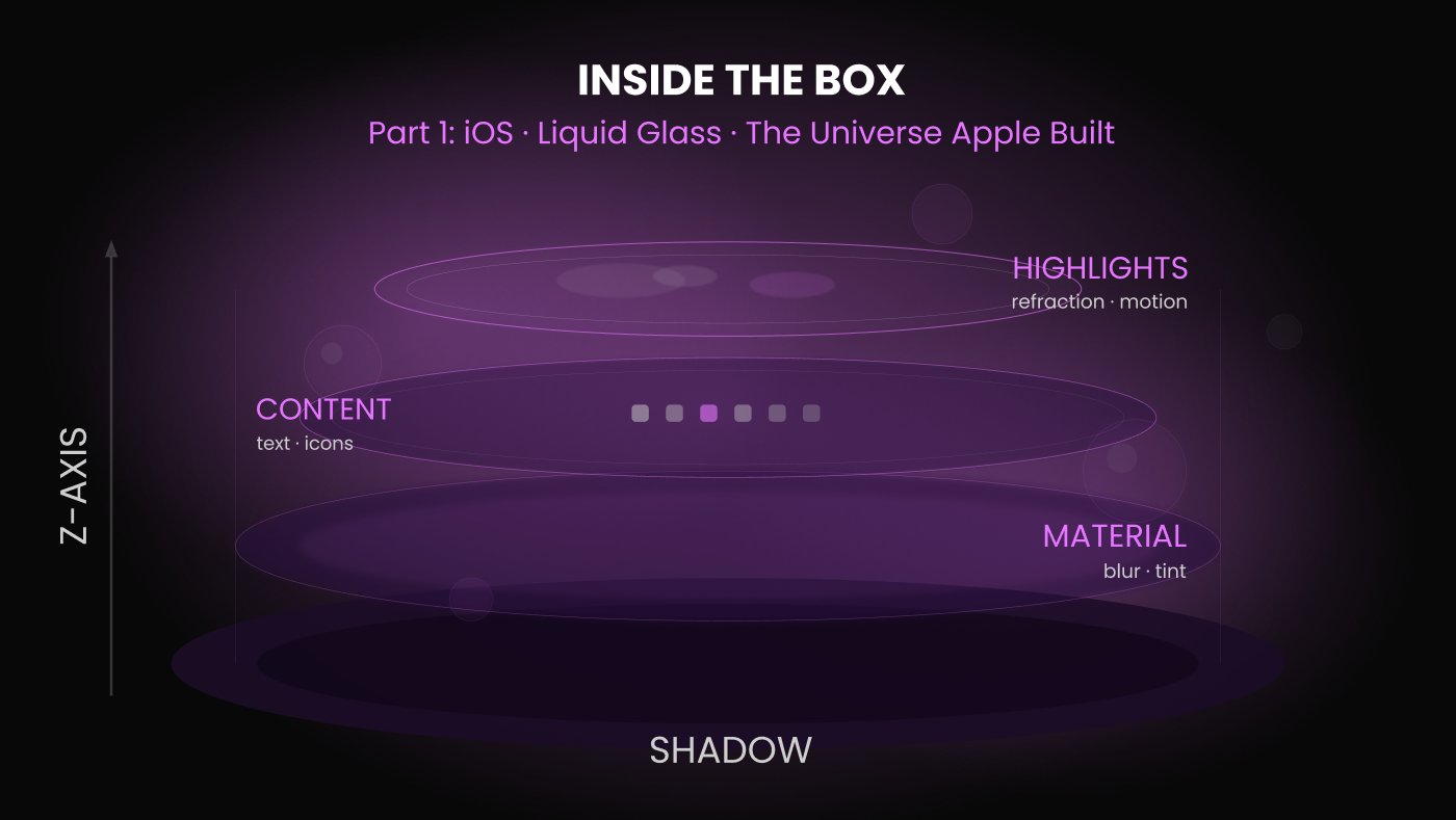
Image created with AI assistance.
“OMG. That’s perfect.”
That was my reaction the first time I saw Liquid Glass. Not surprise exactly. More like recognition. Like watching someone finally say out loud something you’d felt for years but never quite found the words for.
Apple Has Always Had a Philosophy
“Think Different” isn’t just a tagline. It’s a design brief.
From the very beginning Apple has built products that tap into something deeper than utility. Their hardware and software aren’t just tools. They’re frameworks for creativity. They give you a stage and trust you to perform.
The Human Interface Guidelines codify this through six principles: aesthetic integrity, consistency, direct manipulation, feedback, metaphors, and user control. Not rules in the way a style guide has rules. Values. The philosophy behind every decision.
And the iOS platform itself is built on three themes that Apple says differentiate it from everything else: clarity, deference, and depth. Clarity so the interface never competes with the content. Deference so the UI steps back and lets the user’s work take center stage. Depth so the experience feels layered, dimensional, alive.
These three themes are the framework of the story. You bring the content. Apple trusts you to fill it.
The iOS Universe
If you’ve ever picked up an iPhone and just… explored it, you already know this intuitively. But let’s make it explicit, because understanding the iOS universe is what separates designers who work on iOS from designers who design for iOS.
iOS is built on layers. Not metaphorically. Literally.
Think of it as three dimensional space. There’s the x-axis, the horizontal plane. The y-axis, the vertical plane. And the z-axis, which runs back to front, top to bottom, depth to surface. Everything in iOS lives somewhere on that z-axis, and understanding where things live and how they move between those planes is fundamental to designing experiences that feel native.
Primary content lives on solid surfaces. Options, menus, and choices hover above on semi-transparent layers. When you trigger an action, a smaller transparent surface glides into place on its own visual plane, floating just above. For significant actions, the surface below dims, narrowing your focus. Everything has its place in the stack.
iOS operates on a z-index of just four layers. That restraint is intentional. The stack is clean and specific: a Shadow layer that creates depth, a Material layer of blur and tint, a Content layer where text and icons live, and a Highlights layer that handles refraction and motion. Every element knows exactly where it belongs. Four layers, infinite possibility within them.
And everything responds to touch by moving on the z-axis. Expanding. Contracting. Shifting in transparency. Surfaces press down and spring gently back. Transitions slide along the x or y axis while simultaneously shifting depth. Nothing is static. Nothing is flat. Even when you’re not touching anything, bubble-like shapes move and glide slowly in the background, as if the interface itself is breathing.
The laws of physics don’t fully apply here. If you drop something it doesn’t fall to the floor. Gravity isn’t absolute. Solid surfaces can be breached by semi-transparent layers hovering just above. There are no hard and fast rules.
It almost feels like being underwater. That’s not an accident. The gentle, fluid quality of everything, the way it glides and shifts and ebbs, isn’t decoration. It’s philosophy made visible. This is the iOS universe. And Liquid Glass is its most complete expression yet.
Enter Liquid Glass
Apple has always bent the rules of physics to serve creativity. Skeuomorphism gave us metaphor. Flat design gave us clarity. Liquid Glass gives us something else entirely, the interface made physical.
Liquid Glass is a dynamic, translucent material that mimics glass with fluidity. It reflects and refracts the content behind it in real time. It responds to motion. It shifts with context. It doesn’t have a fixed appearance because it was never meant to. It’s a surface that lives in relationship to everything around it.
App icons now use a layered system that brings a clear, transparent appearance with a shimmery effect that reacts to device motion. Toolbars have separated from the bezels and float as bubbles above the content. Elements can change shape and size, a tooltip expanding into a vertical list, a control morphing to meet the moment. The interface doesn’t just respond to you.
It breathes with you. It dances with you.
Liquid Glass doesn’t add new layers to the iOS stack. It activates them. The Highlights layer refracts and moves in response to what’s behind it and how the device is held. The Material layer blurs and tints dynamically. Together they create the sensation that the interface is made of something real, something physical, something that responds to the world around it. It’s the same four layers iOS has always had. Liquid Glass just makes you feel it.
Remember those old iPod ads, the bold solid backgrounds and the silhouette moving freely, joyfully, without inhibition? That spirit never left Apple. It just evolved. Liquid Glass is what that joy looks like in 2026.
The Device That Knows You
We have a unique and deeply personal relationship with our devices. Imagine someone who finishes your sentences, recommends great places to eat, looks out for your appointments, and plays exactly the right music when you ask. Someone who knows your habits, your preferences, your mood.
It’s the last thing we look at before we go to sleep. It’s the first thing we reach for when we wake up. Before the person lying next to us. Before the day has even started.
We are undeniably, emotionally tied to this device. And Apple has always known that. Every design decision, the fluidity, the depth, the way Liquid Glass breathes and dances with you, is in service of that relationship. This isn’t interface design. It’s intimacy design.
The Craft Challenge: Designing for a Living Surface
Here’s where it gets interesting for designers.
Liquid Glass is not a static element. It doesn’t have a fixed color, a fixed opacity, or a fixed appearance. It looks different depending on what’s behind it, how much light is in the environment, what the user is doing, and how the device is moving. You are designing for a surface that is alive.
That’s a beautiful problem. It’s also a genuinely hard one.
Speccing for context
Traditional design handoff assumes a fixed state. Here’s the color. Here’s the opacity. Here’s the border radius. Liquid Glass breaks that assumption. You can’t hand off a single static frame and call it done. You have to document behavior, how the surface responds to dark backgrounds versus light ones, how it reacts to motion, how it handles content that changes behind it in real time. This requires a shift in how we think about specs. Less “what does it look like” and more “how does it behave.” Less a single frame and more a set of rules.
Prototyping the feeling
Static mockups won’t cut it here. Liquid Glass is fundamentally a motion and depth experience. If you’re not prototyping it, actually showing how it moves, refracts, and responds, you’re not designing it. You’re approximating it. This is where Xcode prototypes and visionOS design references become essential. Apple has been developing the visual language behind Liquid Glass through visionOS for two years. That’s your reference library. Study it.
Designing for the z-axis
Everything covered earlier, the layers, the depth, the semi-transparent planes, becomes more critical with Liquid Glass. You need to know exactly where your Liquid Glass elements live on the z-axis relative to everything else. What’s behind them matters now more than ever because it directly affects how they look and feel. Map your layers before you start designing. Know your stack. The z-axis isn’t just a structural tool anymore. With Liquid Glass it’s a design decision.
Accessibility
This is the question nobody is talking about enough yet. Liquid Glass is beautiful. It’s also inherently low contrast in certain contexts. When the material refracts a complex or dark background, text and icons sitting on top of it can become difficult to read. Apple’s own guidelines will evolve here. But as a designer you can’t wait for the guidelines to catch up. Test your Liquid Glass implementations against WCAG contrast requirements in real content contexts, not just in clean mockups with controlled backgrounds. Your users deserve that rigor.
The Design Systems Challenge: Codifying the Uncodifiable
Design systems are built on consistency. Same component, same behavior, same appearance, every time, everywhere. Liquid Glass challenges that assumption at its core.
How do you document a component whose appearance is defined by its context? These are not rhetorical questions. They’re the ones your design systems team is going to be wrestling with for the next twelve to eighteen months.
Document behavior, not appearance
Your Liquid Glass component documentation shouldn’t lead with a visual. It should lead with a behavioral contract. What does this surface do? How does it respond to light content behind it versus dark? What are the motion rules? What triggers shape changes? What are the fallback states? Think of it less like documenting a button and more like documenting an animation. The artifact is the behavior specification, not the static frame.
Build your accessibility rules into the system
Don’t leave contrast decisions to individual designers. Build the rules into the system itself. Define which content types are permitted on Liquid Glass surfaces. Define minimum contrast requirements for text and icons in both light and dark mode contexts. Define what happens when background content makes the surface unreadable. Baking accessibility into the system rather than relying on individual design judgment is always the right call. With Liquid Glass it’s essential.
Expect iteration
Apple shipped Liquid Glass in beta. The guidelines are still evolving. The community is still figuring it out. Your design system documentation for Liquid Glass should be explicitly versioned and treated as a living document for at least the next year. Build in a review cadence. Plan for updates. The teams that will handle this best are the ones that treat Liquid Glass not as a finished component to implement but as a new design primitive to understand over time.
What This Means for Your Platform Decision
If you read my first article on React Native versus separate native builds, you already know where this is going.
Liquid Glass is a native-first feature in the truest sense. It is deeply integrated into the Apple rendering engine, responsive to device motion, context, and environment in real time. It is not a visual style you can approximate with a few CSS properties or a community-maintained library.
If your product lives in the Apple ecosystem and platform fidelity matters to your users, Liquid Glass is the latest and most vivid illustration of why native builds earn their cost. The gap between native and cross-platform isn’t closing. With Liquid Glass, Apple just widened it.
But here’s the thing. That’s not a criticism of React Native. It’s a reminder of what each approach is optimized for. React Native is optimized for efficiency and reach. Separate native builds are optimized for depth and fidelity. Liquid Glass just makes that distinction more visible than ever.
iOS operates on four z-index layers. Material operates on twenty-four. That single comparison tells you almost everything you need to know about the philosophical difference between the two platforms. We’ll go deep on that in Part 2.
Know which one your product needs. Then commit to it fully.
“OMG. That’s perfect.”
I still feel that way every time I see it in motion.
Liquid Glass isn’t just a new feature. It’s Apple telling us exactly who they are and exactly what they believe design can be. Fluid. Dimensional. Alive. In relationship with the person holding the device.
For designers who have spent years learning to think inside this universe, understanding the layers, the physics, the breathing quality of everything, Liquid Glass feels like validation. This is what we were designing toward all along.
Next time we’re going to the other side. The Material universe is just as rich, just as intentional, and just as worth understanding deeply. And I love it just as much.
Stay tuned for Part 2: Inside the Box — Material and the Android Universe.
I developed the ideas, research, and voice in this article. AI writing tools helped me shape and refine them along the way. The observations and opinions are entirely my own.
Kim Spencer is a Staff Product Designer specializing in native iOS and Android. She writes about mobile craft, design systems, and platform thinking at kimspencer.com.
메타데이터
- post_id
- b333ddac132b
- slug
- inside-the-box-part-1-ios-liquid-glass-and-the-universe-apple-built-b333ddac132b
- url
- https://medium.com/@KimSpencerDesigner/inside-the-box-part-1-ios-liquid-glass-and-the-universe-apple-built-b333ddac132b
- canonical_url
- https://medium.com/@KimSpencerDesigner/inside-the-box-part-1-ios-liquid-glass-and-the-universe-apple-built-b333ddac132b
- author_url
- https://medium.com/@KimSpencerDesigner
- status
- ok
- fetched_at
- 2026-06-09 15:37:30