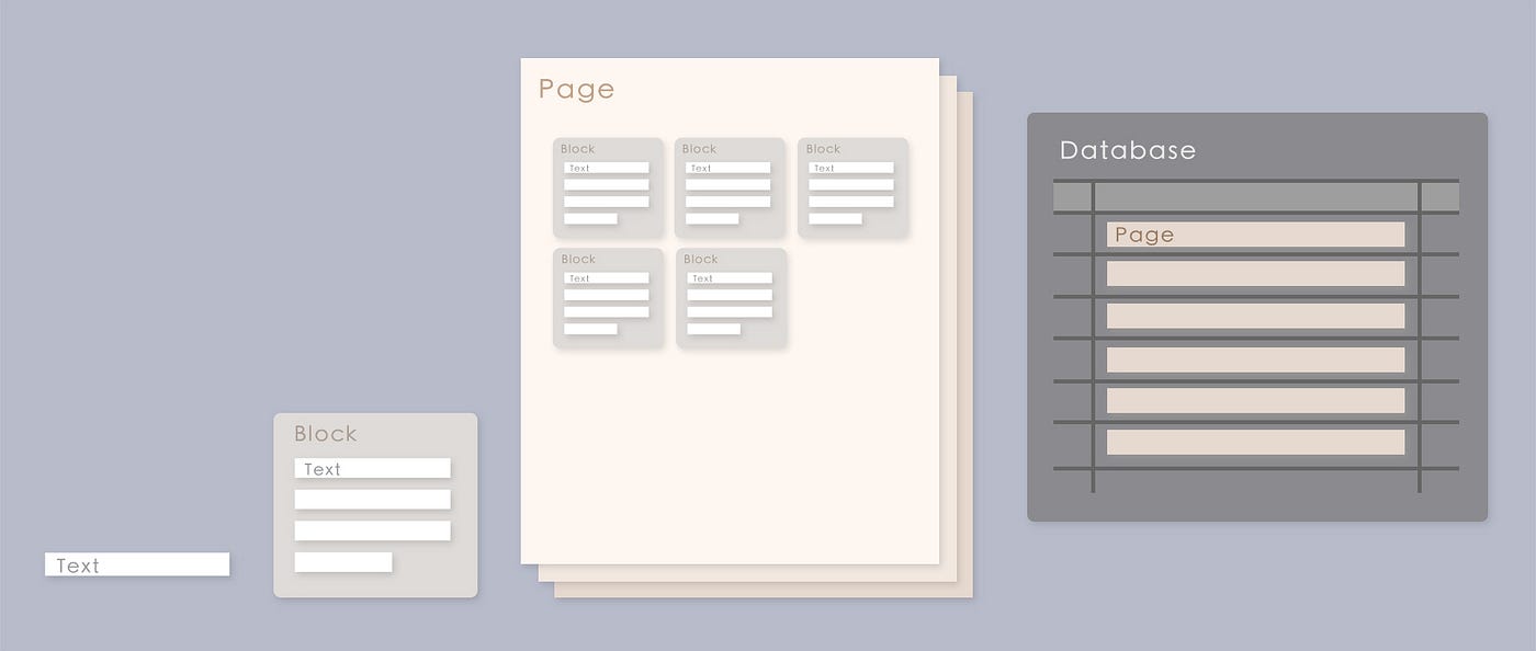
How to create a Chart in Notion quickly
Notion is an awesome place to collect and access your notes and data. While it’s a great tool by itself, it quickly becomes hard to read…
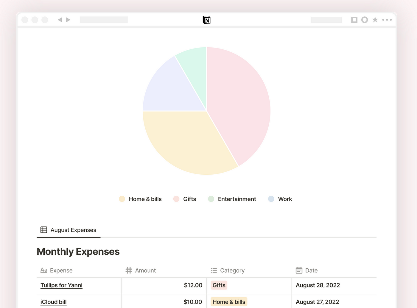
How to create a Chart in Notion quickly
Notion is an awesome place to collect and access your notes and data. While it’s a great tool by itself, it quickly becomes hard to read through your data. Here charts and graphs are great ways to build a big picture about your content within you Notion pages. Here we are going to dig into how to create advanced charts from your Notion databases to extract meaningful insights and embed it. 🚀

Some examples of charts built with Data Jumbo — bar chart, pie, calendar, KPI, radar, …
It will be fairly easy:
- Create a Data Jumbo account and connect it to your Notion workspace
- Build a chart: set a chart type, configure and customize it
- Copy and paste a link to import this chart as an embed right into your Notion Workspace
1. Setup your Data Jumbo account
To get started, you’ll need to register on Data Jumbo. It’s an advanced data visualization tool (based on d3) that connects to your Notion workspace. It has a free plan which is quite good.
> Check out Data Jumbo examples 🔗
Then, if you haven’t done it yet, you have to connect your Notion workspace to your Data Jumbo account. It’s quite straightforward from the dashboard of Data Jumbo. The most important is to pick the Notion database documents that you want to visualize or their parent page. But you can also share the whole workspace with Data Jumbo which is simpler.

If you want to share the whole workspace, click on “Private” and you will be able to build a chart for any database of your workspace
If you did everything well, you should have a screen like that in Data Jumbo

Data Jumbo Dashboard
2. Build a chart
You can now build your first chart. Start by picking the database you want to work on in the drop down of the New chart popup. If you don’t find your Notion database in this list, you might have not shared it with Data Jumbo yet, here’s how to do it.
If you have no database to work on now, you can also duplicate this database for this tutorial. If so, make sure you share it with Data Jumbo and refresh the list of databases by clicking on the button [ ↻ ].

New chart popup — Data Jumbo
Here you will find on the left the configuration of your chart and on the right the customization part.

Data Jumbo — chart editor
The configuration side contains a few sections:
The chart type

You have a list of options, just play around depending on your need. If you want to visualize the evolution of a value over time, the lines are great. Compare different categories with the bar chart, the radar, or the pie. Check out the frequency of an event over time: the calendar. Extract a single result: the KPI.
Value/label columns

Pick the right columns you want to visualize, that’s the most important part. On some chart types, you can pick multiple value columns, which is great to compare them.
Bucket by and splits
These ones are a bit more advanced, they deserve their own blog post. But to keep it simple, you can pick how you want your data to accumulate, and if you want to split it by the value of 3rd column.
Sort
Sort your values to highest or to lowest either based on their value or label.
Filters
This is probably the most useful of all. Filters let you ignore the rows less not for your chart. For example, keep only rows where a date is equal to today, the rows with a value over a number, or simply the rows where a checkbox is checked.
Another quite cool feature here is the customization panel. It’s quite simple to use, you can easily explore it by yourself. Just note that depending on the chart type, the customization available varies.
3. Import your chart to Notion pages
Once you are done with your chart configuration, you can add it to your Notion pages by simply pasting a link. Data Jumbo generates an embeddable chart. To get its link, click on the top right button “Export chart” and find the link under “Private embed”.

Once in Notion, just paste that link and select “Create embed” and it will build an embed block. That’s it! You have your chart ready to be used. The data of your chart will reload every time you load your notion page or click on the reload button on the top/left corner of the embed.
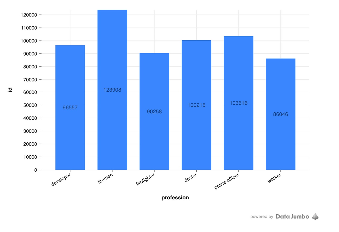
Final chart in the notion page
What about Google Sheets integration?
For now Data Jumbo supports only notion databases as sources but this is about to change. Google Sheets is an awesome tool for collecting data, Data Jumbo would do a nice job here. Contact Data Jumbo supports for more information.
For more example — check out the video tutorial below
[embed]Demo Data Jumbo
For more Notion plugins and tools: https://www.notioneverything.com/tools/data-jumbo
메타데이터
- post_id
- b35b8b24cf9b
- slug
- create-a-chart-in-notion-workspace-b35b8b24cf9b
- url
- https://medium.com/@giardiv/create-a-chart-in-notion-workspace-b35b8b24cf9b
- canonical_url
- https://medium.com/@giardiv/create-a-chart-in-notion-workspace-b35b8b24cf9b
- author_url
- https://medium.com/@giardiv
- status
- ok
- fetched_at
- 2026-06-13 16:00:06