The AI you use for design feedback is guessing
For the past month, AI launches converged on one idea: make the work visible, not the output more convincing. Sounds right. So I tested…
The AI you use for design feedback is guessing
For the past month, AI launches converged on one idea: make the work visible, not the output more convincing. Sounds right. So I tested whether the AI I ask to critique my designs actually does that. Here’s what I found.

image made by chatgpt
Part 1: For a month, every AI product release argued the same thing in terms of design

Four weeks. Four surfaces. One conclusion the field reached without coordinating it.
For four weeks, AI product launches converged on a single idea without coordinating it. Different companies, different surfaces, the same conclusion each week. I’ve been tracking AI launches daily at aiuxdesign.guide/news for a year, and the pattern only became visible laid end to end.
Late April, the argument was about conversation. A wave of writing and product changes pushed the same point: the best AI had stopped trying to seem human and started being transparently useful. Surface uncertainty explicitly. Say “I’m not sure” instead of hedging confidently. Stop optimizing for warmth, start optimizing for clarity about what the system actually knows.
Early May, the same argument moved to artifacts. Google shipped DESIGN.md, a markdown format that lets AI generate UI from plain-text design specifications instead of inferring intent from a picture. Alongside it, a broader shift toward machine-readable design systems: the conclusion that week was that a design system now has to speak both human and machine languages, or AI generates broken experiences at scale. Intent that isn’t legible to the machine gets guessed at.
Mid May, it moved to actions. GitHub put token cost directly in the agent UI instead of backend logs. Anthropic shipped finance agents built around audit trails. The week’s throughline was guardrails: trust requires visible boundaries baked into the interface, not hidden where you can’t see them.
Last week, it reached its sharpest form. OpenAI’s Codex now previews exactly what it can touch before it runs. Smashing Magazine published patterns for replacing the indeterminate spinner with visible process. Stated plainly: agents earn trust by exposing how they work, not by hiding the work behind a confident output.
Four weeks, four surfaces, one principle underneath all of them. An AI you can’t inspect is an AI you can’t trust, and the answer is always to make the work visible rather than the output more convincing.
There is one surface that principle never got applied to. It’s an AI tool designers use constantly. It makes consequential judgments about their work. It produces the most confident-looking output of anything in the workflow and shows none of its reasoning, because it has none to show. And almost nobody is auditing it.
It is the AI you ask to review your design. What if there was a tool that does this so I created an ai design audit tool

aiux audit tool i built and played around with
This was my playground for all the analysis. The findings I think are something that made me learn a lot of things. A few of them here
Part 2: What you’re actually doing when you ask an AI for feedback
You paste a screenshot into Claude. Or ChatGPT. Or whatever AI tool your company has sanctioned. You ask: what’s wrong with this design? The reply comes back fluent, confident, well-organized: five problems, three suggestions, one recommendation. You read it carefully. And somewhere around the third bullet, you start to wonder if any of it is actually true.
That feeling is the subject of this article.
Most designers do this in some form. Some use dedicated audit tools. More paste Figma frames into a chat window. Some do it on personal devices because the corporate Figma tenant won’t let an AI plugin touch company files, or because the policy team hasn’t written the guidelines yet. The behavior is universal even where the tools aren’t standardized.
I’ve spent the last six months in this terrain more deliberately than most. I built a pattern library for AI UX: a few dozen patterns, each defined precisely, each with worked examples of where it applies and where it doesn’t. Then I built an audit tool on top of it specifically to test whether an LLM, given that framework, could correctly apply it to real screenshots.
I uploaded a screenshot of a billing page to the tool. The audit returned, near the top of the findings: “Confidence Visualization is missing, users have no way to gauge the model’s certainty about its response.”

Photo by salomo Jefry on Unsplash
It was a billing page. There was no model on the page. There was nothing to be confident about.
The finding wasn’t just wrong. It was wierd. Confidence Visualization, in the framework the audit was running on, is scoped to surfaces where a model makes claims about external state that could be verifiably wrong: search results, citations, predictions. It is explicitly not applicable to billing pages, settings screens, or any UI without a model in the loop.
The framework existed ie; my own site with 36 patterns to detect when i read a design that is uploaded. The LLM had access to it. The LLM still got it wrong.
That gap, between having a framework and applying it, shows up in every AI design-chat session, whether the tool is a dedicated audit, ChatGPT with a pasted screenshot, or whatever Figma plugin launched this week. The replies come back fluent. The structure looks like analysis. The findings look defensible. They are very often plausible-sounding text loosely anchored to whatever framework the tool claims to apply. Why that happens is structural, and it’s worth understanding before the failures will make sense.
Part 3: Why the failures happen

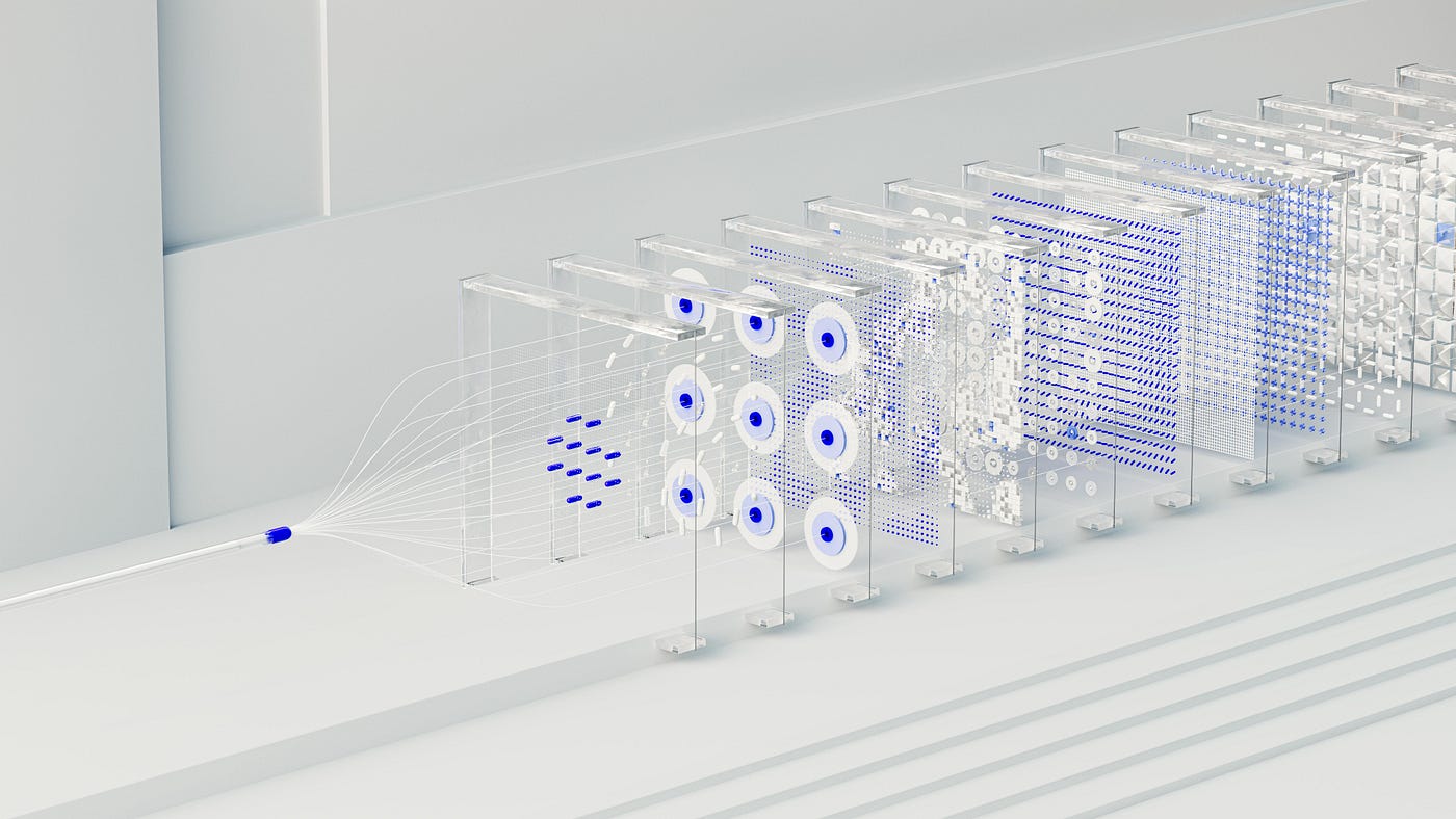
What your AI tool actually sees when you paste a design or a screenshot. Your design becomes text-shaped before the model reads a word of your prompt.
Most designers think of an AI design review the way they think of Figma’s accessibility checker: a tool that scans a screen, finds problems, reports them. The two operations are different in a way that matters.
The accessibility checker reads structured data. It knows there’s a button at (240, 380) labeled “Sign in” with a contrast ratio of 4.5:1, because that information is in the file’s tree. It compares values against rules. The rules are deterministic. The output is identical every time.
An LLM does nothing like this. It breaks your screenshot into patches, runs each through a vision encoder that turns pixels into numerical embeddings, and feeds those embeddings into the same input stream as your prompt text. From the model’s point of view your screenshot is text-shaped: a sequence of tokens that came from a visual encoder rather than a keyboard. It then generates language one token at a time, predicting what comes next given everything it has seen, including whatever framework you handed it.
The mechanics here are roughly those of visual instruction tuning. The foundational paper for how almost every current multimodal chat model is built: take a vision encoder (CLIP), connect it to an LLM (Vicuna in the original), train them jointly on instruction-following data so the LLM learns to “read” the encoder’s output.
The model isn’t looking at your design and applying your framework. It’s generating the most likely next paragraph given a prompt that contains vision tokens plus framework text. The output is plausible language that references the framework, anchored loosely to whatever the encoder surfaced. The same machinery that writes a plausible paragraph about a poem writes the plausible paragraph about your UI. Different genre. Identical behavior.
This is why a good framework doesn’t save you. It gets compressed into the same statistical soup as everything else in the prompt, and the model samples fluent text from that soup. Confidence Visualization applies to model-claim surfaces, not billing pages is a sentence in my prompt. Confidence Visualization is missing from this screenshot is a sentence the model produced. Both are plausible. Nothing in the architecture enforces consistency between the two.
So the failures that follow aren’t unique to my tool, aren’t fixed by a better LLM or more pattern definitions, and aren’t fixed by using Claude instead of ChatGPT. They’re structural. Three show up reliably once you know how to look.
Part 4: The three failure modes
Failure mode 1: hallucinated absence
I ran the same chat-thread design through the model three times. Same image, prompt, model.
Run one: “thumbs-up/down feedback is missing.”

Same screenshot. Same prompt. Three runs. The input never changed. The verdict did.
Run two: correctly identified as present.
Run three: missing again. The icons hadn’t moved. The model decided, run by run, whether they existed.
This has a name in the literature: hallucinated absence.
This is one direction of what the ML literature calls object hallucination in vision-language models — most commonly studied in the other direction (the model claiming something is there that isn’t), measured by benchmarks like. Object Hallucination in Large Vision-Language Models
The inverse call it hallucinated absence — has the same root cause. When an element is present but not visually salient. A weak signal and an absent signal look identical at the next layer, and the model fills the gap with whatever’s plausible. “I don’t see X clearly” and “X is missing” are different sentences in English. Inside the model they collapse into the same region.
Two things reduce it. Temperature controls how randomly the model samples tokens; the default for most chat APIs is around 1.0, which is what makes conversation feel creative and makes audits drift. At zero, the same input produces the same output. Most consumer tools don’t expose this, so the Claude or ChatGPT window you check for designing has drift baked in.
The second fix is structural: force the model to inventory every visible control before it’s allowed to call anything missing, so an absence claim has to contradict its own list.
The diagnostic is faster than either fix. Run the same prompt twice. If findings appear in one run and vanish in the next, the model is sampling and any single run is partly invented.
LLMs almost always hallucinate absece. Trust only what survives both.
Failure mode 2: thoroughness drama
The same model, same screenshot, returned nineteen applicable design patterns. For a UI with, generously, four meaningful surfaces.

Four surfaces worth evaluating. Nineteen patterns returned. The volume is the failure. Its acted like it knew everything, the same way we lie in an interview we badly want to crack.
The prompt said “Be ruthless. Most surfaces invoke 3 to 7 patterns, not 20.” The model ignored it on every run. Call it thoroughness theater: more findings reads as more careful work, and the model has seen enough reviews in training to know “comprehensive” sounds better than “selective.” None of the nineteen is exactly wrong, the way a tarot reading is never exactly wrong, but the volume drowns the signal. It’s the same behavior that produces ten-bullet email summaries when three would do.
What changes it isn’t asking nicely; it’s a contract. “Be ruthless” is a suggestion the model overrides the moment comprehensiveness looks better. “Your response MUST contain at most 8 entries. No exceptions.” is treated as binding. The model reads polite as optional.
The diagnostic: does the model ever return a short answer? If every response is long, it’s padding by default. Read the first three findings, the rest as filler unless something jumps.
If the model can’t say “no significant issues,” it has no concept of significance, only of looking comprehensive.
Failure mode 3: I read what you wrote not what your actual design is
The third is the inverse of what you’d expect. I uploaded a screenshot of Claude Code in a terminal: monospace text, status lines, a one-minute timer. I expected agentic-interface patterns. The model returned zero.
I almost flagged it as a an error. Then I looked again. It was just text. No buttons, no panels, no clickable affordances. The Bash blocks were content, not UI. The model had correctly refused to invent design affordances from textual descriptions of agent activity.

Correct. There is no UI here, only text describing UI behavior. The model was right to return nothing.
That’s the right behavior, and it teaches the failure by negation. Given both a screenshot and a framing (“this is an agentic interface”), the model works from two streams: what’s visible, and what the surface is supposed to be. A careless prompt lets the framing win. The model hallucinates the controls it expects in an agentic interface even when the screenshot has none. The framing leaks into the findings.
This is the most common way AI design goes wrong in everyday use, because designers do it without thinking. They paste a screenshot and write “this is the V2 of our onboarding flow, can you review it?” Now the model has the image and the phrase “onboarding flow,” and it will describe onboarding patterns whether they’re visible or not.
The diagnostic: describing your work in text alongside the image gives the model permission to invent. The cleanest feedback comes from minimal context. Strip the framing, run it again; if the findings change meaningfully,
LLMs are reading your description more carefully than your screens you designed.
Part 5: How I knew the failures were real
Anyone can tell a story about a weird AI response. The question that matters is whether it’s reproducible or just bad luck on a run. I tested it the way a designer tests anything: structured, with known answers.
I picked two screenshots I knew well and wrote down what a correct response should be.
The chat screenshot: no agentic patterns, at most eight findings.
The terminal screenshot: zero patterns, because there’s no UI.
Those became fixed test cases. Every prompt or settings change, I reran both and checked the output against the expectations.
To score this, I created a grader ai in the code, I used FastChat LLM Judge based on the paper Judging LLM-as-a-Judge for doing this. The paper that established “use a strong LLM to grade weaker LLMs” as a legitimate evaluation technique, and documented its biases — position bias, verbosity bias, self-enhancement bias, limited reasoning. The canonical benchmark for measuring when vision-language models claim things are present that aren’t. They convert hallucination evaluation into a polling-based yes/no question format and measure how often models get it wrong.
its like a second AI to grade the first, five questions per run on a 0 to 5 scale: does every finding reference something actually present; does it cite a concrete element or just restate the pattern; are the patterns relevant to this surface; are the recommendations shippable; did it fabricate any UI. I created a LLM grader in the code, and asked it to grade the output the grader is an LLM too, so it has its own variance but I had no other way around grading this.
I asked a second AI to grade the first. Five questions per response, rated 0 to 5: does every finding point to something actually on screen; does it name a specific element or just repeat the pattern label; do the patterns actually fit this screen; can you act on the suggestion; did it describe anything that wasn’t there.
The grader is also an AI, so its scores wobble too.
Score the same response three times and you might get 2.0, then 4.5, then 1.0. I worked around that two ways: I ran the grader three times per response and averaged the score, and I added simple yes-or-no checks alongside the scores. Did the chat screenshot get flagged for agent patterns? It shouldn’t, because the chat isn’t an agent. Did the terminal screenshot return zero findings? It must, because there’s no UI on it. Numbers do the rough work; the checks catch the obvious failure.
After three fixes making the model give the same answer every time, forcing shorter answers, and requiring it to list everything visible before deciding what’s missing the results looked like this:

The model response improved but the design detection was still low
Run the same response past it three times and you get 2.0, 4.5, and 1.0 on the same axis. I worked around that by averaging multiple grader runs and pairing the scores with simple pass/fail checks: did the chat fixture flag agentic patterns (it must not), did the terminal fixture return zero (it must). Numbers do the rough work; the checks catch the obvious failures. It is like saying
After three fixes (temperature to zero, the hard cap on length, the inventory-before-judging rule):
The interesting part isn’t the deltas, it’s the asymmetries. Nothing fabricated jumped most because zero temperature killed the drift behind Failure Mode
- Pattern fit is stuck at 3.0: forcing fewer findings didn’t help the model pick the right ones, and I haven’t fixed it, because I have only one chat fixture and tuning a rule on a single example is how you over-correct on a future surface.
- The second-most-useful thing I learned was when not to tune. This is a small amount of data: two screenshots, three runs, one noisy grader. Not academic rigor. Enough to catch failures I’d otherwise ship, which is the only bar that matters when the goal is reading AI design without being misled by it.
Part 6: The four questions, and the fix the industry is already building
You don’t need a test harness. You need four questions, held in your head while the response comes back. They are, in effect, a way of forcing the critique to show its work when the tool won’t, the same demand the field made of agents all month.
Does it cite the specific element? “The submit button is misaligned with the fields above it” is verifiable against your screen. “Your form lacks clarity” is not. Findings without anchors are findings the model can’t defend.
Does it reproduce? Run it twice. If findings drift, the model is sampling and any single run is partly invented. Trust what survives both.
Can it return short? A critique that always finds twelve issues is padding. No concept of “this is fine” means no concept of significance.
Is it grounded in the image or the framing? Strip your description, run it again. If the findings change, it was reading your words more carefully than your work.

the four question framework to help you design better
These aren’t perfect tests. They’re cheap habits. They cost minutes; not running them costs whatever you build on hallucinated ai design understanding.
There is a deeper fix, and it’s the one the industry has been circling all month. The four questions are a defense: they force you to interrogate an output that won’t explain itself. But the reason the model guesses is that the thing it most needs (your actual design intent, the rules the product follows, the patterns that apply and the ones that explicitly don’t) isn’t legible to it. It sees pixels and infers a framework. It never sees the decisions behind the pixels, because those live in your head, a Figma comment thread, a doc nobody exported.
I argued a version of this before, from the outside. When AI agents read your product and can’t see what makes it yours, they don’t leave the gap empty; they fill it with a competitor’s words, with outdated content, with whatever’s plausible. Your design becomes invisible and something else gets described in its place. This is the same blind spot from the inside. The critique fails for the identical reason the agent’s description fails: the intent is invisible, so the model substitutes a plausible one. The thesis hasn’t changed, it has moved one step closer to the desk. It used to be about how AI describes your shipped product to the world. Now it’s about how AI describes your unshipped screen back to you. Same gap, same fabrication, same fix.
This is exactly the gap Google’s DESIGN.md is aimed at, and why machine-readable design systems were the throughline of an entire week of releases. A plain-text, structured statement of design intent (what the product is, what rules it follows, which patterns apply and why) is, for a model, the difference between reading and guessing. It is the design equivalent of the visible-permissions preview Codex shipped and the process-revealing patterns Smashing wrote up. Show the work so the model doesn’t have to invent it. The defensive fix is interrogating the output. The systemic fix is making the intent legible in the first place so there’s less to interrogate. They’re the same principle the field has been converging on for a month, applied at two different points in the loop.
It cuts both ways, too. An AI that builds a UI from a prompt fails the same way an AI that reviews one does, for the same reason: it works from inferred intent, not stated intent.
Legible intent in, grounded output out. Guessed intent in, fluent fabrication out.
Part 7: Audit
The four questions above work on any AI tool you can use to critique your design and find gaps. A chat window. A Figma plugin. A dedicated audit. If it takes a screenshot and returns a verdict, the questions apply.
If you want a place to practice them, my audit tool is free it also has knowledge of what an actual ai design looks like using 36 patterns as a framework so you don't blindly go about refining your design aiuxdesign.guide. It runs the 36-pattern framework you have been reading about, and it is the tool whose before-and-after scores you saw in Part 5. Pattern fit is still at 3.0, which is exactly why the four questions are not optional even there. Run the audit. Run the questions on what comes back. See what survives.
The bigger thing
For a month, without coordinating it, the field converged on one idea from four directions: honesty about uncertainty, legible intent, visible boundaries, exposed reasoning. Stated plainly, it’s that an AI you can’t inspect is an AI you can’t trust, and the answer is always to make the work visible rather than the output more convincing.
The AI tools designers use to create and critique their own work are the conspicuous exception. They produce the most confident-looking output in the workflow and the least inspectable, and almost nobody audits them, because the output looks exactly like the kind of thing you don’t need to audit: structured, specific, reasonable.
The literacy this requires isn’t technical. It’s a posture: assume the model can be wrong in ways that look right, and build the habit of making it show its work, because it won’t volunteer. That habit compounds. The more failure modes you can spot, the faster you pull signal out of even a mediocre tool.
I’ve been circling this for a while now. First it was restraint in what AI *says: the best response is sometimes no response. Then what AI [sees](https://medium.com/design-bootcamp/ai-cant-see-your-design-so-it-guesses-c50e3695f01a): the most designed parts of your work are invisible to it. Then what AI [does](https://medium.com/design-bootcamp/who-is-designing-the-boundary-for-ai-3a51b18b5fc7)*: capability ships, the boundary doesn’t. This is the next one. Not what AI says, sees, or does, but whether you can trust what it tells you about your own work. Same through-line every time: the AI looks more certain than it has earned, and the design job is to build the seam where a human can see in.
The version of that for a designer is simpler than a test harness. Run it twice. Ask what it cites. Never let it pad. Strip the framing and see what survives. And where you can, stop making the model guess your intent. State it. Use a framework something the ai can anchor on to give you a refined
The audit tool I built and broke and rebuilt is free at aiuxdesign.guide. It runs the 36-pattern framework against your screenshot and returns scored findings. It is the same tool whose before-and-after numbers you read in Part 5. The eval setup that caught those failures is open source at github.com/imsaif/aiex. I also publish a weekly digest at aiuxdesign.guide/news: what shipped, which patterns it demonstrates, what it means for designers. The four-week arc above came from there.
If you want to take this further: I write about making design intent legible to AI tools at designwithclaude.com, because if the model is going to guess your intent, the fix is to write it down somewhere the machine can actually read it.
Sources & further reading
- This Week in AIUX: Honesty Over Warmth (Apr 27)
- This Week in AIUX: Machine-Readable Design Systems (May 4)
- This Week in AIUX: Agents Need Guardrails (May 11)
- This Week in AIUX: Visibility Beats Magic Description (May 18)
- DESIGN.md: plain-text design specs for AI generation via Google Design
- Building a secure sandbox for Codex on Windows by OpenAI
- Practical interface patterns for AI transparency by Smashing Magazine
- AI can’t see your design, so it guesses by Imran (previous article)
메타데이터
- post_id
- b4b9cfeaf7ee
- slug
- the-ai-you-use-for-design-feedback-is-guessing-b4b9cfeaf7ee
- url
- https://medium.com/design-bootcamp/the-ai-you-use-for-design-feedback-is-guessing-b4b9cfeaf7ee
- canonical_url
- https://medium.com/design-bootcamp/the-ai-you-use-for-design-feedback-is-guessing-b4b9cfeaf7ee
- author_url
- https://medium.com/@imsaif
- status
- ok
- fetched_at
- 2026-06-09 15:37:30