Adding Extra Legends to CanvasJS Charts
When building complex data visualizations with CanvasJS, developers often encounter scenarios where the standard legend entries — tied…
Adding Extra Legends to CanvasJS Charts
When building complex data visualizations with CanvasJS, developers often encounter scenarios where the standard legend entries — tied directly to dataseries — aren’t sufficient to convey the complete story. Enter extra legends: a technique that allows you to display additional contextual information in your chart legend without corrupting your actual dataset.
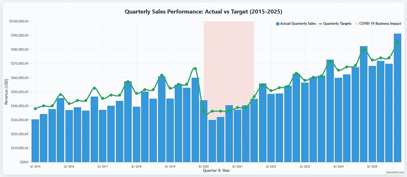
Why Extra Legends Are Essential
In sophisticated data visualization, context is king. While your primary dataseries tell the main story, auxiliary information often requires equal prominence in the legend to ensure proper interpretation. Consider these scenarios:
- Temporal annotations: Highlighting specific periods like recessions, policy changes, or global events
- Threshold indicators: Showing benchmark lines, target zones, or acceptable ranges
- Categorical groupings: Distinguishing between different data collection methods or sources
- Visual annotations: Explaining custom styling, striplines, or background regions
Traditional approaches might involve cluttering tooltips or adding separate text elements, but extra legends provide a clean, integrated solution that maintains the visual hierarchy of your chart.
The CanvasJS Approach: Phantom DataSeries
The elegant solution involves creating “phantom” dataseries — additional series with minimal or null datapoints that exist solely to populate legend entries. This approach leverages CanvasJS’s native legend system while maintaining data integrity.
{
  type: "scatter",
  legendText: "Performance Benchmark",
  name: "benchmark",
  color: "#3498db",
  showInLegend: true,
  legendMarkerType: "triangle",
  legendMarkerColor: "#3498db",
  dataPoints: [{ x: new Date(2023, 0, 1), y: null }]
}
The key parameters here are:
showInLegend: trueensures the series appears in the legend.legendTextdefines the display text (independent of series name).legendMarkerTypeandlegendMarkerColorcontrol visual representation.dataPointscontains a single null or minimal data point to satisfy CanvasJS requirements.
Strategic Implementation Patterns
Temporal Context Markers
For time-series data requiring period annotations, phantom series excel at providing context:
{
  type: "scatter",
  legendText: "Market Volatility Period",
  showInLegend: true,
  legendMarkerType: "square",
  legendMarkerColor: "rgba(255, 193, 7, 0.3)",
  dataPoints: [{ x: new Date(2020, 0, 1), y: null }]
}
Threshold and Benchmark Indicators
When striplines or plotbands represent critical thresholds, corresponding legend entries clarify their significance:
{
  type: "line",
  legendText: "Critical Performance Threshold",
  showInLegend: true,
  legendMarkerType: "line",
  lineDashType: "dash",
  dataPoints: [{ x: 0, y: null }]
}
Multi-Dataset Source Attribution
In composite charts combining multiple data sources, phantom series can indicate data provenance:
{
  type: "scatter",
  legendText: "External API Data",
  showInLegend: true,
  legendMarkerType: "circle",
  legendMarkerColor: "#e67e22",
  dataPoints: [{ x: 1, y: null }]
}
[embed]
Common Use Cases in Production
Financial Analytics
Quarterly earnings charts often require annotations for market events, regulatory changes, or economic indicators that don’t correspond to actual datapoints but provide crucial context for interpretation.
Performance Dashboards
SLA monitoring dashboards frequently display acceptable ranges, warning zones, and critical thresholds alongside actual performance metrics, requiring clear legend differentiation.
Scientific Data Visualization
Research datasets often combine observational data with theoretical models, experimental conditions, or environmental factors that need legend representation without dataseries pollution.
Business Intelligence Reports
Sales analytics might include seasonal patterns, promotional periods, or external market factors that influence interpretation but don’t constitute primary dataseries.
Implementation Considerations
Performance Optimization
Phantom series should use minimal datapoints — typically one null value — to avoid unnecessary rendering overhead. The chart engine still processes these series, so excessive phantom series can impact performance.
Legend Order Management
CanvasJS renders legends in series order. Position phantom series strategically in your data array to achieve desired legend sequencing:
data: [
  actualDataSeries1,
  phantomLegendSeries,
  actualDataSeries2
]
Visual Consistency
Maintain visual harmony by coordinating phantom series colors and markers with your overall design system. Consider using transparency or distinct marker shapes to differentiate contextual legends from data legends.
Extra legends in CanvasJS represent a sophisticated approach to comprehensive data storytelling. By leveraging phantom dataseries, developers can create rich, contextual visualizations that communicate not just what the data shows, but why it matters — transforming charts from simple displays into meaningful analytical tools.
메타데이터
- post_id
- b4e4f4ab50a6
- slug
- adding-extra-legends-to-canvasjs-charts-b4e4f4ab50a6
- url
- https://medium.com/@vishwas-r/adding-extra-legends-to-canvasjs-charts-b4e4f4ab50a6
- canonical_url
- https://medium.com/@vishwas-r/adding-extra-legends-to-canvasjs-charts-b4e4f4ab50a6
- author_url
- https://medium.com/@vishwas-r
- status
- ok
- fetched_at
- 2026-06-24 04:09:36






