From Radar Pulses to AI-Ready Tensors: Building a Sentinel-1 Preprocessing Pipeline 🛰️⚙️
Ever wondered how raw satellite “images” actually get processed?
From Radar Pulses to AI-Ready Tensors: Building a Sentinel-1 Preprocessing Pipeline 🛰️⚙️
Ever wondered how raw satellite “images” actually get processed?
Behind the stunning satellite views we see on maps lies a complex world of microwave physics and high-precision data engineering. Unlike a standard camera that captures light as a “photo,” a Synthetic Aperture Radar (SAR) satellite (like Sentinel-1) sends out microwave pulses and records the energy that bounces back from Earth as a Digital Number (DN).
To a human eye, these raw millions of numbers look like a noisy, distorted mess. To turn them into a clean, geolocated “image,” they have to pass through a high-precision digital factory.
In this post, I’ll walk you through the 6-stage pipeline I built to bridge the gap between raw .SAFE radar exports and high-contrast, AI-ready tensors.
The Tech Stack: Language: Python 3.10+ Physics Engine: ESA SNAP Array Processing: NumPy & SciPy Geospatial: Rasterio & LXML Deep Learning: PyTorch
The 6 Stages of Processing
1. Ingest: Parsing the Raw Microwave Grid The first step is reading the raw .SAFE package. We use lxml to parse the metadata XMLs and rasterio to load the massive 25,000 x 16,000 pixel grids (VV and VH polarizations).
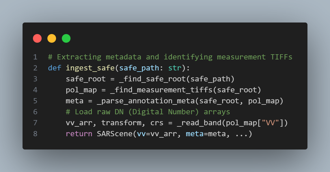
Code Snippet (Ingestion)
2. Radiometric Calibration: DN to Physical Power Raw numbers (DN) mean nothing in isolation. Calibration converts them into Sigma-Nought (σ°) — a physical measure of backscatter. We interpolate a sparse Look-Up Table (LUT) from the metadata across the entire image grid.
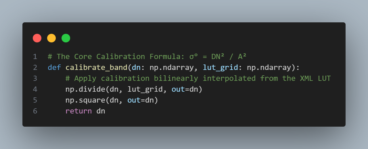
Code Snippet (Radiometric Calibration)
3. Thermal Denoising: Clearing the “Noise Floor” Satellites have internal electrical noise (NESZ). For deep learning, we must strip this away to find the true signal, especially in dark ocean areas.
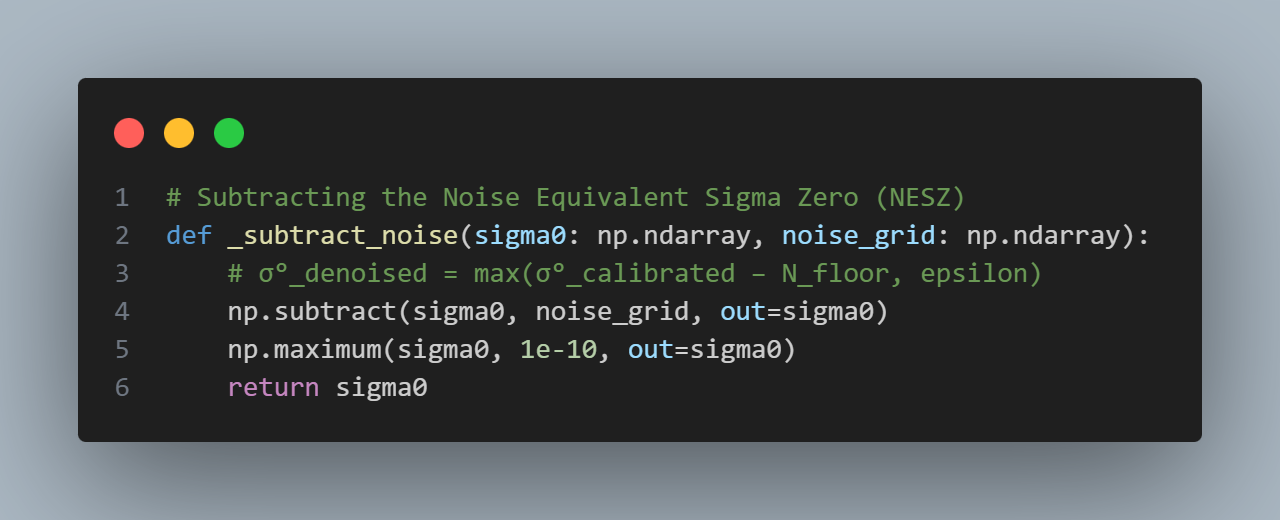
Code Snippet (Thermal Denoising)
4. Terrain Correction: Fixing Earth’s Curvature SAR imagery is captured in “slant-range” geometry, which looks distorted. We use Range-Doppler Terrain Correction and the SRTM 1-Second DEM to map every pixel to its exact Lat/Lon on Earth.
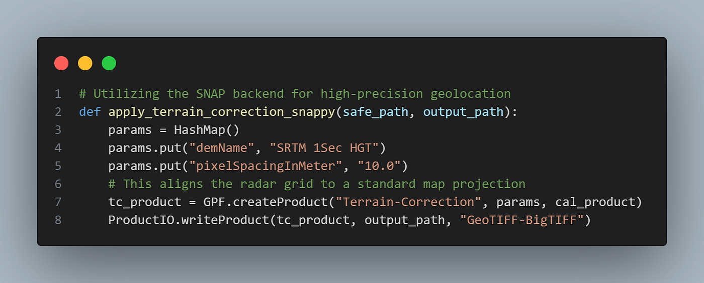
Code Snippet (Terrain Correction)
5. Speckle Filtering: Smoothing the “Salt & Pepper” Radar interference causes a grainy texture called “speckle.” We apply an Adaptive Lee Filter which uses local variance to smooth the ocean while keeping bright targets (like ships or buildings) sharp.
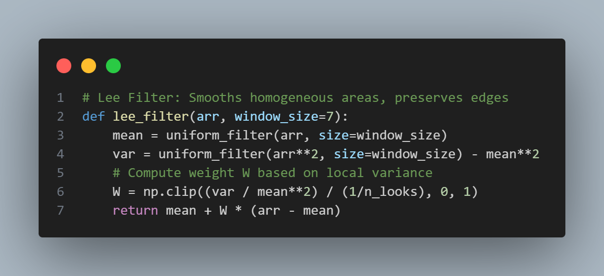
Code Snippet (Speckle Filtering)
6. Normalization & RGB Export To make the data AI-ready, we convert the linear power to Decibels (dB), clip it to a range of [-30, 0], and scale it to [0, 1].
For visualization, I mapped the channels to a standard RGB image. However, since SAR typically only provides two polarizations (VV and VH), we use a custom mapping:
Red Channel: VV Polarization (highlights structure) Green Channel: VH Polarization (highlights texture) Blue Channel: Empty (0)
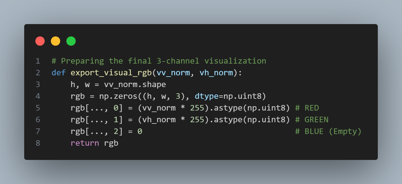
Code Snippet (Normalization & RGB export)
Visual progress:
note: According to the additive color model, when you combine Red + Green, the mathematical result is Yellow.
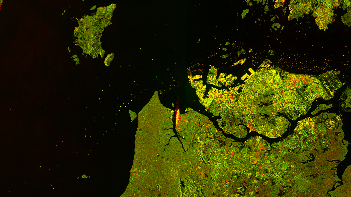
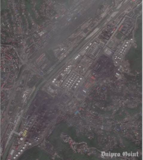
The raw, noisy, and distorted SAR data before any processing.
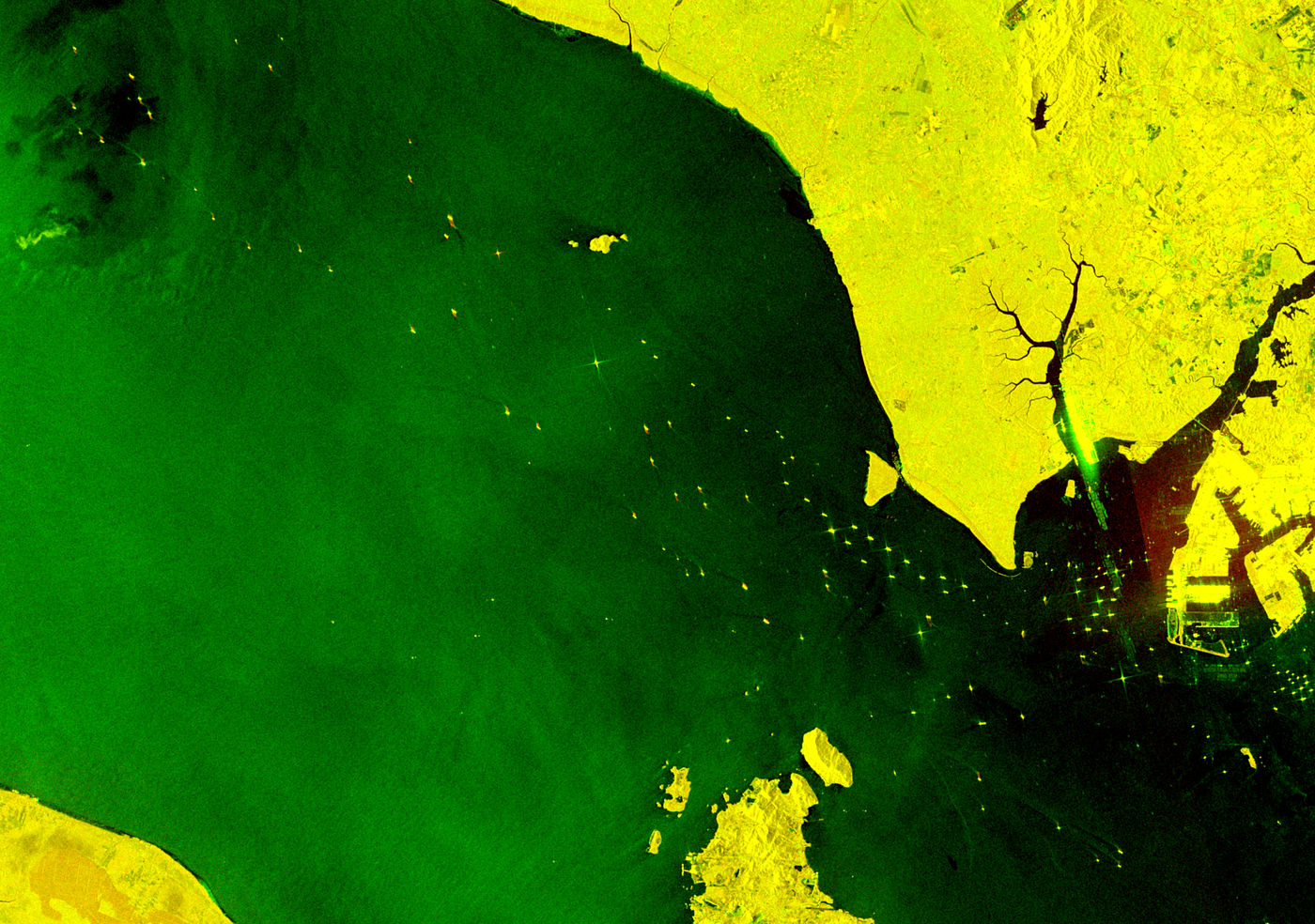
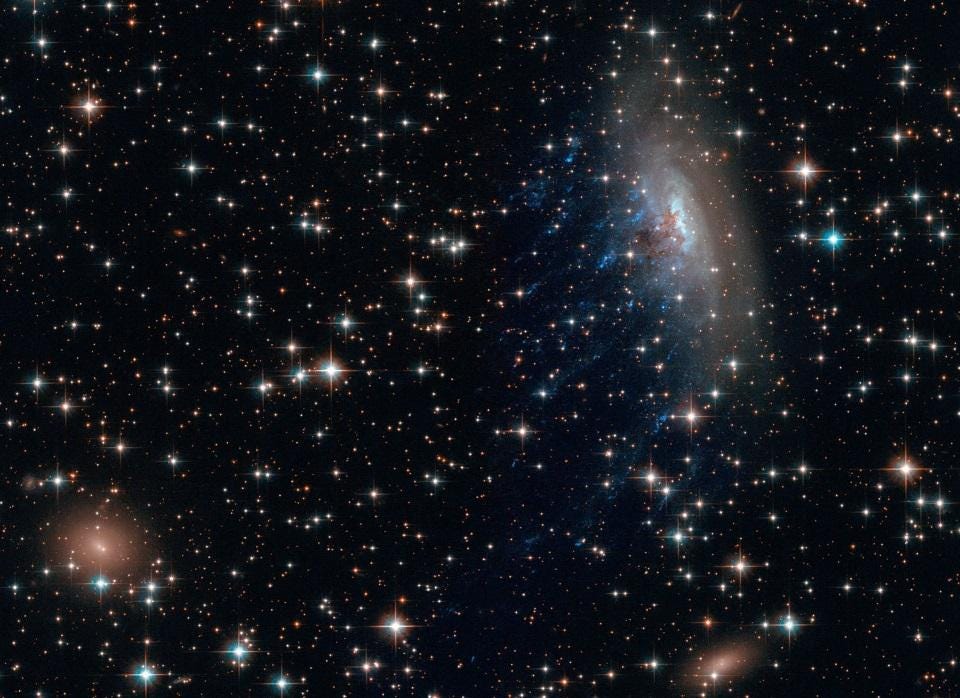
The final output. Notice the high contrast and the “Red-Green” look where the Blue band is left empty.
Description: The final output. Notice the high contrast and the “Red-Green” look where the Blue band is left empty.
Targets that appear bright yellow (like ships, metal structures, or land) are areas where the radar signal bounced back strongly in both the VV and VH polarizations.
- Strong Yellow: High backscatter in both VV and VH. This is typical for “corner reflectors” like the hull of a ship or a large building where the microwave pulse bounces multiple times and returns with high intensity in both polarities.
- Dark Regions: Passive areas (like calm deep water) that reflect energy away from the sensor, resulting in low values for both channels (Black).
- Red/Green Variations:
- If a target appears more Red, it means it has strong VV but weak VH (typical for slightly rough water).
- If it appears more Green, it means it has strong VH but weak VV (common for certain types of vegetation).
Conclusion: Data Quality is Everything
In satellite analysis, the model is only as good as the data pipeline. By automating these 6 stages, we transform raw microwave noise into standardized, analysis-ready tensors.
Whether you are building a ship detector or monitoring deforestation, the journey starts with mastering the “grid of numbers.”
#SatelliteImagery #DataEngineering #SAR #DeepLearning #Python #RemoteSensing #ComputerVision
메타데이터
- post_id
- b6fcf026b2ca
- slug
- from-radar-pulses-to-ai-ready-tensors-building-a-sentinel-1-preprocessing-pipeline-️-️-b6fcf026b2ca
- url
- https://medium.com/@akstasy_/from-radar-pulses-to-ai-ready-tensors-building-a-sentinel-1-preprocessing-pipeline-%EF%B8%8F-%EF%B8%8F-b6fcf026b2ca
- canonical_url
- https://medium.com/@akstasy_/from-radar-pulses-to-ai-ready-tensors-building-a-sentinel-1-preprocessing-pipeline-%EF%B8%8F-%EF%B8%8F-b6fcf026b2ca
- author_url
- https://medium.com/@akstasy_
- status
- ok
- fetched_at
- 2026-06-21 07:44:09